Rapid Wellness Delivery Landing Page Template
Brine is a Neo-Retro masonry landing page template built for low-sodium grocery delivery services. It pairs editorial food photography with a warm Parchment and Rust color system, a full-screen video hero, and a booking flow that guides visitors from sensory craving to scheduled delivery. Ideal for heart-health-focused delivery brands targeting post-cardiac patients and hypertension managers.
by Rocket studio
Quick summary
Brine is a single-page food delivery landing page template crafted for low-sodium grocery delivery. It opens with a full-screen video hero, flows through a masonry product grid, and closes with a two-step delivery booking flow. The landing page design feels like a warm farmstand editorial, not a medical pamphlet.
Who this template is for
This delivery landing page is built for founders and marketers running heart-health grocery delivery brands. It suits teams ready to convert health-conscious visitors through beautiful food visuals first.
- Low-sodium grocery delivery startups serving post-cardiac patients and hypertension managers
- Renal dietitians or clinicians recommending a trusted grocery shopping source to patients
- Food and beverage brands launching a subscription delivery service for sodium-restricted households
What problem this template solves
Most food delivery landing page designs bury health claims in bullet points. Visitors with cardiac or renal diet needs want to feel the food before reading the label. This landing page solves that tension.
- Health messaging feels clinical and off-putting rather than appetizing on standard grocery landing page templates
- Booking flows for specialty delivery services often lack sodium-specific product context that builds trust
- Visually appealing elements are missing from templates that target medical diet niches
What you get with this template
This grocery landing page delivers a complete single-page layout with high-impact visuals and a structured booking flow. A well-organized layout ensures the user moves naturally from discovery to scheduling.
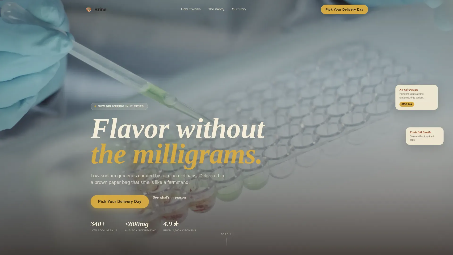
- Full-screen video hero with overhead unboxing footage and a sticky call-to-action bar
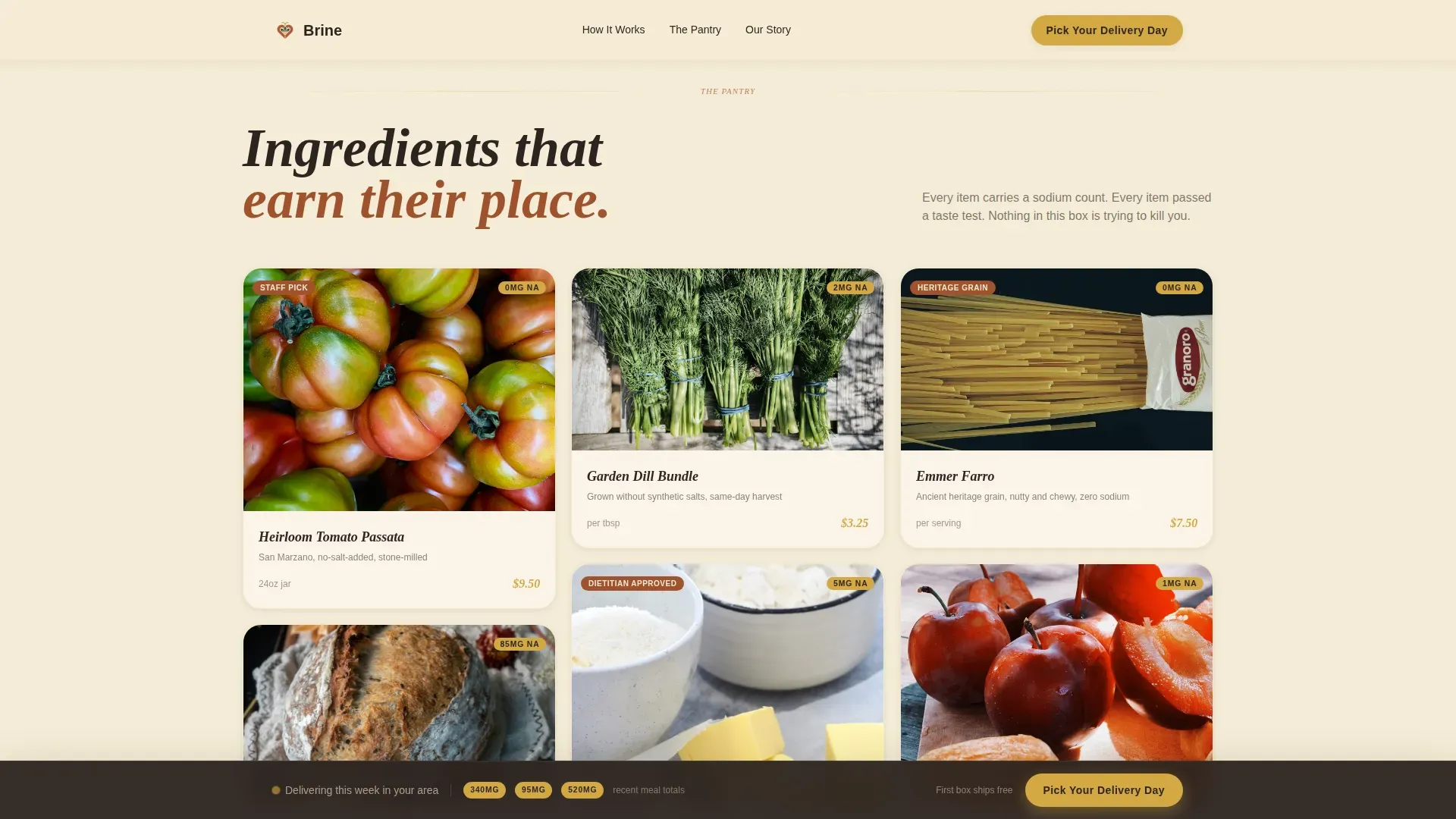
- Masonry editorial grid with hover-tilt cards, sodium callouts, and composed meal transitions
- Two-step delivery booking modal with cadence calendar and box-size selector (Solo, Household, Family Table)
Feature list
This food delivery landing page template includes purpose-built sections that make grocery shopping feel irresistible and medically credible at once.
Full-Screen Video Hero
An overhead camera drifts across a wooden table as hands unpack a delivery box. The landing page opens with golden-hour light, ambient sound design, and the tagline "Flavor without the milligrams" to set tone before a single product is named.
Masonry Editorial Grid
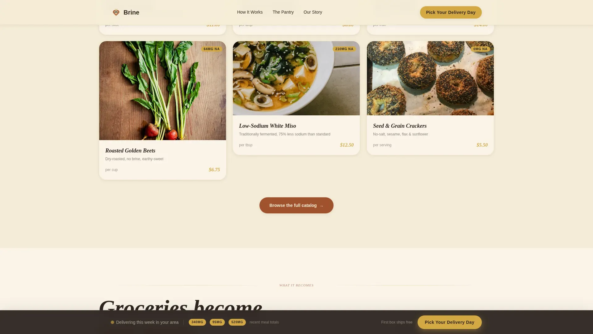
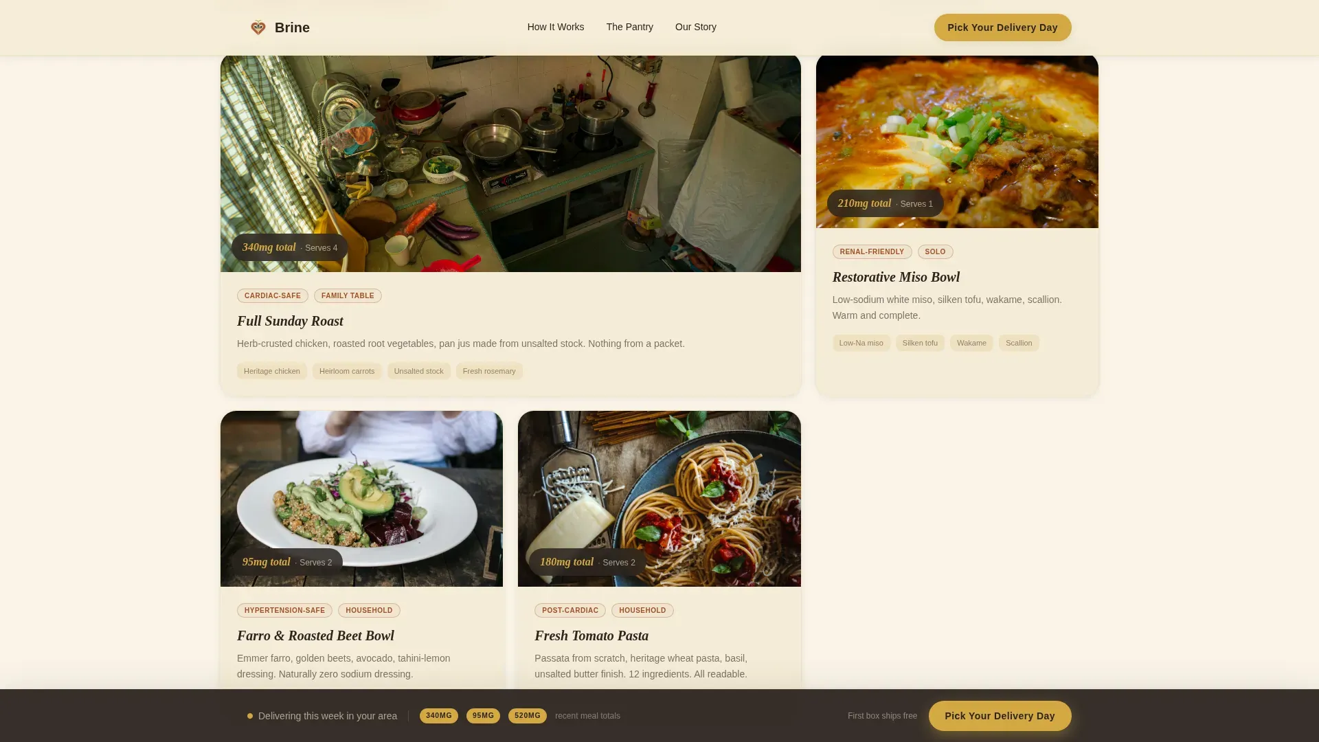
Editorial product photography fills a Pinterest-style masonry grid. Cards tilt on hover with a soft shadow shift. Sodium callouts appear on each card, and the grid transitions from individual ingredients to composed meals as the user scrolls deeper.
Customer Kitchen Stories
Real kitchen photos with sodium-count captions anchor social proof. Captions like "Full Sunday roast. 340mg total." save visitors from doubt and add the kind of trust that moves a health-conscious buyer to book.
Two-Step Booking Flow
Clicking "Pick Your Delivery Day" opens a delivery calendar modal. Step one sets weekly or biweekly cadence. Step two selects a box size with sodium-per-serving averages displayed, giving customers full convenience and dietary clarity.
Sticky Call-to-Action Bar
A preserved-lemon gold bar appears after the first scroll. It stays anchored at the bottom of the landing page and keeps the primary booking prompt visible without interrupting the food photography experience.
Custom Box Path
A secondary "Build a Custom Box" path lets advanced users browse the full catalog and schedule from cart, giving the delivery landing page a second conversion route for high-intent shoppers.
Page sections overview
| Section | Purpose |
|---|---|
| Video Hero | Open with sensory impact and tagline |
| Masonry Product Grid | Showcase ingredients with sodium callouts |
| Composed Meals | Show finished dishes from the ingredients |
| Customer Kitchen Stories | Build trust with real sodium-count captions |
| Box Selection Flow | Present box sizes and delivery scheduling |
| Footer Split | Logo, tagline, and navigation links |
Design & branding system
The landing page uses a Neo-Retro Parchment and Rust palette that feels analog and trustworthy without looking dated. Typography pairs Fraunces editorial serif headlines with DM Sans for body and interface text.
- Colors: parchment cream (#F5ECD7) background, cast-iron rust (#A0522D) primary, smoked paprika (#8B3A2A) deep accent, pantry charcoal (#2C2420) body text, preserved-lemon gold (#D4A843) for buttons and price tags
- Animation: video parallax, scroll-linked section reveals, and masonry card hover tilts are all included in the landing page design
Mobile & speed optimization
The template is desktop-first to give food photography real estate, with a graceful mobile fallback. Responsive design ensures the delivery landing page works across screen sizes without breaking the visual grid.
- Video loads lazy and autoplays muted so the landing page stays fast on initial paint
- CSS smooth scroll behavior and optimized image assets keep the food delivery landing page responsive and fluid
How this template helps you convert
A high-converting food delivery landing page earns the click through craving before obligation. This template sequences content to protect the visitor's trust and move them naturally toward booking.
- The video hero creates immediate sensory appeal, so the landing page feels inviting before any health claim appears
- The sticky call-to-action bar and two-step booking flow reduce friction and save the visitor from hunting for the next step
Other information about this template
This template is totally customizable with organized layers and responsive design, making it straightforward to adapt for any low-sodium grocery delivery brand. The layout of a landing page must present unique selling points prominently, and Brine places "Low Sodium" and "All-Natural" signals throughout every scroll depth.
- Template files include clean, organized layers compatible with Adobe XD and Sketch workflows for design teams who want to customize before handoff
- Adobe XD and Sketch users can get started quickly because each section is grouped and labeled within the file
- The landing page design includes sections ready for nutritional labels, ingredient lists, and allergen information, supporting health-conscious buyers who need that transparency
- Grocery delivery services offer a seamless online shopping experience, and this template reflects that standard with a well-organized layout built to attract customers
- Finding a specialized template for a low-sodium brine product requires combining health-conscious design with e-commerce elements, and this grocery landing page does exactly that
- Low sodium grocery options can help individuals manage their blood pressure and contribute to overall heart health, so the template keeps those messages visible without feeling prescriptive
Theme
Neo-Retro
Creative direction
Sensory Appeal
Color system
Parchment & Rust
Style
Masonry/Pinterest
Direction
Booking/Scheduling
Page Sections
Full-screen Video Hero with Sticky Call to Action
Masonry Editorial Product Grid
Composed Meals and Kitchen Stories
Two-step Delivery Booking Modal
Custom Box Builder Path
Neo-retro Parchment and Rust Design System
Related questions
Who is this landing page template designed for?
Can I customize the box sizes and delivery cadence options?
Does the template include social proof sections?
What file formats does this template support?
Is the masonry grid layout mobile-friendly?



