Expert Subscription Box Services Pricing & Packages Website Template
Fresh is a vibrant bento grid landing page template built for underwear subscription upsell flows. It combines a UGC photo wall header, seasonal product clusters, and an inline tier-comparison toggle to move existing subscribers from a basics plan toward Premium or All-Access. The Citrus Burst color system keeps the page energetic, warm, and effortlessly on-brand.
by Rocket studio
Quick summary
Fresh is a single-page bento grid landing page template designed for subscription box upsell campaigns. It targets existing underwear subscribers and guides them toward a higher-tier plan. Seasonal product clusters, staggered animations, a blurred-preview lock mechanic, and a sticky upgrade footer work together to build desire and earn the click.
Who this template is for
This template is built for subscription box brands in the apparel and personal care space. It works especially well when you already have an active subscriber base and need a dedicated page to drive plan upgrades.
- Subscription box operators running quarterly underwear or apparel programs who want to convert basics-plan members to Premium or All-Access tiers
- Direct-to-consumer brands targeting busy twenty-something professionals, new parents, and active gym-going women who value restocking convenience
- Marketing teams that need a visually rich, self-contained upsell landing page without rebuilding their entire storefront
What problem this template solves
Most subscription upgrade pages are generic comparison tables dropped inside a dashboard. They inform but do not inspire. Subscribers scroll past them because nothing on the page makes them feel what they are missing.
- The template replaces flat comparison charts with an immersive seasonal grid that lets subscribers see, almost touch, and genuinely want the fabrics locked behind their current plan
- It removes friction from the "Gift an Upgrade" secondary path, giving gift-minded visitors a clear route without cluttering the primary upsell flow
- It handles the emotional gap between functional underwear restocking and personal identity, framing the upgrade as a statement about how you want to feel every day
What you get with this template
You get a fully structured bento grid landing page with every major section pre-built and ready to customize. The layout is opinionated enough to deploy quickly and flexible enough to reflect your brand voice.
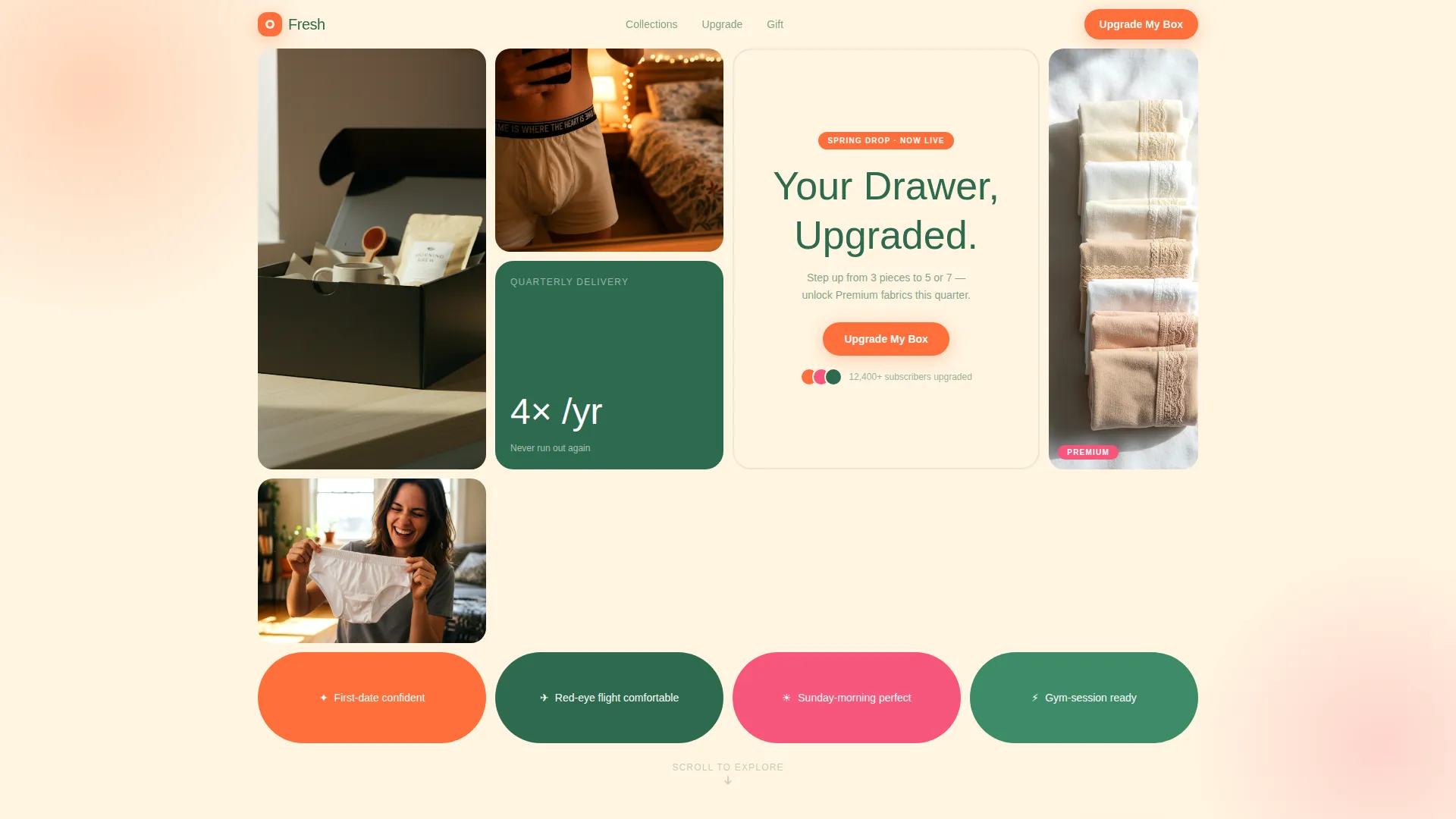
- A full-viewport UGC photo wall header with staggered tile fade-in animation and a typewriter headline effect
- Three seasonal product grid clusters, each with its own accent color shift, moment-card interrupts, and a pinned "Upgrade My Box" call-to-action button
- An inline tier-comparison toggle showing the 3-piece, 5-piece Premium, and 7-piece All-Access plans, with blurred fabric swatches and lock icons for upgrade-exclusive styles
Feature list
This template ships with a set of carefully considered components. Each one serves the upsell journey rather than adding visual noise.
UGC Photo Wall Header
The header fills the full viewport with an asymmetric bento mosaic of subscriber-style snapshots. Tiles load with a staggered fade-in, each arriving a beat after the last. The center cell carries a typewriter headline that types "Your Drawer, Upgraded" in grove green.
Seasonal Bento Grid Clusters
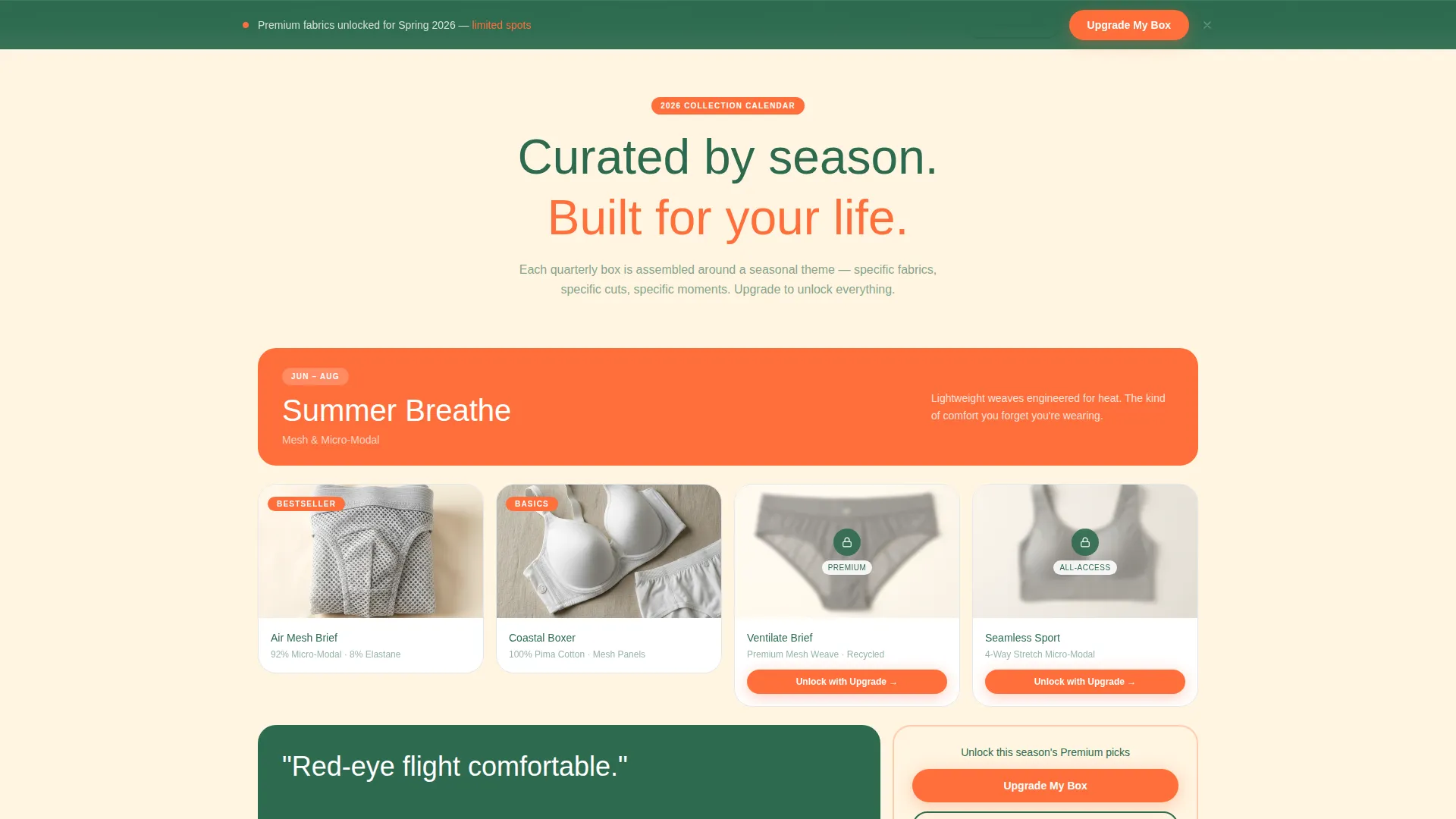
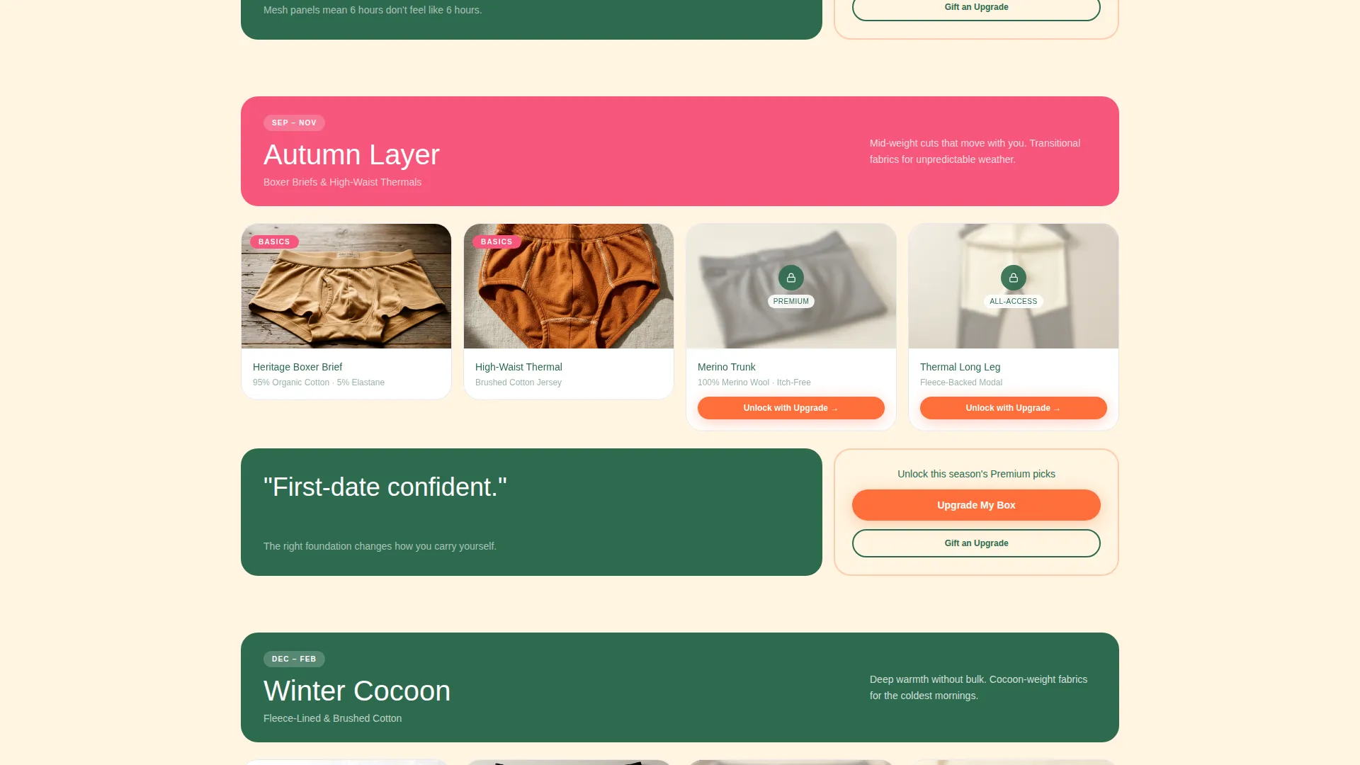
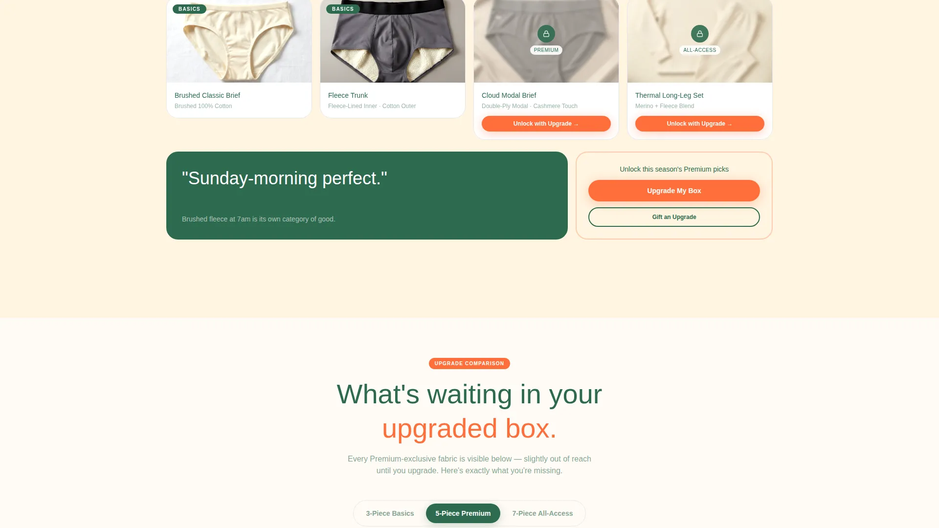
Three distinct grid clusters represent Summer Breathe, Autumn Layer, and Winter Cocoon. Each cluster uses its own accent color shift, moving from tangerine through grapefruit to muted terracotta as the visitor scrolls. The progression makes the page feel curated rather than repetitive.
Moment-Card Interrupts
Between seasonal clusters, single-cell moment cards break the grid rhythm. Cards carry short identity-focused lines such as "First-date confident" or "Sunday-morning perfect," each paired with a tight product crop. These cards shift the conversation from product features to how the subscriber will feel.
Inline Tier-Comparison Toggle
A bento card expands inline to show a side-by-side comparison of the 3-piece quarterly basics plan, the 5-piece Premium tier, and the 7-piece All-Access tier. Visitors see exactly which styles and fabrics unlock at each level without leaving the page.
Blurred Preview Lock Mechanic
Every Premium-exclusive fabric swatch is visible on the page but rendered with a subtle blur and a lock icon overlay. The grid itself becomes a preview of what sits just behind the upgrade, creating desire through visibility rather than description.
Sticky Upgrade Footer Bar
A persistent footer bar stays pinned at the bottom of the viewport throughout the scroll. It carries the primary "Upgrade My Box" call-to-action in tangerine and a secondary "Gift an Upgrade" link, ensuring the conversion path is always reachable.
Page sections overview
| Section | Purpose |
|---|---|
| UGC Photo Wall | Opens the page with real subscriber energy and the typewriter headline |
| Summer Breathe Grid | Showcases mesh and micro-modal styles with tangerine accent |
| Moment Card Interrupt | Shifts tone from product to personal identity between clusters |
| Autumn Layer Grid | Presents mid-weight and high-waisted styles with grapefruit accent |
| Winter Cocoon Grid | Features fleece-lined and brushed cotton styles with terracotta accent |
| Tier Comparison Toggle | Lets visitors compare basics, Premium, and All-Access plans inline |
| Gift Upgrade Path | Provides a secondary conversion route for gift-minded visitors |
| Sticky Footer Bar | Keeps the upgrade call-to-action pinned throughout the entire scroll |
Design & branding system
The Citrus Burst color system drives every visual decision on this page. Colors are saturated without being sweet and warm without being loud, keeping the energy high and the reading experience comfortable.
- Core palette: sun-bleached tangerine (#FF6F3C) for call-to-action buttons and hover states, ripe grapefruit pink (#F7567C) for seasonal badges, soft lemon cream (#FFF4E0) for card backgrounds, and deep grove green (#2D6A4F) for headlines and anchoring text
- The bento grid layout sits on a lemon cream base, with card tiles creating natural visual separation across the asymmetric columns
- Typography uses grove green to ground all headline text, preventing the warm palette from feeling unanchored or overly playful
Mobile & speed optimization
The bento grid layout is structured to restack cleanly across smaller viewports. Seasonal clusters and moment cards adapt to single-column flow without losing the scroll narrative.
- Staggered tile animations are designed to feel lightweight, with each tile fading in sequentially rather than loading all at once
- The sticky footer bar remains accessible on mobile, keeping the upgrade call-to-action within thumb reach throughout the entire page scroll
- Blurred swatch overlays and lock icons scale proportionally so the teaser mechanic reads clearly on smaller screens
How this template helps you convert
This template is engineered around a single goal: turning a passive subscriber into an active upgrader. Every layout decision serves that outcome.
- The blurred-swatch lock mechanic makes Premium-exclusive fabrics visible but out of reach, creating genuine desire before the visitor reaches the comparison toggle
- Seasonal clusters build stakes progressively as the visitor scrolls, moving the conversation from restocking convenience toward personal identity and everyday confidence
- The sticky footer bar and cluster-level call-to-action buttons ensure the upgrade path is never more than a glance away, regardless of where on the page the visitor pauses
Other information about this template
This template fits naturally into a broader subscription retention and upgrade strategy. It is designed as a standalone upsell landing page, meaning it can be linked from a subscriber dashboard, a quarterly email, or a post-purchase confirmation screen without requiring a full site rebuild.
- The "Gift an Upgrade" secondary path serves subscribers who are satisfied with their current plan but want to share the experience, expanding the conversion surface without diluting the primary upsell message
- Seasonal accent color shifts are built into the grid clusters, so refreshing the page for a new quarter is a matter of updating content rather than reworking the layout
- The template is categorized under Retail and E-Commerce, Subscription Box Services, and aligns with activewear subscription niche intent, making it relevant for apparel, personal care, and lifestyle subscription brands beyond underwear alone
Theme
Neo-Retro
Creative direction
Curated Collection
Color system
Lavender Dream
Style
Overlap/Layered
Direction
Marketplace/Multi
Page Sections
UGC Photo Wall Header with Staggered Animation
Seasonal Bento Grid Clusters
Identity-driven Moment Card Interrupts
Inline Tier-comparison Toggle
Blurred Swatch Lock Mechanic
Sticky Upgrade Footer Bar
Related questions
Can I use this template for a new subscriber acquisition campaign?
How does the inline tier-comparison toggle work?
Can I adapt the seasonal clusters to match my own product lineup?
Does the blurred swatch lock mechanic need special backend setup?
Can the page support both the upgrade path and the gift path simultaneously?



