Neo-Retro Japanese Stationery Store Landing Page
Fude is a bento grid landing page built for a curated Japanese stationery boutique. It pairs a Neo-Retro Ink and Paper visual identity with surprise-and-delight interactivity: flip tiles, an ink swatch loop, a mystery reveal cell, and a bundle upsell flow. Every scroll feels like opening a wooden drawer in a Kyoto paper shop and finding something impossible to put back.
by Rocket studio
Quick summary
Fude is the Fude Neo-Retro Japanese Stationery Store Landing Page Template, purpose-built for specialty retail shops that sell pen, ink, paper, and craft goods rooted in Japan. The page runs on a 12-cell asymmetric bento grid, drives revenue through visible bundle upgrades, and wraps every interaction in the warm, analog feeling of a Kyoto stationery drawer waiting to be opened.
Who this template is for
This template speaks directly to shop owners and creative founders who sell thoughtfully chosen stationery goods. It is designed for businesses where the product itself carries emotional weight and where visitors arrive ready to spend time, not just money.
- Independent Japanese stationery boutiques selling pen, ink, paper, notebook, and planner goods to collectors and journaling devotees
- Gift-focused lifestyle shops that want to guide visitors through a curated "Build a Gift Box" ritual rather than a standard checkout form
- Design students, calligraphy enthusiasts, and precision-tool seekers who trust a shop that understands the difference between a 0.2 mm mechanical pencil and a broad-nib fountain pen
What problem this template solves
Most e-commerce landing pages treat every product equally: a grid of tiles, a price, an "Add to Cart" button, and nothing more. For specialty stationery shops, that approach misses the point entirely. Buyers of journals, fountain pen ink, calligraphy brushes, and precision pencils are not impulse shoppers. They are researchers, collectors, and ritualists who need to feel the shop before they trust it.
- A standard product grid cannot convey the difference between seasonal ink arrangements, limited-edition notebook covers, and handwritten staff recommendations, Fude is built to display all three at once
- Without bundle logic baked into the layout, upsell opportunities disappear; this template makes every pen pairing and ink set upgrade visible and natural
- Generic templates give visitors no reason to linger; Fude's flip tiles, mystery cell, and animated stamps create genuine moments of discovery that lead shoppers deeper into the craft
What you get with this template
Fude delivers a fully designed, interaction-rich landing page ready to represent a Japanese stationery brand. Every section is intentional, every animation is tied to a real buying behavior, and every layout choice reflects the Neo-Retro Kyoto paper shop aesthetic described in the brief.
- A 12-cell asymmetric bento grid with flip tiles, an ink swatch video loop, a mystery reveal cell, editorial haiku, and upgrade tabs built into each product tile
- A full Gift Box Builder flow where three bento cells lock together into a custom set, earning the upgrade through the ritual of choosing rather than the pressure of selling
- A persistent bottom bar that tracks cart total and nudges visitors toward a free shipping threshold with a hand-drawn progress line
Feature list
This section walks through the standout built-in capabilities of the Fude template. Each feature is grounded in the design and interaction brief for this page.
Catalog Card Search Hero
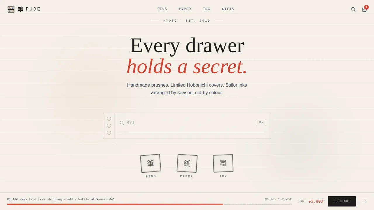
The header opens on a single oversized search box centered on a washi cream field. It is styled like a vintage library catalog card, complete with monospaced placeholder text reading "ink, washi, Sailor, Hobonichi…" and a soft vermillion cursor that blinks. Below it, three hand-drawn-style category stamps, Pens, Paper, and Ink, animate in with a rubber-stamp press motion, each landing slightly off-axis like a real ink impression. The hero section conveys the brand's unique value without competing imagery.
Surprise and Delight Bento Grid
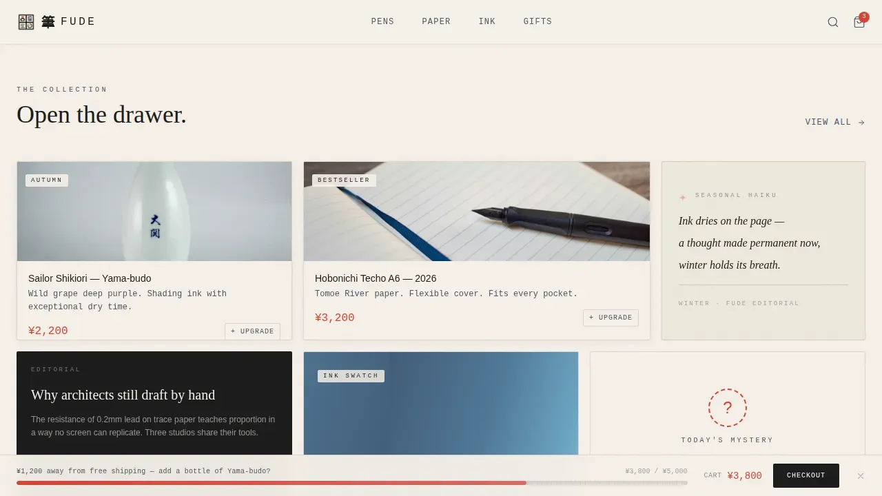
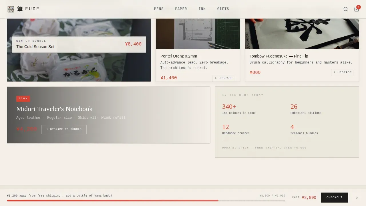
The 12-cell asymmetric bento grid is the heart of the page. Large tiles interrupt small ones, editorial haiku sits beside product photos, and seasonal bundles appear like gifts wrapped in illustrated belly bands. One tile flips on hover to reveal a handwritten staff note. Another cell auto-plays a three-second ink swatch video loop on Tomoe River paper. A mystery cell pulses gently, and clicking it reveals a rotating daily product at a secret price. Visitors who scroll forward always find something new to discover.
Upgrade Tab and Bundle Upsell
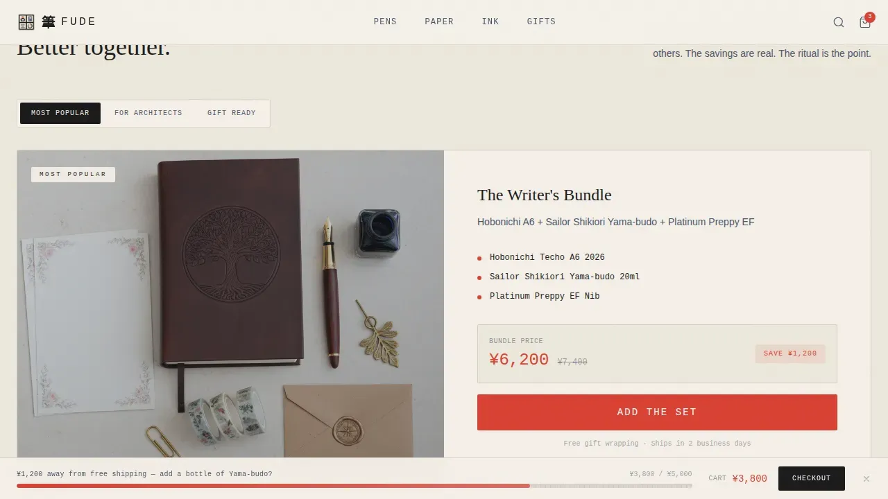
Every product tile includes a faded indigo "+Upgrade" tab that slides open to show a premium pairing: the fountain pen plus a matched ink bottle, the notebook plus a leather sleeve, the ink set plus a glass dip pen. The primary call to action reads "Add the Set" in vermillion, always showing the bundle price against the cost of buying each item separately. This layout makes the upsell feel like a natural recommendation rather than a pushy sign.
Gift Box Builder Flow
Three bento cells lock together into a custom gift set. Visitors choose their items, a pen, a notebook, a roll of masking tape, an eraser, a set of pencils, and the template creates a gift box experience with tissue wrapping. The flow rewards the ritual of choosing. It converts gift-hunters who believe the right stationery changes how someone thinks, not just how they write.
Persistent Shipping Progress Bar
A bottom bar stays visible as visitors scroll. It tracks the cart total and displays a hand-drawn progress line nudging toward the free shipping threshold. Example prompt copy reads "¥1,200 away from free shipping, add a bottle of Yama-budo?" This single element keeps buyers engaged with their cart and consistently leads to larger order values by suggesting specific other items.
Handwritten Staff Picks Section
The Staff Picks section displays handwritten recommendation cards alongside seasonal ink swatches. Cards link directly to product tiles, so the recommendation flows naturally into the purchase path. This section functions as social proof without requiring external reviews. It creates the feeling of a knowledgeable shop assistant standing on one side of the counter, ready to guide every visitor toward the perfect pen or journal.
Page sections overview
| Section | Purpose |
|---|---|
| Catalog Card Hero | Opens with a vintage search box and rubber-stamp category animation to set the shop's tone |
| Bento Product Grid | 12-cell asymmetric layout housing flip tiles, ink swatch video, mystery cell, editorial haiku, and upgrade tabs |
| Upgrade Bundle Showcase | Displays curated pen, ink, and notebook pairings with visible savings and "Add the Set" call to action |
| Gift Box Builder | Three-cell lock-together flow guiding visitors through a custom gift ritual |
| Staff Picks | Handwritten recommendation cards with seasonal ink swatches linked to product tiles |
| Footer | Minimal ink-styled horizontal flow footer |
Design & branding system
Fude's visual identity is built on the Ink and Paper color system, which feels like a freshly stamped postcard drying on a tatami mat. The palette keeps the page warm, analog, and quietly collectible without ever feeling busy. Typography pairs bold serif editorial headers with clean sans-serif interface text and monospaced catalog elements, creating clear layers of visual hierarchy across every page section.
- Color roles are strict: washi cream (#F5F0E8) as the ground, sumi ink (#1A1A1A) for primary type, faded indigo (#4A5568) for secondary text and upgrade tabs, and vermillion hanko red (#D94032) reserved exclusively for price callouts, sale badges, hover states, and primary call-to-action buttons
- Grid cells sit on the cream ground with hairline ink borders, letting negative space breathe like margins in a well-set book; retro textures including a floating grain layer and halftone dot patterns reinforce the Showa-era analog feel
- Typography uses DM Mono for catalog and search elements, Fraunces for editorial haiku and headings, and DM Sans for user interface copy; bold serif headers are always paired with clean sans-serif body text throughout
Mobile & speed optimization
Fude is built desktop-first because stationery collectors browse carefully and the bento grid rewards that deliberate pace. However, the layout is designed to reflow gracefully so the experience holds together on smaller screens. Visitors on mobile can still flip tiles, activate upgrade tabs, and complete the gift box builder flow without losing the core interaction logic.
- The bento grid reflows from its asymmetric desktop arrangement into a stacked single-column format on mobile, preserving the sequence of hero, grid, bundle, gift builder, staff picks, and footer
- Server Components handle the static grid structure for fast initial load, while Client Components manage interactive tiles including flip cards, the mystery reveal, the upgrade tab slide, and the shipping progress bar
- Videos inside the ink swatch cell are short three-second loops, keeping the embedded media light and appropriate for mobile data connections
How this template helps you convert
A landing page for a neo-retro Japanese stationery store must balance nostalgic warmth with modern e-commerce functionality. Fude does this by pairing emotionally resonant design with conversion mechanics that feel natural inside the shop's aesthetic. Pages with embedded video content can increase conversions significantly, and Fude's ink swatch loop cell puts that principle to work inside the bento grid itself.
- The "+Upgrade" tab on every product tile creates a consistent upsell path that feels like a curator's suggestion rather than a pop-up; visitors sign up for larger basket values because the pairing makes obvious sense, and the visible savings remove any hesitation
- The Gift Box Builder converts the gift-hunter segment by transforming the checkout into a ritual: visitors stand before three open cells, choose their items, and craft a complete set, the act of building the box is the reason to complete the purchase
- The persistent shipping progress bar keeps the cart visible at all times and uses specific product suggestions to lead visitors toward the free shipping threshold, turning passive browsers into active buyers without any aggressive sales copy
Other information about this template
The craft of Japanese stationery runs deep. Understanding its history helps any shop owner frame their products with the confidence and context that collectors expect. This template is designed to support that storytelling alongside the commerce.
- Japanese stationery culture is deeply rooted in daily life, beginning in elementary school where students express themselves through their writing instruments; the history of Japanese stationery spans over a century, starting in the 1910s with the establishment of major fountain pen companies like Pilot, Platinum, and Sailor
- Yoshino Washi is traditional washi paper prized by calligraphers for its texture and strength for 1,300 years; the Fukunishi family in Yoshino has been producing it for six generations and supplies it to Japan's Imperial Household Agency
- Nara is known for producing 90% of the ink in Japan, with Kobaien being one of the oldest ink brands using traditional techniques since 1577; calligraphy brushes made in Nara use a blend of up to ten different types of animal hair, giving them exceptional flexibility; Isshindo is one of Nara's best-known calligraphy shops, offering a wide range of calligraphy accessories and brushes
- The Hobonichi Techo, launched in 2001, has become a phenomenon in planner culture; the Kokuyo Jibun Techo is also one of the most popular planner options today, highly detailed and meticulously developed
- Masking tape, now widely used for arts and craft decoration and scrapbooking, was originally developed for industrial purposes before being embraced by stationery enthusiasts in the 2000s
- Winning a category in the Japanese Stationery Awards can lead to a significant sales spike; the awards are judged by stationery store staff who have deep insights into customer opinions and product quality; recent winners include the Kire-Na Highlighter by Pilot (Grand Prize 2025), the UNI Jetstream Lite Touch Ink from Mitsubishi Pencil (Functionality Award), and the Kori Jirushi Ice Cube Stamp by King Jim (Innovation Award)
- Brand names that appear in the Surfer keyword targets for this template include: Lihit Lab and Zebra; both are recognized Japanese stationery companies whose products sit naturally alongside the pens, pencils, erasers, and notebooks this template is built to display
- The template supports display of highlighters, crayons, transparent rulers, durable pencil cases, and other items beyond the core pen and ink range; the bento grid layout and upgrade tab system can be adapted to carry a wide variety of stationery product types
- Visitors can use a promo code field in the cart or checkout area to redeem discount offers; shop owners can link this to seasonal campaigns or limited-edition product launches
- Product photos and videos are central to the template's persuasion system; warm-toned photos showcasing stationery in action, alongside short swatch videos, give visitors as much information as they need to feel confident before they add an item to their bag
- Log into your account after purchase to access the template files and any future updates posted to the platform
Theme
Neo-Retro
Creative direction
Surprise & Delight
Color system
Ink & Paper
Style
Bento Grid
Direction
Upsell/Upgrade
Page Sections
Catalog Card Search Hero with Stamp Animation
Cell Asymmetric Bento Grid with Flip Tiles
Upgrade Tab Upsell on Every Product Tile
Ritual-led Gift Box Builder Flow
Persistent Cart and Shipping Progress Bar
Handwritten Staff Picks with Ink Swatch Cards
Related questions
Is this template suitable for a store that sells pencils, erasers, and highlighters, not just fountain pens?
Can I replace the ink swatch video loop with my own product footage?
Does the bento grid reflow correctly on mobile screens?
How does the Gift Box Builder section work for gift-hunters?
Can I add a promo code or discount field to the cart experience?



