High-Protein Food & Dining Reviews Website Template
Fuel is a full-width immersive catering landing page template built for high-protein meal prep delivery services. It combines a UGC photo wall header, a local sourcing map, a weekly menu carousel, and handwritten-style testimonials to build appetite and trust. The goal is a single clear action: get visitors to click through to the weekly menu ordering page.
by Rocket studio
Quick summary
Fuel is a catering landing page template designed for neighborhood high-protein meal prep services. It uses real customer photos, sourcing transparency, and honest macro data to move visitors toward one clear goal: clicking through to the weekly menu. Every section is full-width, warm, and unhurried, food and story fill every pixel.
Who this template is for
This template is a strong fit for food businesses that lead with protein, locality, and real ingredients. It works especially well for services targeting health-conscious people who need verified macros and convenient meals.
- Amateur bodybuilders and fitness athletes tracking macros for summer cuts
- Postpartum mothers and remote workers who need real food without effort
- Neighborhood catering or meal prep companies ready to grow direct-to-consumer orders
What problem this template solves
Most catering landing page designs look like stock-photo restaurant menus. They do not build appetite or trust fast enough. Visitors leave before they find the menu. This template fixes that by leading with social proof, sourcing honesty, and clear protein data.
- Visitors bounce because generic food pages feel impersonal and unverifiable
- Macro-focused buyers need protein counts stated clearly before they commit
- Mobile users checking between gym sets need a fast, thumb-friendly landing page experience
What you get with this template
You get a complete, ready-to-customize catering landing page layout. Every section is pre-built to guide visitors from first impression to click-through without a form on the page.
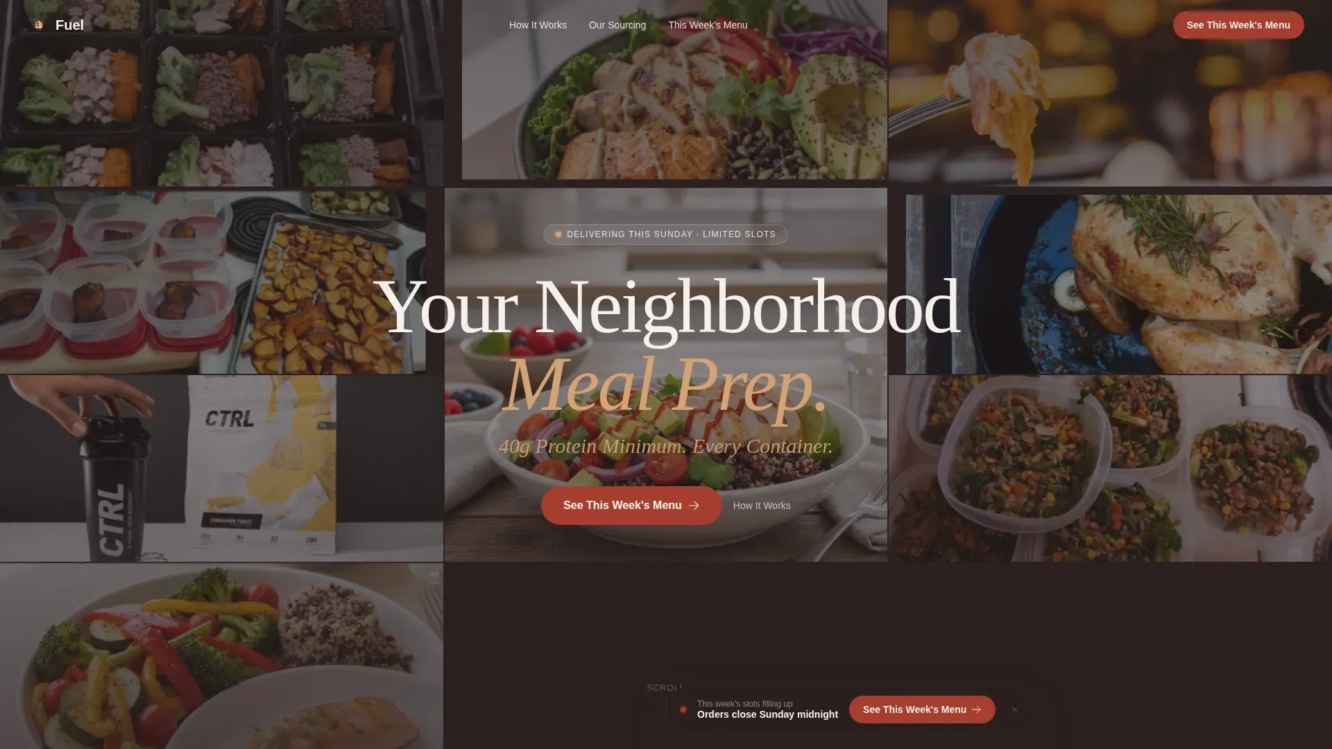
- UGC photo wall hero with Ken Burns animation and a bold headline overlay
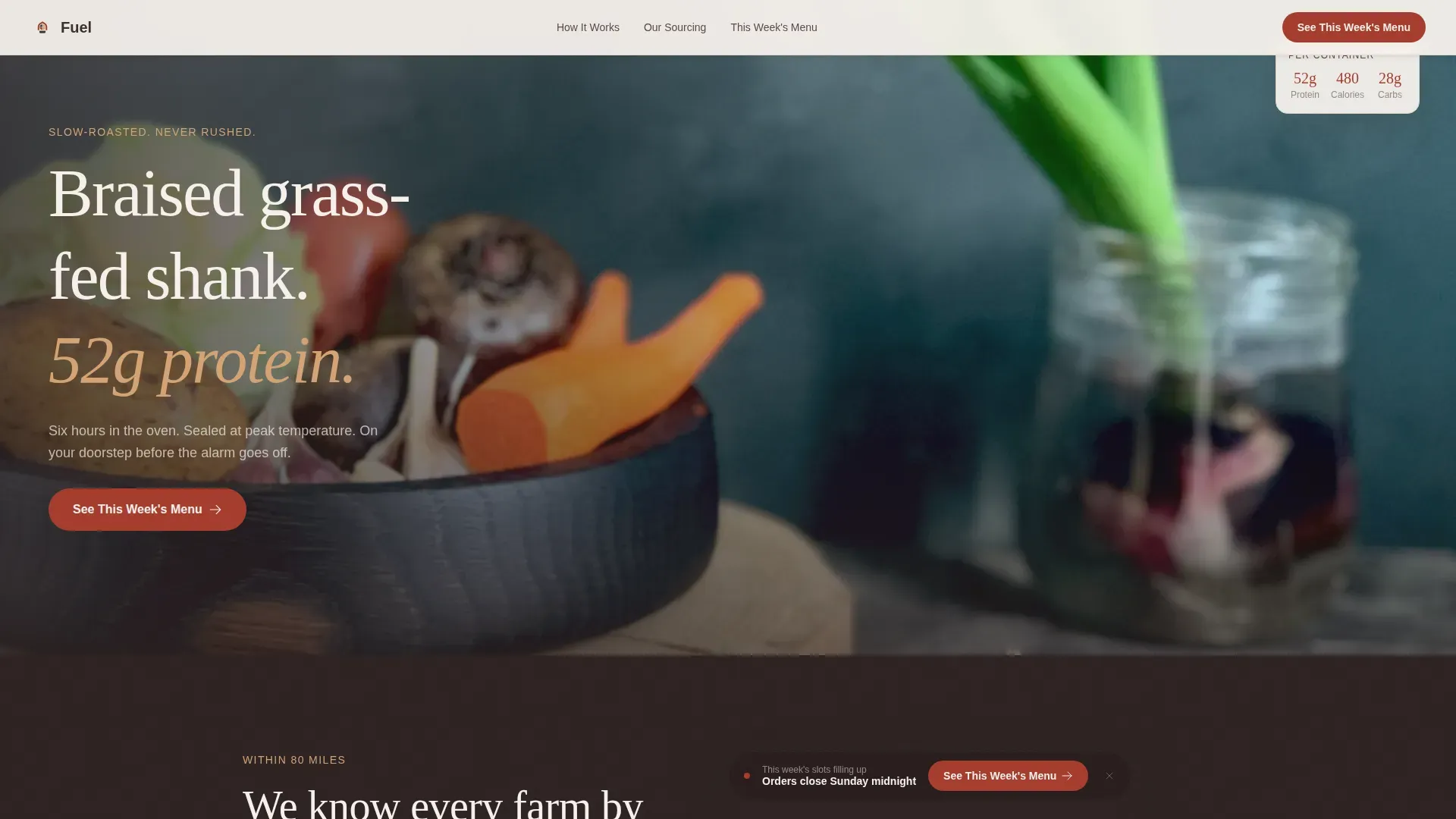
- Full-bleed hero meal shot section with a primary "See This Week's Menu" call to action
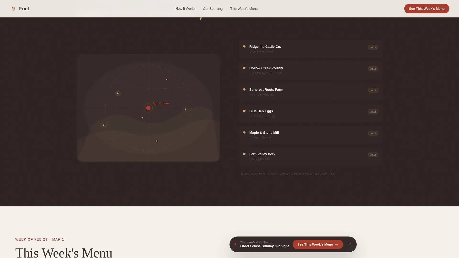
- Local sourcing illustrated map, weekly menu carousel, three-step how-it-works section, and kraft-paper testimonials
Feature list
A paragraph introduces the feature blocks below. Each feature is drawn directly from the template brief and delivers specific, visible value to the catering company using it.
UGC Photo Wall Header
The header fills the full viewport with a mosaic of real customer food photos. A gentle Ken Burns drift animates the mosaic while a hand-set headline fades in over center. Imperfect, phone-camera images create immediate social proof, healthy food landing pages perform best when visually appealing, real images of food lead the experience.
Floating Call to Action Bar
A "See This Week's Menu" button in paprika red appears beneath the header. After the second scroll, it returns as a sticky bottom bar. Clear calls to action on healthy food landing pages increase user engagement, and this template keeps that prompt visible without interrupting the story.
Weekly Menu Carousel with Macro Cards
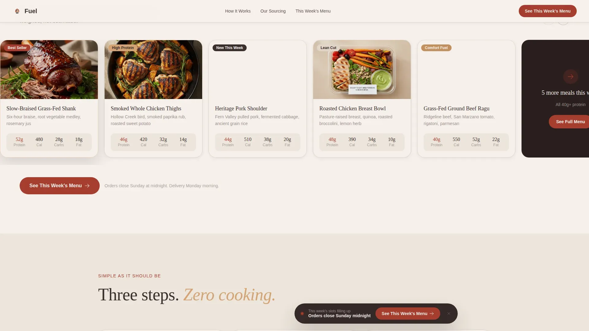
Each menu card displays protein counts in honest block typography. High-protein meal plans are effectively showcased when the protein count per serving is stated clearly, for example, "40g+ Protein", appealing directly to fitness enthusiasts and busy families.
Local Sourcing Illustrated Map
An illustrated map section names the farms and butchers supplying the food. Incorporating local credibility, including mentioning neighborhoods served, builds the trust that converts a curious visitor into a returning customer.
Handwritten Testimonial Strip
Customer quotes appear in a handwritten style, pinned to kraft-paper backgrounds. Each testimonial attributes the reviewer by neighborhood rather than job title, keeping the social proof grounded and specific to the catering service area.
Macro Comparison Strip
A dedicated strip compares the template service's meals against generic meal-kit competitors using honest numbers. This section helps the catering landing page make its nutritional case without needing long paragraphs.
Page sections overview
| Section | Purpose |
|---|---|
| UGC Photo Wall | Opens with social proof and brand tone |
| Hero Meal Shot | Full-bleed food photography with primary call to action |
| Local Sourcing Map | Shows named farms and neighborhoods served |
| Weekly Menu Carousel | Displays macro cards for each meal option |
| Macro Comparison Strip | Contrasts protein content against competitors |
| Handwritten Testimonials | Builds trust through real neighborhood voices |
| How It Works | Three-step logistics for first-time visitors |
| Footer | Business info, social links, and navigation |
Design & branding system
The design follows a Pastoral Calm theme through a Fire and Earth color system. Typography uses Fraunces for serif headlines and DM Sans for body text, creating a warm and readable pairing across all sections.
- Smoked paprika red (#A63D2F) marks interactive elements, buttons, and hover states
- Slow-ember charcoal (#3B2F2F) anchors all body and headline typography
- Sun-warmed clay (#D4A373) accents section backgrounds; raw linen white (#F5F0EB) provides generous breathing room
Mobile & speed optimization
Over 80% of local searches occur on mobile, making a responsive design non-negotiable for catering websites. This template is built mobile-first, so the layout, typography, and calls to action scale cleanly across every screen size. Animations rely on CSS transforms and IntersectionObserver to keep the experience smooth on any device.
- Responsive full-width sections reflow naturally from desktop to phone
- Sticky call to action bar stays accessible on small screens without covering key content
How this template helps you convert
The template is structured as a click-through catering landing page with one conversion goal: get visitors to the weekly menu ordering page.
- The UGC photo wall and macro comparison strip earn trust before any ask is made, so visitors arrive at the call to action already convinced
- The floating call to action bar keeps the primary prompt visible without a form, reducing friction and guiding users toward the menu at their own pace
Other information about this template
This template is practical for anyone creating a catering landing page without a development team. No-code platforms allow users to design landing pages without writing code, and drag-and-drop interfaces simplify the process of creating a responsive layout quickly. Using no-code tools can significantly reduce the time required to launch a landing page.
- Essential business information such as company name, address, phone, email, and social media icons can be added to the footer section
- NAP information (Name, Address, Phone) is important for local search visibility and should stay consistent with your business profile
- The template can store and display multiple weekly menu recipes within the carousel, making it easy to update food offerings each week
- Vibrant images of food enhance social media marketing when shared from the landing page, helping the catering company reach new users on platforms like Instagram
- The Fuel Neighborhood High-Protein Catering Landing Page Template is a perfect starting point for any restaurant-adjacent food service ready to protect its local customer base and build direct ordering relationships
Theme
Pastoral Calm
Creative direction
Local & Neighborhood
Color system
Fire & Earth
Style
Full-Width Immersive
Direction
Click-Through
Page Sections
UGC Photo Wall with Ken Burns Animation
Floating Sticky Call to Action Bar
Weekly Menu Carousel with Macro Cards
Local Sourcing Illustrated Map
Macro Comparison Strip
Handwritten-style Kraft Paper Testimonials
Related questions
Does this template include a contact form?
Can I update the menu carousel with new recipes each week?
Is the catering landing page template responsive on mobile?
Can I add my own customer photos to the UGC header?
What type of catering business fits this template best?



