Hispanic-Owned Business Specialist Professional Website Template
Fuerza is a bold, single-page landing page template built for a Hispanic-owned fitness studio. It uses a Neo-Retro Ink and Paper visual identity, a curated notebook-style scroll, and a focused upsell flow that moves existing members toward a premium membership upgrade with minimal friction.
by Rocket studio
Quick summary
Fuerza is a gallery-plus-detail landing page template designed for a barrio fitness studio with deep cultural roots. The layout scrolls like a hand-inked notebook, presenting each membership tier as its own editorial spread. The primary goal is converting existing basic members into premium subscribers through a confident, community-driven reveal.
Who this template is for
This template is built for fitness studio owners who want a landing page that reflects real community identity, not generic gym stock imagery. It speaks directly to second-generation professionals who train hard and expect spaces that feel like theirs.
- Hispanic-owned fitness studios offering tiered membership plans
- Studio operators targeting an upsell or upgrade campaign for current members
- Fitness businesses whose brand leans analog, bold, and culturally specific
What problem this template solves
Most fitness landing pages feel interchangeable. They recycle the same hero photos, the same benefit bullets, and the same cold call-to-action buttons. A culturally rooted studio loses its edge the moment its page looks like every other gym downtown.
- Generic templates erase the cultural personality that makes a studio worth joining
- Flat membership pages fail to communicate the difference between tiers in a meaningful way
- Upsell flows that ask too much of returning members cause drop-off before conversion
What you get with this template
The template delivers a full single-page layout structured as a curated editorial experience. Every scroll section functions as a "page" in a notebook, with each membership tier given its own visual spread and supporting detail.
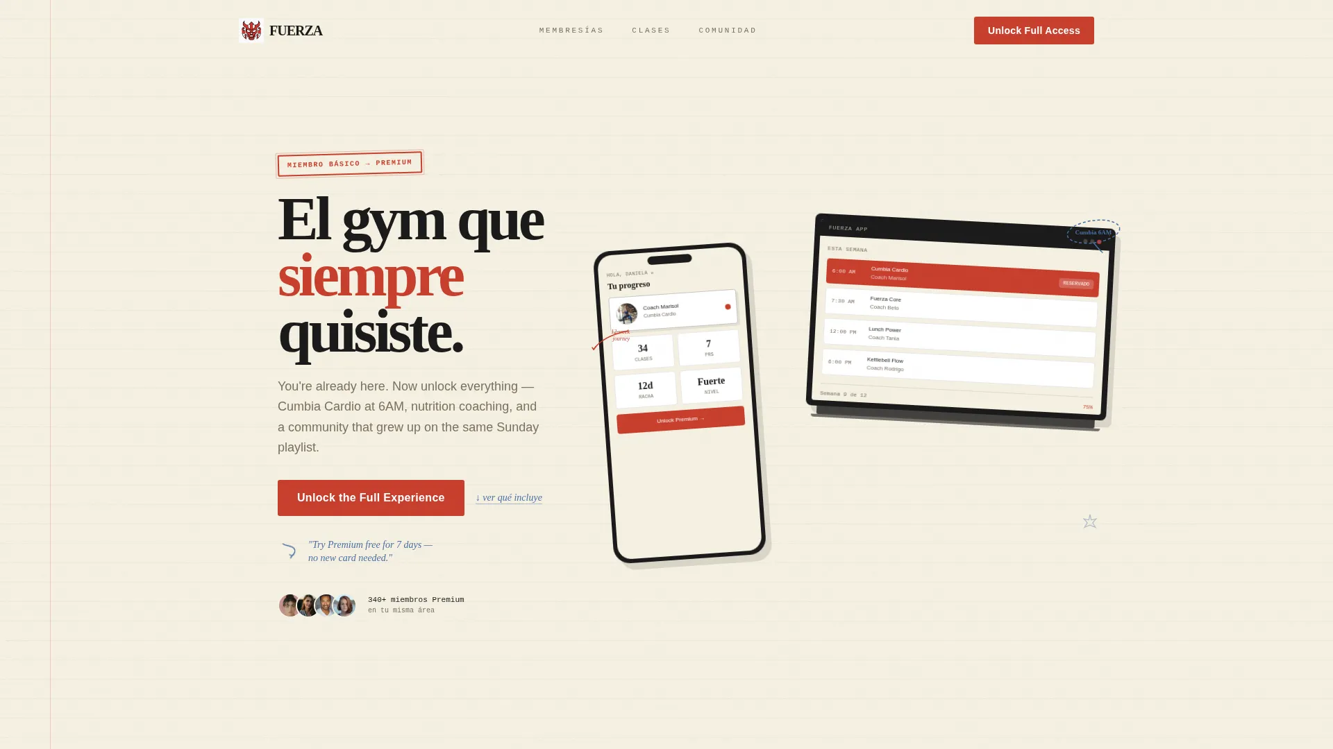
- A Device Mockup header showing an iPhone and laptop at slight angles, screens displaying a class calendar, coach portrait, and a twelve-week progress tracker
- Three editorial membership tier spreads, each with distinct visual treatment and expandable detail panels
- A pinned upsell call-to-action block, a side-by-side comparison toggle module, and a one-tap upgrade confirmation form
Feature list
This template is built around a specific set of design and layout features grounded in the source brief.
Editorial Notebook Scroll Layout
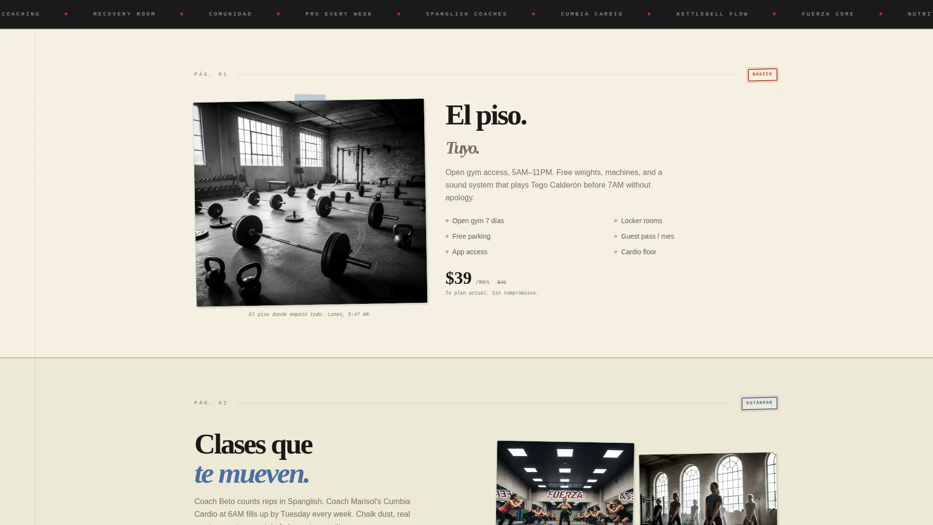
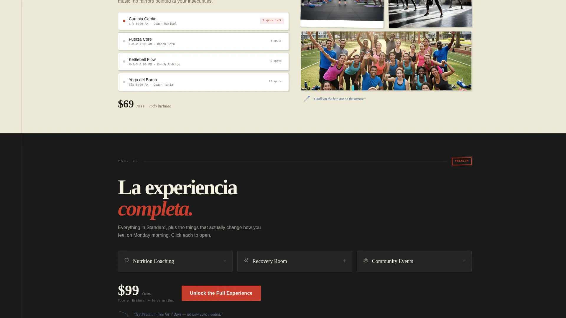
Each scroll section is designed as a standalone "page" in a notebook. The basic tier spread uses a zine-style photograph. The group class spread includes looping short clips with a coach counting in Spanglish. The premium spread reveals nutrition coaching, recovery room details, and community events through expandable click-open panels.
Device Mockup Header
The header floats an iPhone and laptop at a slight angle against an unbleached cream background. The screens show the studio membership app mid-scroll, featuring a class calendar with a highlighted early-morning class, a real coach portrait, and a twelve-week progress tracker. Hand-drawn ink arrows and circled annotations frame the devices.
Membership Tier Comparison Toggle
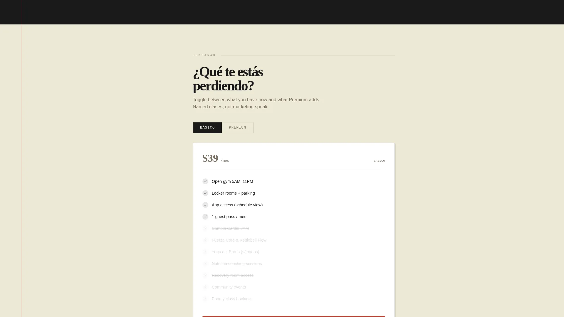
A dedicated comparison module lets visitors toggle between their current basic membership and what a premium upgrade adds. Specific classes and perks are named rather than abstracted, so members understand exactly what they are gaining before they commit.
Pinned Upsell Call-to-Action Block
The primary call-to-action button reads "Unlock the Full Experience" and is rendered in stamped vermillion. It sits pinned after the premium tier reveal, keeping the upgrade path visible without interrupting the editorial scroll experience.
Handwritten Annotation Secondary call to action
A secondary call-to-action styled as a handwritten margin annotation reads "Try Premium Free for 7 Days." This detail reinforces the analog notebook aesthetic while providing a lower-commitment entry point for hesitant visitors.
One-Tap Upgrade Confirmation Form
The upgrade form is designed for returning members. It auto-detects current membership, requires a single tap to start a trial, and assumes the payment method is already on file, removing the friction that causes drop-off in standard upgrade flows.
Page sections overview
| Section | Purpose |
|---|---|
| Mockup Header | Introduces the studio app experience with annotated device visuals |
| Basic Tier Spread | Presents open gym access through a zine-style editorial layout |
| Group Class Spread | Showcases group sessions with looping coach clips and energy |
| Premium Tier Spread | Reveals nutrition, recovery, and events through expandable panels |
| Comparison Toggle | Lets members contrast current and upgraded membership benefits |
| Pinned call to action Block | Anchors the primary upgrade prompt after the premium reveal |
| Upgrade Form | Confirms the trial start with a one-tap, low-friction interaction |
Design & branding system
The visual identity follows a Neo-Retro theme built on an Ink and Paper color system. Every design decision references the texture of a lucha libre handbill photocopied at a corner shop, bold and unapologetically analog inside a digital frame.
- Core palette: heavy sumi black (#1A1A1A), unbleached newsprint cream (#F5F0E1), faded ballpoint blue (#4A6FA5), and stamped vermillion (#C83E2C) used for prices, badges, and active interface states
- Texture and decoration: hand-drawn ink arrows, Sharpie-style circled annotations, and grainy zine photography carry the worn-notebook personality across sections
- Typography and layout: the Overlap and Layered template style creates depth without clutter, letting each spread breathe while staying visually connected to the one before it
Mobile & speed optimization
The layout is structured as a single-page flow, which keeps the navigation path direct and the loading scope contained. The editorial scroll format naturally limits each section to one focused visual and one clear action.
- Single-page architecture reduces navigational complexity for mobile visitors arriving from an in-app banner
- Looping short video clips in the group class section are scoped to that one spread, keeping media load intentional
- The one-tap upgrade form minimizes input fields, making the conversion action fast on a phone screen
How this template helps you convert
The template is built around a specific upgrade scenario: an existing basic member sees an in-app banner, taps through, and lands on a page that rewards their curiosity without pressuring them.
- The editorial scroll reveals premium value progressively, so visitors feel like they are discovering perks rather than being sold to, which reduces resistance before the call-to-action appears.
- The comparison toggle names specific classes and perks, giving members a concrete reason to upgrade rather than a vague promise of "more," and the one-tap form removes the last barrier to starting the trial.
Other information about this template
This template was designed with a specific cultural audience and business scenario in mind. A few additional details help set accurate expectations before you build.
- The template is categorized under Retail and E-Commerce with a Hispanic-Owned Business subcategory focus
- The Curated Collection creative direction means the scroll is intentionally slow and revealing, suited to warm audiences who already know the brand
- The Neo-Retro theme and Ink and Paper palette are pre-built into the template; color values are ready to apply or adjust to match your studio's exact brand
- This is a single landing page template, not a multi-page website; it is designed to serve one campaign or upgrade flow at a time
- The template style is Overlap and Layered, creating visual depth through stacked elements rather than flat grid arrangements
Theme
Neo-Retro
Creative direction
Curated Collection
Color system
Cloud Canvas
Style
Overlap/Layered
Direction
Direct Sales
Page Sections
Editorial Notebook Scroll Layout
Device Mockup Header Section
Membership Tier Comparison Toggle
Pinned Vermillion Call to Action Block
Handwritten Annotation Secondary Call to Action
One-tap Upgrade Confirmation Form
Related questions
Who is the primary audience for this landing page template?
Can this template work for a brand-new fitness studio launch?
What makes the scroll layout different from a standard gym page?
Is the visual identity fully built into the template?
How does the upgrade form work within this template?



