Heartfelt Education Mutual Aid Landing Page Template
Fund is a masonry-style education access landing page built for mutual aid networks that connect parents, mentors, and donors. It features a full-width movement banner, a dynamic person-card grid, a sticky donation bar, and a lightbox with preset giving amounts tied to real student outcomes. Every section earns the gift before the visitor reaches for their card.
by Rocket studio
Quick summary
Fund is a warm, editorial landing page for neighborhood-scale education access networks. The masonry layout turns every scroll into an introduction, pairing faces and micro-stories with dollar-to-impact tiles. A sticky persimmon bar keeps the call to action visible at all times, and a donation lightbox lets visitors give in under a minute.
Who this template is for
This template is built for community-led organizations where trust matters more than polish. It works best when the people behind the network are the story.
- Mutual aid coordinators running school supply drives, tutoring rides, and application fee waiver programs
- PTA leaders, parent volunteers, and neighborhood organizers who need a donation page that feels personal
- First-generation college students and community advocates paying it forward and seeking a credible web presence
What problem this template solves
Most donation pages feel transactional. They ask for money before explaining who it helps or why it matters. Small mutual aid networks often lack the design resources to change that, so visitors leave without giving.
- Donors cannot see where their money goes, so they hesitate to commit
- Community stories stay buried in social media posts instead of living on a page that drives action
- Volunteer and mentor contributions go unrecognized, weakening the network's social proof
What you get with this template
You get a complete, single-page fundraising experience designed around real people and specific outcomes. Every element is built to lower the barrier between "I care" and "I gave."
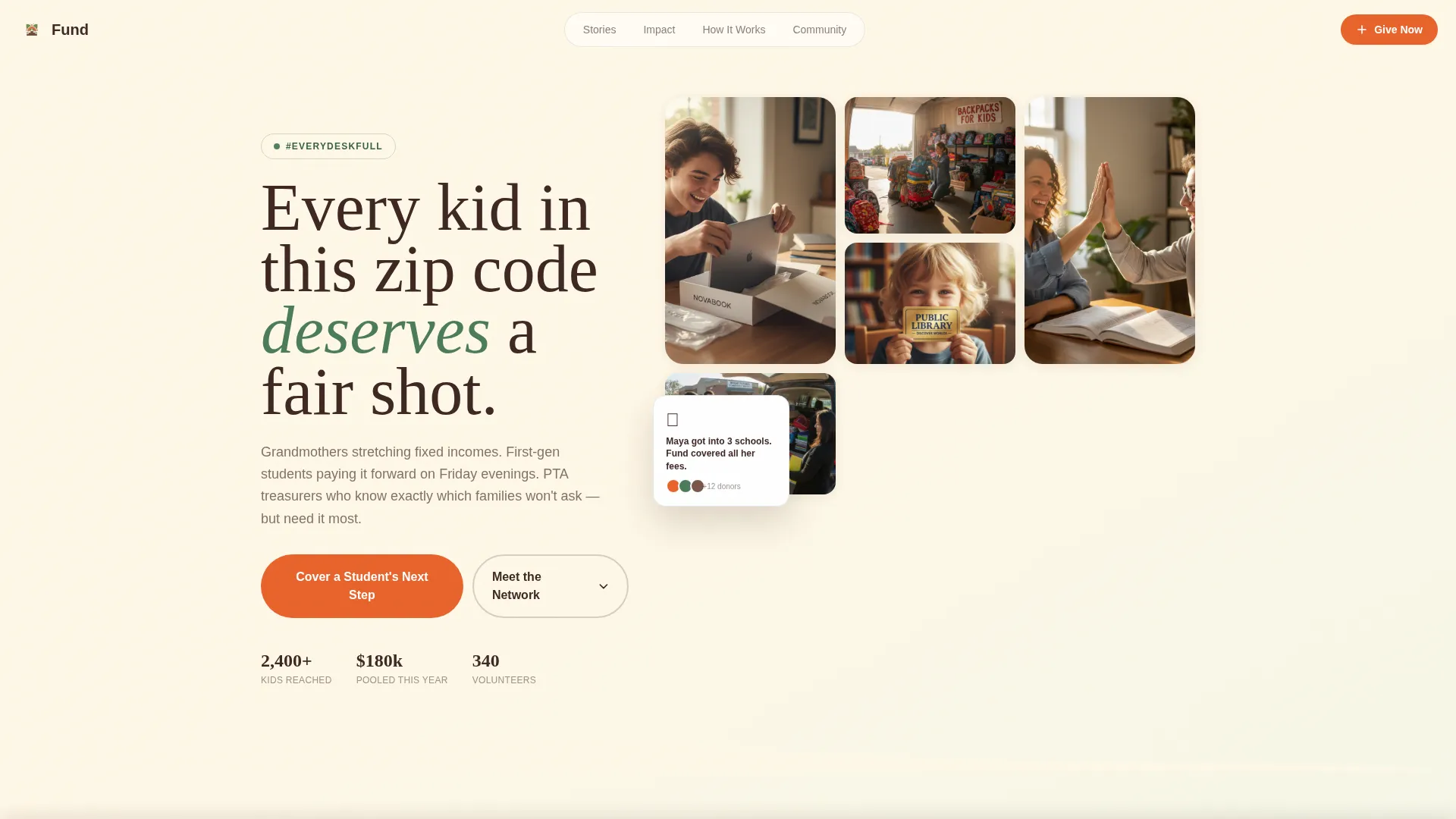
- A full-width mosaic hero section anchored by a movement hashtag and candid community photography
- A masonry grid of person-cards, impact tiles, and moment cards that build density as visitors scroll
- A sticky bottom donation bar, a giving lightbox with preset amounts, and per-story card sponsorship taps
Feature list
A brief look at what makes this template work in practice, broken down by its core components.
Full-Width Movement Hero
The header spans the full browser width and layers the hashtag #EveryDeskFull in hand-drawn serif type over a mosaic of real candid snapshots. Clip-path reveals and entrance animations bring the photo wall to life on load. The images flow directly into the masonry grid below, so the page feels continuous rather than sectioned.
Masonry Person-Card Grid
Cards alternate between portrait photos with two-sentence quotes, infographic tiles showing dollar-to-outcome conversions, and short video loop moments. The grid builds visual density as the visitor scrolls, reinforcing that the network grows with every new contribution. Staggered entrance animations give the layout a natural, hand-placed feel.
Sticky Donation Bar
A persimmon-colored bar stays fixed at the bottom of the screen throughout the entire scroll. The call to action reads "Cover a Student's Next Step" and opens the donation lightbox on tap or click. Visitors on mobile at a PTA meeting can give without ever losing their place on the page.
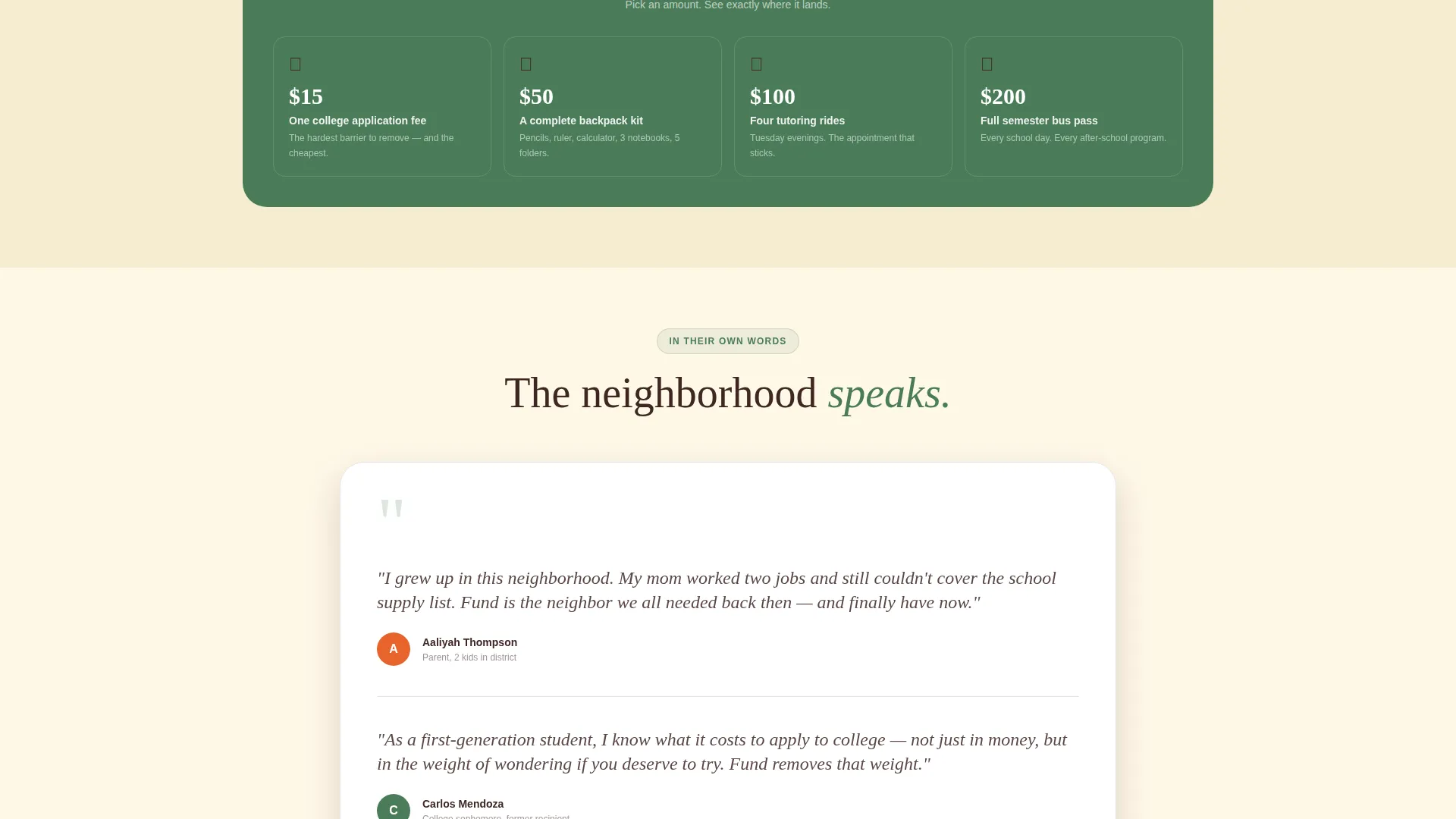
Donation Lightbox with Preset Amounts
The lightbox presents three tangible giving tiers tied to specific outcomes: $15 covers one application fee, $50 fills a backpack, and $200 funds a semester bus pass. After choosing an amount, the visitor fills in a name, email, and payment. The flow is intentionally short to minimize drop-off.
Per-Story Card Sponsorship
Every person-card in the masonry grid is also a conversion point. Tapping a card lets the visitor sponsor that specific individual's story. This turns passive browsing into a direct, personal act of giving without requiring the donor to navigate elsewhere.
Animated Impact Strip
A horizontal band between sections displays scroll-linked counters that animate as the visitor reaches them. Each counter ties a community stat to a real dollar outcome. The strip reinforces credibility and keeps momentum going between the grid and the testimonials section.
Page sections overview
| Section | Purpose |
|---|---|
| Hero mosaic banner | Establishes movement identity with #EveryDeskFull and community photos |
| Masonry story grid | Introduces faces, quotes, impact tiles, and video moments |
| Animated impact strip | Shows live-style counters converting dollars to outcomes |
| Community voices | Stacks testimonial cards from mentors, recipients, and donors |
| How it works | Three-path visual showing Give, Mentor, and Organize options |
| Footer row | Single-row linear footer with essential links |
| Sticky donation bar | Persistent persimmon call-to-action anchored at screen bottom |
Design & branding system
The visual identity follows a Botanical color system rooted in a Family First theme. The palette feels like a community garden in late June, warm and grounded with moments of bright urgency exactly where they should be.
- Deep loam brown (#3E2723) for primary text, living fern green (#4A7C59) for card and section backgrounds, and soft petal cream (#FFF8E7) as the full-page canvas
- Ripe persimmon (#E8632B) is reserved for donate buttons, the sticky bar, and urgent callouts so the eye lands there naturally
- Typography pairs Fraunces serif headlines with DM Sans body text, creating a hand-crafted warmth that feels human and easy to read
Mobile & speed optimization
This template is built mobile-first because community donors are most often on their phones during school events, PTA meetings, or while reading a neighbor's social share. Every interaction is designed for a thumb, not a cursor.
- Images are lazy-loaded so the page opens quickly even on slower connections
- Scroll behavior uses native CSS and IntersectionObserver for counter reveals, keeping the experience smooth without heavy dependencies
- The sticky donation bar and lightbox flow are sized and spaced for easy one-handed use on small screens
How this template helps you convert
The page earns trust before it asks for anything. By the time a visitor reaches the donation bar, they have already met real people, seen specific dollar outcomes, and felt the warmth of the community behind the network.
- The masonry grid introduces named individuals and micro-stories first, so donors feel they already know the student before they give, which reduces hesitation and increases follow-through.
- Per-card sponsorship turns every scroll into a potential giving moment, multiplying conversion touchpoints beyond a single call-to-action button.
- Preset lightbox amounts tied to tangible outcomes remove the uncertainty of "how much is enough," making it easier for first-time donors to commit quickly.
Other information about this template
This template is part of a broader library of Community and Nonprofit landing page designs suited for education access mutual aid organizations and similar cause-driven projects.
- The template style is Masonry and Pinterest-inspired, making it a strong fit for story-rich, people-centered campaigns
- The creative direction is Team and People, meaning the design prioritizes individual faces and voices over abstract statistics
- It works well for annual back-to-school drives, college application season campaigns, and ongoing community fund pages
- The header concept is Hashtag and Movement-oriented, making it easy to anchor a social campaign to the page
- Organizations already running a campaign on social media can use the movement banner to bridge online buzz to a dedicated giving page


Theme
Family First
Creative direction
Team & People
Color system
Botanical
Style
Masonry/Pinterest
Direction
Donation/Fundraising
Page Sections
Full-width Movement Hero Banner
Masonry Person-card Grid
Sticky Persimmon Donation Bar
Donation Lightbox with Preset Tiers
Per-story Card Sponsorship
Animated Scroll-linked Impact Strip
Related questions
Can I replace the placeholder photos with my own community images?
Do I need a developer to connect the donation lightbox to a payment system?
Can I edit the preset donation amounts and their outcome labels?
Does this template work for both a one-time campaign and a permanent fund page?
Can each person-card open its own independent sponsorship flow?


