Agriculture Content Marketing Agency Landing Page
Furrow is a storybook-style landing page template built for agriculture content marketing agencies. It combines full-viewport photography, parallax storytelling sections, and an editorial Ink & Paper visual identity to present your work with the gravitas it deserves. The design moves from soil close-ups to aerial landscapes, guiding visitors toward a high-intent B2B partnership inquiry form.
by Rocket studio
Quick summary
Furrow is a single-page, full-bleed landing page template crafted for agencies that produce editorial content for row-crop farmers, ag-tech startups, co-ops, and input brands. It unfolds like a bound field journal, layering immersive photography, chapter-style client stories, and bold proof statistics into a deliberate scroll that earns trust before it asks for a commitment.
Who this template is for
This template is built for content studios and creative agencies working inside the agriculture industry. If your clients include precision agriculture technology companies, regional cooperatives, or multinational input brands, Furrow speaks their language visually and editorially.
- Agriculture content marketing agencies pitching B2B partnerships to agribusiness clients
- Creative studios producing trade media placements, conference keynotes, and dealer newsletters
- Independent content consultants repositioning agricultural brands for a new generation of growers
What problem this template solves
Most agency landing pages look generic. They rely on bullet-point service lists and stock photography that could belong to any industry. For an agriculture content marketing agency, that disconnect is fatal. Prospects who work with farmers, soil scientists, and field reps need to see craft and credibility before they ever fill out a form.
- Generic agency pages fail to communicate the depth and specificity of agricultural editorial work
- Prospective clients cannot gauge writing quality or storytelling ability from a standard portfolio layout
- High-value B2B prospects need social proof and demonstrated expertise before committing to a partnership conversation
What you get with this template
Furrow delivers a complete, story-driven landing page that functions as a live portfolio, a lead generation tool, and a brand statement simultaneously. Every section is designed to advance trust incrementally, so the call to action feels earned rather than imposed.
- A full-viewport header with a serif headline stamped over an aerial wheat field photograph at magic hour
- Chapter-style client story sections with parallax photography, datelines, client category tags, and two-sentence result callouts in violet
- Interstitial full-page proof panels displaying oversized statistics against deep editorial black to punctuate the scroll rhythm
- A primary B2B partnership form asking for company name, content challenge category, annual budget range, and a free-text prompt
- A secondary gated PDF download path for prospects who want to evaluate your thinking before committing
Feature list
Furrow's design and structural choices are deliberate. Each feature serves the single goal of making agricultural editorial work feel as premium and considered as content from any high-end vertical.
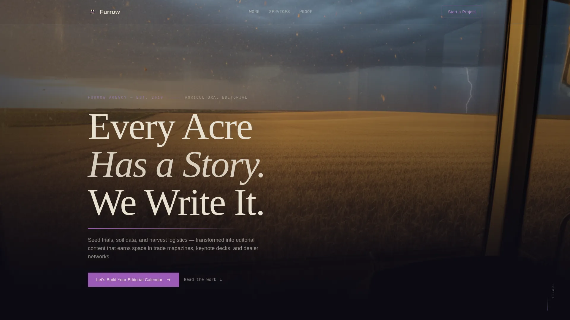
Full-Viewport Editorial Header
The header section spans the entire screen with an aerial photograph of combine tracks curving through a golden wheat field at magic hour, grain dust hanging in the air. A massive parchment-white serif headline reads "Every Acre Has a Story. We Write It." A thin violet rule beneath the subhead pulses once on load, signaling to the visitor that what follows is crafted, not assembled.
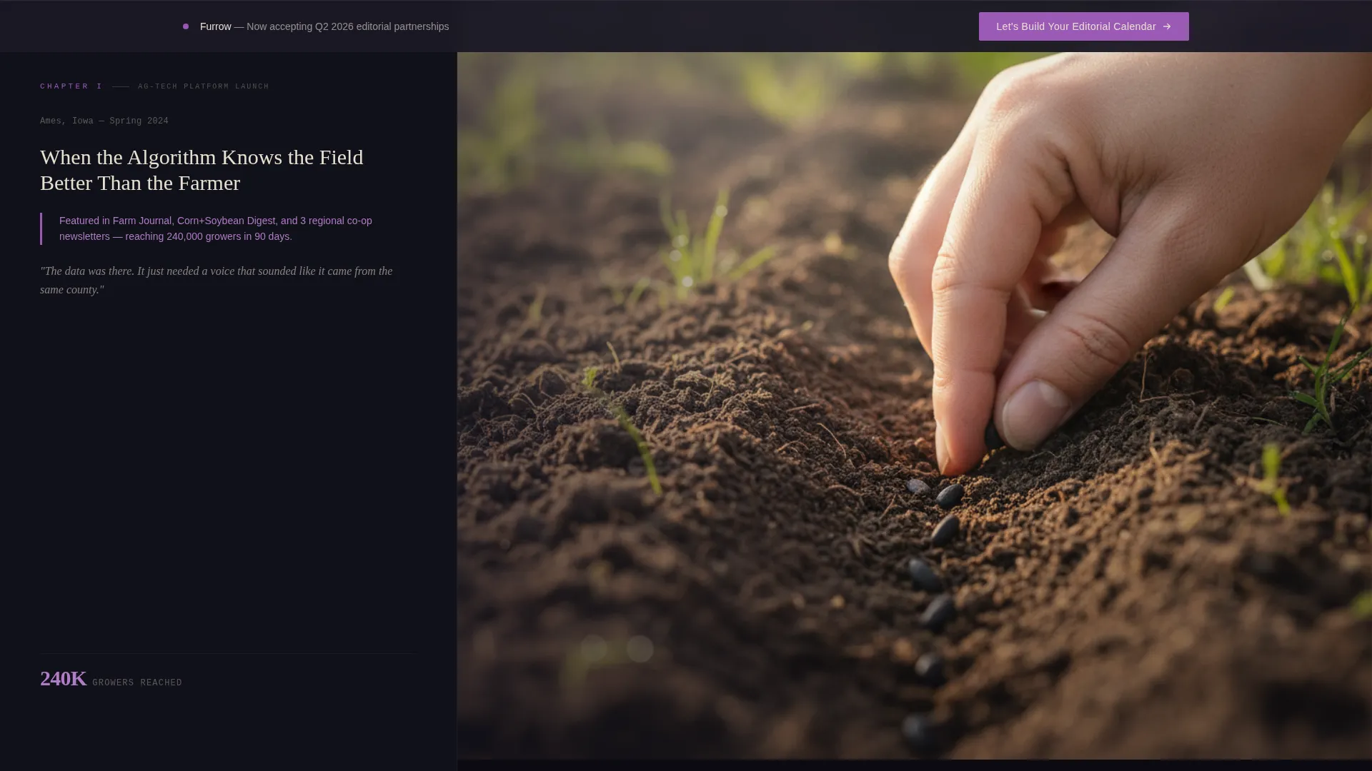
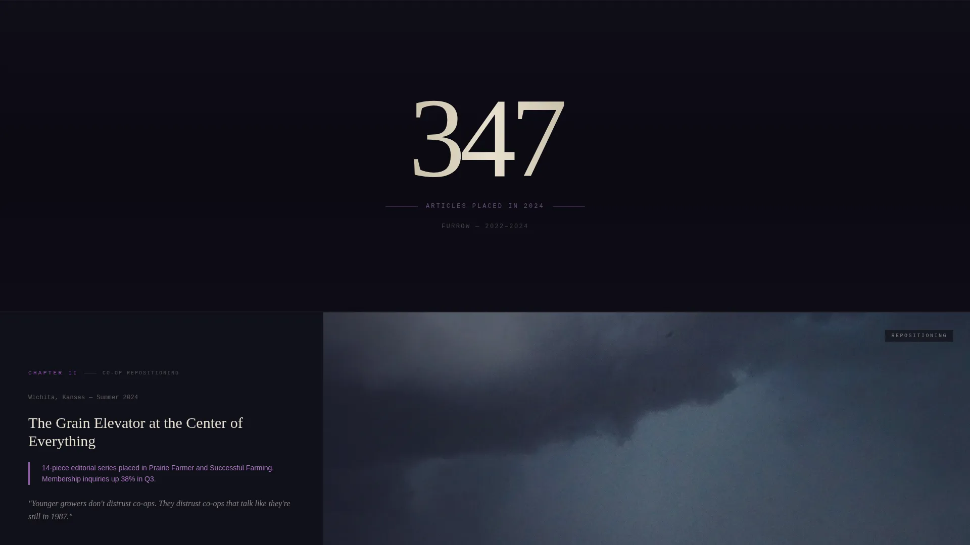
Chapter-Style Client Story Sections
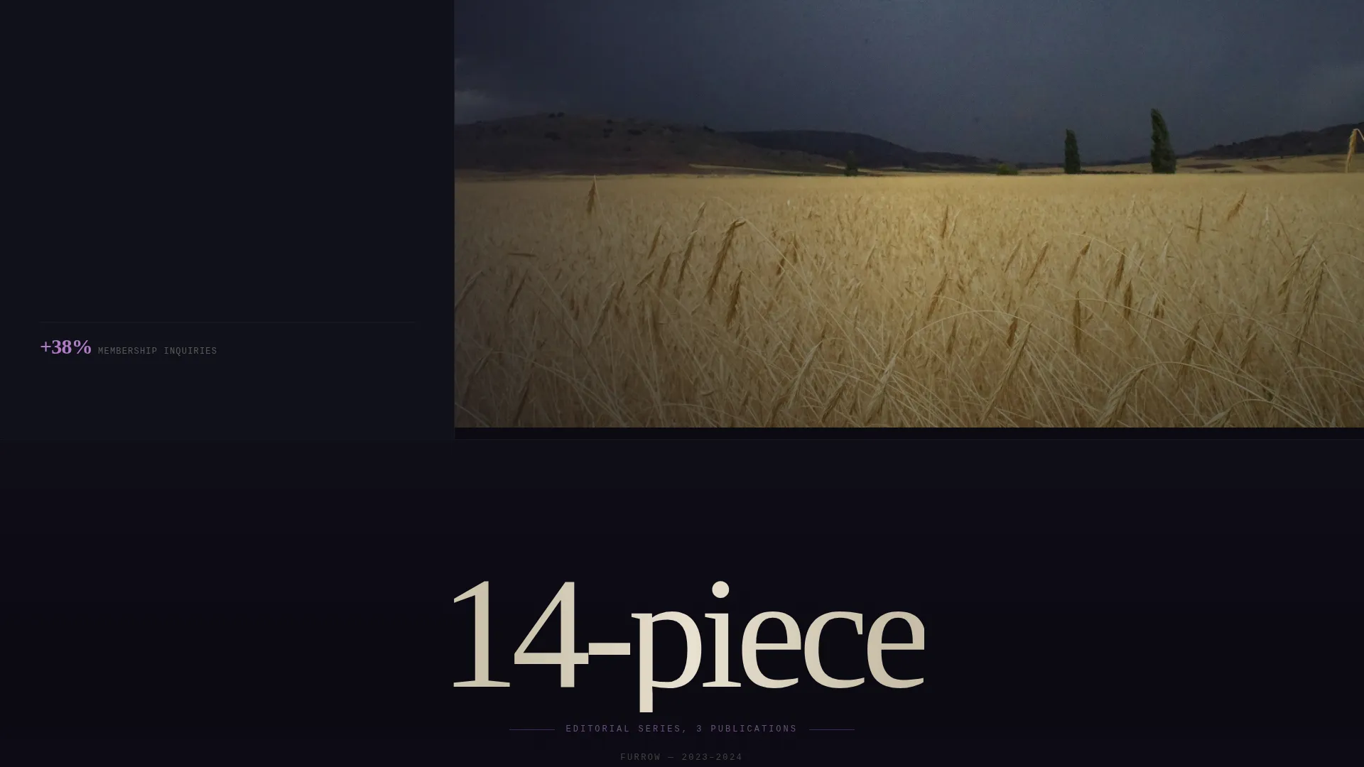
Each full-page story section divides into a left editorial column and a dominant photographic right panel. The left column holds a dateline, a client category tag, and a two-sentence result statement rendered in annotation purple. The right panel uses parallax scrolling, shifting from soil close-ups to aerial landscapes to weathered hands on equipment as the visitor moves through the page.
Interstitial Proof Panels
Between each client story, a full-page interstitial section presents a single oversized statistic against void black. An example from the brief is "347 articles placed in 2024." These panels interrupt the visual rhythm deliberately, creating a pause that makes proof feel dramatic rather than incidental.
Dual Conversion Pathways
The primary call to action, "Let's Build Your Editorial Calendar," appears first as a fixed bottom bar after the third client story, then again as a full-page closing spread. A secondary path offers a downloadable PDF titled "The Ag Content Playbook: 12 Frameworks We Use," gated behind email and company name for prospects who are not yet ready to engage directly.
Partnership Inquiry Form
The closing form collects the information that actually qualifies a lead. Fields include company name, a content challenge dropdown with options for brand launch, dealer enablement, thought leadership, and trade media, an annual content budget range selector, and a free-text field labeled "What story isn't being told?" This structure surfaces intent and budget context before a first conversation.
Ink & Paper Visual Identity System
The entire page uses the Void & Violet color system: deep editorial black for backgrounds, aged parchment for body text surfaces, dusty violet for structural accents, and sharp annotation purple for links, hover states, and pull-quote borders. Typography is set in heavy serif weights that feel carved rather than rendered, reinforcing the field journal aesthetic throughout.
Page sections overview
| Section | Purpose |
|---|---|
| Full-Viewport Header | Establishes editorial identity and presents the core brand statement over an aerial photograph |
| Client Story One | Presents the first case study with parallax photography, dateline, and result callout |
| Proof Statistic Panel | Interrupts scroll with a single oversized metric on void black to reinforce credibility |
| Client Story Two | Continues the chapter narrative with a second immersive client result section |
| Proof Statistic Panel | Delivers a second proof moment to maintain the image-story-proof rhythm |
| Client Story Three | Completes the story triptych before the primary call to action activates |
| Fixed Bottom Bar | Surfaces the primary call to action after the third story for visitors ready to engage |
| PDF Download Offer | Presents the gated playbook download for prospects still in evaluation mode |
| Closing Partnership Spread | Full-page final section with the partnership inquiry form and free-text prompt |
Design & branding system
Furrow's visual identity is built around the Ink & Paper theme, expressed through the Void & Violet color system. The palette draws from university press monograph aesthetics, serious and literary with an unexpected richness that sets it apart from standard agribusiness design conventions.
- Color palette includes deep editorial black (#0B0A12), aged parchment (#E8E0D0), dusty violet (#6B4C6E), and annotation purple (#9B59B6) for interactive and accent elements
- Typography uses heavy serif weights that feel carved and permanent, evoking a leather-bound field journal rather than a digital brochure
- Violet ink bleeds into margins and pull-quote borders like a late-season thistle in a harvested field, giving the design a specific, earned visual metaphor
Mobile & speed optimization
The template is structured for full-page immersive experiences, and its section-by-section layout adapts to smaller viewports without losing the editorial weight that defines the Furrow aesthetic.
- Full-viewport sections and parallax panels are designed to reflow gracefully at tablet and mobile breakpoints
- Typography scales are set so oversized headline and statistic treatments remain impactful at reduced screen widths
- The fixed bottom bar call to action is built to remain accessible and visible across device sizes without obscuring content
How this template helps you convert
Furrow earns the conversion rather than demanding it. The page is structured so that by the time a visitor reaches the form, they have already consumed better agricultural writing and photography than they will find anywhere else in their industry. The result is a genuinely warmed prospect rather than a cold form submission.
- The image-story-proof rhythm builds cumulative credibility across three client stories and two interstitial proof panels before any call to action appears, so visitors arrive at the form already persuaded
- The dual conversion pathway captures both high-intent prospects ready to discuss partnership and lower-intent prospects who want to evaluate your methodology first through the gated PDF download
- The free-text form field "What story isn't being told?" invites prospects to self-qualify and articulate their content gap, making every lead that arrives more specific and actionable than a standard contact form submission
Other information about this template
Furrow is a storybook-style, single-page template categorized under Portfolio & Agency, specifically within the agriculture marketing and agency subcategory. It is designed for the agriculture content marketing agency niche, where differentiation depends on demonstrating editorial craft rather than listing services.
- The template style is classified as Storybook and Full-Page, meaning every scroll step is a deliberate chapter rather than a navigational menu item
- The creative direction is Immersive Visual, with the header concept built as Type Over Image using a full-bleed aerial photograph as the canvas
- The landing page direction is Partnership and B2B, aligning every section toward qualifying and converting agribusiness leads rather than capturing consumer traffic
- The Void & Violet color system and Ink & Paper theme are distinctive enough to function as a competitive differentiator in an industry where most agency pages default to green fields and clean sans-serif type
Theme
Ink & Paper
Creative direction
Immersive Visual
Color system
Void & Violet
Style
Storybook/Full-Page
Direction
Partnership/B2B
Page Sections
Full-viewport Editorial Header
Parallax Client Story Sections
Interstitial Proof Statistic Panels
Dual B2B Conversion Pathways
High-intent Partnership Inquiry Form
Void & Violet Branding System
Related questions
Can I replace the client story photographs with my own images?
How does the fixed bottom bar call to action behave?
What is the gated PDF download section used for?
Who is the ideal agency to use this template?


