Agriculture Agency Horizontal Scroll Landing Page
Furrow is a horizontal scroll landing page template built for agriculture web design agencies. It uses a scroll-jacked case study narrative to walk visitors through real client transformations, from outdated dealership sites to high-performing digital storefronts. The Ink & Paper visual identity, built on void black, cardstock cream, and muted violet, makes every panel feel like a printed portfolio spread.
by Rocket studio
Quick summary
Furrow is a single-page horizontal scroll template for an agriculture-focused web design agency. It guides visitors through a series of client case study panels, building trust before presenting a lead capture form. The Ink & Paper aesthetic uses letterpress-inspired typography, a cream-dominant canvas, and a Void & Violet color system that feels deliberate and handcrafted.
Who this template is for
This template is built for web design agencies that serve the agriculture sector. It speaks directly to studio owners and creative directors who want a portfolio that earns attention before asking for a name and email.
- Agencies pitching seed suppliers, equipment dealers, co-ops, and agronomy consultants
- Studios replacing a generic portfolio page with a proof-driven, narrative landing page
- Design teams ready to show before-and-after client transformations to agriculture business owners
What problem this template solves
Agriculture business owners are skeptical buyers. A generic agency portfolio rarely convinces a dealership owner or co-op marketing director that you understand their world. Furrow solves the trust gap by leading with evidence, not credentials.
- Ag-business clients need to see their own situation reflected before they trust a pitch
- Standard vertical-scroll portfolios feel disconnected from the deliberate, print-like authority this niche responds to
- Generic lead forms placed too early collect bounces, not qualified inquiries
What you get with this template
Furrow delivers a fully structured horizontal scroll landing page with every panel mapped to a specific persuasion purpose. The layout moves from a bold typographic opener through three case study narratives and into a focused lead capture panel.
- A scroll-jacked horizontal layout with viewport locking and a rightward scroll-jacked experience
- Three sequential case study panel sets, each telling a client story in three frames: before screenshot, challenge statement, and results mockup
- A final vertical-snap lead generation panel with a three-field form and a secondary checklist download path
Feature list
Furrow is built around a tight set of purposeful features. Each one earns its place in the scroll sequence.
Scroll-Jacked Horizontal Navigation
The viewport locks on vertical scroll and translates movement into horizontal page travel. Visitors experience the landing page like turning spreads in a portfolio book, one deliberate panel at a time.
Typography-First Opening Panel
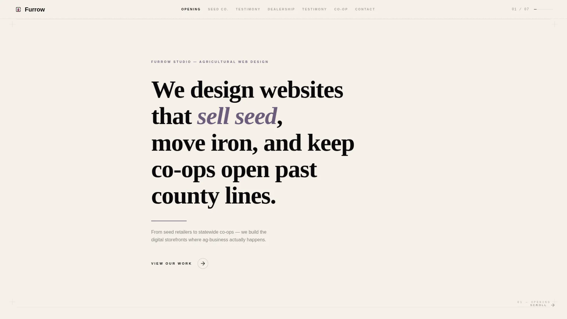
The first frame holds a single headline set in a sharp serif on cardstock cream. No images, no animations. Just the sentence, a thin violet rule, and a rightward arrow pulse that invites the next panel.
Three-Frame Case Study Panels
Each client story unfolds across three panels: a grainy before screenshot, a single-sentence challenge statement in violet over black, and a crisp browser mockup with real inked metrics below. Three stories progress from a seed retailer to a dealership to a statewide cooperative.
Interstitial Testimonial Panels
Full-black panels carrying single-line testimonials in cream type appear between each case study. They give the scroll a breathing rhythm and add social proof without interrupting the visual momentum.
Dual-Path Lead Capture Panel
The final panel snaps back to vertical scroll and presents a three-field form: website URL, business type dropdown, and email. A secondary path below offers a downloadable Ag Web Audit Checklist for visitors who are not yet ready to submit.
Void & Violet Color System
The palette pairs absolute void black with heavy cardstock cream, muted violet ink, and a registration-mark magenta reserved for hover states and active indicators. Every color has a defined role, keeping the design consistent across all panels.
Page sections overview
| Section | Purpose |
|---|---|
| Opening typography panel | Sets tone with a single bold headline on cream |
| Seed retailer case study | Shows before, challenge, and after for a small ag client |
| Interstitial testimonial | Adds voice and breathing room between evidence blocks |
| Dealership case study | Raises stakes with a multi-location equipment dealer story |
| Interstitial testimonial | Second social proof beat before the final case study |
| Co-op case study | Closes the narrative arc with a statewide cooperative result |
| Lead capture panel | Converts warm visitors with a form and checklist download |
Design & branding system
The visual identity follows an Ink & Paper theme. Every design decision references letterpress printing, heavy stock, deliberate ink, uncoated texture, translated into a digital layout.
- Void black frames each panel like a portfolio case; cream dominates the canvas like paper grain you can almost feel
- Muted violet ink washes over headlines and navigation markers, sitting between bruised plum and a fresh stamp pad
- Registration-mark magenta appears only on hover states and active indicators, keeping the palette disciplined and precise
Mobile & speed optimization
The horizontal scroll experience is designed as the primary desktop presentation. The layout structure supports adaptation for smaller viewports.
- The Ink & Paper visual system uses flat color fields and typographic weight rather than heavy image assets, keeping the visual load lean
- The final lead capture panel returns to a vertical scroll flow, ensuring form usability on any screen size
How this template helps you convert
Furrow earns the lead before asking for it. The scroll sequence is a deliberate persuasion path, not a collection of sections.
- The opening panel sets authority immediately with a sharp, specific headline that speaks the client's language, seed, iron, co-ops, before any portfolio claim is made.
- Three rising-stakes case study sets show real transformations with specific metrics, so a dealership owner or co-op marketing director sees their own situation in the before screenshots.
- The dual-path lead capture panel meets visitors at two commitment levels, offering either a direct consultation form or a free checklist download to capture those who need more time.
Other information about this template
Furrow is a strong fit for agencies positioning against generic digital studios with no agriculture sector experience. The template's structure and tone do the positioning work inside the scroll.
- The template is categorized under Portfolio & Agency with a niche focus on agriculture web design and agriculture marketing
- The Ink & Paper theme and Void & Violet color system are defined at the intersection of creative direction and visual identity, making customization straightforward for designers adapting it to a specific agency brand
- The case study narrative structure can support any number of client verticals common in the agriculture space: seed suppliers, equipment dealers, cooperatives, and agronomy consulting firms
- The secondary checklist download path inside the lead panel is built for email capture at a lower commitment level, widening the funnel without adding a separate page



Theme
Ink & Paper
Creative direction
Case Study Narrative
Color system
Void & Violet
Style
Horizontal Scroll
Direction
Lead Generation
Page Sections
Scroll-jacked Horizontal Layout
Typography-first Opening Frame
Three-frame Case Study Panels
Interstitial Testimonial Panels
Dual-path Lead Capture Panel
Void & Violet Color System
Related questions
What kind of agency is this template built for?
How does the horizontal scroll experience work?
Can I replace the case study content with my own client stories?
What does the lead capture panel include?
Is this a single landing page or a full multi-page website?



