Horse Trainer Landing Page Template
Gait is a single-page landing page template built for professional horse trainers. It features a comparison table layout covering three training programs, a booking form, expert-panel story blocks, and a split photo-and-text header. The design uses a deep plum, saddle leather, and brass color system that communicates serious, earned equestrian expertise from the first scroll.
by Rocket studio
Quick summary
Gait is a landing page template designed for horse trainers who want a professional, trust-building online presence. It centers on a three-program comparison table, transparent pricing rows, and a booking form that puts the horse's name first. The visual identity is rich, warm, and unmistakably equestrian without veering into novelty.
Who this template is for
This template is built for working horse trainers who take on clients at multiple skill levels. It suits professionals who need a credible, organized page that sells their programs without requiring a long sales call first.
- Experienced trainers offering foundation, tune-up, or competition preparation programs
- Professionals serving amateur owners, young riders between trainers, and competitive eventers
- Horse training businesses ready to move from word-of-mouth to a structured online booking flow
What problem this template solves
Most horse trainer websites undersell the trainer's depth of experience. They rely on vague service descriptions, no pricing transparency, and a generic contact form that gives prospective clients no reason to feel confident before reaching out.
- Potential clients cannot compare program options side by side, so they move on
- No visible pricing or session details creates hesitation and unnecessary phone tag
- The trainer's story, philosophy, and real client results are buried or absent entirely
What you get with this template
You get a focused, single-page layout that walks a prospective client from curiosity to booking in one confident scroll. Every section has a defined job, and nothing is decorative without purpose.
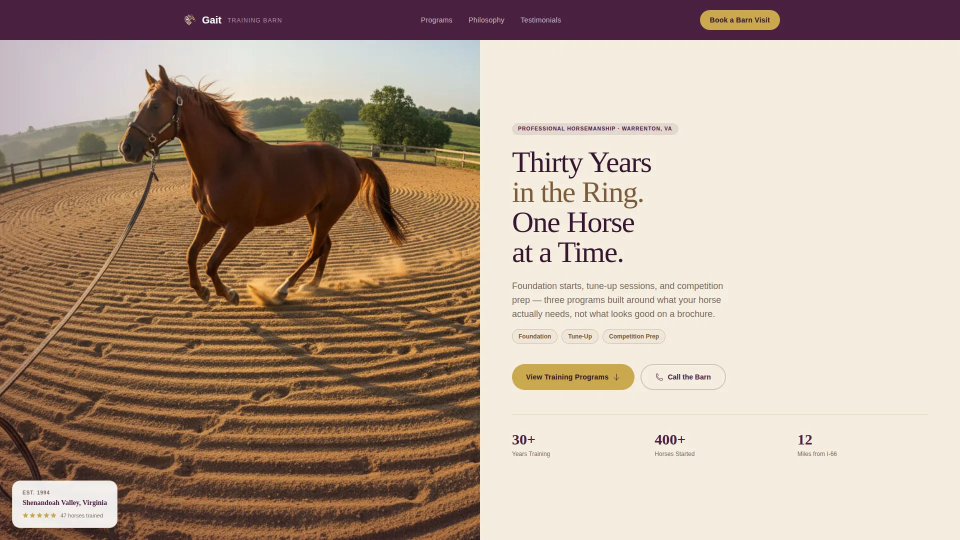
- A half-page split header with a candid action photo and a direct headline
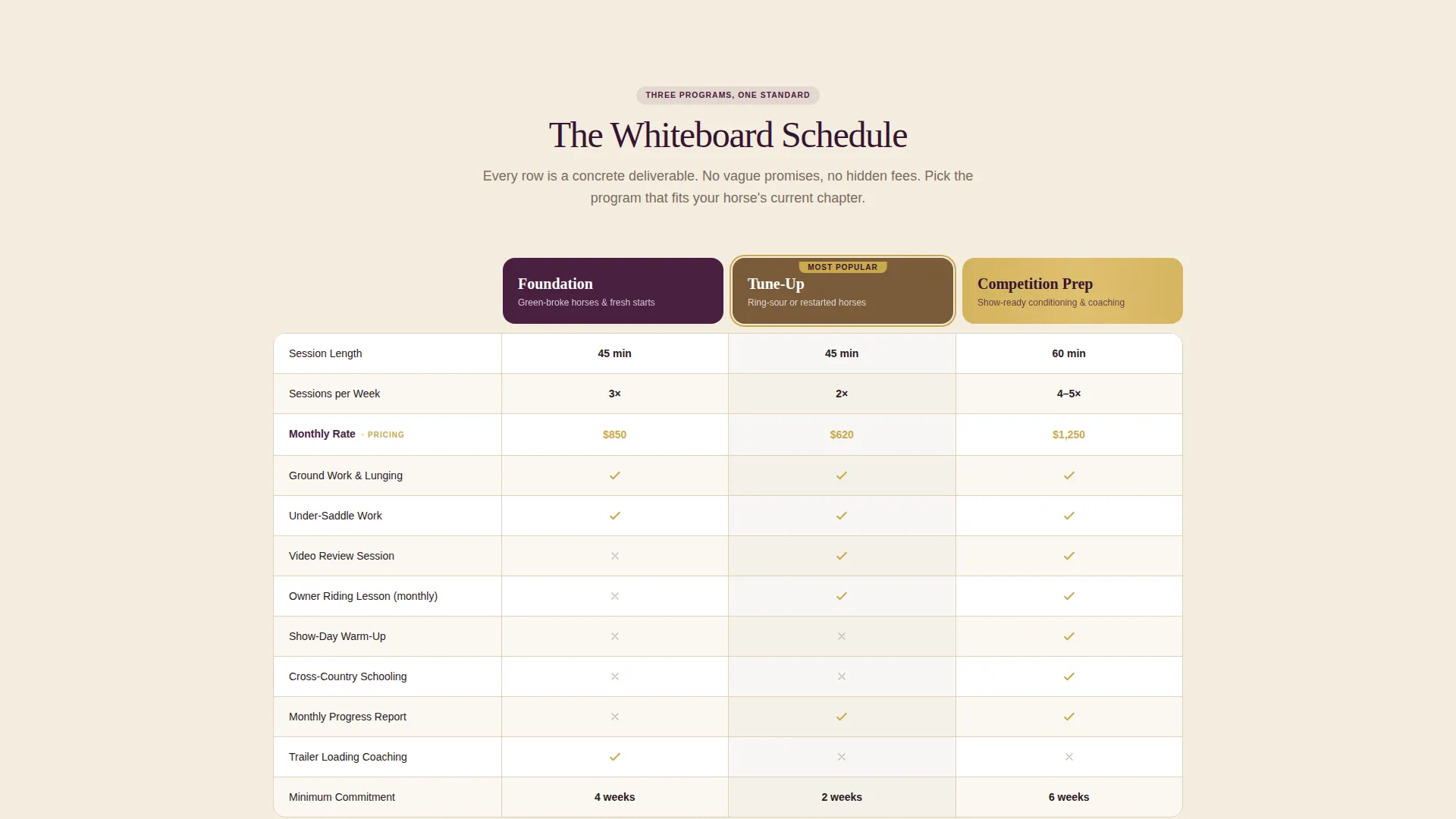
- A three-column comparison table showing session length, frequency, included services, and monthly pricing
- Expert-panel story blocks with trainer philosophy, a before-and-after client story, and a testimonial quote per program
- A booking form that leads with the horse's name and breed, followed by discipline, current challenge, and preferred day
- A secondary "Call the Barn" tap-to-dial option for clients who prefer a direct conversation
Feature list
This section describes the core functional and design features built into the Gait landing page template.
Three-Program Comparison Table
The comparison table places Foundation, Tune-Up, and Competition Prep side by side in clearly labeled columns. Each row specifies a concrete deliverable: session length, weekly frequency, included extras like video review or show-day warm-up, and monthly pricing. Nothing is left vague.
Expert Panel Story Blocks
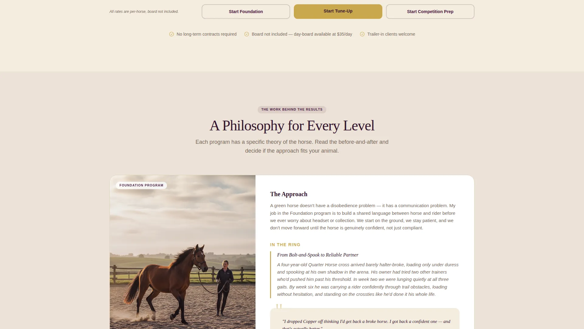
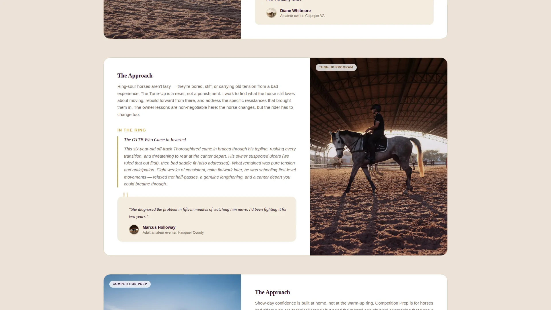
Below the comparison table, each program expands into its own panel. The panel holds the trainer's philosophy for that level, a specific before-and-after client story, and a direct quote from a real client. This structure builds trust through specificity rather than generality.
Booking Form with Horse-First Fields
The booking form opens with the horse's name and breed before asking anything about the owner. It then collects discipline, a free-text current challenge field, and a preferred day of the week. This sequence feels natural to horse owners and lowers the barrier to submitting.
Half-Page Split Header
The header divides the viewport into two equal halves. The left side holds a candid, mid-action photo at hip level: a trainer's hand on a lunge line, a bay horse moving through a balanced trot in morning arena light. The right side delivers a direct headline, a single-line subhead naming the three programs, and a brass call-to-action button.
Sticky Mobile Booking Button
On mobile viewports, a sticky "Book a Barn Visit" button remains visible throughout the scroll. This keeps the primary conversion action accessible without requiring the visitor to scroll back to the top.
Transparent Pricing Architecture
Pricing is displayed directly inside the comparison table rows, highlighted with the brass accent color. There are no hidden fees and no redirects to a separate pricing page. Every number a prospective client needs is visible in one place.
Page sections overview
| Section | Purpose |
|---|---|
| Split Header Block | Introduces trainer identity and core programs with a candid photo and direct headline |
| Comparison Table | Displays all three programs side by side with concrete rows for deliverables and pricing |
| Foundation Program Panel | Shares trainer philosophy, a before-and-after story, and a client quote for entry-level work |
| Tune-Up Program Panel | Covers the trainer's approach, a specific client result, and a testimonial for mid-level horses |
| Competition Prep Panel | Details the trainer's competition-day philosophy, a result story, and an eventer client quote |
| Booking Form Section | Collects horse and owner details to open the scheduling conversation |
| Call the Barn Option | Provides a tap-to-dial secondary path for owners who prefer to speak directly |
Design & branding system
The Gait template uses a Plum Executive color system that communicates credibility and equestrian heritage without relying on clichéd imagery. Every color in the palette has a specific role, and nothing competes for attention where it should not.
- Deep plum (#4A2040) anchors the navigation bar and all primary headers, grounding the page with authority
- Warm saddle leather (#7B5B3A) warms testimonial blocks and story panels, adding a tactile, earned quality
- Arena dust cream (#F5EDE0) carries the page background, keeping body sections open and readable
- Focused brass (#C9A84C) is reserved exclusively for call-to-action buttons and pricing highlights, drawing the eye only at decision points
Mobile & speed optimization
The Gait template is structured with mobile horse owners in mind. Many clients browse from a phone in the barn aisle or while sitting in a trailer cab, so the layout prioritizes readable text and accessible actions on small screens.
- The comparison table adapts for narrow viewports so program rows remain scannable without horizontal scrolling
- The sticky "Book a Barn Visit" button stays fixed at the bottom of the mobile screen throughout the full page scroll
- The tap-to-dial "Call the Barn" link gives mobile visitors an immediate, one-tap path to a direct conversation
How this template helps you convert
The Gait landing page template is engineered around one goal: turning a curious horse owner into a booked barn visit. Every structural decision supports that outcome.
- The comparison table does the selling before the form appears, so the visitor arrives at the booking section already informed and ready to commit rather than uncertain and browsing
- The expert-panel story blocks replace vague service claims with specific, verifiable client results, which builds the kind of trust that moves someone from "maybe" to "let's schedule it"
- The brass accent color appears only on pricing highlights and call-to-action buttons, so the visitor's eye is naturally guided to the two moments that matter most: understanding cost and taking action
Other information about this template
The Gait template fits naturally into the broader horse trainer business website category, where the need for transparent program information and a professional booking path is especially high. It is a practical starting point for any trainer building or refreshing their online presence.
- The template style is a Comparison Table layout under a Service Utility theme, making it well suited to Professional Services niches where clients evaluate options before committing
- The header concept is a Half-Page Photo and Text split, which works best with a single strong candid action photograph rather than a gallery or slider
- The creative direction follows an Expert Panel approach, meaning the page earns trust through trainer voice and real client stories rather than feature bullet lists alone
- The landing page direction is Booking and Scheduling, so every section funnels toward the booking form rather than toward general brand awareness
Theme
Service Utility
Creative direction
Expert Panel
Color system
Plum Executive
Style
Comparison Table
Direction
Booking/Scheduling
Page Sections
Three-program Comparison Table
Expert Panel Story Blocks
Horse-first Booking Form
Half-page Split Header
Sticky Mobile Booking Button
Brass-accented Pricing Highlights
Related questions
Can I edit the three training programs to match my own offerings?
Does the booking form support a free-text field for describing a horse's challenge?
What kind of photo works best in the split header?
Is this template suitable for a trainer who works across multiple disciplines?
Can a visitor call the trainer instead of filling out the booking form?



