Medical Equipment & Supply Booking Website Template
Gait is a prosthetics and orthotics clinic landing page built around FAQ-driven comparison tables. It guides recent amputees, parents of children with structural conditions, and veterans through device types, coverage likelihood, and fitting timelines before asking for anything. The page earns every appointment click by answering every question the visitor arrived with.
by Rocket studio
Quick summary
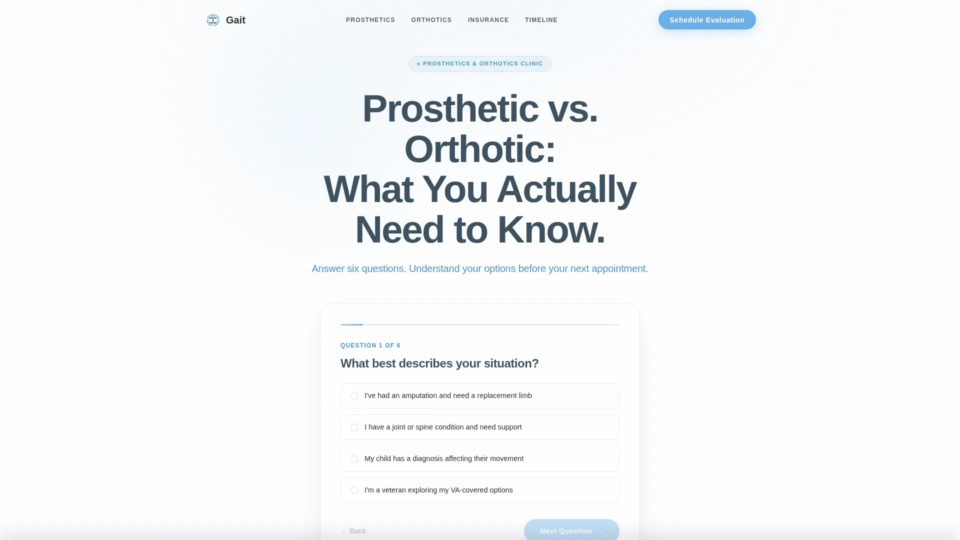
Gait is a single-page clinic landing page designed around one idea: answer every patient question before requesting an action. Interactive comparison tables walk visitors through prosthetic versus orthotic differences, insurance coverage scenarios, and fitting timelines. A six-question quiz surfaces a personalized result card. The page closes with a clear "Schedule Your Evaluation" call to action once trust is fully established.
Who this template is for
This template is built for prosthetics and orthotics clinics that want to convert anxious, research-heavy visitors into booked appointments. It works best when the clinic's strength is patient education and transparent clinical communication.
- Recent amputees navigating their first prosthetic prescription and needing clear device comparisons before any appointment
- Parents researching pediatric orthotics for a child newly diagnosed with scoliosis or a structural condition
- Veterans returning to care and looking for a clinic that answers questions directly and without jargon
What problem this template solves
Prospective patients arrive at clinic websites carrying specific, urgent questions. Most clinic pages bury those answers in walls of text or skip them entirely, leaving visitors to keep searching at midnight. This template solves that gap head-on.
- Visitors leave other sites confused about whether they need a prosthetic or an orthotic device, what insurance will realistically cover, and how long the fitting process takes
- Parents and veterans especially carry anxiety that generic clinic pages never address, making them hesitate to book
- Without clear, structured answers, a clinic loses the appointment to whichever competitor educates the patient first
What you get with this template
You get a fully structured, single-page layout built entirely around patient education and appointment conversion. Every section earns the next scroll through useful, specific content.
- A hero section with a centered headline, a six-question interactive quiz, and a floating result card that directs the visitor toward the right device category
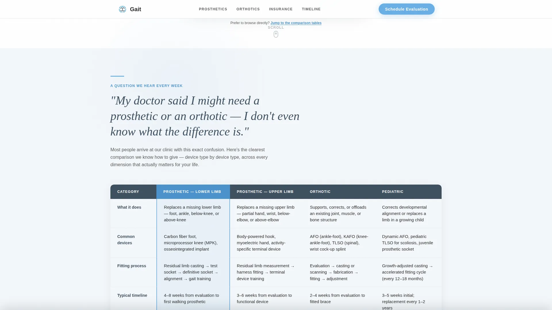
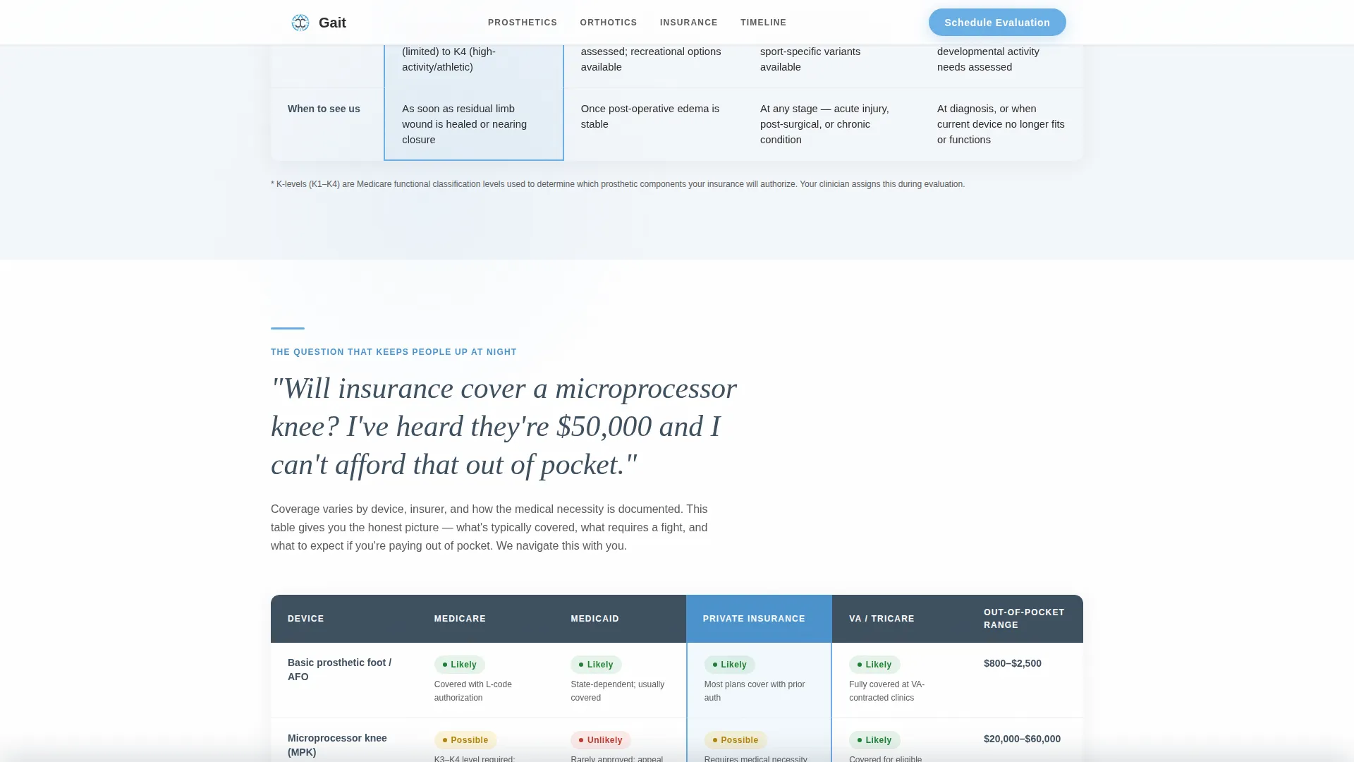
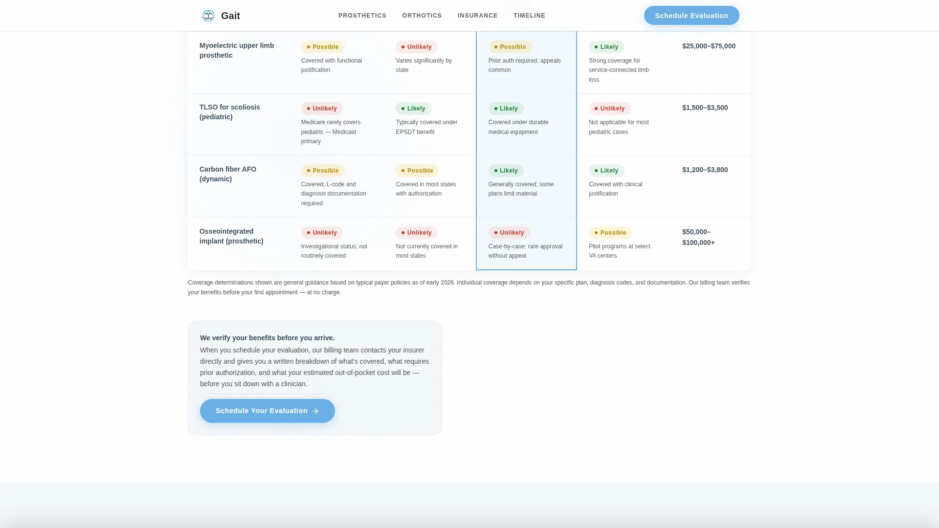
- Three FAQ-anchored comparison tables covering device differences, insurance and coverage likelihood, and pediatric fitting timelines, each with columns for function, lifestyle fit, timeline, and coverage
- A patient stories section featuring three testimonial perspectives from a recent amputee, a parent of a child with scoliosis, and a veteran, each with specific outcomes
- A "Schedule Your Evaluation" primary call to action placed below the quiz result card and repeated in a fixed slim bottom bar that activates after the second comparison table
- A single-row linear footer rounding out the page
Feature list
This section covers the functional building blocks that make the Gait template work as a patient education and conversion tool.
Interactive Six-Question Quiz
Visitors answer six short questions and receive a floating result card that points them toward the right device category. The quiz creates an immediate, personalized reason to keep reading and to book an evaluation.
FAQ-Anchored Comparison Tables
Three full comparison tables are each introduced by a real patient question. Columns cover device function, lifestyle fit, average timeline, and coverage likelihood. The tables do the clinical explaining so the visitor arrives at the call to action already informed.
Fixed Bottom Call to Action Bar
After the second comparison table, a slim bar locks to the bottom of the viewport and stays visible during continued scrolling. It keeps the "Schedule Your Evaluation" action reachable without interrupting reading.
Staggered GSAP Scroll Animations
Table rows and section blocks animate into view using ScrollTrigger reveals and staggered entrances. The motion feels measured and clinical rather than flashy, reinforcing the educational guide tone throughout the page.
Three-Perspective Testimonial Section
Patient stories are presented from three distinct voices: a recent amputee, a parent navigating pediatric orthotics, and a veteran. Each story references a specific outcome and a named clinician, adding concrete credibility.
Click-Through Appointment Flow
There is no form on this page. The primary call to action sends visitors to a dedicated scheduling page where visit type, insurance carrier, and preferred location are collected. This keeps the landing page focused purely on education and trust-building.
Page sections overview
| Section | Purpose |
|---|---|
| Hero Quiz | Headline, six-question quiz, floating result card, first call to action |
| Prosthetic versus. Orthotic | FAQ-anchored comparison table: device differences by function and lifestyle |
| Insurance Coverage Table | FAQ-anchored coverage comparison table, first inline call to action |
| Timeline Fitting Table | FAQ-anchored pediatric and adult fitting timeline comparison, fixed bottom bar activates |
| Patient Stories | Three testimonials from amputee, parent, and veteran perspectives with final call to action |
| Linear Footer | Single-row footer closing the page |
Design & branding system
The visual identity follows an Educational Guide theme built on the Slate and Sky color system. Every design choice reinforces clinical warmth and deliberate calm, like a well-lit examination room with a window open.
- Color palette: clinical slate (#3D4F5F) for primary type and structure, open-sky blue (#6AAFE6) for interactive highlights and selected table states, cloud white (#F4F7FA) for section backgrounds, and soft charcoal (#2B2B2B) for body text
- Typography pairing: DM Sans in bold weights for headings and interface labels, Crimson Text for patient quotes and testimonials where warmth is the priority
- Texture and motion details include a grain overlay, a mouse glow effect, and magnetic call to action behavior that adds tactile depth without distracting from the educational content
Mobile & speed optimization
The template is designed desktop-first, with complex comparison tables built to use full horizontal space. Mobile responsiveness is addressed thoughtfully so that no content is lost on smaller screens.
- Comparison tables shift to a horizontal scroll pattern on mobile, preserving full column data without collapsing critical information
- Static page sections are built as server components, while the quiz mechanic and GSAP animations are isolated as client components to keep the interactive elements snappy and the rest of the page lightweight
How this template helps you convert
Every design and content decision in this template is oriented toward one outcome: a visitor who clicks "Schedule Your Evaluation" because every concern they arrived with has been addressed clearly.
- The quiz result card gives the visitor a personalized device recommendation before they read a single comparison table, creating immediate relevance and reducing drop-off in the first scroll
- Each comparison table resolves a specific anxiety, so by the third table the visitor has answered their own questions about device type, insurance, and timeline without needing to speak to anyone yet
- The fixed bottom call to action bar keeps the appointment action visible and accessible at the exact moment the visitor feels most informed and most ready to act
Other information about this template
This template is built specifically for the United States healthcare context, with language and coverage framing suited to the American prosthetics and orthotics market, including references to the Veterans Affairs system and standard insurance carrier scenarios. All copy uses USD and USA-standard clinical terminology.
- The page is localized for English-speaking patients and caregivers in the United States, covering VA system navigation, private insurance, and pediatric orthotic scenarios common in domestic clinical practice
- Typography and layout decisions prioritize reading clarity for patients who may be managing significant stress, using generous whitespace and an exam-room aesthetic to reduce visual overwhelm
- The template style is a Comparison Table layout guided by a Click-Through landing page direction, meaning the page focuses on educating visitors and routing them to a separate scheduling page rather than capturing data directly
Theme
Educational Guide
Creative direction
FAQ-Driven
Color system
Slate & Sky
Style
Comparison Table
Direction
Click-Through
Page Sections
Interactive Six-question Quiz
Faq-anchored Comparison Tables
Fixed Bottom Call to Action Bar
GSAP Scroll Reveal Animations
Three-perspective Testimonials
Click-through Appointment Flow
Related questions
What types of patients is this landing page template designed to serve?
Does the page collect patient information directly?
How does the six-question quiz work?
Can this template work for a clinic focused on only one specialty?
What makes this template different from a standard clinic website page?



