Retro Art Subscription Landing Page Template
Curate is a neo-retro flash deal wall art subscription landing page template built for print subscription brands. It uses scroll-reveal progressive sections, countdown-driven upgrade tiers, and a curated masonry discovery engine to move base subscribers toward Premium and Collector upgrades. The design draws from vintage print culture, wrapping urgency mechanics in a warm, tactile retro style.
by Rocket studio
Quick summary
Curate is a single-page, scroll-reveal landing page template designed for wall art and prints subscription boxes. It blends retro style aesthetics with flash deal urgency mechanics to convert existing base subscribers into higher-value tiers. Every section progressively reveals print artwork, countdown timers, and illustrated upgrade selectors, creating a purchasing experience that feels like discovery rather than a sales pitch.
Who this template is for
This template is built for direct-to-consumer subscription brands selling curated wall art, gallery prints, and physical art objects. It suits brands whose subscribers already hold a base plan and need a compelling reason to upgrade. It also works for new subscriber acquisition when the visual story is strong enough to stand on its own.
- Art subscription box operators selling tiered plans to design-obsessed urban renters
- Creative directors and gift-givers who want a tactile, premium physical art experience
- Retail and e-commerce pages focused on wall art, canvas prints, and collectible print editions
What problem this template solves
Most subscription upgrade pages feel transactional. They list features in a table and hope the price difference makes sense. Curate solves that by making the upgrade feel inevitable. It uses progressive scroll reveals to show subscribers exactly what they are missing, print by print, before a countdown timer forces the decision.
- Subscribers see their current base box contents fanned out visually, then watch Premium and Collector tiers slide in beside it
- Flash deal countdowns compress decision time naturally, without aggressive popups or disruptive overlays
- The one-step upgrade selector removes friction by using saved payment and a tap-to-choose tier interface
What you get with this template
Curate delivers a fully structured, single-page retro landing page with five major scroll-reveal sections and a sticky upgrade call-to-action. The design system is ready to use and every section serves a specific conversion role.
- A hero section with an interactive search-as-discovery engine and tilting masonry print grid
- Three progressive flash deal sections, each with a live countdown timer and illustrated tier comparison
- A one-step upgrade selector with three illustrated box tiers and a pulsing sticky call-to-action button
Feature list
The template ships with interconnected interactive and visual systems that work together across the page.
Interactive Search-as-Discovery Hero
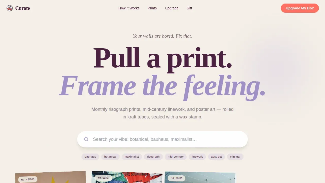
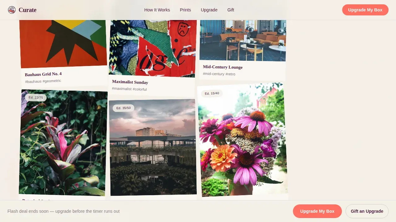
The hero opens with an oversized, rounded search input on a parchment cream canvas. As users type style keywords, print thumbnails cascade below in a masonry grid. Each card tilts slightly, mimicking pinned postcards. This is a curated reveal engine, not a live database query. It creates a sense of exploring a curated collection, building engagement before any upgrade offer appears. The combination of motion and imagery primes visitors emotionally, making the wall art feel personally relevant from the first scroll.
Progressive Flash Deal Reveal Sections
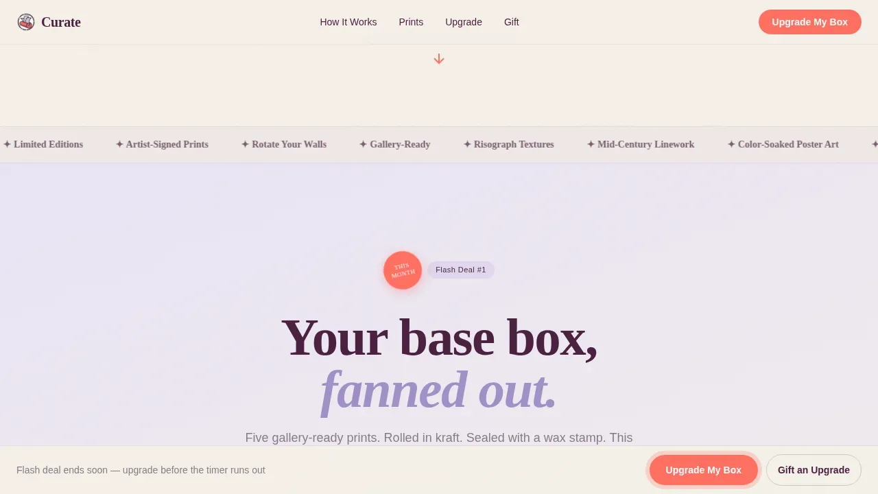
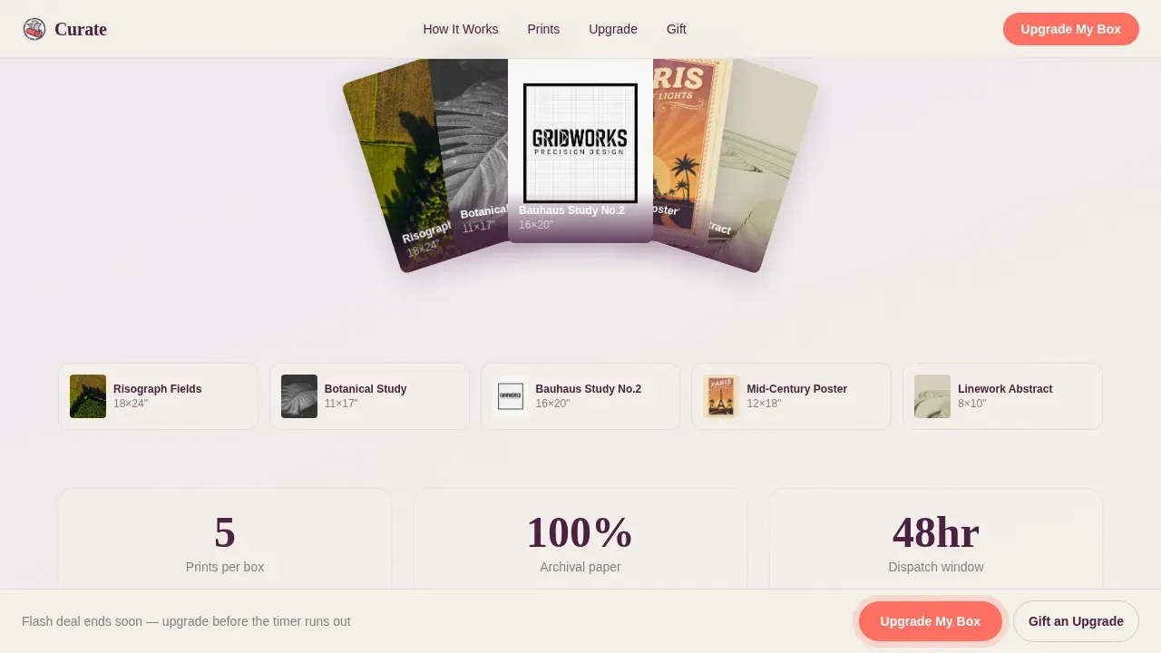
Three scroll-triggered sections progressively reveal upgrade tiers. The first shows the current base box contents fanned out like a poker hand, a clear reflection of what the subscriber already receives. The second slides in the Premium tier beside it, with two additional large-format prints, a custom frame kit, and a struck-through price replaced by a flash number. The third introduces the Collector tier, complete with an artist-signed edition, a printed provenance card, and a linked artist interview. Each reveal hits harder than the last.
Live Countdown Timers per Tier
Each flash deal section carries its own hot coral countdown timer. The Premium timer runs longer. The Collector timer is shorter, compressing urgency as perceived value climbs. When a countdown crosses the two-minute mark, the sticky call-to-action button at the bottom of the viewport begins to pulse. This urgency mechanic is grounded in a proven principle: countdown timers and limited-edition tags boost conversion by creating a tangible sense of FOMO across retro landing pages.
One-Step Upgrade Selector
The upgrade section displays three illustrated box tiers side by side. Subscribers tap to choose their tier and confirm with saved payment. No new form fields, no multi-step checkout. The selector is designed to eliminate friction at the decision point. Social proof signals, including subscriber counts and edition numbers, are placed directly beside each tier card, keeping trust signals close to the conversion action.
Sticky Pulsing Call-to-Action
The primary call-to-action button reads "Upgrade My Box" and lives pinned to the bottom of the viewport throughout the scroll. It pulses gently when any countdown crosses the two-minute threshold. A secondary path labeled "Gift an Upgrade" sits beside it for subscribers purchasing a tier bump for someone else. The hot coral color creates strong contrast against the parchment cream background, making the button impossible to miss without feeling aggressive.
Neo-Retro Design System
The full design system is pre-built and consistent across every section. Typography uses Fraunces for display headlines and DM Sans for body text. The color combination spans parchment cream as the base canvas, deep grape for headlines and navigation, soft lavender washes behind each progressive section, and hot coral reserved exclusively for calls-to-action and countdown timers. The palette feels warm, slightly psychedelic, and entirely intentional, inspired by vintage print culture and mid-century poster art.
Page sections overview
| Section | Purpose |
|---|---|
| Hero Search Section | Interactive search reveal engine with masonry print cascade and brand headline |
| Flash Deal One | Base box fan reveal showing current subscriber contents |
| Flash Deal Two | Premium tier slide-in with large-format prints, frame kit, and first countdown |
| Flash Deal Three | Collector tier with signed edition, provenance card, and shorter countdown |
| Upgrade Tier Selector | One-step illustrated tier picker with sticky pulsing call-to-action |
| Horizontal Flow Footer | Page close with branding elements and secondary navigation |
Design & branding system
The Lavender Dream color system drives the entire visual identity of this retro landing page. Color is often synonymous with branding, and every hue here carries a deliberate purpose. The combination of warm and cool tones creates contrast that guides the eye without shouting.
- Parchment cream (#F5F0E8) forms the base canvas; deep grape (#4A2040) anchors all headline type and navigation; soft lavender (#C3B1E1) washes float behind each progressive section like tinted acetate overlays
- Hot coral (#FF6F61) is reserved exclusively for calls-to-action and countdown timers, using high contrast to stand out from every background it sits against
- Fraunces display serif headlines carry vintage authority while DM Sans body text keeps reading light and comfortable across all section types
Mobile & speed optimization
This retro landing page is built desktop-first with strong mobile support, recognizing that subscribers frequently check email and act on upgrade offers from their phones. Mobile optimization is crucial for retro landing pages since many visitors browse on phones, and the interactive sections are designed to display correctly across screen sizes.
- The masonry cascade, tier selector, and countdown timers all adapt to mobile viewports without losing their tactile, tilted-card visual style
- GSAP ScrollTrigger handles all progressive reveal animations; static server components carry non-interactive content, while client-side islands handle countdowns and the search cascade, supporting the website's performance under real traffic conditions
- The sticky call-to-action remains pinned to the bottom of the mobile viewport throughout the scroll, keeping the upgrade path visible regardless of how far a user has scrolled
How this template helps you convert
Creating a high-converting landing page for a neo-retro flash deal wall art subscription requires blending nostalgia-driven aesthetics with urgent, modern e-commerce conversion tactics. Curate is built around that principle. Every design decision, from the search hero to the pulsing call-to-action, serves a measurable conversion role.
- The search-as-discovery hero turns passive browsing into active engagement. Visitors feel like they are exploring a curated collection, which increases time on page and primes them for the upgrade reveal. The conversion rate, defined as the percentage of visitors who sign up or upgrade, benefits directly from this engagement lift.
- Progressive flash deal sections and countdown timers create layered urgency. Each tier reveal makes the next offer feel more valuable. The shorter countdown on the Collector tier compresses decision time at the highest price point, a tactic that works consistently across subscription upgrade pages.
- The one-step upgrade selector with saved payment removes every friction point at the moment of commitment. Social proof signals placed near each tier, including edition numbers, artist names, and subscriber upgrade counts, reinforce trust exactly where visitors need it most.
Other information about this template
Curate is a strong fit for subscription brands exploring different types of wall art formats, from canvas prints and large-format poster art to artist-signed editions and framed pieces. The template draws on a wide range of design inspiration, from risograph texture work to mid-century linework and colour-soaked poster paintings. Brands building retro landing pages in the wall art and prints niche will find the section structure maps naturally to how design-obsessed audiences analyse value and make decisions about decorating their spaces.
The template supports pages where photographs, digital art thumbnails, and illustrated graphics all display within the same masonry canvas without visual conflict. Using bold, saturated colors like electric blues, warm greens, teal accents, and pink highlights alongside the primary palette helps brands experiment with seasonal variations. Spring collections, for example, can lean into lighter lavender and green tones to complement the warm parchment base, while darker winter editions can push toward dark grape and deep wood-toned frames.
Color combinations inspired by everyday items create feelings of familiarity and harmonize with our surroundings. The Lavender Dream palette does exactly that: parchment echoes aged paper, grape recalls deep velvet, and coral brings the heat of a well-loved vintage poster. Brands use color combinations to communicate their identity, and this system gives art subscription services a sleek, refined visual language that stands apart from generic e-commerce pages.
Tools like Canva, Shopify, and Figma are commonly used alongside landing page templates during the design review and brand-approval phase. The template's design system is structured so that brand-kit colors and typography can be swapped consistently across all sections. A brand kit helps keep your color scheme consistent, which matters when subscribers review upgrade communications across multiple traffic sources, from email campaigns to social ads.
The Curate template references print culture at every level. Kraft tube packaging, wax stamp seals, and artist provenance cards are all reflected in the section narrative. These materials and tactile details wrap the subscription offer in a story that canvas and wall art e-commerce pages rarely tell this well. For brands whose passion is connecting people with original artwork, this template gives that story a home that feels worthy of the prints inside.
- Gallery walls are a fun way to display multiple pieces of art in a cohesive manner, and this template's tier reveal sections can showcase exactly that kind of curated wall vision
- Canvas art is often ready to hang with minimal tools, a selling point worth including in your own copy when adapting the Flash Deal sections
- Digital art and printable downloads on platforms like Etsy demonstrate the range of ideas subscribers bring to wall decorating decisions; this template's search hero can surface those style ideas before a single upgrade pitch is made
Theme
Neo-Retro
Creative direction
Flash Deal
Color system
Lavender Dream
Style
Scroll Reveal (Progressive)
Direction
Upsell/Upgrade
Page Sections
Search-as-discovery Hero Engine
Progressive Flash Deal Reveal Sections
Live Countdown Timers with Urgency Pulse
One-step Upgrade Tier Selector
Sticky Pulsing Call-to-action
Neo-retro Lavender Dream Design System
Related questions
Who is this template designed for?
Can I adapt this template for new subscriber acquisition?
How do the countdown timers work in this template?
What animation technology powers the scroll reveals?
Can I change the colors and typography to match my brand?



