Artisan Glassblower Portfolio Landing Page Template
Gather is an asymmetric 60/40 grid landing page built for artisan glassblowers who want their work to speak before a word is read. It pairs large-format portfolio photography with first-person journal entries, anchored by an animated ink-sketch header and a warm Ink & Paper visual identity that feels like a handmade sketchbook left open on a studio workbench.
by Rocket studio
Quick summary
Gather is a single-page glassblower portfolio and blog landing page. It uses an asymmetric 60/40 grid to place photography and writing side by side, guided by a handcrafted Ink & Paper aesthetic. The page draws fellow flameworkers, interior designers, and collectors into the studio through scroll-driven storytelling, ending with two clear calls to action.
Who this template is for
This template is built for working glassblowers who want an online presence that reflects the craft itself rather than a generic portfolio grid. It suits anyone whose audience needs to feel the process before they inquire or buy.
- Artisan glassblowers and flameworkers sharing technique, studio updates, and finished work
- Interior designers and collectors looking to understand and source one-of-a-kind blown or sculpted glass vessels
- Studio artists who want a content-led page that earns trust through real craft knowledge before asking for an email or a click
What problem this template solves
Most portfolio templates treat craft work like a product catalog. They display images but never explain the process, and visitors leave without understanding the difference between a solid sculpt and a blown form. Gather fixes that disconnect.
- No clear way to show both finished pieces and the in-process story behind them at the same time
- Generic layouts that fail to communicate the tactile, handmade quality of artisan glasswork
- Calls to action that feel transactional before the visitor has built any connection with the maker
What you get with this template
The template delivers a fully designed, section-led single-page layout ready to fill with your own images, writing, and links. Every visual and structural decision has already been made for you.
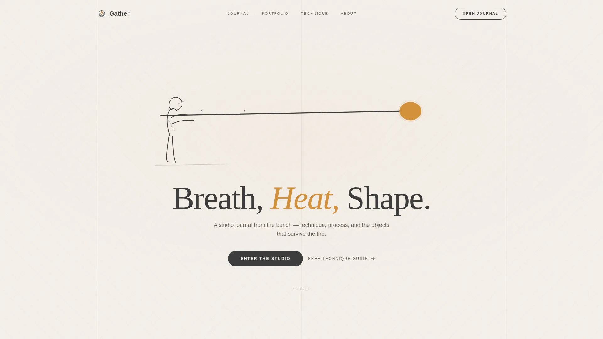
- An animated ink-sketch header that draws itself stroke by stroke, with your headline appearing last in a letterpressed serif
- A scrollable 60/40 portfolio and journal grid that alternates between finished vessel photography and in-process shots, with subtle parallax
- Two built-in conversion paths: a primary "Open the Studio Journal" blog call to action and a secondary email-gated "Download the Technique Guide" lead capture
Feature list
This section describes the core built-in capabilities of the Gather landing page template.
Animated Ink-Sketch Header
A hand-drawn illustration of a glassblower mid-gather animates stroke by stroke on page load, as if an invisible pen is sketching in real time. The blowpipe spans the full viewport width. The molten gather at its tip blooms into watercolor amber, the only color on screen until the headline arrives.
Asymmetric 60/40 Portfolio Grid
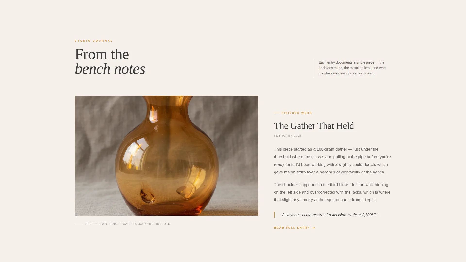
The wide column holds large-format portfolio images shot against raw linen, while the narrow column carries first-person journal entries describing the technique behind each piece. This split gives equal weight to the work and the story without either overwhelming the other.
Scroll-Driven Process Rhythm
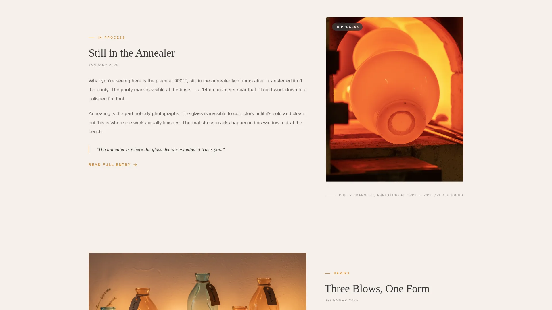
As the visitor scrolls, images alternate between polished finished vessels and raw in-process shots: punty marks, tool impressions, a piece still glowing in the annealer. The rhythm creates a sense of being inside a real studio visit rather than browsing a static gallery.
Subtle Parallax Scrolling
Images drift slightly slower than the surrounding text as the visitor scrolls down the page. The effect mimics the feel of flipping through a heavy art book, adding depth without distracting from the work itself.
Dual Conversion Path Layout
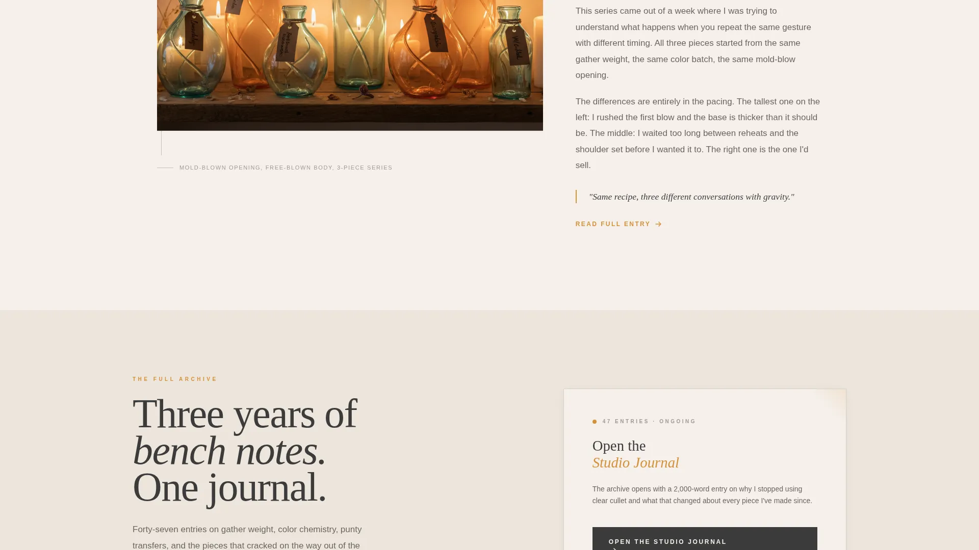
After the third portfolio entry, a primary call-to-action block links to the full blog archive. A secondary block below it presents a single email field gated to a free illustrated technique guide PDF. Both paths are placed where the visitor is already invested in the narrative, not at the top of the page.
Cloud Canvas Color System
The palette is built around four specific tones: unbleached cotton (#F5F0EB), graphite sketch (#3B3B3B), kiln-door amber (#D4913A), and soft atmospheric gray (#C6C1BA). Amber appears only on links, hover states, and pull-quote borders. All backgrounds stay in the cotton-to-gray range, keeping the page matte, warm, and tactile.
Page sections overview
| Section | Purpose |
|---|---|
| Animated Header | Opens with the ink-sketch illustration animating live, headline appearing last |
| Portfolio Entry One | First 60/40 pairing of finished vessel image and first-person journal text |
| Portfolio Entry Two | Second image-and-journal pairing, featuring an in-process shot |
| Portfolio Entry Three | Third pairing that completes the narrative arc before the primary call to action |
| Studio Journal call to action | Primary conversion block linking visitors to the full blog archive |
| Technique Guide Gate | Secondary email capture block offering a free illustrated PDF download |
Design & branding system
The Ink & Paper theme treats the page like a calligrapher's desk at golden hour. Every surface is warm and matte. Texture is implied through the color palette and typographic choices rather than added pattern or noise.
- Typography uses a letterpressed serif for headlines and a clean body face with generous leading, so reading the page feels like reading a printed journal
- The Cloud Canvas palette keeps backgrounds in the unbleached cotton (#F5F0EB) to soft gray (#C6C1BA) range, with graphite (#3B3B3B) carrying all body text and amber (#D4913A) reserved for interactive and accent moments only
- Pull-quote borders, link underlines, and hover states all use kiln-door amber as the single warm accent, connecting every interactive moment back to the material at the center of the work
Mobile & speed optimization
The 60/40 asymmetric layout is designed to reflow cleanly for smaller screens. The two-column structure collapses into a single vertical reading flow, keeping images and their paired journal entries in sequence.
- Portfolio images and the animated header illustration are sized to load responsively across device widths without breaking the visual rhythm
- The parallax scroll effect is handled lightly so the page remains readable and stable on mobile without requiring the visitor to fight the layout
How this template helps you convert
Gather earns its conversions by delivering real value through the scroll itself. By the time a visitor reaches either call to action, they have already spent time inside the studio.
- The alternating portfolio-and-journal rhythm gives away genuine craft knowledge before asking for anything, making the "Download the Technique Guide" offer feel like a natural next step rather than a lead-generation wall.
- The "Open the Studio Journal" call to action appears after the third portfolio entry, precisely when curiosity about the maker is at its peak, so the click feels like continuing a conversation rather than leaving the page.
Other information about this template
Gather is part of the Portfolio & Agency category and sits within the Glass Blower Portfolio subcategory. It is designed as a single-page, section-led landing page, not a multi-page website, so all content flows through one continuous scroll.
- The template style is classified as Asymmetric Grid (60/40), with a creative direction of Immersive Visual and a header concept of Animated Illustration
- The landing page direction is Content and Resource, meaning the page is structured to educate and engage before converting, matching the niche of a glass blower blog and portfolio
- Placeholder text inside the email field reads "Your best email, no spam, just glass," which sets the tone for the secondary lead capture and can be edited to match your voice
Theme
Ink & Paper
Creative direction
Immersive Visual
Color system
Cloud Canvas
Style
Asymmetric Grid (60/40)
Direction
Content/Resource
Page Sections
Animated Ink-sketch Header
Asymmetric 60/40 Portfolio Grid
Scroll-driven Process Rhythm
Subtle Parallax Scrolling
Dual Conversion Path Layout
Cloud Canvas Color System
Related questions
Who is this landing page template designed for?
Can I use this template without a blog archive already in place?
What does the email capture section require from visitors?
How does the animated header illustration work?
Is the 60/40 column layout adjustable?



