Indigenous-Owned Business Portfolio & Case Study Website Template
Gather is a bento grid landing page template built for Indigenous-owned art galleries. It pairs a parallax search header with a scrolling Comparison Journey that moves visitors from traditional technique to contemporary form. The design uses a bold Dopamine Pop palette and a Neo-Retro visual system to make every artwork feel gallery-worthy on screen.
by Rocket studio
Quick summary
Gather is a single-page bento grid template designed for Indigenous-owned art galleries representing First Nations, Inuit, Métis, and Native American artists. The layout combines a cinematic search header with a paired-tile Comparison Journey, guiding corporate art consultants, private collectors, and cultural institutions from first impression straight to the collection browser.
Who this template is for
This template was built for gallery owners and art directors who represent Indigenous artists and need a landing page that communicates provenance, scale, and cultural depth at a glance. It speaks directly to buyers who expect more than a product listing.
- Indigenous-owned galleries exhibiting traditional and contemporary works side by side
- Corporate art consultants sourcing statement commissions for new headquarters
- Cultural institutions seeking authentic pieces for traveling exhibitions
What problem this template solves
Generic gallery templates flatten every artwork into a product card. They offer no sense of cultural context, no journey of discovery, and no visual proof that the work belongs in a serious collection. Gather solves this by making the landing page feel like a physical gallery walk.
- Buyers cannot assess provenance or artistic lineage from a standard grid layout
- Traditional and contemporary works look disconnected without a deliberate pairing structure
- Visitors who are ready to commission have no clear path forward on most gallery sites
What you get with this template
You get a fully structured bento grid landing page that moves visitors from curiosity to intent. Every section is purposeful, every call to action is earned by the content around it.
- A parallax mosaic search header with turquoise cursor pulse and focus-snap behavior
- A Comparison Journey section with paired tiles that escalate from intimate jewelry to room-filling commissions
- Two distinct calls to action placed at strategic points: "Explore the Collection" and "Commission an Artist Directly"
Feature list
This template includes layout components and interaction patterns drawn directly from the brief. Each feature serves the gallery context without decoration for its own sake.
Parallax Mosaic Search Header
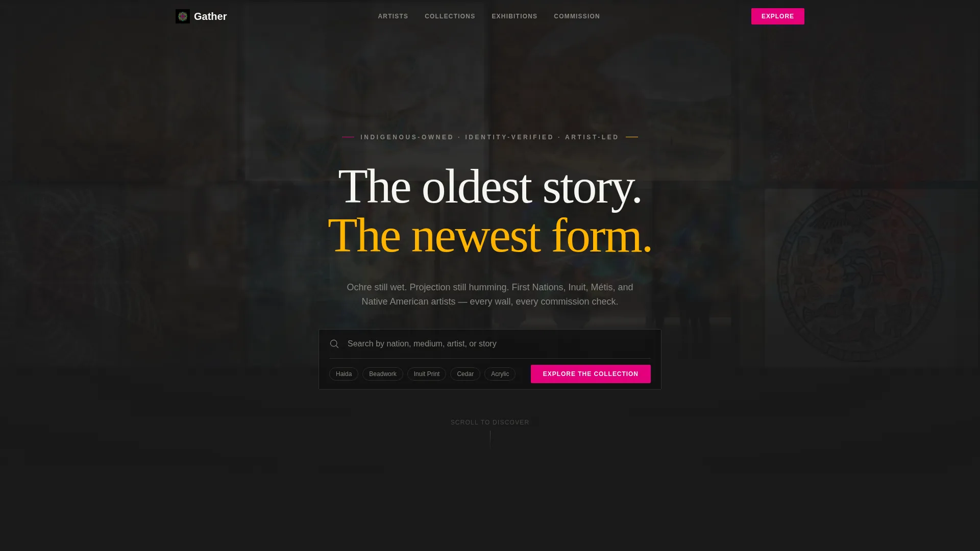
The header opens on a full black field with an oversized search box at center. A mosaic of artwork thumbnails drifts slowly behind it in a parallax grid, slightly blurred at rest. When a visitor types, matching tiles snap into sharp focus. A fallback "Explore the Collection" button sits inside the search box for visitors who prefer to browse rather than search.
Comparison Journey Tile Pairs
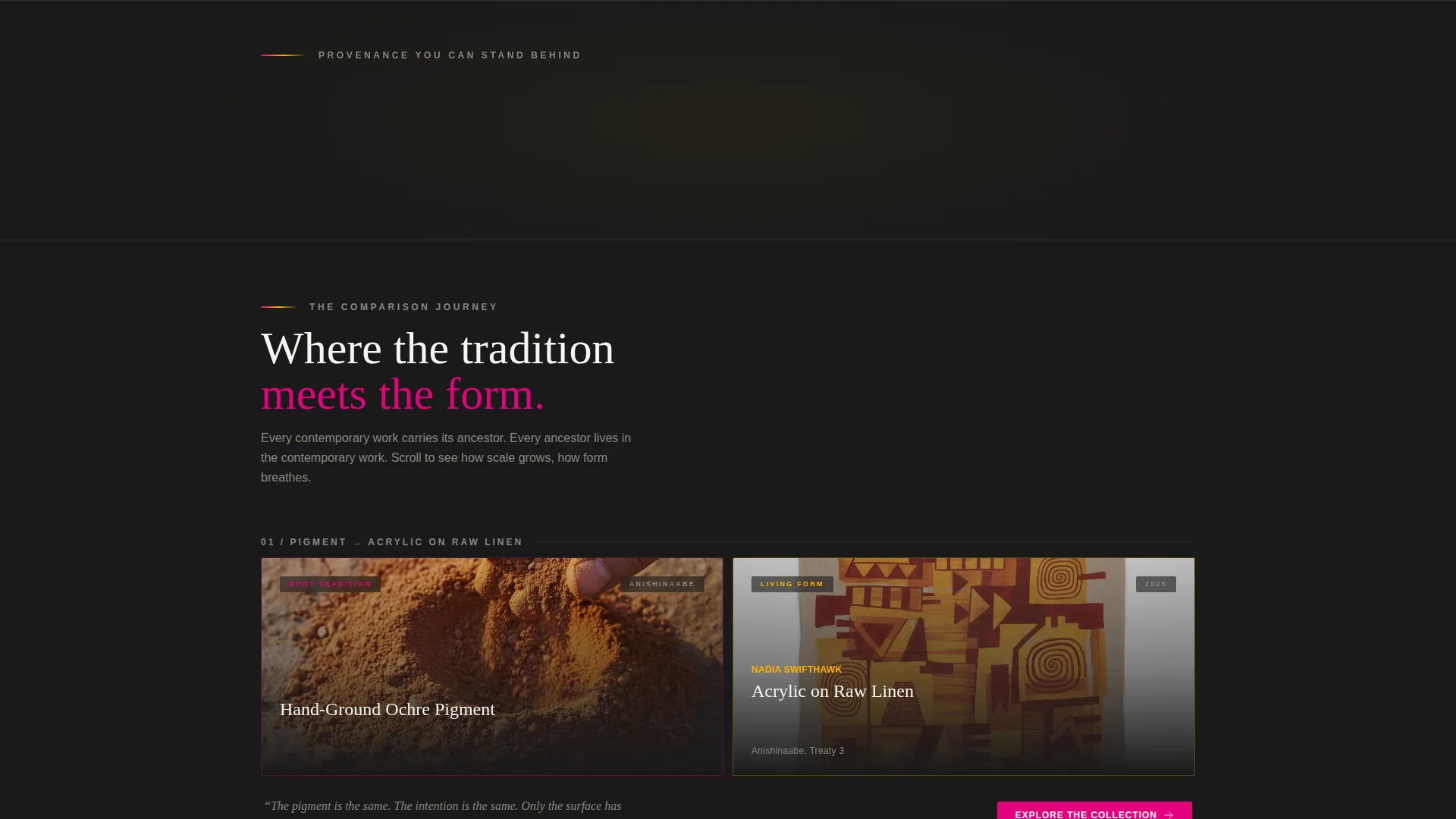
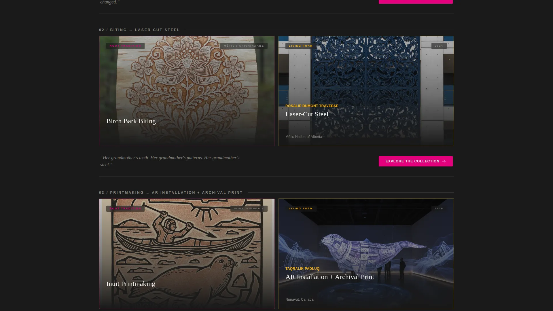
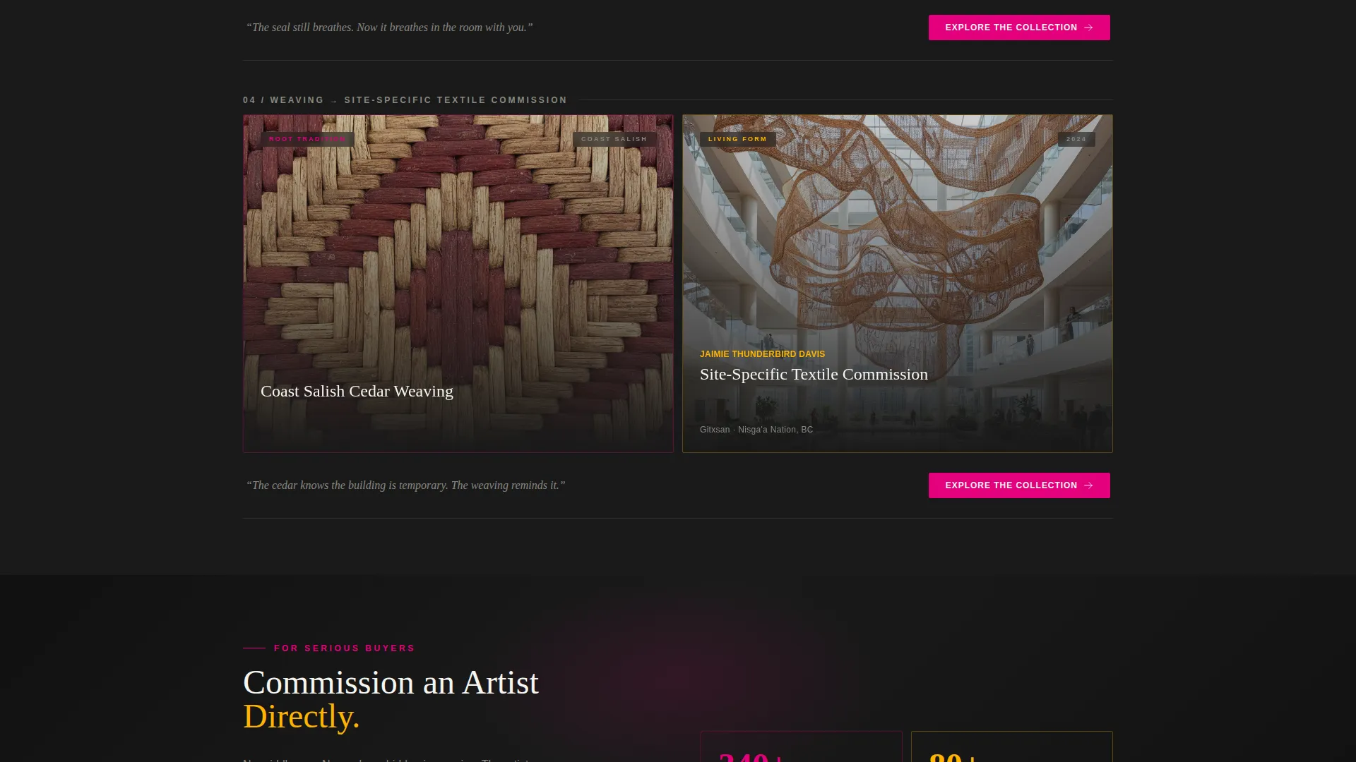
Paired bento tiles show a traditional technique on the left and the contemporary artist who channels it on the right. Each row escalates in physical scale, from intimate jewelry pieces up to room-filling installations. The grid breathes more as you scroll, with tiles growing larger until the final row becomes a single full-width artwork that anchors the page.
Tiered Call-to-Action Placement
The primary call to action, "Explore the Collection," appears first inside the search header and repeats after every comparison pair. A secondary call to action, "Commission an Artist Directly," surfaces after the third row for visitors showing clear purchase intent. No pricing appears on the page; the calls to action earn their clicks through provenance and scale.
Neo-Retro Dopamine Pop Color System
The palette uses electric magenta, sun-ceremony gold, deep gallery black, and living turquoise as the four core colors. Black dominates grid backgrounds. Magenta and gold alternate as tile accent borders. Turquoise activates on hover states and interactive borders. Off-white breathes through typography to keep the text readable against dark tiles.
In-Situ Scale Photography Layout
The template is structured to display scale-in-context photographs alongside each artwork. Seeing a canvas or installation in its intended environment communicates physical presence in a way that cropped product images cannot. This is how the layout builds desire without a price tag.
Bento Grid Layout Structure
The bento grid arranges content in varied tile sizes rather than a uniform product matrix. Tiles shift in proportion as the visitor scrolls, creating a rhythm that mirrors a physical gallery walk. The layout is designed to hold pieces ranging from small wearable jewelry to large architectural commissions within the same visual language.
Page sections overview
| Section | Purpose |
|---|---|
| Parallax Search Header | Invites discovery and orients visitors to the breadth of the collection |
| Comparison Tile Row 1 | Pairs an intimate traditional technique with its contemporary counterpart |
| Comparison Tile Row 2 | Escalates to mid-scale works and reinforces the traditional-to-contemporary arc |
| Comparison Tile Row 3 | Introduces the secondary commission call to action for purchase-ready visitors |
| Full-Width Anchor Piece | Delivers a single large-format work that stops the scroll and closes the journey |
| Repeat Collection call to action | Drives final click-through to the full collection browser |
Design & branding system
The visual identity follows a Neo-Retro theme expressed through a Dopamine Pop color system. The result feels like a vintage jukebox repainted by a muralist: saturated, unapologetic, and alive against gallery black.
- Core palette: electric magenta (#E4007C), sun-ceremony gold (#FFB400), deep gallery black (#1A1A1A), living turquoise (#00CFC1), and off-white (#F5F5F0) for typography
- Tile borders alternate between magenta and gold; turquoise fires on hover and interactive states
- Typography uses off-white on dark backgrounds to maintain contrast and give the text room to breathe
Mobile & speed optimization
The bento grid is designed to reflow across screen sizes without losing the gallery-walk feeling. Tile proportions adapt so the Comparison Journey remains readable and impactful on smaller displays.
- Paired comparison tiles stack vertically on mobile so the traditional-to-contemporary arc stays intact
- The parallax mosaic header simplifies on smaller screens to keep the search experience responsive
- Full-width anchor pieces scale to fill the viewport on any device, preserving their stopping power
How this template helps you convert
Every layout decision in Gather is oriented toward one outcome: moving a curious visitor into the collection browser or opening a commission conversation. The page never rushes that journey.
- The search header makes the collection feel vast and personalized from the first second, giving visitors a reason to stay and explore rather than bounce.
- The Comparison Journey builds cultural authority row by row, so by the time a call to action appears, the visitor already trusts the gallery and wants to go deeper.
- The tiered call-to-action structure separates browsers from buyers, routing each visitor to the right next step without forcing a single conversion path on everyone.
Other information about this template
Gather is built specifically for the Indigenous-owned art gallery niche within the broader retail and e-commerce space. It is optimized as a click-through landing page, meaning its single job is to move qualified visitors into the collection browser or toward a direct commission inquiry.
- The template style is a bento grid, suited to galleries showing diverse media: acrylic canvases, augmented reality installations, laser-cut steel, dot painting, cedar weaving, and mixed-media works
- The creative direction is a Comparison Journey, a format that works well for galleries explaining artistic lineage to buyers who are new to Indigenous art traditions
- The header concept is a Search Box with focus-snap behavior, designed to communicate collection depth to corporate consultants and institutional curators who know what they are looking for
- The page carries no pricing, no cart, and no checkout flow; its purpose is to earn the click to the next destination
Theme
Neo-Retro
Creative direction
Comparison Journey
Color system
Dopamine Pop
Style
Bento Grid
Direction
Click-Through
Page Sections
Parallax Mosaic Search Header
Comparison Journey Tile Pairs
Tiered Call-to-action Structure
Neo-retro Dopamine Pop Palette
In-situ Scale Photography Layout
Responsive Bento Grid Structure
Related questions
Who is this landing page template designed for?
Does this template include a shopping cart or pricing display?
Can I use this template for both traditional and contemporary artwork?
What color palette does this template use?
How does the search header work?



