Glassblower Video Portfolio Landing Page Template
Gather is an asymmetric 60/40 grid landing page built for glassblowing video portfolios. It uses a draggable Before/After Slider header, stage-by-stage process sections with looping video, and a sticky Partnership/B2B collaboration form. The Ink & Paper color system grounds everything in deep charcoal, warm parchment, and a molten amber accent that makes the work itself feel like the only light in the room.
by Rocket studio
Quick summary
Gather is a single-page glassblower video portfolio template built on an asymmetric 60/40 grid. It opens with a draggable Before/After Slider, walks visitors through each stage of the glassblowing process with looping video, and closes with a sticky collaboration form. The design feels like a hand-printed exhibition catalog: dark, focused, and completely led by the work.
Who this template is for
This template is purpose-built for glassblowing artists and studios whose clients are institutions and brands, not casual buyers. If you work on commission, licensing, or exhibition projects, this layout speaks that language from the first scroll.
- Glassblowers and glass artists building a professional video portfolio for B2B clients
- Studio owners pitching gallery curators, luxury hotel chains, interior design firms, or production companies
- Craft artists who need a process-led presentation that qualifies serious partners before a single phone call
What problem this template solves
Most portfolio templates are built around static image grids. They show finished pieces but say nothing about the process, the scale, or the craft complexity behind them. For high-value commissions and licensing deals, that silence is expensive.
- Clients who commission lobby installations or editorial campaigns need to understand what they are buying into before they reach out
- A flat image grid cannot communicate heat, motion, or skill the way slow-motion video and a stage-by-stage layout can
- Without a clear qualification path, serious partners and casual browsers land in the same inbox
What you get with this template
You get a fully structured landing page that doubles as a portfolio presentation and a partnership pitch. Every section has a defined visual role and a clear conversion job to do.
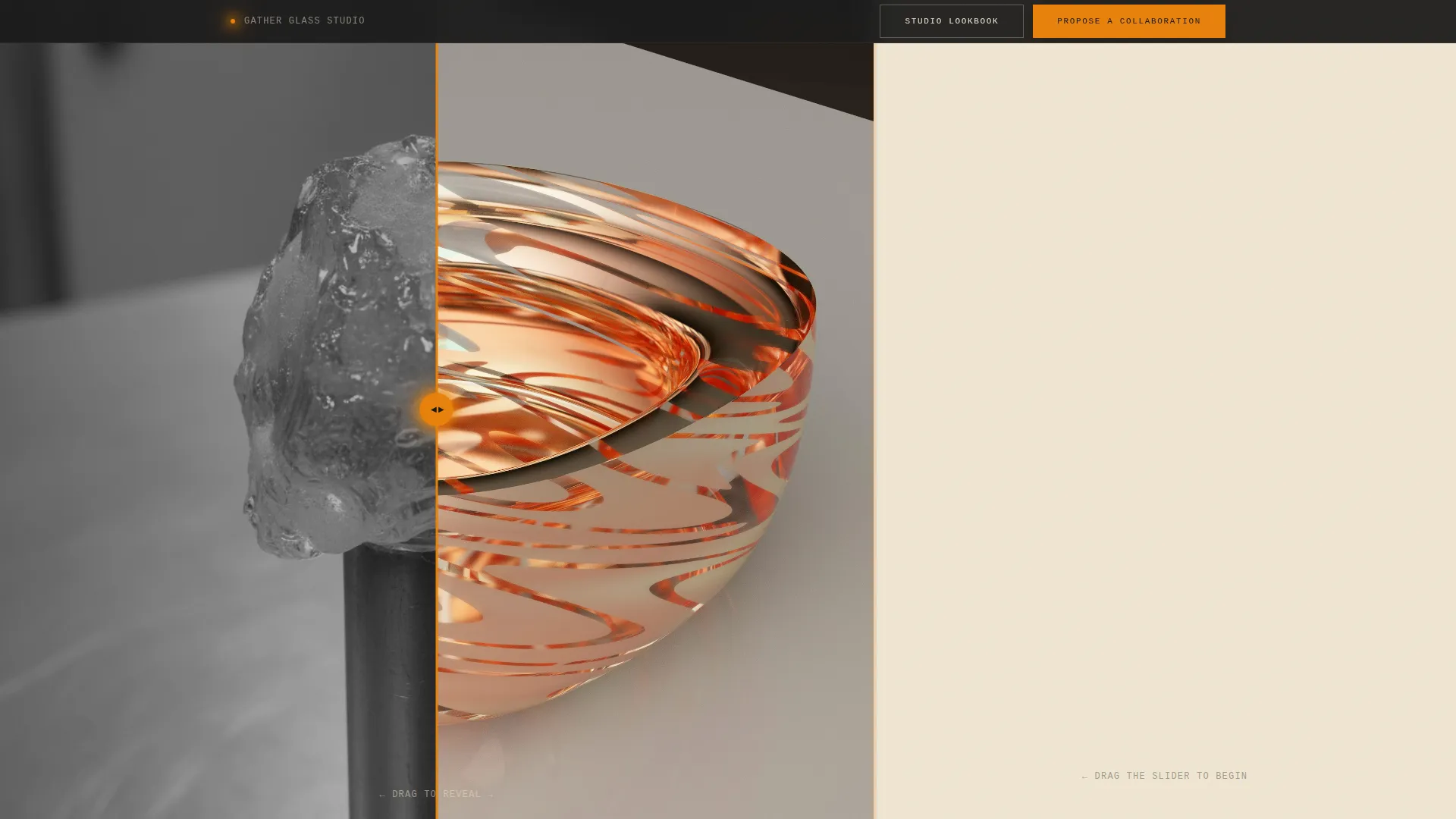
- A draggable Before/After Slider header that reveals the transformation from raw gather to finished vessel
- Five process-stage sections, each pairing a looping 60-column video with a 40-column text panel and clickable gallery
- A sticky collaboration bar with a structured form and a secondary gated PDF download path
Feature list
This section details the core interactive and visual components built into the Gather template.
Before/After Slider Header
The 60-column header is split by a draggable divider. The left side shows a raw, cold glass gather in flat documentary light. The right side reveals the finished translucent vessel rotating on a black turntable. The studio name and tagline only appear once the visitor drags the slider past center, making the first reveal feel earned.
Stage-by-Stage Process Sections
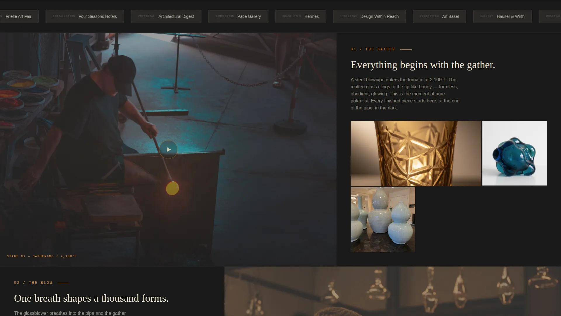
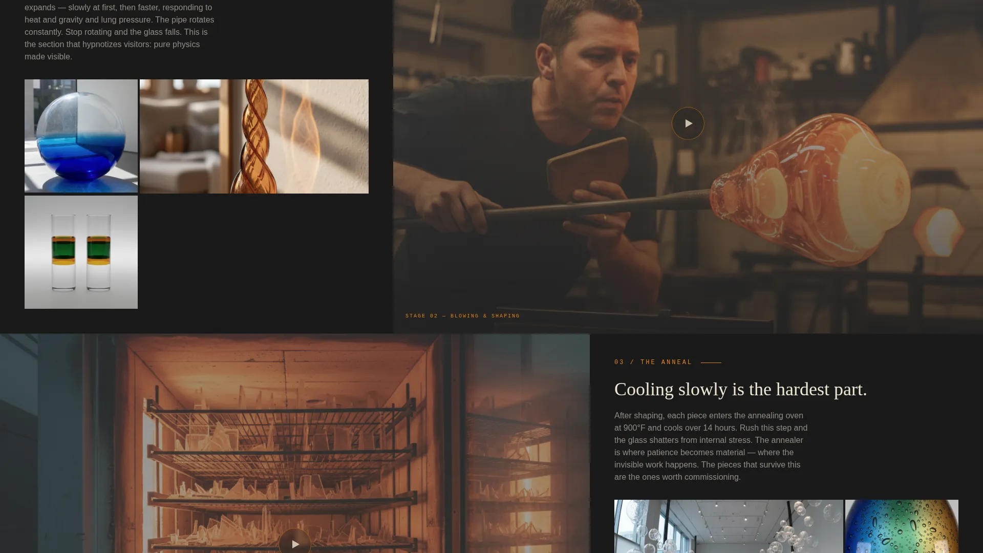
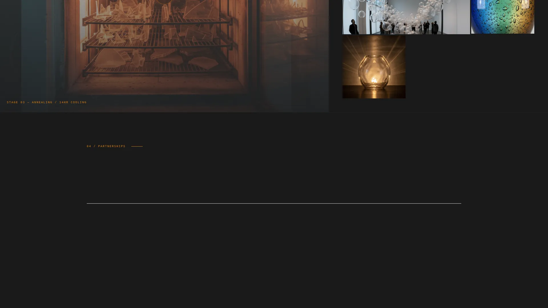
The page maps the full glassblowing process across five sections: gathering, blowing, shaping, annealing, and finishing. Each section places looping video in the dominant column and a short descriptive paragraph with a clickable finished-piece gallery in the secondary column. The asymmetry alternates sides as visitors scroll, creating a rhythm that mirrors the constant rotation of the pipe.
Sticky Collaboration Bar
After the third process section, a sticky bar appears at the bottom of the viewport. It anchors the primary call to action, "Propose a Collaboration," without interrupting the visual experience. The form captures company name, project type (commission, licensing, exhibition, or editorial), and a free-text field labeled "Describe what you're imagining."
Gated Studio Lookbook Download
A secondary conversion path sits alongside the primary form. Visitors can download the Studio Lookbook PDF by entering a business email address only. This separates qualified partners from early-stage browsers without requiring a discovery call.
Ink and Paper Color System
The palette uses deep charcoal black (#1A1A1A) as the dominant background, warm parchment (#F0E6D3) for text panels and pull quotes, and soft graphite (#4A4A4A) for secondary surfaces. Molten amber (#E8820C) is reserved exclusively for hover states, progress bars, and call-to-action elements, keeping visual hierarchy clean and intentional.
Shifting Asymmetric Grid
The 60/40 column split does not stay fixed. Video jumps from left to right and text panels trade sides as visitors move through the process stages. This controlled rhythm keeps the layout dynamic without losing structure, reinforcing the sense of constant, deliberate motion that defines the craft itself.
Page sections overview
| Section | Purpose |
|---|---|
| Before/After Slider | Reveals raw-to-finished transformation and triggers studio name reveal |
| Gathering Stage | Introduces the process with looping video and first gallery |
| Blowing Stage | Shows the breath-and-pipe technique with paired text panel |
| Shaping Stage | Demonstrates forming tools and technique with clickable pieces |
| Annealing Stage | Explains the cooling process and links to finished commissions |
| Finishing Stage | Presents the completed work and final portfolio gallery |
| Sticky Collaboration Bar | Anchors the primary call to action after the third process section |
| Lookbook Download | Offers gated PDF to qualify and capture business email |
Design & branding system
The visual identity follows a Lens and Frame theme that treats the page like a darkroom surface. Every color choice is deliberate: the background absorbs ambient noise so the video and glass work become the only focal point in the room.
- Deep charcoal black (#1A1A1A) background absorbs everything and pushes the work forward visually
- Warm parchment (#F0E6D3) text panels and soft graphite (#4A4A4A) secondary surfaces create print-like legibility against the dark ground
- Molten amber (#E8820C) appears only on hover states, progress bars, and call-to-action elements, protecting its visual weight
Mobile & speed optimization
The Gather template is structured so that its video-heavy layout remains navigable and purposeful on smaller screens. The alternating grid and slider are built to adapt without losing the process-stage logic that makes the page work.
- The asymmetric grid reflows gracefully so that video and text panels stack in a logical reading order on mobile viewports
- The sticky collaboration bar remains accessible without covering critical content on smaller screen sizes
- Looping video sections are contained within their grid columns so the layout does not break when the viewport narrows
How this template helps you convert
The conversion architecture is designed around a B2B buyer who needs context before committing to a conversation. Every layout decision supports the journey from curious visitor to qualified inquiry.
- The Before/After Slider creates an immediate interactive moment that earns the visitor's attention before any text appears, establishing craft quality on first contact.
- The five process stages build cumulative understanding of the work's complexity, so by the time the sticky collaboration bar appears, the visitor has already qualified themselves.
- The dual conversion paths, the collaboration form and the gated Lookbook download, capture two different levels of buyer readiness in a single scroll.
Other information about this template
Gather is part of a broader portfolio template family built around video-led creative work. It is particularly well suited for niches where the process is as important as the finished piece.
- The template style is classified as Asymmetric Grid (60/40), making it a strong fit for any craft discipline that relies on video documentation
- The creative direction is Interactive Explorer, meaning the visitor controls their depth of engagement rather than being pushed through a fixed narrative
- The header concept, Before/After Slider, is a recognized conversion pattern for transformation-led portfolios where showing change is more persuasive than describing it
- The Partnership/B2B landing page direction means every structural decision, form fields, gating logic, sticky bar timing, is oriented toward institutional and commercial clients rather than retail audiences
- The Lens and Frame theme and Ink and Paper color system are reusable design languages that can be adapted to other craft or fine art portfolio contexts within the same template family
Theme
Lens & Frame
Creative direction
Interactive Explorer
Color system
Ink & Paper
Style
Asymmetric Grid (60/40)
Direction
Partnership/B2B
Page Sections
Draggable Before/after Slider Header
Stage-by-stage Process Layout
Sticky Collaboration Form
Gated Studio Lookbook Download
Alternating Asymmetric Grid
Ink and Paper Color System
Related questions
Who is this template built for?
Does the template work without video footage?
How does the dual conversion path work?
What fields does the collaboration form include?
When does the sticky collaboration bar appear?



