Obesity Care Professional Website Template
Gather is a compassionate obesity support landing page template built on a 50/50 split-screen layout. It pairs clinical facts with handwritten-style member voices, guiding visitors through a seven-question readiness assessment. The Cloud Canvas color system and Fraunces serif typography create a warm, unhurried feel that puts emotional safety before any sales pressure.
by Rocket studio
Quick summary
Gather is a single-page landing page template for obesity support communities. It uses a split-screen structure to pair research-backed facts with real member voices, then moves visitors into a gentle seven-question readiness quiz. The result is a page that feels more like a conversation than a pitch.
Who this template is for
This template is built for community health organizers, peer wellness facilitators, and healthcare providers who run or refer patients to obesity support groups. If your audience has spent years feeling judged by clinical language, this template meets them differently.
- Facilitators and coordinators running weekly obesity support circles
- Healthcare providers and dietitians referring patients to peer group programs
- Community organizations serving post-bariatric patients, parents, or night-shift workers with limited food access
What problem this template solves
Most health-related landing pages feel transactional. They list programs, show pricing, and ask for a sign-up before a visitor feels seen. For people navigating weight and body image, that coldness is a conversion killer.
- Visitors arrive carrying years of shame and leave before they find the sign-up form
- Generic wellness language signals "another diet program," not a safe peer community
- Traditional call-to-action buttons ask for commitment before trust is established
What you get with this template
You get a fully structured, single-page layout with every section planned and sequenced for emotional impact. The page moves visitors from recognition to readiness at a pace that respects their experience.
- A stats-led hero section, a three-pair Testimonial Mosaic, archetype cards, a three-step "How It Works" flow, and a quiz-driven primary call to action
- A seven-question readiness assessment with personalized results and a single low-friction sign-up step
- A complete Cloud Canvas design system with defined colors, Fraunces and DM Sans typography, and cornflower blue reserved exclusively for interactive elements
Feature list
A clear paragraph introduces the feature blocks below. Every feature listed here is grounded directly in the source brief and reflects what this template actually delivers.
Stats-Led Split Hero
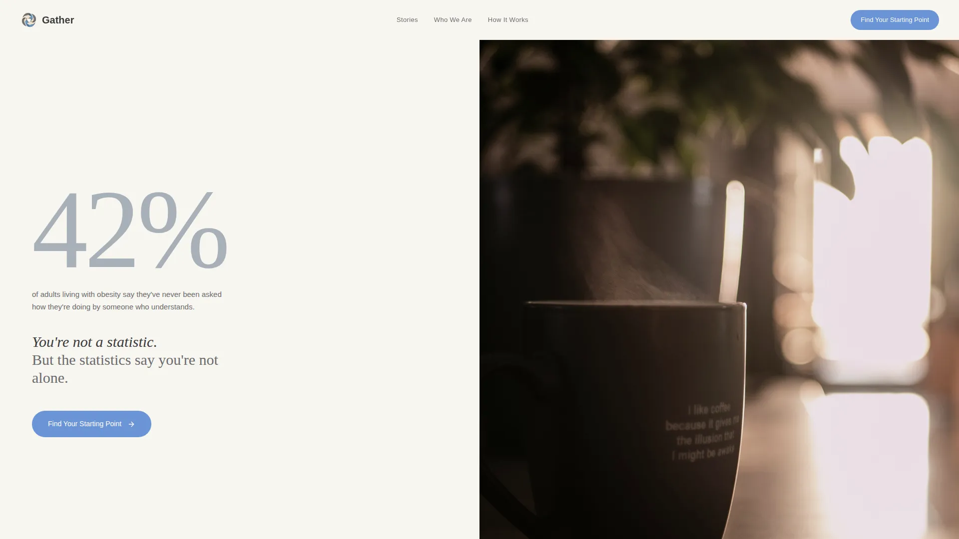
The hero opens with an oversized "42%" stat in harbor gray on the left panel. The right panel holds a soft-focused photograph of two hands around a coffee mug. A headline fades in beneath: "You're not a statistic. But the statistics say you're not alone." The combination earns attention without demanding anything.
Testimonial Mosaic Layout
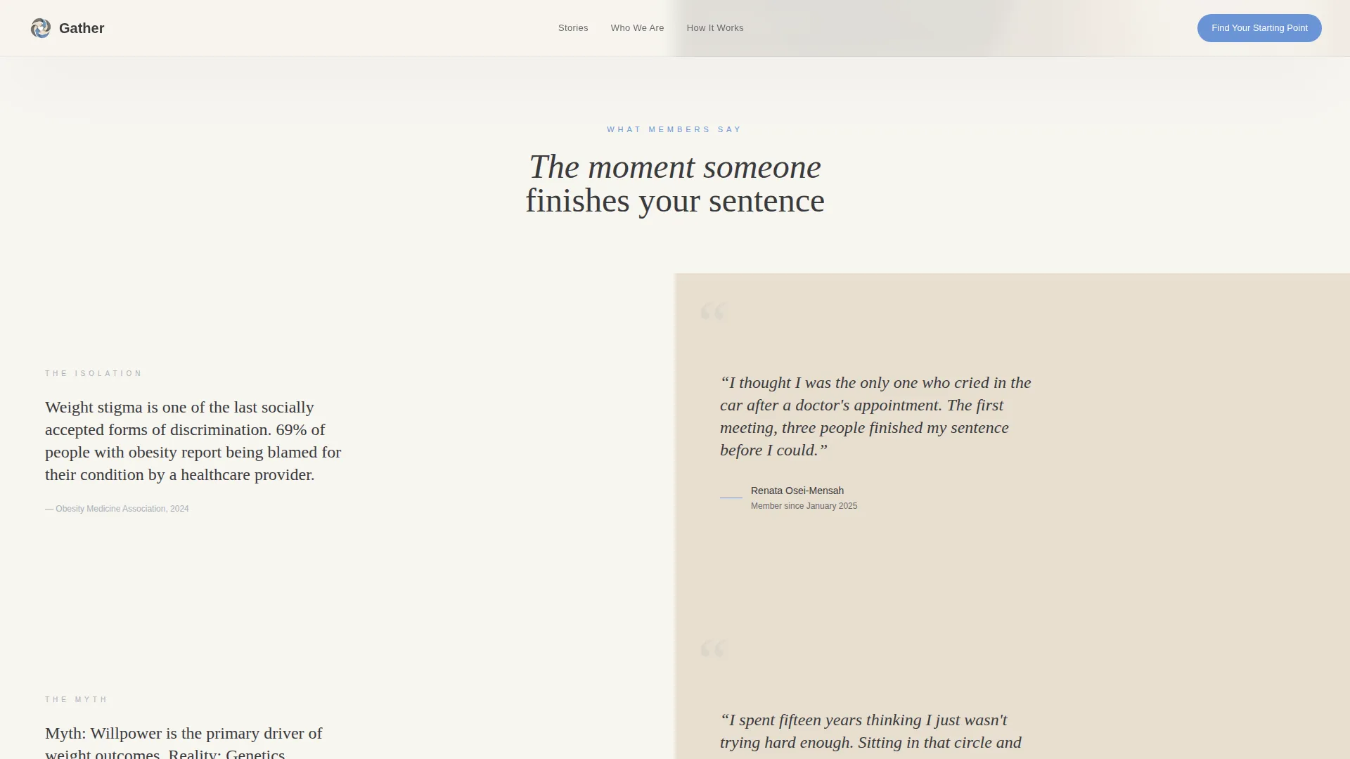
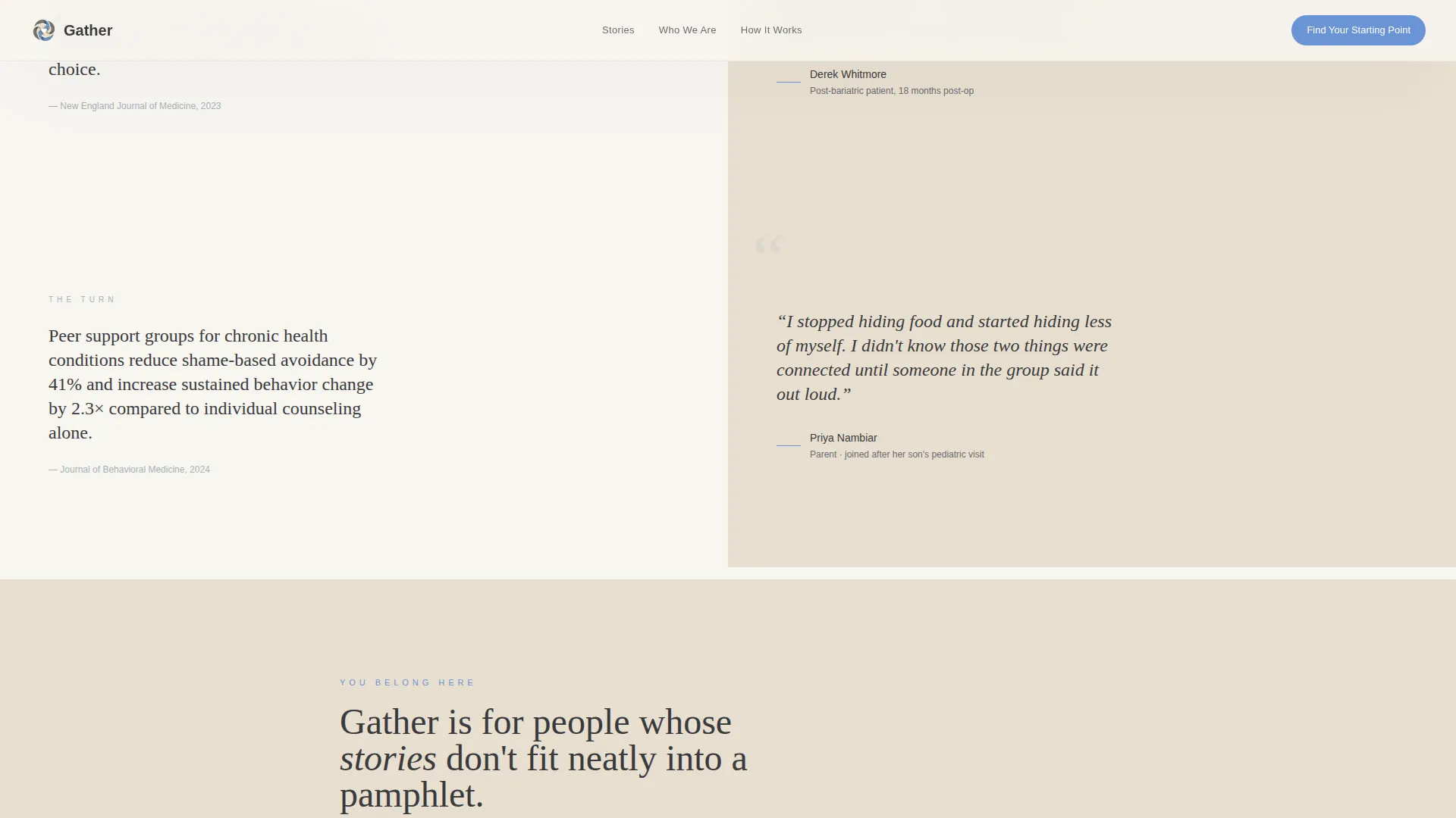
Three alternating split-screen pairs scroll in sequence. The left side of each pair delivers a clinical fact, myth debunked, or research finding. The right side answers with a handwritten-style member pull quote layered over a soft linen background. The emotional arc moves from isolation to recognition to transformation.
Seven-Question Readiness Quiz
The primary call to action leads to a one-question-at-a-time assessment flow. Questions move from emotional to practical to situational, with no weight entry or body mass index calculator involved. Results deliver a personalized group-format recommendation and a "Reserve My Chair" button asking only for a first name and email.
Member Archetype Cards
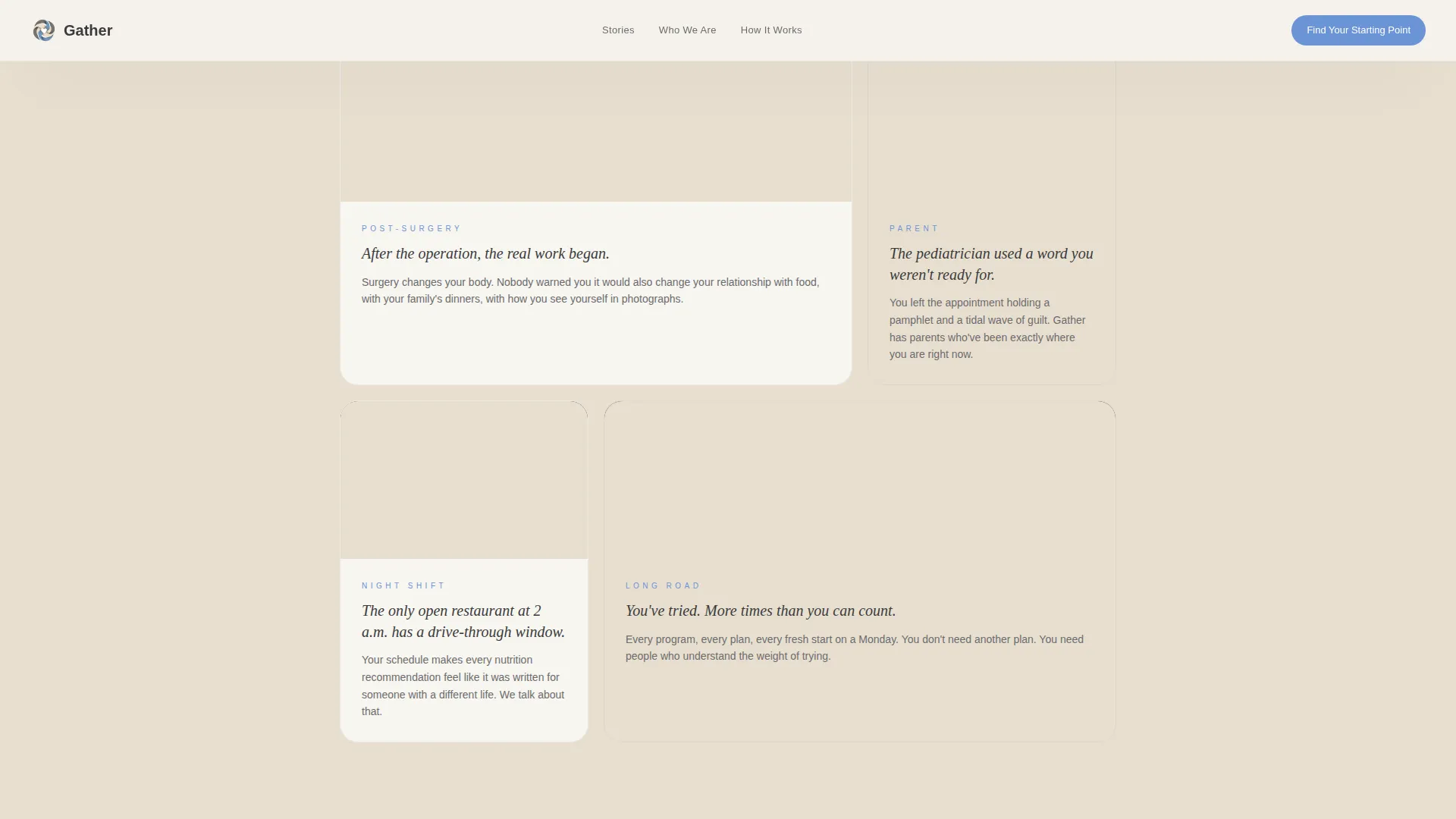
A "Who Gathers Here" section presents member types in an asymmetric bento-style card layout. Cards represent post-bariatric patients, parents of children flagged with obesity, and night-shift workers with limited food access. The non-uniform grid avoids clinical symmetry and keeps the section feeling human.
Gentle Three-Step Flow
A "How It Works" section explains the group process in three visual steps without a numbered timeline layout. The asymmetric design keeps the explanation approachable rather than procedural, matching the overall warmth of the page.
GSAP Scroll-Triggered Animations
The template includes medium-intensity GSAP ScrollTrigger animations throughout. Blur reveals, image-reveal overlays, staggered mosaic transitions, and quiz state transitions are all built in. Client Components handle the interactive quiz and animation layers, while static sections use Server Components.
Page sections overview
| Section | Purpose |
|---|---|
| Split-screen hero | Opens with an oversized stat and a warm photograph, with a fading headline |
| Testimonial Mosaic pairs | Alternates clinical facts with handwritten member quotes across three pairs |
| Who Gathers Here | Shows member archetype cards in an asymmetric bento grid |
| How It Works | Explains the group process in three gentle, non-numbered visual steps |
| Quiz and assessment | Delivers a seven-question readiness flow with personalized results |
| Minimal footer | Closes with a horizontal flow layout, keeping exit low-pressure |
Design & branding system
The Cloud Canvas color system defines every visual decision on this page. The palette was chosen to feel like an overcast morning: even light, no harsh shadows, and nothing clinical.
- Colors: cumulus white (#F7F5F0) and warm linen (#E8DFD0) alternate as backgrounds; deep graphite (#3A3A3C) carries all body text; harbor gray (#A8B0B8) handles supporting stats and labels; cornflower blue (#6B93D6) appears only on buttons, progress indicators, and interactive elements
- Typography: Fraunces serif is used for emotional headlines and pull quotes; DM Sans handles all body copy for maximum readability
- Visual tone: handwritten-style quote layering, soft-focus photography, and asymmetric layouts reinforce the Educational Guide theme throughout
Mobile & speed optimization
The template is built with an equal desktop and mobile priority. On desktop, the split-screen structure runs side by side. On mobile, panels stack vertically while the emotional hierarchy is preserved.
- The quiz flow, mosaic transitions, and scroll animations are handled by Client Components to keep interactive sections responsive
- Static page sections use Server Components, separating heavy interactivity from content that does not need it
- The stacked mobile layout keeps the stat, photograph, and headline in the correct emotional reading order on smaller screens
How this template helps you convert
Conversion here is not about urgency or pressure. The page builds trust section by section, then asks for a small, safe step at the right moment.
- The hero stat establishes that the visitor is not alone before a single program detail is mentioned, lowering the defensive guard that health pages typically trigger.
- The Testimonial Mosaic accumulates recognition across three pairs, so visitors arrive at the quiz already nodding rather than skeptical.
- The seven-question readiness assessment replaces a generic sign-up form with a personalized experience, and the final "Reserve My Chair" button asks only for a first name and email.
Other information about this template
This template is categorized under Health and Medical, specifically the Obesity Care subcategory, and is designed for the obesity support group niche. It carries an Educational Guide theme and a Testimonial Mosaic creative direction, both of which inform every layout and copy decision.
- The intersection match score for this template is 13, reflecting a strong alignment between the Health and Medical category, Obesity Care subcategory, and the Obesity Support Group niche
- The footer follows a Vercel Horizontal Flow pattern, keeping the page exit minimal and pressure-free
- The quiz result screen delivers three outputs: a recommended group format, a first-session expectation brief, and the "Reserve My Chair" button
- The template is localized for English (US) with an informal, warm tone and no currency references anywhere on the page
Theme
Educational Guide
Creative direction
Testimonial Mosaic
Color system
Cloud Canvas
Style
Split Screen (50/50)
Direction
Quiz/Assessment
Page Sections
Stats-led Split-screen Hero
Testimonial Mosaic Section
Seven-question Readiness Quiz
Member Archetype Card Grid
GSAP Scroll-triggered Animations
Cloud Canvas Design System
Related questions
Does the quiz collect any weight or body mass index data?
What does the 'Reserve My Chair' button ask for?
Can this template work for a healthcare provider referral program?
Is this template suitable for a community organization with no design team?
How does the Testimonial Mosaic section build trust?



