Virtual Church Landing Page Template
Gather is a single-column landing page template built for online and virtual churches. It uses a warm, botanical visual identity, a user-generated photo wall hero, and a scroll-driven origin story to earn visitor trust. Two clear calls to action guide visitors toward live service registration and small group matching.
by Rocket studio
Quick summary
Gather is a single-column landing page template designed for online and virtual faith communities. It leads with a mosaic of real congregation photos, unspools a founding testimony as visitors scroll, and closes with two conversion paths: joining a live Sunday service and finding a weekly small group. The design is warm, unhurried, and built for people on the move.
Who this template is for
This template is made for faith leaders and community builders who serve people that cannot attend a physical church. It fits ministries that already exist online and congregations that are expanding their digital reach.
- Online and virtual church communities looking to grow their membership
- Pastors and ministry teams serving scattered, time-shifted, or overseas audiences
- Faith organizations that want a warmer, more personal landing page than a generic church website
What problem this template solves
Many people carry a real desire for church community but cannot show up on Sunday morning. Shift work, overseas postings, young children, and distance all create barriers that a physical building cannot solve. A generic church homepage does nothing to close that gap.
- Visitors feel unseen by pages built around in-person schedules and local addresses
- Without social proof and a personal story, isolated believers have no reason to trust a digital church
- Scattered calls to action leave curious visitors with no clear first step
What you get with this template
You get a fully designed, single-column landing page that moves visitors through an emotional and logical journey from first impression to registration. Every section is built to serve a specific conversion purpose, and the visual identity is ready to use without starting from scratch.
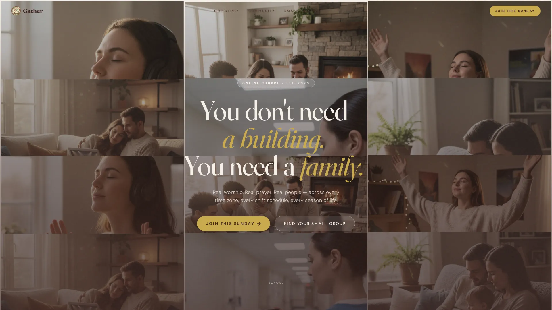
- A user-generated photo wall hero with a handset-style headline and dual calls to action
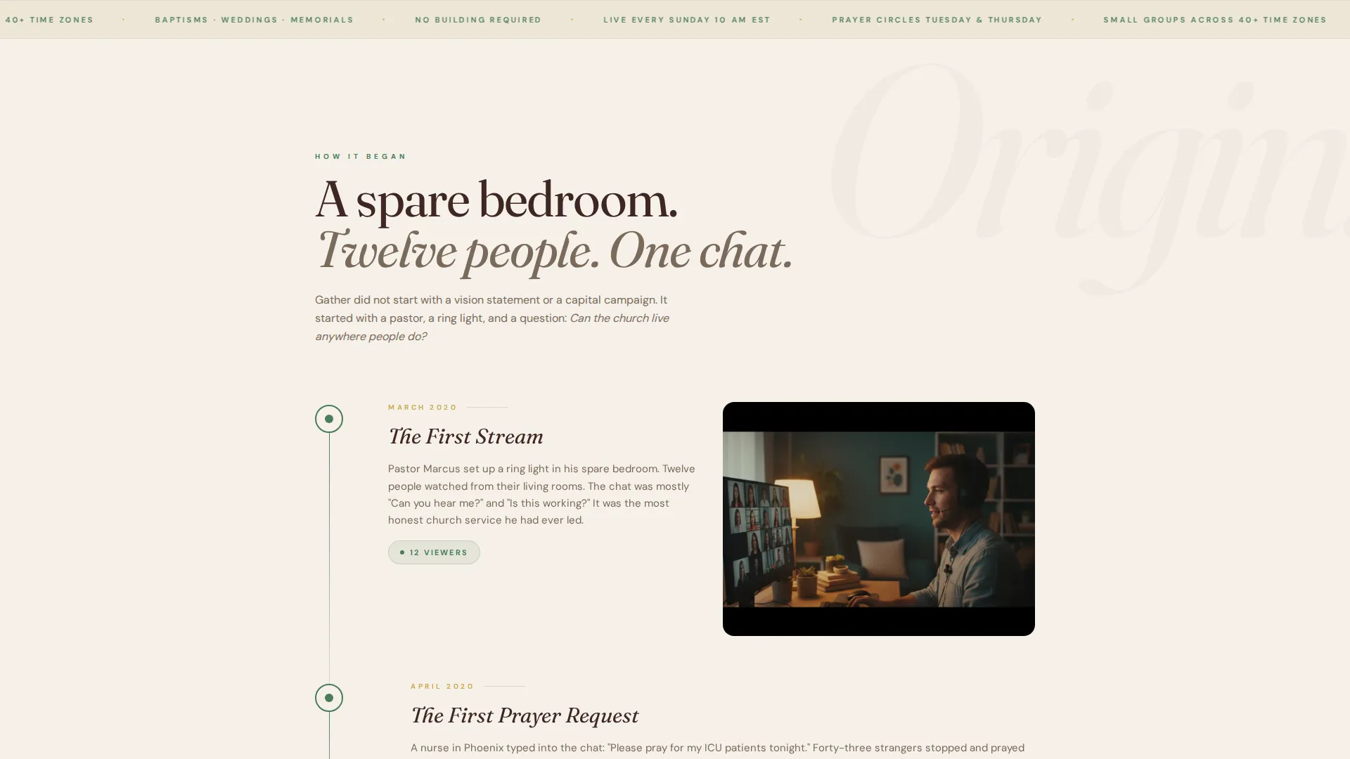
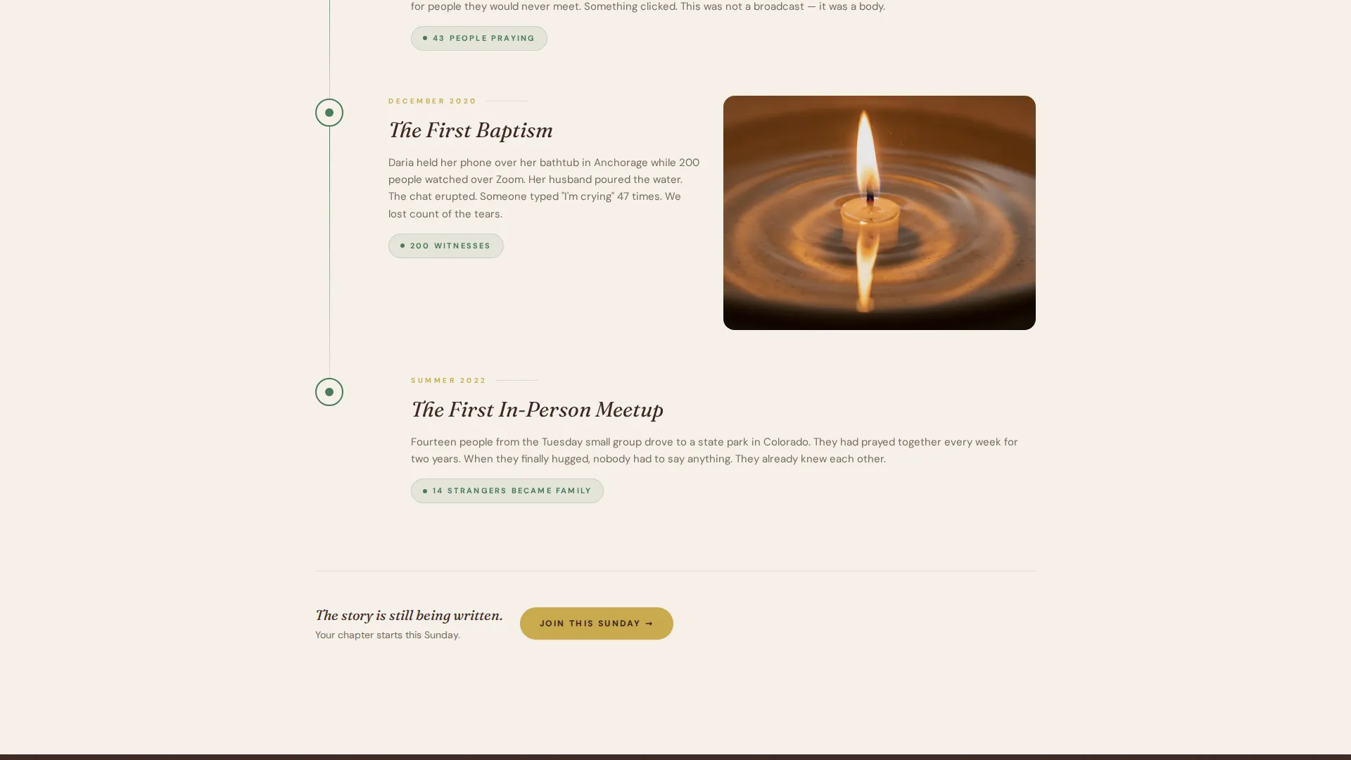
- A scroll-driven origin story with milestone markers and shifting photography
- A small group finder widget, community testimonials, and a service registration section
Feature list
A short paragraph explains what makes this feature set work together as a whole. Each component below serves a defined role in guiding a visitor from curious to committed.
UGC Photo Wall Hero
The header tiles real congregation member photos into a breathing, quilt-like mosaic. Warm, slightly imperfect images at varied aspect ratios replace stock photography with genuine community proof. A single handset-style headline rises from the center of the composition.
Scroll-Driven Origin Story
The page unspools like a testimony as visitors scroll. It opens with the founding moment, then widens through milestones: the first prayer request, the first baptism over video, the first mission trip funded by people who had never met in person. GSAP scroll reveals and staggered animations pace the narrative naturally.
Small Group Finder Quiz Widget
A midpage interactive quiz asks three short questions: time zone, life stage, and interest. The quiz matches the visitor to a weekly video group, making the second conversion path feel personal rather than administrative.
Dual Call-to-Action Structure
The primary call to action, "Join This Sunday," links to live service registration and repeats after every origin chapter. A secondary path, "Find Your Small Group," appears midpage. The dual structure serves visitors at different levels of readiness.
Community Proof Section
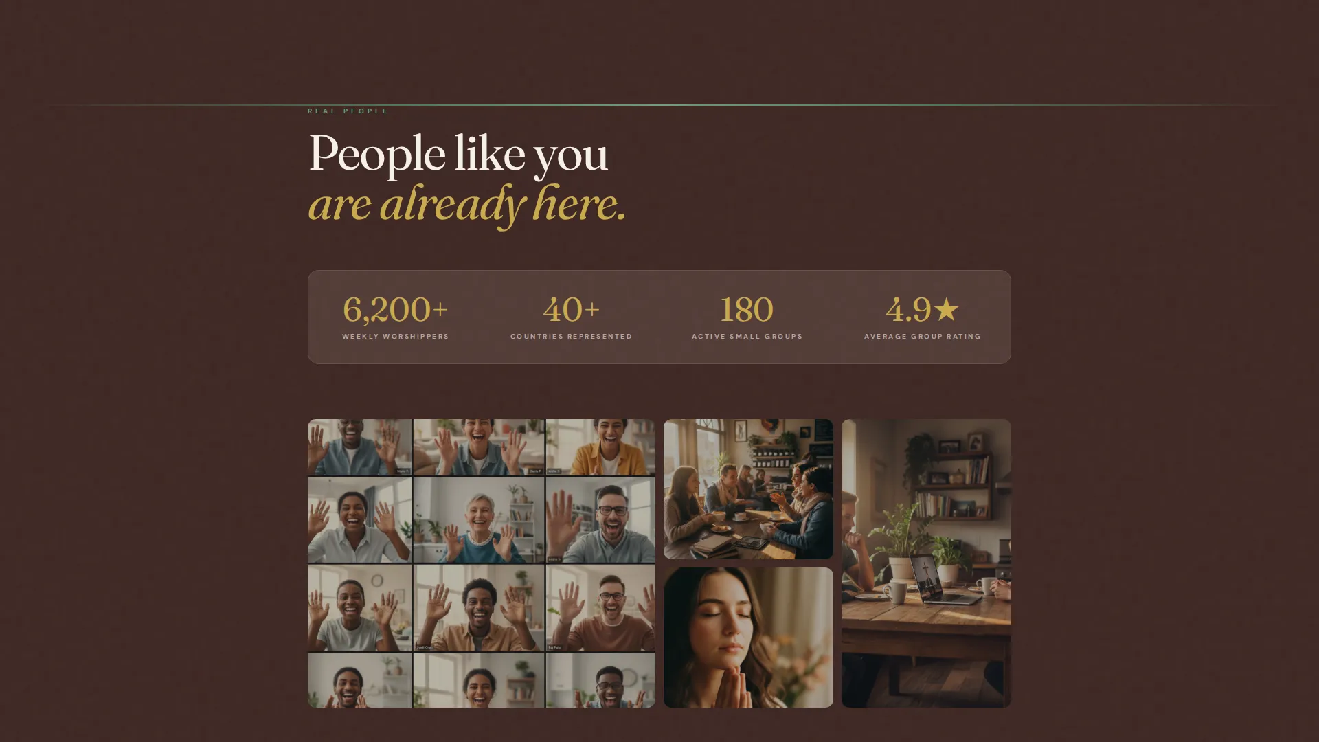
Testimonials with photos and community screenshots appear as evidence that real relationships have formed through the platform. The photography arc shifts from solo screens to group screenshots to in-person meetups, building a visual case for belonging over proximity.
Botanical Color and Typography System
The template ships with a defined color palette and type pairing. Cream dominates the background, loam anchors the body copy, fern marks section transitions, and gold draws attention to every call to action. Fraunces handles display headings and DM Sans handles body text.
Page sections overview
| Section | Purpose |
|---|---|
| Hero Photo Wall | Open with community and headline |
| Origin Story Scroll | Build trust through founding testimony |
| Milestone Markers | Show real growth over time |
| Community Proof | Testimonials and connection evidence |
| Small Group Finder | Match visitors to a weekly video group |
| Join This Sunday | Service details and primary registration |
| Footer | Navigation and secondary links |
Design & branding system
The visual identity follows a Community Hearth theme built on a botanical color system. Every design choice reinforces warmth, rootedness, and an unhurried sense of welcome.
- Colors: cream (#F5F0E8) as the dominant background, loam brown (#3E2723) for typography, fern green (#4A7C59) for section accents, and dried wildflower gold (#C9A94E) for buttons and highlights
- Typography: Fraunces, a warm serif, for display headings; DM Sans for all body text, keeping the pairing legible and grounded
- Animation: medium-weight GSAP scroll reveals, a breathing photo mosaic, marquee elements, and scroll-linked opacity shifts add life without overwhelming the content
Mobile & speed optimization
The template is designed mobile-first, reflecting the reality that the target audience is most often on a phone. A night-shift nurse checking in at 3am or a parent watching from a couch needs a page that loads cleanly and reads easily on a small screen.
- Static hero with lazy-loaded photos keeps the first paint fast and the experience smooth on slower connections
- Single-column flow means every section stacks naturally without layout shifts or horizontal scrolling
- Touch-friendly quiz widget and call-to-action buttons are sized and spaced for thumb navigation
How this template helps you convert
The page is structured to earn the click before asking for it. Visitors feel recognized by the photography, the story, and the testimonials long before they reach a registration button.
- The photo wall and origin story establish that this is a real community with real roots, reducing the skepticism that virtual churches often face before any call to action appears.
- The small group quiz makes the second conversion path feel like a personal recommendation, lowering the commitment barrier for visitors who are not yet ready to join a live service.
Other information about this template
This template is a strong fit for online ministry teams building or refreshing their digital front door. It is also well suited for hybrid congregations that want to serve members who cannot attend in person consistently.
- The footer uses a horizontal flow pattern designed to present links and community information cleanly without cluttering the page
- The page uses a 12-hour time format and United States English localization by default
- Scroll-linked opacity and staggered section reveals create a sense of warmth and pacing that mirrors the communal experience the page is designed to convey
- The template is built as a single-column flow, meaning layout customization requires no grid knowledge and editing is straightforward for non-technical users
Theme
Community Hearth
Creative direction
Origin Story
Color system
Botanical
Style
Single Column Flow
Direction
Click-Through
Page Sections
UGC Photo Wall Hero
Scroll-driven Origin Story
Small Group Finder Quiz
Dual Call-to-action Structure
Community Proof Section
Botanical Color and Type System
Related questions
Who is this landing page template designed for?
Can I replace the photo wall with my own congregation images?
What are the two main calls to action on this page?
Does the small group quiz work out of the box?
Can the animations be turned off or adjusted?