Fundraising Landing Page Template for Multi-Faith Centers
The Gather "One Roof Every Tradition" fundraising landing page template is built for multi-faith community centers that need to raise money with honesty and heart. A hero-dominant, Nature-Inspired design guides visitors through an emotional story arc, from witness to participant, before presenting a clear, tiered donation form that makes giving feel like belonging, not obligation.
by Rocket studio
Quick summary
Gather is a hero-dominant fundraising landing page template for multi-faith community centers. It follows a Hero's Journey creative direction, moving every visitor through four emotional chapters before arriving at a named, tiered donation form. The Slate and Sky color palette feels grounded and wide. The goal is simple: raise money by making the donor feel they are already part of the table.
Who this template is for
This fundraising landing page is designed for community-led nonprofit organizations that serve people of multiple faiths, backgrounds, and languages under one roof. It works best when the cause has real, specific costs to communicate and real people whose stories can be shown.
- Multi-faith community centers running capital campaigns or ongoing donation drives
- Nonprofit organizations and charitable groups that need to raise awareness and collect donations online
- Youth group coordinators, refugee support networks, and interfaith dialogue teams who want to engage supporters beyond a Sunday service or in-person event
What problem this template solves
Generic donation page designs treat giving as a transaction. They put a donation form above the fold, skip the story, and hope urgency alone will convert visitors. That approach fails community centers where trust is everything and the donor needs to understand exactly what their money becomes before they give.
- Visitors land cold and leave without context, reducing the funds raised per campaign
- Community members and congregation members have no shared emotional entry point on a flat, form-first page
- The fundraising process stalls because donors never feel the weight of the need or the warmth of the outcome
What you get with this template
You get a single-page layout structured as a four-chapter narrative arc. Each chapter deepens the stakes and prepares the visitor to give with confidence, not guilt. The donation form appears only after the visitor has seen the timeline, the honest needs, and the community voices.
- A full-viewport hero image section with a translucent headline bar, followed by "The Call," "The Threshold," "The Trials," and "The Return" narrative sections
- Three named donation tiers, "A Meal" (£10), "A Month of Meals" (£75), and "A Seat on the Board" (£500), with a custom-amount field, a monthly giving toggle, and a secondary volunteer sign-up path
- A sticky sandstone call-to-action bar labeled "Set a Place at the Table" that appears after the visitor scrolls past the milestone timeline
Feature list
This fundraising landing page is built around a clear set of prompt-defined components. Each one serves the larger goal: to raise money by earning it.
90/10 Hero-Dominant Layout
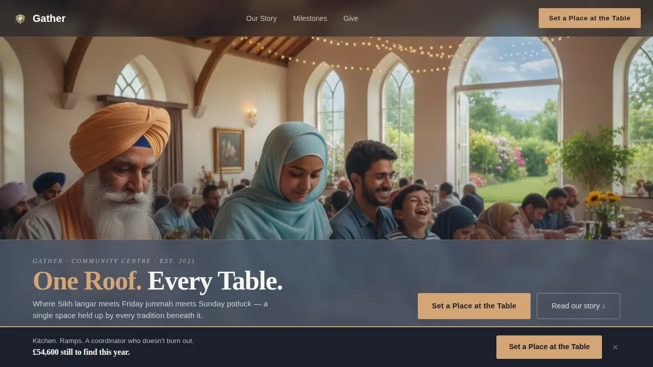
The hero image fills ninety percent of the viewport. It is a wide-angle, candid shot taken during a shared meal inside the main hall. Fairy lights, exposed beams, and a garden glimpsed through tall windows give the photograph warmth and texture. A single line of copy, "One Roof. Every Table.", sits in sandstone against a translucent slate bar at the bottom of the frame. The emotional appeal is immediate and rooted in something real.
Four-Chapter Narrative Arc
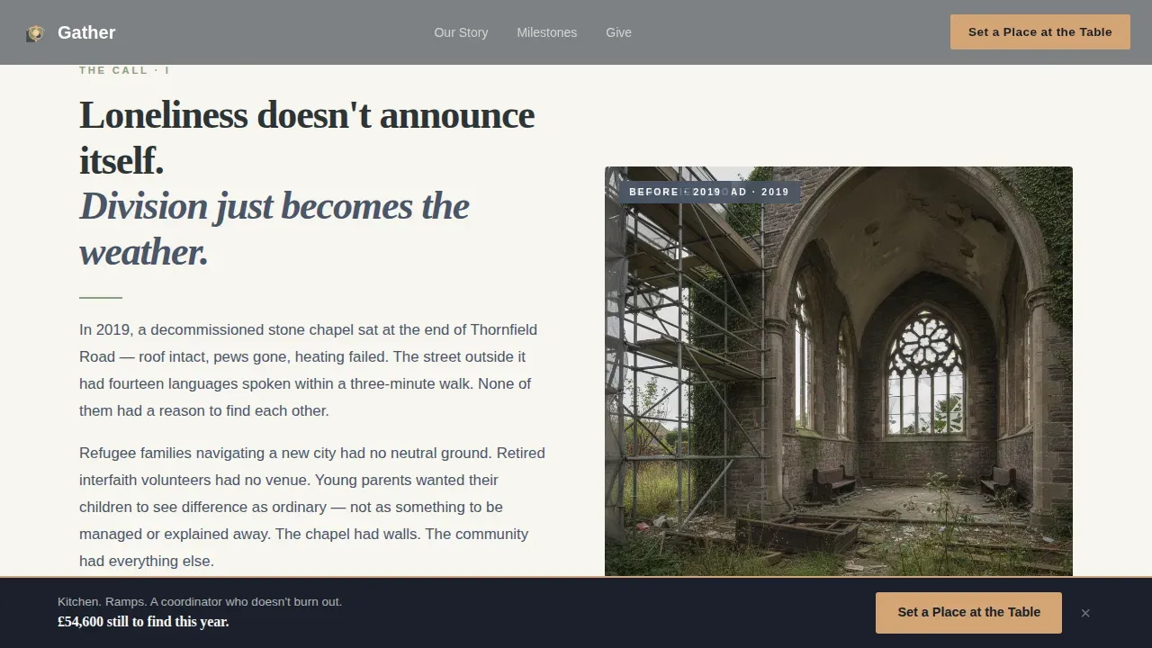
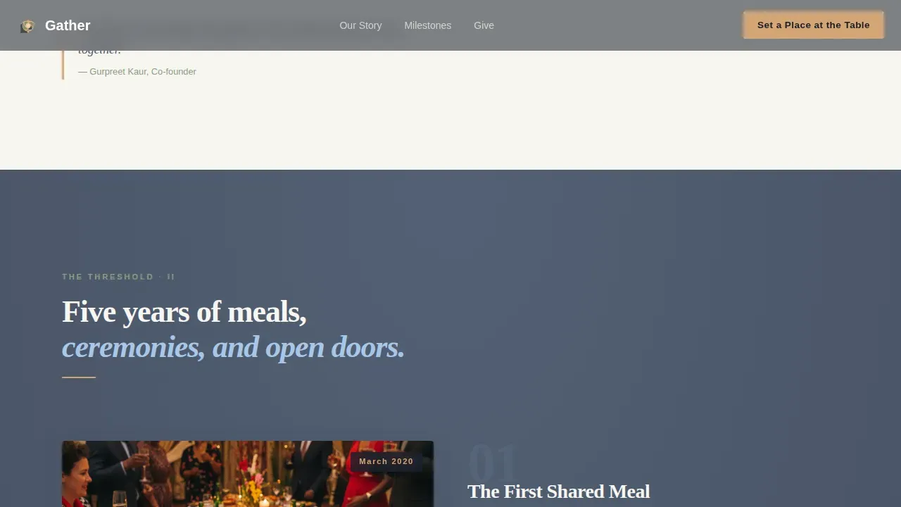
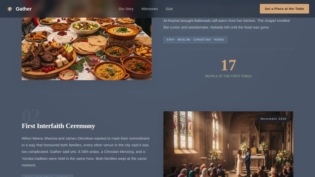
The scroll is a transformation sequence. "The Call" names the loneliness and division the center was built to answer. "The Threshold" presents a milestone timeline with candid photography and rising impact counters. "The Trials" lists specific unmet needs with exact costs beside each, new kitchen, accessibility ramps, youth mentorship coordinator. "The Return" closes with a mosaic grid of thirty-second video testimonials, each completing the sentence "This place gave me ___." Storytelling creates an emotional connection that motivates donors to give; this structure makes that connection deliberate and earned.
Named, Tiered Donation Form
The donation form offers three impact-driven tiers. Each tier has a name, not just a number. Donors appreciate having options for how much they give, and naming those options, "A Meal," "A Month of Meals," "A Seat on the Board", makes the donation amount feel purposeful. A custom-amount field sits below the tiers. A monthly giving toggle supports recurring donations so the center maintains a steady stream of income. The donation process is kept intentionally short to reduce drop-offs.
Sticky "Set a Place at the Table" call to action Bar
The primary call-to-action is a sandstone button on a slate bar that locks to the bottom of the screen. It appears only after the visitor scrolls past the milestone timeline, so it arrives at exactly the right emotional moment. Visible call-to-action buttons placed using a contrasting color are a proven method to increase donations and convert visitors who are emotionally ready. The timing of this bar is part of the design, not an afterthought.
Community Voices Mosaic Grid
"The Return" section is a mosaic grid of short video testimonials from community members of different faiths. Each video completes the same sentence, so the viewer hears the diversity of the answer. Visual storytelling, such as impactful imagery and videos, can complement written narratives to create a more compelling fundraising message. This section functions as both an emotional close and a trust signal.
Volunteer Sign-Up Path
Below the main donation form, a quieter secondary path reads "Volunteer With Us" in lichen green. It leads to a short online form collecting name, availability, and a multi-select of skills. This path helps the center recruit volunteers and engage supporters who are not yet ready to give money but are ready to give time. Community involvement grows when there is a low-friction entry point designed for it.
Page sections overview
| Section | Purpose |
|---|---|
| Full-Viewport Hero | Sets emotional tone and headline |
| The Call | Names the problem the center solves |
| The Threshold Timeline | Shows milestones and rising impact |
| The Trials Needs | Lists specific costs with transparency |
| The Return Mosaic | Shares community voices and videos |
| Donation Form Tiers | Collects gifts across three named levels |
| Sticky call to action Bar | Persists sandstone giving prompt on scroll |
| Volunteer Sign-Up | Offers a secondary non-monetary entry point |
Design & branding system
The design language follows a Nature-Inspired theme built on the Slate and Sky color system. Every color choice has a physical reference: weathered stone, lichen on a hillside, open sky after rain, and warm sandstone underfoot. The palette feels grounded, unhurried, and inclusive without trying to be cheerful.
- Core colors: weathered slate (#4A5568) and soft off-white (#F7F5F0) alternate as section backgrounds; deep charcoal (#2D3436) carries all body text; lichen gray-green (#8B9D83) marks secondary links and volunteer paths; warm sandstone (#D4A574) is reserved for primary buttons, donation tiers, and highlighted impact numbers; open-sky blue (#A7C7E7) washes appear behind testimonial cards
- Typography and layout: text lives in deep charcoal for maximum readability; backgrounds alternate to create visual rhythm without adding noise; the hero uses a translucent slate overlay bar so the headline reads clearly against any photograph
- Imagery direction: photographs are candid, warm, and slightly chaotic, a Sikh elder and a hijabi teenager working side by side, a toddler mid-laugh, fairy lights above exposed beams; the pre-renovation image in "The Call" provides deliberate contrast to show transformation
Mobile & speed optimization
The template is built for mobile devices from the ground up. Visitors arriving through digital advertising, push notifications, or shared links on a phone should experience the same emotional arc as desktop visitors, without compromise.
- The hero image is composed for vertical crop, keeping the core scene, the shared meal, the fairy lights, the garden window, legible at any screen width on mobile devices
- The sticky sandstone call to action bar is sized for thumb reach and appears after the appropriate scroll depth on smaller screens, keeping the donation process smooth for users who give on their phones
- The donation form, volunteer sign-up, and video mosaic grid are each designed to reflow cleanly, so financial transactions and sign-up steps feel simple regardless of the device used
How this template helps you convert
A fundraising landing page only works when it moves visitors from interest to action. This template is structured to do exactly that, without pressuring the donor before they are ready.
- The narrative arc earns trust before asking for anything. By the time the visitor reaches the donation form, they have already seen the milestone history, the honest needs list with specific costs, and the community voices grid. The emotional part of a fundraising landing page assures the donor that their donation will make a difference, while the practical part makes the donation process simple and easy. Donors who feel a personal connection to the cause are more likely to contribute.
- Named tiers, a monthly giving toggle, and a custom-amount field reduce friction and raise money at every level. Offering impact-driven donation tiers illustrates how different donation amounts support the diverse needs of the community. The monthly giving option supports recurring giving, turning one-time gifts into long-term relationships and helping the center raise additional funds over time.
- The sticky call-to-action bar keeps the giving prompt visible without interrupting the story. It appears at exactly the right scroll point and uses sandstone on slate, a high-contrast combination, to draw the eye. A compelling call-to-action can significantly impact fundraising success, and timing its appearance to the emotional peak of the page is a deliberate design decision that helps convert visitors efficiently.
Other information about this template
This section covers additional practical context for anyone evaluating the Gather "One Roof Every Tradition" fundraising landing page template for their campaign, cause, or organization.
- Fundraising event compatibility: The page structure supports promotion of any fundraising event tied to the center, a community potluck where everyone contributes their best dishes, a charity art auction (live or silent art auctions are among the most profitable fundraising events), a talent show where participants pay a small entry fee, or seasonal drives during the holiday season that carry genuine holiday cheer. Community yard sales and bake sales can be featured in "The Trials" or "The Threshold" sections as milestone events.
- Peer to peer fundraising and crowdfunding: The volunteer and community voice sections create a natural entry point for peer to peer fundraising. Congregation members, youth group leaders, and church members who feel connected to the story can extend the campaign by sharing it with their own networks. A peer to peer fundraising campaign can significantly extend reach by empowering individuals to fundraise on behalf of the organization. This template also provides the emotional foundation needed for a crowdfunding campaign by making the cause feel immediate and personal.
- Hybrid fundraising strategies: Hybrid fundraising strategies integrate both online and offline methods to maximize donations. This template supports that blend. QR codes placed at donation kiosks or printed programs during an in-person event can direct attendees to the donation page and keep online donations flowing after the room empties. Churches should promote digital giving options during in-person services to encourage participation from all attendees. Combining digital and physical touchpoints helps reach the wider community beyond those who can attend in person.
- Broader fundraising tools: Teams can use the template as a campaign site alongside merchandise sales of branded goods, which give participants a memento and raise extra money. You can sell tickets to events like a charity golf tournament where participants pay an entry fee. You can also sell raffle tickets for a travel raffle offering a vacation prize, or invite members to a seasonal silent auction where they bid on donated items. Sell raffle tickets online by linking the donation page to a simple raffle ticket sign-up form. A small admission fee model also works for talent shows or film nights hosted at the center.
- Capital campaigns and major donors: The "Seat on the Board" tier at £500 provides a natural entry point for capital campaigns and major donors. Teams can use this tier as a gateway to a longer, more personal conversation about significant funds or multi-year giving commitments.
- Recurring donations and monthly giving: The monthly giving toggle on the donation form supports recurring donations and recurring giving without requiring a separate campaign page. Transparent communication about how donations are used increases donor trust and makes recurring giving easier to commit to.
- Volunteer and engagement paths: The secondary volunteer sign-up is designed to recruit volunteers efficiently. It collects name, availability, and a skill multi-select so the center can match people to real needs quickly. This is especially useful for organizations that rely on congregation members, youth group participants, and local businesses who prefer to give time rather than money.
- Expanding reach and additional funds: Digital advertising, push notifications, and shared links can all direct traffic to this fundraising landing page. The page structure is designed to engage a target audience that may arrive cold, knowing nothing about the center. Compelling narratives can enhance donor engagement and retention by demonstrating real-world outcomes. A thank you page built to complement this template should express gratitude and remind donors how their gift translates into practical change, a full meal, a month of programming, or a seat at the decision-making table. Regularly reviewing and updating the donation page to reflect current programs and campaigns helps maintain momentum and raise awareness over time. A crowdfunding campaign can also direct traffic to this page as its central hub, increasing the funds raised across multiple channels. Strong nonprofit landing pages create a scalable system for acquisition, engagement, and long-term supporter retention. Using analytics and testing can improve the performance of online donation platforms over successive campaigns. The goal is always the same: raise money in a way that makes every donor feel they belong to something real.
- Creative fundraising ideas this template can support: A bake sale or community yard sale promoted through the page gives congregation members a way to donate goods and time. Local businesses can be featured as sponsors in "The Threshold" timeline. Virtual ideas, such as online auctions or livestream concerts, can be embedded or linked from the video mosaic section to engage a wider community online. Hosting a talent show with a small admission fee, a golf day where charge participants pay an entry fee, or themed in-person event evenings can each be promoted through the fundraising landing page as a campaign site to boost fundraising and raise awareness beyond the immediate congregation. Events work best when they are connected to a page that tells the full story, because donors who see the context give more money and return more often. A perfect event promoted through a well-built fundraising landing page can boost engagement significantly and encourage donations from people who might otherwise never have heard of the center. Whether you want to double the donation impact of a specific event through matched giving or simply collect donations from new community members, this template gives you the structure to do it with clarity, warmth, and purpose.
Theme
Nature-Inspired
Creative direction
Hero's Journey
Color system
Slate & Sky
Style
Hero-Dominant (90/10)
Direction
Donation/Fundraising
Page Sections
90/10 Hero-dominant Viewport Layout
Four-chapter Hero's Journey Arc
Named Three-tier Donation Form
Scroll-triggered Sticky Call to Action Bar
Community Voices Mosaic Grid
Secondary Volunteer Sign-up Path
Related questions
Who is this fundraising landing page template designed for?
Can this template support recurring donations and monthly giving?
How does the Hero's Journey structure improve the donation process?
Can this template support peer to peer fundraising and volunteer sign-ups?
Is this template suitable for promoting a fundraising event alongside online giving?


