Agency Owners Co-Working Community Landing Page
Gather is a masonry-style landing page built for agency owners co-working communities. It leads with an honest candid hero photo, cascades member stories and workshop proof through a pinboard card layout, and gates a downloadable burnout self-assessment behind a simple two-field form. The template combines warm botanical visuals with a resource-first content flow designed to turn isolated founders into active community members.
by Rocket studio
Quick summary
Gather is a single-page community landing page for agency founders who are tired of leading alone. It opens with a film-grain candid team photo, moves through a masonry proof-board of member stories and workshop snapshots, and delivers a free burnout audit download before asking for anything in return. The design feels warm, grounded, and intentionally human.
Who this template is for
This template was built for founders running small creative agencies, dev shops, or performance marketing businesses who want to grow a real peer community around their work. It suits community builders who need a landing page that earns trust before it asks for a signup.
- Solo creative directors scaling past six figures and feeling the weight of every decision alone
- Performance marketing founders and dev shop owners rebuilding after burnout or a difficult season
- Community organizers in the agency space offering free resources, workshops, or virtual sessions
What problem this template solves
Agency founders often carry the hardest decisions without anyone in the room who truly understands. Generic community pages feel cold or corporate. This template solves the trust gap by leading with vulnerability, proof, and free value before any conversion ask appears.
- Isolation and decision fatigue are named directly in the hero, so the right visitor feels seen immediately
- Vague membership pitches are replaced by real-feeling masonry proof: member stories, retreat photos, and Slack pull quotes
- The resource gate arrives after the visitor has already received context and value, making the ask feel natural
What you get with this template
You get a fully structured single-page layout with every section pre-built and ready to populate with your community's real content. The layout handles both emotional storytelling and practical conversion in one continuous scroll.
- A film-grain hero section with a candid team photo crop, emotional headline, and scroll-linked entrance animation
- A masonry card board with staggered reveal animations for member stories, workshop snapshots, pull quotes, and resource covers
- A primary burnout audit download gate with an email field, a single qualifying question, and a magnetic call-to-action button with micro-interaction
Feature list
This template includes a focused set of built-in components drawn directly from the brief. Each one serves the community's core goal of converting isolated founders into engaged members.
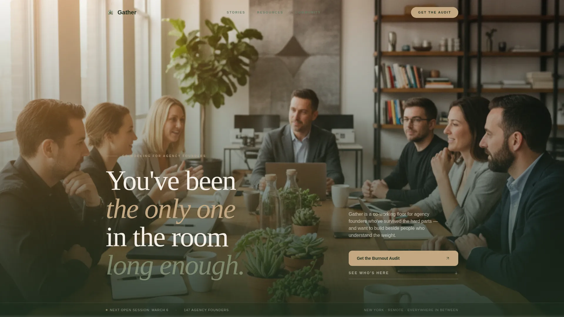
Film-Grain Candid Hero Section
The hero opens with a wide-crop team photo treated with a film-grain overlay. A subtle parallax effect activates on scroll. The composition includes space for an emotional headline that speaks directly to the founder's experience of leading alone.
Masonry Pinboard Card Layout
Cards cascade in a Pinterest-style masonry grid with staggered entrance animations tied to scroll position. Each card supports member stories, workshop snapshots, retreat recaps, resource covers, and Slack-thread pull quotes. Hover states activate on every card for desktop interaction.
Burnout Audit Download Gate
The primary call-to-action section includes an email input field and one qualifying question asking about team size. A magnetic call-to-action button with a micro-interaction animation completes the form. The gate is positioned below enough proof that the download feels like the next logical step.
Free Resource Secondary Cards
Below the gate, a second tier of cards links to podcast episodes, community playbooks, and a monthly virtual open-door session signup. These cards deliver value before the visitor decides whether to join, reinforcing the resource-first content strategy.
Community Pulse Social Proof Row
A dedicated section surfaces Slack-thread pull quotes and momentum statistics. This section sits between the masonry board and the download gate, building confidence at the moment the visitor is closest to converting.
Arc Browser Split Footer
The footer uses a split layout with logo and tagline on the left and navigation links on the right. It closes the page with brand grounding and clear wayfinding without cluttering the conversion flow above it.
Page sections overview
| Section | Purpose |
|---|---|
| Hero with photo | Open with candid team image and emotional headline |
| Masonry proof board | Display member stories, workshop photos, and pull quotes |
| Burnout Audit gate | Collect email and team-size answer for PDF download |
| Free Resources cards | Link to podcast episodes, playbooks, and virtual session |
| Community Pulse row | Show Slack quotes and momentum statistics as social proof |
| Arc Browser Split Footer | Close with logo, tagline, and navigation links |
Design & branding system
The visual identity follows a Healing Space theme built on a Botanical color system. Every color choice and typographic pairing reinforces the feeling of something warm, slow, and genuinely restorative rather than polished or performative.
- Colors: deep fern (#2D5F2D) as the primary tone, sun-warmed linen (#F5F0E8) as the background, dried eucalyptus (#8A9A7B) as a secondary accent, and living clay (#C4A882) for buttons and interactive cards
- Typography: Fraunces serif carries emotional weight in headlines, while DM Sans handles body copy with clarity and calm
- Texture and atmosphere: film grain on the hero photo, organic whitespace throughout, and a composition language that feels handmade rather than templated
Mobile & speed optimization
The template is built desktop-first, reflecting how agency founders typically browse and research tools. Mobile adaptation is strong so the same founder can finish reading on their phone later in the day.
- Masonry layout and scroll-linked animations are handled by client-side components, while static content sections use server components for faster initial load
- Staggered card entrances and parallax effects are scoped to avoid layout shifts on smaller screens
- The burnout audit form collapses cleanly to a single-column layout on mobile, keeping the two-field gate easy to complete on any device
How this template helps you convert
The content flow follows a Movement and Cause structure: the scroll begins with the shared wound and moves toward the collective remedy. Conversion happens because trust is built before the ask arrives.
- The hero names the founder's specific pain (isolation, decision fatigue, leading alone) so the right visitor immediately feels the page was made for them, not a generic audience
- The masonry proof board builds credibility through real-feeling member evidence before any form or signup appears, so the visitor arrives at the download gate already convinced
- Free resource cards below the gate keep non-ready visitors engaged, giving them a lower-commitment next step that still moves them into the community's orbit
Other information about this template
This template is built for the agency owners co-working community niche and fits naturally into a broader community membership or creative agency professional network context. A few additional details are worth noting before you build.
- The template style is Masonry and Pinterest-grid inspired, making it well suited for content-heavy communities with ongoing member stories and workshop output to showcase
- The creative direction follows a Movement and Cause arc, meaning the page is structured to emotionally progress the visitor from recognition of pain toward belief in the remedy
- The header concept is a Team Photo, specifically a candid film-grain wide crop rather than a posed headshot grid, which signals authenticity before a single word is read
- The landing page direction is Content and Resource focused, meaning value delivery (the burnout audit PDF) is the primary conversion goal rather than a paid membership or direct sales transaction
- This template fits the Community and Nonprofit category and the Agency Owners Community subcategory within that space


Theme
Healing Space
Creative direction
Movement & Cause
Color system
Botanical
Style
Masonry/Pinterest
Direction
Content/Resource
Page Sections
Film-grain Candid Hero Section
Masonry Pinboard Card Layout
Burnout Audit Download Gate
Free Resource Secondary Cards
Community Pulse Social Proof Row
Arc Browser Split Footer
Related questions
Who is the primary audience for this landing page template?
What is the primary call to action on this page?
Can I use this template for a community with ongoing content like podcasts or playbooks?
What makes the masonry layout different from a standard card grid?
Does the page work well on mobile devices?


