Geriatrics Support Community Landing Page Template
Gather is a split-screen landing page for a geriatrics support group and community. It pairs animated caregiver statistics with warm, honest FAQ content to guide adult children, retired spouses, and social workers toward real help. The inline Caregiver Readiness Assessment and secondary community path make it easy for every visitor to find a next step that fits where they are right now.
by Rocket studio
Quick summary
Gather is a split-screen landing page built for a geriatrics support community. It leads with grounding statistics, moves through honest FAQ sections addressing real caregiver questions, and ends each major block with an inline five-step Caregiver Readiness Assessment. The page feels warm, clinical, and unhurried, the right tone for people navigating some of the hardest decisions of their lives.
Who this template is for
This template is designed for organizations, practitioners, or community builders serving family caregivers of aging parents. It speaks directly to people managing elder care, whether from across the street or across the country.
- Adult children between ages 35 and 60 coordinating a parent's medication schedules, mobility support, or cognitive care
- Retired spouses learning to advocate within a medical system that was not built for solo navigators
- Social workers and care coordinators looking for a credible community resource to share with clients
What problem this template solves
Family caregivers often spend over a year searching for support that actually matches their situation. Generic pamphlets and cold clinical websites do not answer the questions people ask at two in the morning. This template solves the trust gap by leading with honest data, honest questions, and honest answers.
- Caregivers arrive with anxiety and leave with a clear next action, because every FAQ section ends with a practical resource
- The Caregiver Readiness Assessment replaces guesswork with a five-step self-evaluation that results in a personalized resource guide
- The secondary call to action gives hesitant visitors a low-pressure path into the community without requiring self-disclosure upfront
What you get with this template
You get a fully structured single-page layout built for the geriatrics support niche. Every section is purposeful and every interaction is designed to reduce friction for a stressed, time-limited audience.
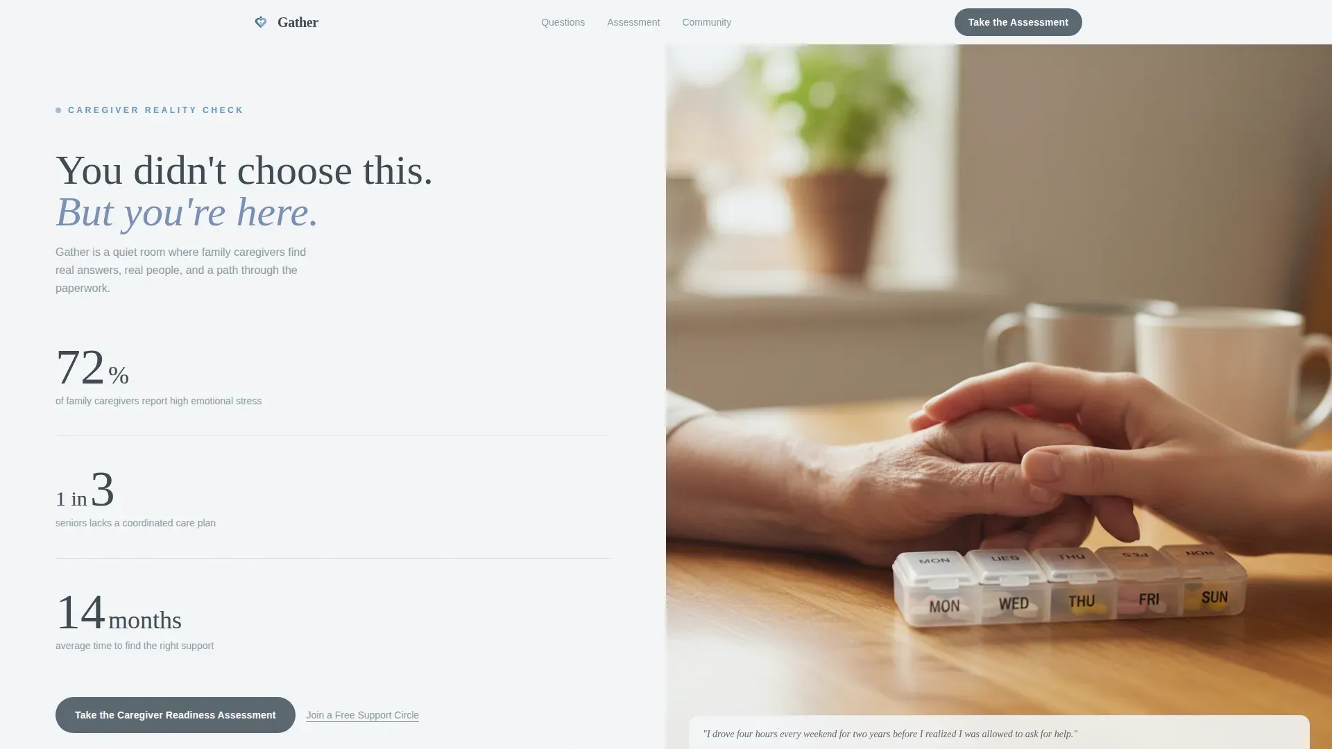
- A 50/50 split-screen hero section with animated statistics on the left and a warm, intimate photograph placeholder on the right
- Three FAQ split sections, each pairing a real caregiver question in large serif type with a paired resource card on the right half
- An inline five-step Caregiver Readiness Assessment with a dropdown, multiple-choice options, a slider, a one-to-five emotional support scale, and a name and email capture field
Feature list
Gather includes a carefully chosen set of interactive and visual features. Each one serves the core purpose: helping caregivers trust this community quickly and take a meaningful next step.
Animated Statistics Hero Panel
The left panel of the hero section displays three real caregiver data points in large, unhurried typography. Numbers animate in gently using counter animations, arriving like facts from a calm physician rather than a sales pitch.
FAQ-Driven Split Sections
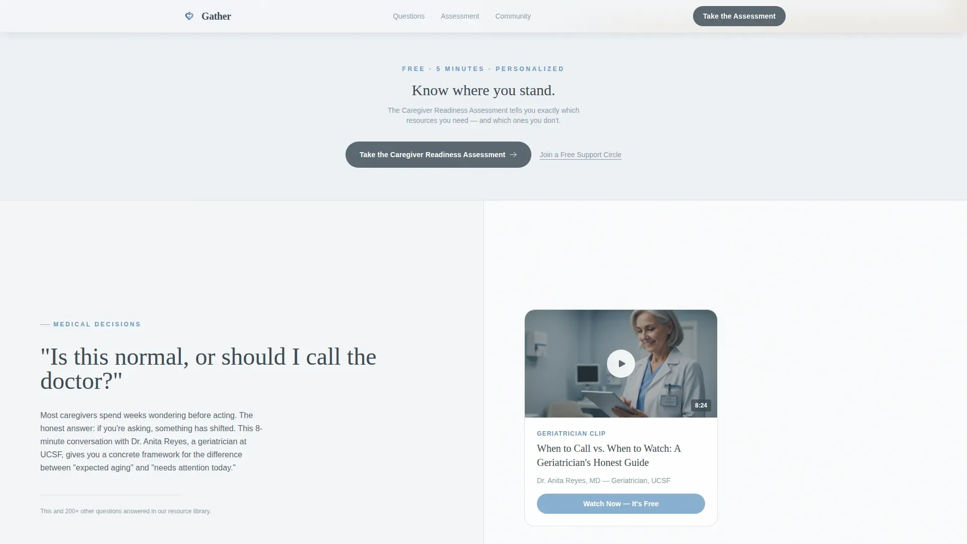
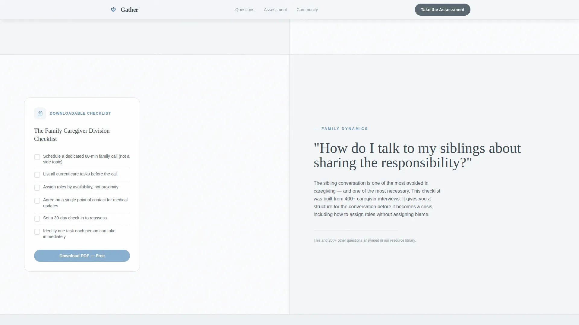
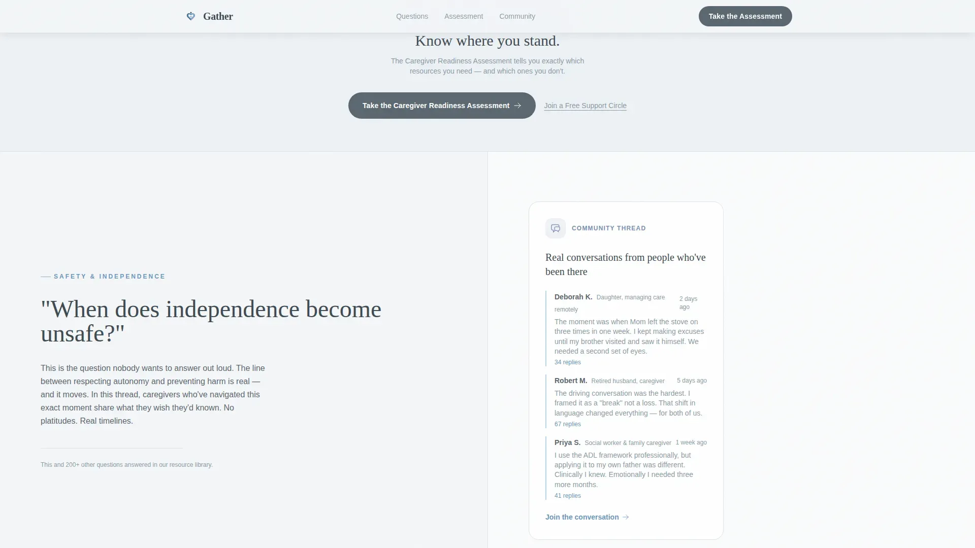
Three full-width split sections each pose a question that real caregivers ask. The left half holds the question and a brief honest answer in Fraunces serif type. The right half holds a paired resource such as a geriatrician video card, a downloadable checklist, or a community thread preview.
Inline Five-Step Assessment
The primary call to action opens an assessment directly on the page, not in a new tab. Visitors move through five progressive questions covering caregiving role, daily challenges, hours per week, emotional support level, and contact details. The result is a personalized resource guide.
Dual Conversion Paths
Below every assessment block, a secondary text link reads "Join a Free Support Circle." This gives visitors who are not ready to self-assess a softer, lower-commitment entry point into the community.
Healing Space Visual System
The Slate and Sky color palette uses weathered slate gray for grounding text, soft clinical white for breathing room, and sky-blue on interactive elements. The overall effect is warm enough to exhale in while still feeling credible and trustworthy.
Staggered Scroll Reveal Animations
Gentle scroll-triggered reveals and staggered text animations guide the eye down the page without escalating anxiety. Transitions feel deliberate and calm, matching the page's quiet authority tone.
Page sections overview
| Section | Purpose |
|---|---|
| Hero Stats Panel | Display three animated caregiver statistics alongside an intimate hands photograph |
| FAQ Split One | Answer "Is this normal or should I call the doctor?" with a geriatrician resource card |
| Assessment Block One | Prompt visitors to take the inline Caregiver Readiness Assessment |
| FAQ Split Two | Answer "How do I talk to my siblings about sharing responsibility?" with a downloadable checklist |
| FAQ Split Three | Answer "When does independence become unsafe?" with a community thread preview |
| Final Call to Action | Repeat the assessment prompt and offer the free support circle text link |
| Footer Row | Single-row linear footer with essential links and contact details |
Design & branding system
The visual identity follows a Healing Space theme. Every color choice and typographic decision reinforces quiet authority and warmth without sacrificing clinical credibility.
- Color palette: slate gray (#5B6770) for primary text and grounded sections, clinical white (#F4F6F8) for backgrounds, sky-blue (#89B0D0) for interactive elements and progress indicators, and muted periwinkle (#7A8FB5) for secondary accents
- Typography pairing: Fraunces serif for questions and headlines, which carries emotional weight, and DM Sans for body copy and interface elements, which keeps things readable and clean
- Photography direction: a single tightly composed image of two hands on a kitchen table, one older and one younger, with a pill organizer between them, no faces, the intimacy is in the detail
Mobile & speed optimization
The template is built desktop-first, reflecting the reality that caregivers often research late at night from a desk or laptop. Full mobile support is included so the experience remains usable on any screen size.
- Static-first build structure keeps the base page fast, with client-side components loaded only for the assessment form and scroll animations
- The five-step inline assessment uses a slider, dropdown, and scale inputs that are touch-friendly and function correctly on mobile screens
- Scroll reveal and counter animations are medium intensity, designed to perform reliably without heavy resource demands
How this template helps you convert
Every structural decision in Gather is aimed at moving a stressed, skeptical visitor toward one meaningful action. The page does not rush or overwhelm; it builds confidence section by section.
- The hero statistics create immediate credibility by grounding the visitor in shared, recognizable data before asking them to do anything
- Each FAQ section dismantles a specific anxiety with a direct answer and a concrete resource, so trust compounds as the visitor scrolls
- The Caregiver Readiness Assessment repeats after every third FAQ block, catching visitors at the moment their confidence peaks, while the secondary support circle link keeps the door open for anyone not yet ready
Other information about this template
This template is localized for English-language audiences in the United States, using USD currency references and standard US date formats. It is a single-page layout with a linear single-row footer pattern.
- The assessment collects a first name and email address, enabling a follow-up personalized resource guide to be delivered after completion
- The page is designed for a desktop-first experience but includes responsive behavior for tablet and mobile viewports
- Animation intensity is set to medium, meaning transitions are noticeable and purposeful but never distracting or performative
Theme
Healing Space
Creative direction
FAQ-Driven
Color system
Slate & Sky
Style
Split Screen (50/50)
Direction
Quiz/Assessment
Page Sections
Animated Statistics Hero Panel
Faq-driven Split Sections
Inline Five-step Assessment
Dual Conversion Paths
Healing Space Visual Identity
Staggered Scroll Reveal Animations
Related questions
Who is this landing page template designed for?
What is the Caregiver Readiness Assessment and how does it work?
Can I customize the FAQ questions and paired resource cards?
What happens if a visitor is not ready to take the assessment?
What typography and colors does this template use?



