Summer Season Business Portfolio Website Template
Gather is a masonry-style landing page template built for summer event planning studios. It uses a Citrus Burst color palette, a full-bleed editorial hero, and a staggered Pinterest-style grid to showcase five event categories. Every section builds visual desire, leading visitors toward a single clear call to action: Plan Your Summer.
by Rocket studio
Quick summary
Gather is a single-page landing page template designed for full-service summer event planners. It opens with a Dutch-angle farm table hero, flows through a staggered masonry grid of five event categories, and weaves in two testimonial strips before closing with a minimal footer. The entire experience is built to convert desire into one decisive click.
Who this template is for
This template suits event planning studios that sell a premium outdoor summer experience. It works best for teams who want their portfolio to feel editorial rather than transactional.
- Brides planning golden-hour outdoor ceremonies who want proof, not paperwork
- Startup founders and corporate coordinators booking retreats with personality
- Parents orchestrating milestone birthday weekends where every detail has to land exactly right
What problem this template solves
Most event planning pages list services and ask visitors to fill out a form too early. Gather flips that logic. It leads with visual evidence and builds desire before it asks for anything.
- Visitors leave before inquiring because the page feels generic and low-trust
- Five distinct event categories get buried in plain text instead of shown as immersive visuals
- Mobile urgency is missing, so seasonal momentum is never communicated
What you get with this template
You get a complete, ready-to-customize landing page with every section pre-built and positioned for maximum impact. The structure is deliberate from the first pixel to the footer.
- A full-bleed hero section, two masonry grid clusters, two testimonial strips, and a minimal footer
- A Citrus Burst color system with five defined hex values applied consistently across every section
- Fraunces display serif for headlines and DM Sans for body text, paired for editorial warmth
Feature list
This template is built around six core capabilities drawn directly from the brief.
Full-Bleed Dutch-Angle Hero
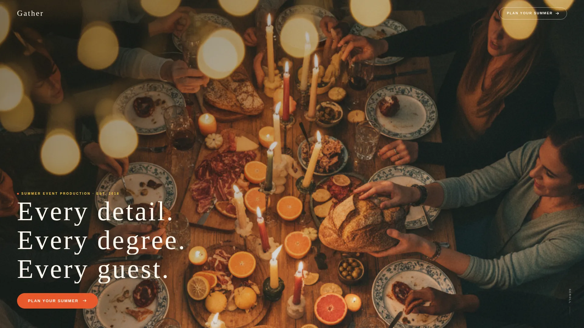
A top-down photograph of a long farm table mid-celebration fills the entire viewport with no padding or border. The headline sits low and left in a thin, wide-tracked cream serif, anchored against the shadowed corner of the image.
Staggered Masonry Grid with Parallax Hover
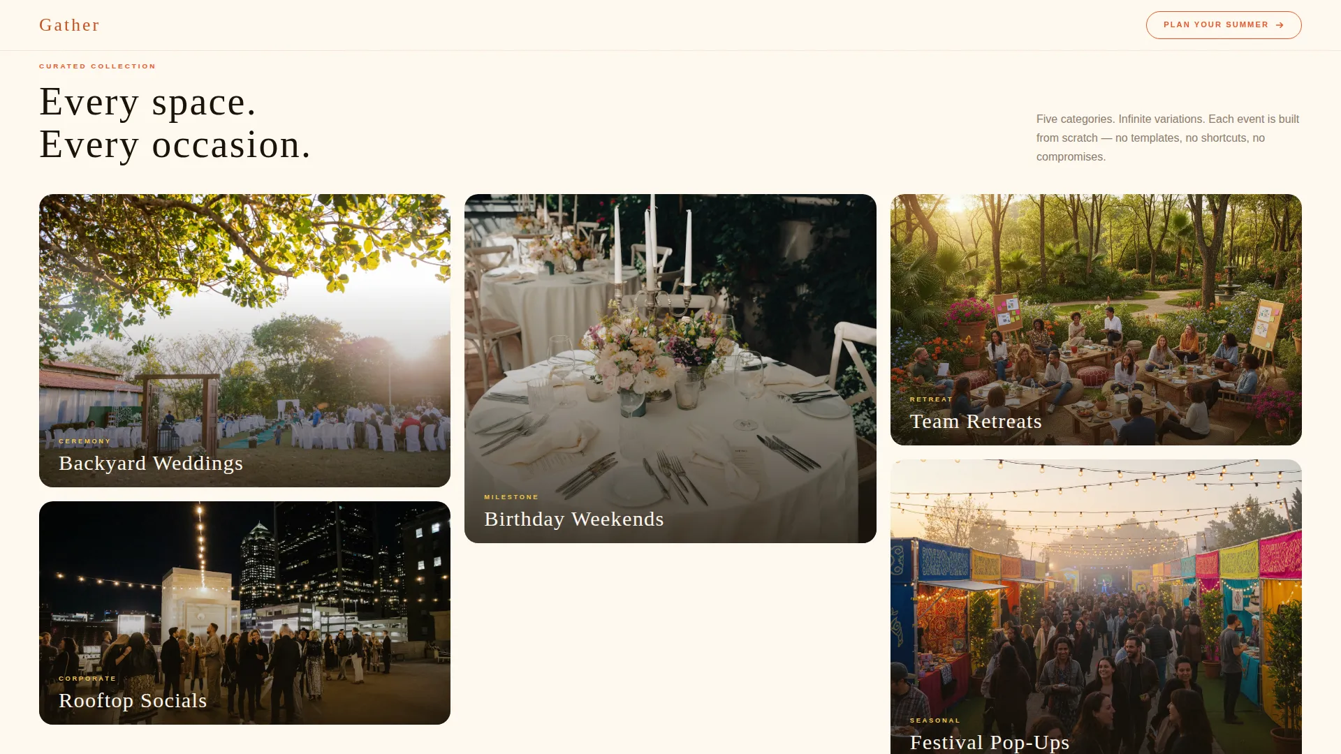
Five event category tiles load in a staggered sequence, each styled as a magazine cover with a hero image, a two-word label, and a parallax shift on hover. Tiles grow larger and more immersive as the visitor scrolls deeper into the page.
Two Testimonial Strip Sections
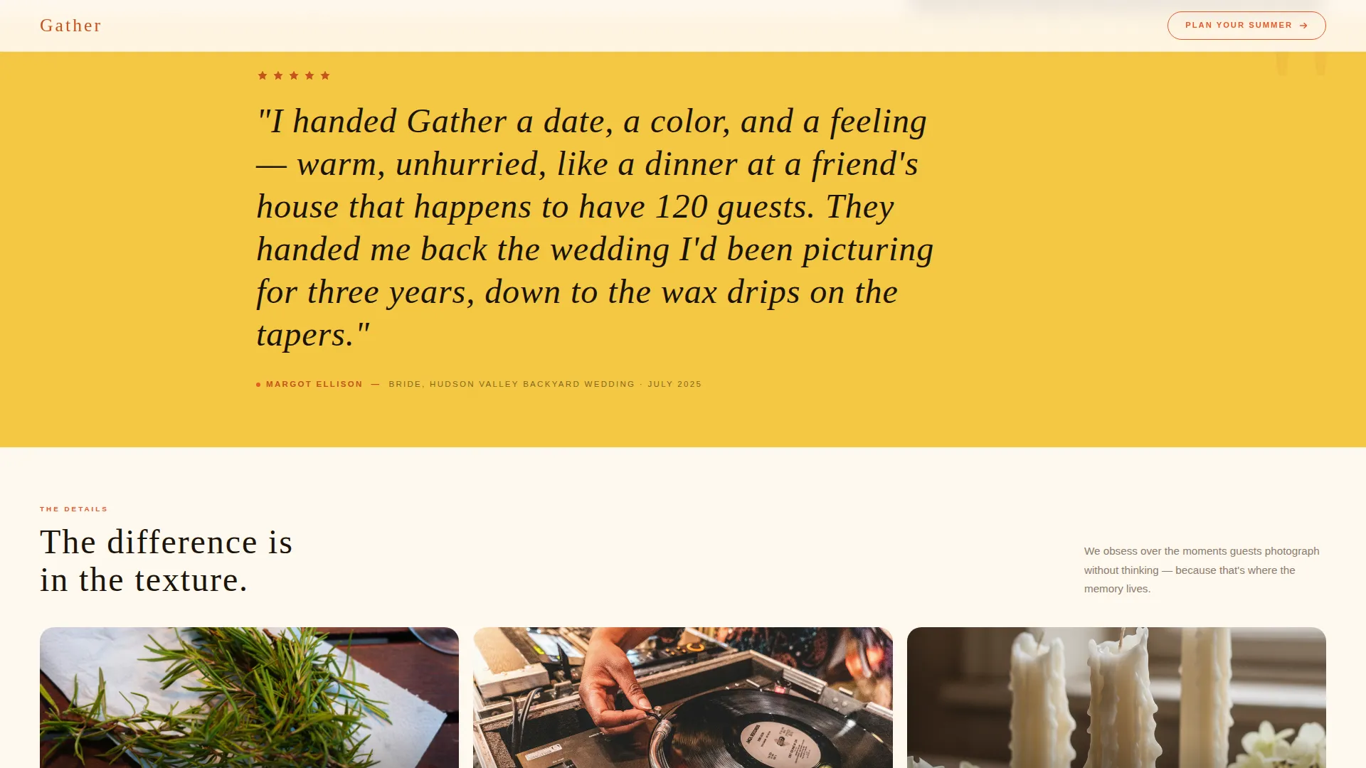
Oversized italic client quotes break the grid rhythm at two points in the scroll. Each strip sits against a Meyer lemon wash background, providing social proof without interrupting the visual momentum.
Detail Grid Close-Up Cluster
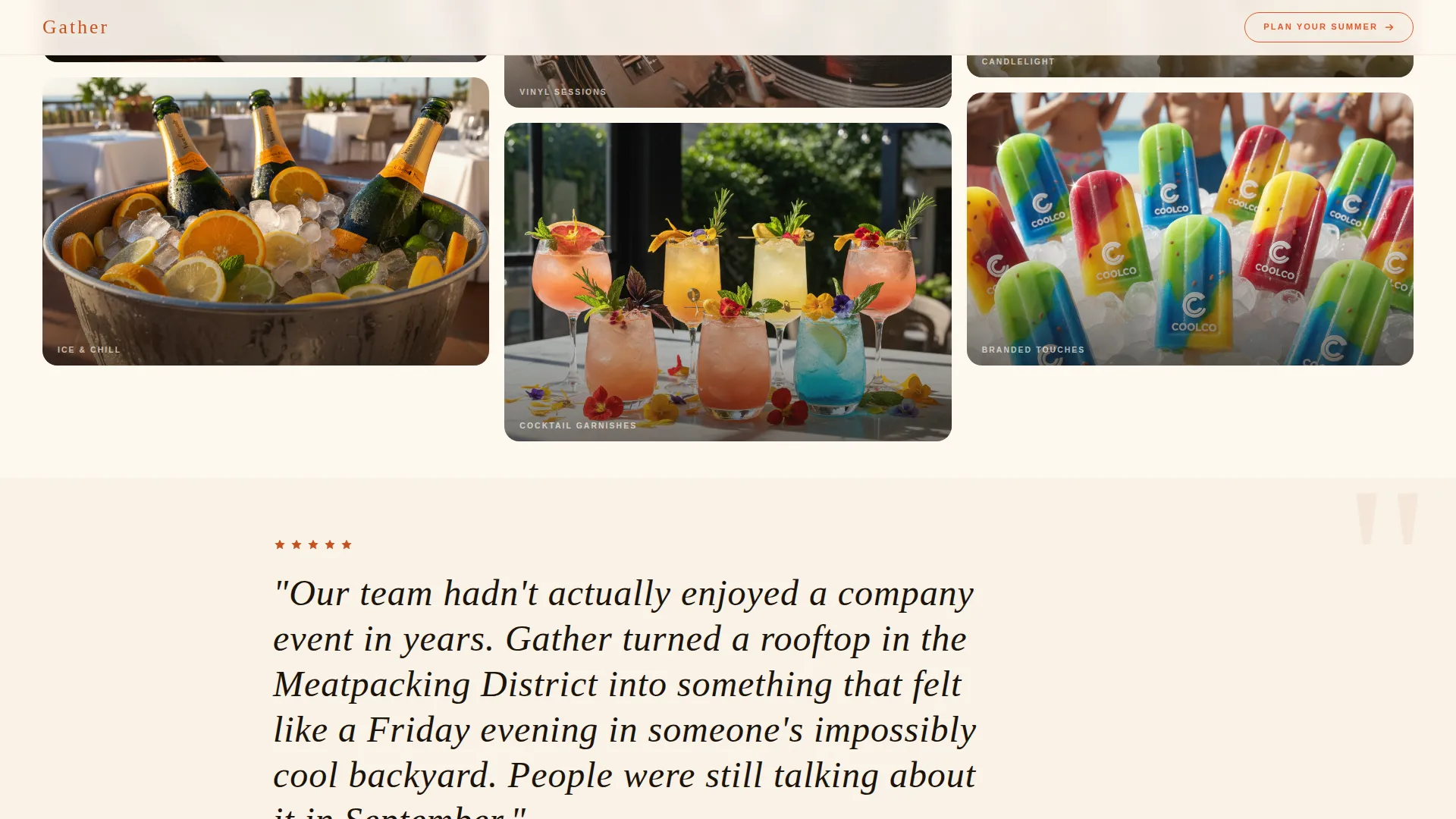
A second masonry cluster follows the first testimonial strip. It showcases texture shots of napkin folds, sweating ice buckets, a DJ's hand on vinyl, and cocktail garnishes, shifting the visitor's experience from browsing to craving.
Single Persistent Call to Action
Every masonry tile and the header both link to the same destination with the button text "Plan Your Summer." There is no form on this page. The entire structure is built to generate one confident click.
Floating Mobile Call-to-Action Bar
On mobile devices, a fixed bottom bar repeats the primary call to action with a secondary line beneath it reading "Limited summer weekends remaining." This communicates seasonal urgency without a countdown timer.
Page sections overview
| Section | Purpose |
|---|---|
| Full-Bleed Hero | Opens with a Dutch-angle farm table photo and low-left headline |
| Category Masonry Grid | Showcases five event types as parallax magazine-cover tiles |
| Testimonial Strip One | Breaks grid rhythm with an oversized italic quote on lemon wash |
| Detail Masonry Grid | Close-up texture shots shift the mood from browsing to craving |
| Testimonial Strip Two | Adds a second client voice before the page closes |
| Minimal Footer | Horizontal flow footer anchored in kumquat navigation text |
Design & branding system
The visual identity is built on a Citrus Burst palette that feels like a July farm stand. Sun-bleached white dominates the background, blood orange drives every button and hover state, and kumquat anchors footer and navigation text so the warmth stays grounded.
- Five defined hex values: #FFF9F0 white, #E8572A blood orange, #F5C842 Meyer lemon, #C7511F deep kumquat, #4A7C59 leafy stem green
- Fraunces in display weight for headlines; DM Sans in body weight for all supporting text
- Editorial sun-drenched visual style with linen-tablecloth warmth throughout every section
Mobile & speed optimization
The template is designed desktop-first, with a dedicated mobile treatment that adds a layer of urgency without altering the core visual experience.
- Images are lazy-loaded and transforms are GPU-accelerated to keep scroll performance smooth
- A fixed floating call-to-action bar appears at the bottom of the screen on mobile with the primary button and a seasonal urgency line
- GSAP scroll reveals and staggered tile animations are applied with performance-conscious techniques
How this template helps you convert
Gather is built entirely around one conversion goal: getting visitors to click "Plan Your Summer." Every design decision serves that outcome.
- The masonry grid builds layered visual proof across real event categories and close-up detail shots, so trust grows naturally as visitors scroll rather than being asked to read credentials.
- The floating mobile bar introduces seasonal scarcity through copy rather than a timer, making the urgency feel genuine and context-aware instead of manufactured.
Other information about this template
This template fits naturally within a broader summer season business strategy. It is built as a single landing page, not a multi-page site, so the focus stays on one action at every point in the scroll.
- Template style: Masonry/Pinterest layout with a Marketplace Grid theme
- Creative direction: Curated Collection, where each tile functions as a browsable editorial unit
- Landing page direction: Click-Through, with zero forms and a single destination link
- Header concept: Full-Bleed Photo with Dutch-angle composition and low-left serif headline placement
- Localization: English language, USD currency, and US date format
- Typography pairing: Fraunces for display headers combined with DM Sans for body and interface text
Theme
Marketplace Grid
Creative direction
Curated Collection
Color system
Citrus Burst
Style
Masonry/Pinterest
Direction
Click-Through
Page Sections
Full-bleed Dutch-angle Hero Section
Staggered Masonry Grid with Parallax Hover
Two Testimonial Strip Sections
Detail Close-up Masonry Cluster
Single-destination Click-through Structure
Floating Mobile Call-to-action Bar
Related questions
Does this template include any contact forms?
Can I change the event categories shown in the masonry grid?
Is the floating mobile bar included in the base template?
How many testimonial sections does this template include?
Can I use this template for non-summer events?



