Vibrant Festival Landing Page Template
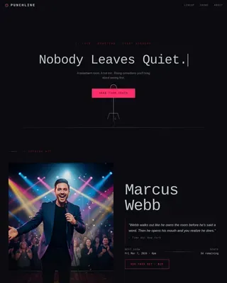
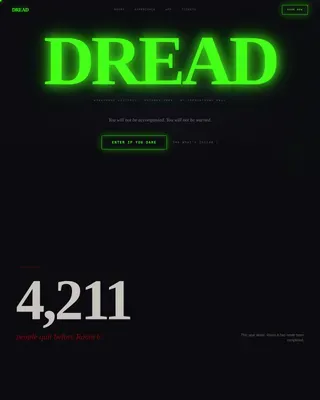
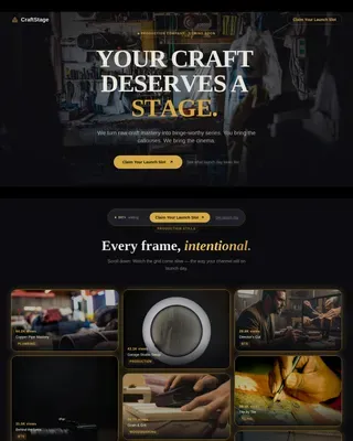
Gather is a single-column festival landing page built for community and cultural events. It pairs a full-screen video header with editorial creator spotlight cards to make your festival feel alive before anyone buys a pass. The cinematic dark palette, amber typography, and magenta call-to-action buttons combine to create an immersive, crowd-first experience that moves visitors toward your ticketing page.
by Rocket studio
Quick summary
Gather is a bold, single-column landing page for community and cultural festivals. It opens with immersive full-screen video, then scrolls through portrait-led creator spotlights that reveal your lineup person by person. The cinematic dark color system and editorial magazine layout make the festival feel alive and local, building real momentum toward the primary ticket call to action.
Who this template is for
This template is built for organizers who want their event page to feel as alive as the event itself. It works best when the festival identity is rooted in people, neighborhood culture, and a diverse mix of performers, makers, and food vendors.
- Festival and community event organizers promoting a multi-stage, multi-vendor weekend
- Local artists, makers, and small-business sponsors who want their presence on the page to feel meaningful
- Marketing teams or independent creators who need a visually striking click-through page without a complex build
What problem this template solves
Most festival pages list a lineup and stop there. Visitors scan, feel nothing, and move on without buying. Gather solves the engagement gap by replacing flat schedules with editorial storytelling that builds emotional investment scroll by scroll.
- Generic event pages fail to communicate neighborhood character or the feeling of being there
- Visitors who do not feel the energy of the event before the call to action rarely convert
- Organizers without large design budgets struggle to compete visually with major festival brands
What you get with this template
Gather delivers a fully structured single-column landing page with every section already designed and sequenced. The layout is built around the creator spotlight format, so the hardest editorial decisions are already made for you.
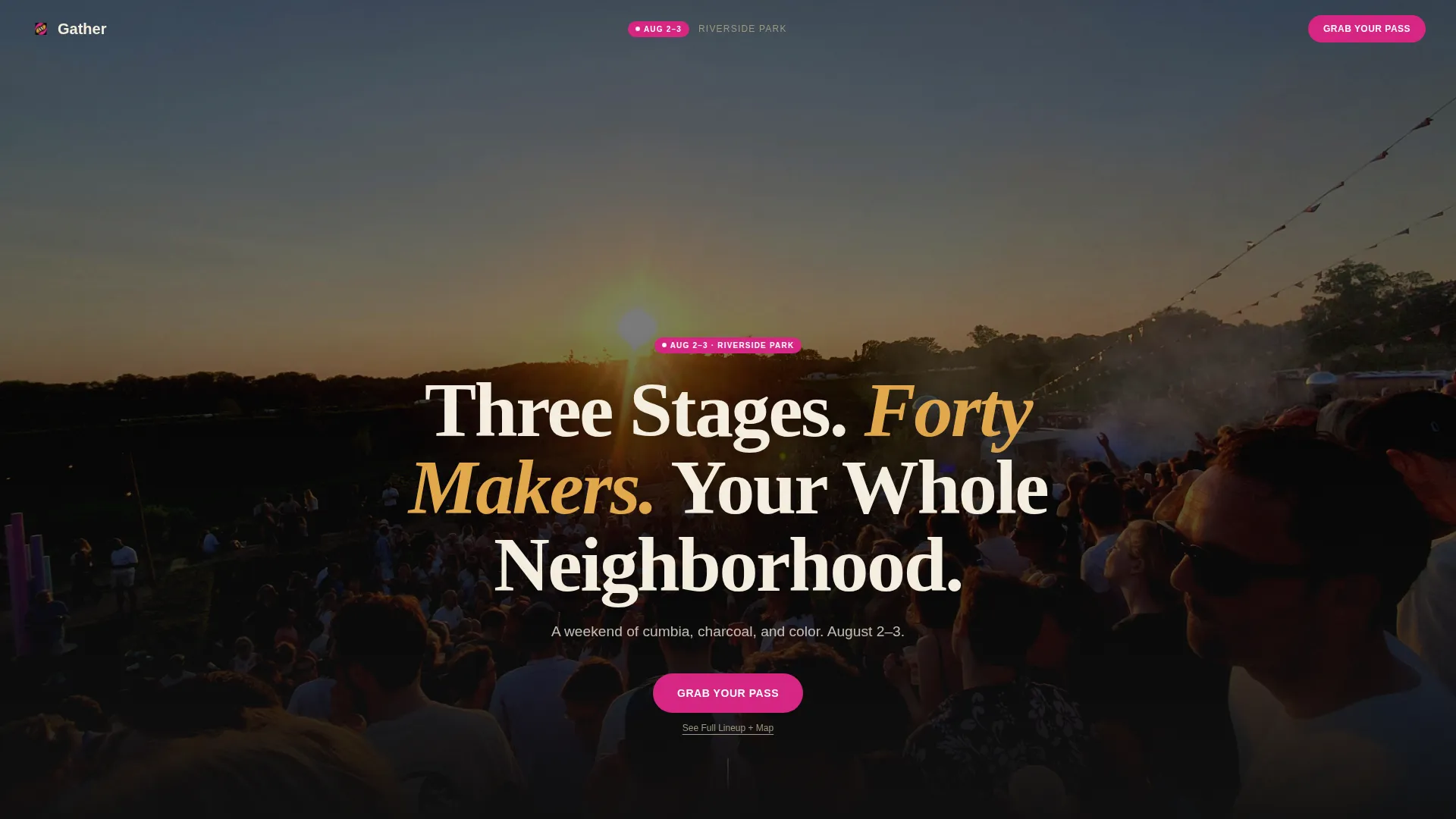
- A full-screen video background header with a centered headline overlay in cream sans-serif type
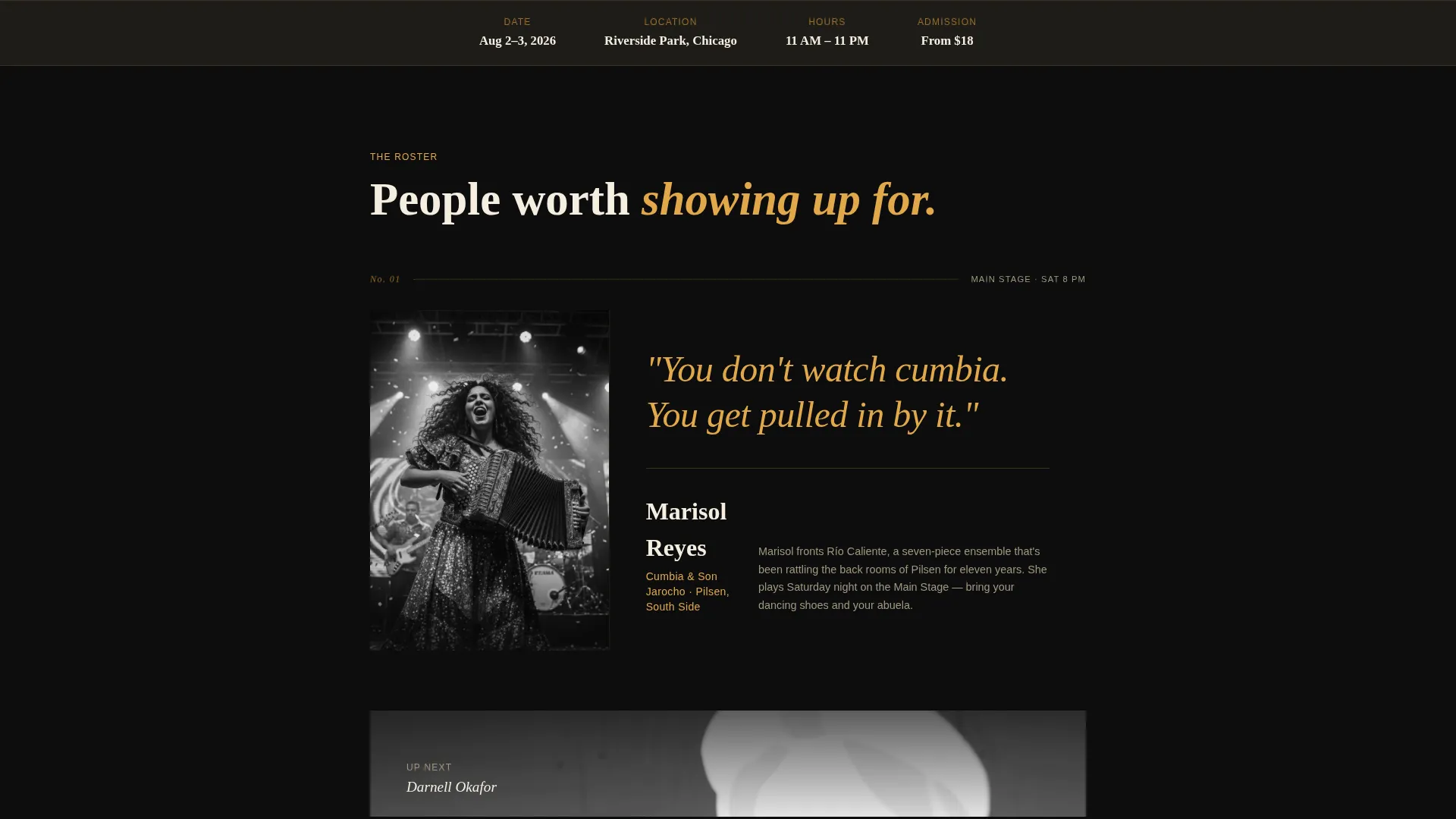
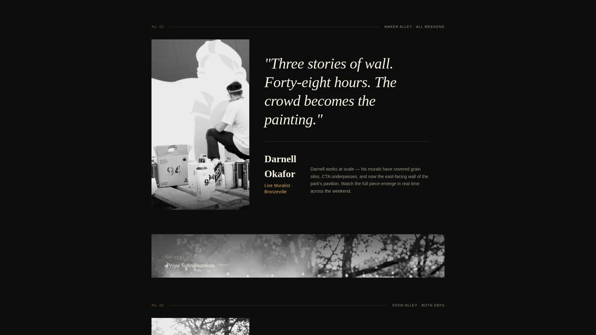
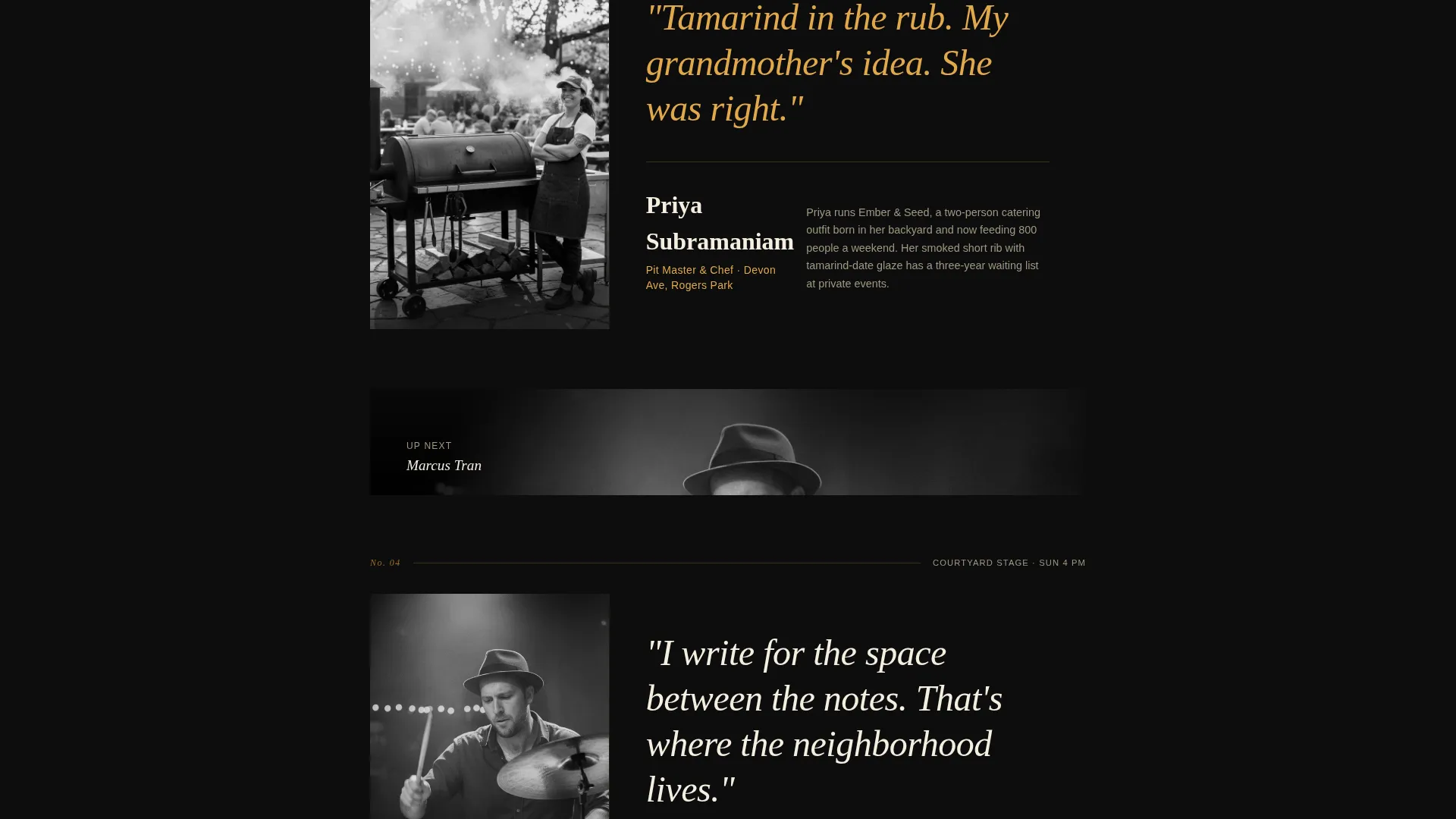
- A scrolling series of portrait-led editorial creator cards, each with a black-and-white photo, amber pull-quote, and two-sentence bio
- A sticky magenta call-to-action pill after the header, a full-width call-to-action band after the final spotlight, and a secondary text link beneath each button
Feature list
This template is designed around a specific creative direction. Every built-in feature serves the goal of making a community festival feel real, warm, and worth attending.
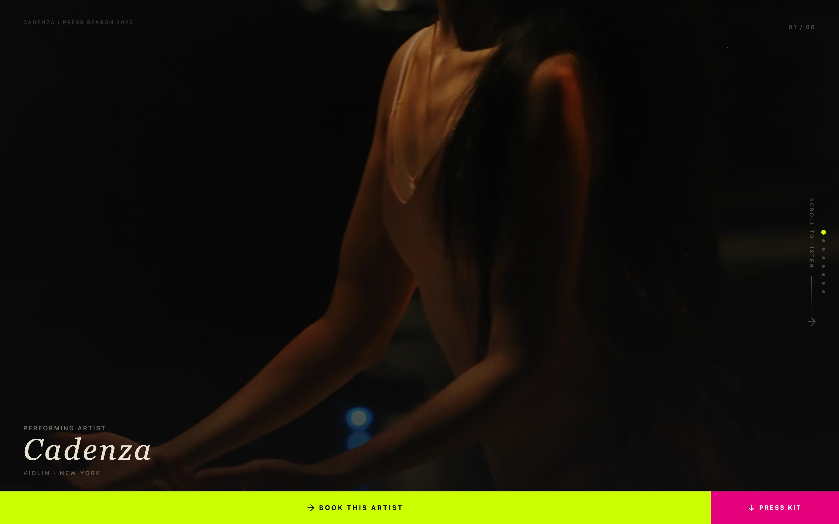
Full-Screen Video Background Header
The header fills the entire viewport with looping handheld footage. The warm, grainy, 24fps aesthetic signals authenticity rather than corporate production. A single cream headline fades up over the footage to anchor the visitor immediately.
Editorial Creator Spotlight Cards
Each spotlight card is a portrait-led editorial block. A tight black-and-white photo anchors the left third, a pull-quote runs large in amber serif type, and a concise two-sentence bio names the creator's craft and their neighborhood. Cards are sequenced so the next creator's photo peeks into frame as you scroll, creating natural forward momentum.
Sticky Click-Through Call to Action
The primary "Grab Your Pass" button appears as a sticky magenta pill after the header and again as a full-width band at the end of the page. Both instances route visitors to an external ticketing page. A secondary "See Full Lineup + Map" text link sits beneath each call to action for visitors still in the browsing phase.
Cinematic Dark Color System
The palette uses deep festival-night black for the background, warm tungsten amber for headlines and pull-quotes, program-paper cream for body text and the main headline, and neon wristband magenta reserved strictly for buttons and live-status badges. The result is a page that feels like editorial print under Edison-bulb lighting.
Single-Column Scroll Flow
The entire page runs in a single, uninterrupted column. There are no side panels, tab menus, or pop-up overlays. Every design decision directs the visitor downward through the lineup and toward the call to action at the natural end of the scroll.
Editorial Magazine Typography
Headlines and pull-quotes use a large amber serif to echo printed festival programs and music-magazine layouts. Body text and captions appear in cream on dark backgrounds, keeping contrast high and the reading experience comfortable even on dark-mode devices.
Page sections overview
| Section | Purpose |
|---|---|
| Video header | Opens with immersive crowd footage and the main headline |
| Sticky call to action pill | Keeps the ticket action visible immediately after the header |
| Creator spotlight cards | Reveals the lineup through editorial portrait stories |
| Full-width call to action band | Closes the scroll with a final ticket prompt |
| Secondary lineup link | Offers a browsing path for visitors not yet ready to buy |
Design & branding system
The visual identity follows an editorial magazine theme executed through a cinematic dark color system. Every design choice reinforces the feeling of a real neighborhood festival captured in print.
- Colors: deep black (#0D0D0D) for the base, warm amber (#E2A84B) for display type, program-paper cream (#F5EFE0) for body text and headlines, and neon magenta (#D72483) for buttons and live-status badges only
- Typography: large amber serif for pull-quotes and feature headlines, clean cream sans-serif for the header headline and navigation text, keeping the hierarchy clear at every scroll depth
- Texture and grain: the video footage is intentionally ungraded, handheld, and grainy at 24fps, reinforcing the feeling that the page was made by someone inside the crowd rather than above it
Mobile & speed optimization
The single-column layout is inherently well-suited to mobile screens because there are no multi-column grids to restack. Each creator spotlight card and the full-screen video header are designed to work at phone-width without losing the editorial impact.
- Portrait-format creator photos maintain their cropping and weight on narrow screens, keeping the black-and-white editorial feel intact
- The sticky magenta call-to-action pill remains visible on mobile viewports throughout the scroll, so the ticket action is never out of reach
- The minimal page structure, with no sidebars, tab panels, or pop-up layers, reduces layout complexity and keeps the page navigable on any device size
How this template helps you convert
Gather is built around the principle that visitors convert when the festival already feels real to them. The layout earns the click before it asks for it.
- The full-screen video header drops visitors inside the crowd immediately, creating emotional presence before any text is read or any button is seen
- The creator spotlight sequence builds lineup investment card by card, so by the time visitors reach the final call-to-action band, they feel like they already know the performers, chefs, and makers they will meet
- The secondary "See Full Lineup + Map" text link keeps browsing visitors on the page and moving forward, reducing drop-off among people who need more context before committing
Other information about this template
Gather is part of a broader set of editorial-style event templates designed for organizers who prioritize storytelling over spec sheets. A few additional details worth knowing before you start building:
- The template is categorized under Media and Entertainment, with a specific fit for music festival and concert venue use cases, as well as community and cultural festival events
- The click-through direction means this page is intentionally lean: it does not host a ticket form or payment flow. It routes visitors to your existing external ticketing provider
- The creator spotlight format works equally well for chef lineups, maker markets, spoken-word nights, and any event where individual participants are the draw
- Color overrides are straightforward because the palette uses only four defined values, making it easy to swap in your own festival brand colors without restructuring the layout
Theme
Editorial Magazine
Creative direction
Creator Spotlight
Color system
Cinematic Dark
Style
Single Column Flow
Direction
Click-Through
Page Sections
Full-screen Video Background Header
Editorial Creator Spotlight Cards
Sticky Click-through Call to Action
Cinematic Dark Color System
Single-column Scroll Flow
Editorial Magazine Typography
Related questions
Can I add more creator spotlight cards to the page?
Does this template include a ticket purchase form?
Can I replace the video header with a static image?
Is this template suitable for a one-day event or a recurring annual festival?