user experience Designers Community Landing Page Template
Gather is a masonry-style landing page template built for a free user experience designer Discord community. It uses a Forest Trust color palette, a Half-Page Photo and Text hero, and a cascading resource grid to show authentic community value before asking for a click. The design feels grounded, warm, and honest, built for designers who are tired of performative online spaces.
by Rocket studio
Quick summary
Gather is a single-page landing page template designed to invite user experience designers into a free Discord community. The layout pairs a warm editorial aesthetic with a masonry resource grid, real member quotes, and a manifesto-style call to action. Every section earns trust before it asks for anything.
Who this template is for
This template is built for community founders, design advocates, and anyone launching a free space for user experience professionals. It speaks directly to the people most likely to join and stay.
- Mid-career product designers stuck in sprint cycles with little mentorship
- Junior user experience researchers navigating rejection emails and bootcamp debt
- Freelance interaction designers who haven't spoken to another designer in weeks
What problem this template solves
Most community landing pages either over-promise or under-explain. They list features without showing proof, and they ask for sign-ups before building any trust. Designers, in particular, can spot a hollow pitch instantly.
- The page has no form fields to slow the visitor down, the primary call to action links directly to Discord
- The masonry grid replaces vague benefit bullets with real resource screenshots and member activity
- The manifesto tone creates emotional resonance before the visitor ever reaches a button
What you get with this template
You get a fully structured, single-page landing page built around a content-first approach to community conversion. Every section is already sequenced to guide a skeptical designer from arrival to action.
- A 50/50 hero split with a photo side and headline text side, plus floating stat cards
- A cascading masonry grid of resource tiles tagged as Workshop, Template, Thread, or Live Event
- A sticky bottom call-to-action bar, animated community stat counters, and asymmetric testimonial layout
Feature list
This template includes a set of purpose-built components, each designed to show value before asking for a commitment.
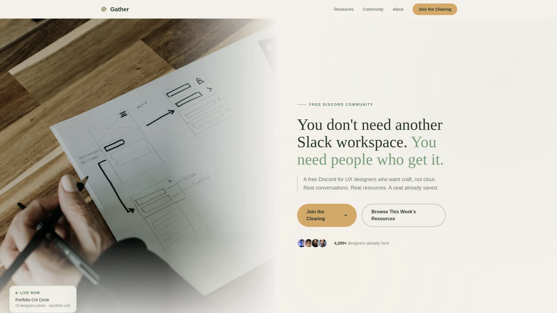
Half-Page Photo and Text Hero
The hero splits the screen evenly. The left side holds a softly desaturated photograph of hands sketching wireframes beside an open laptop, with morning light and a single succulent in frame. The right side carries the headline and a sub-line in a rounded serif at generous size.
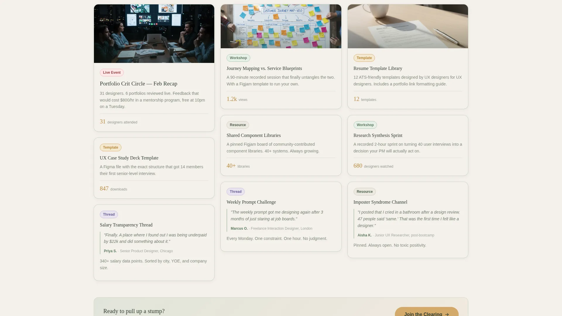
Masonry Resource Grid
A cascading Pinterest-style grid displays resource tiles, recorded portfolio review sessions, weekly prompt challenges, a resume template library, salary transparency thread screenshots, and shared component library previews. Each tile carries a soft lichen border and a content tag for quick scanning.
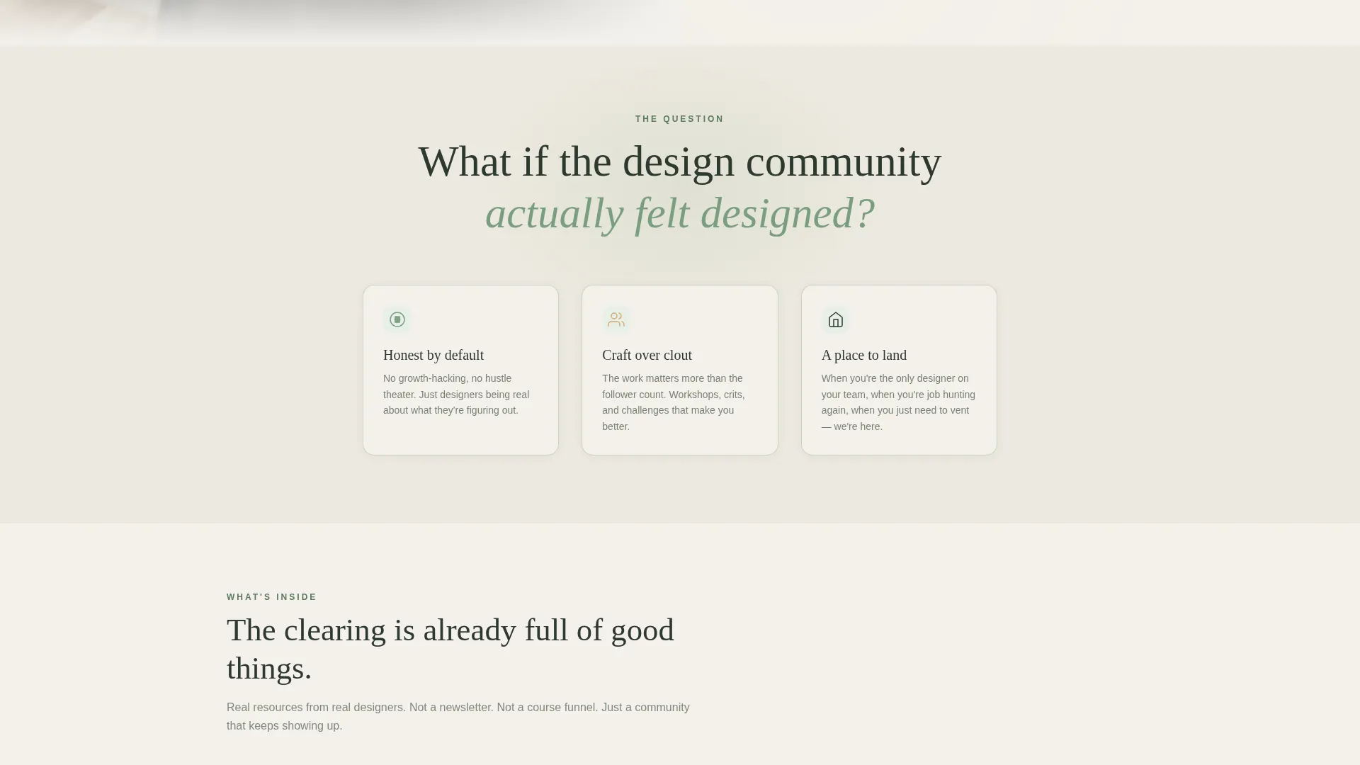
Manifesto Belief Statements
Between masonry rows, large birch-on-loam type blocks deliver belief statements that read like a manifesto spoken aloud. These anchor the emotional arc of the page and keep the visitor oriented around shared values rather than feature lists.
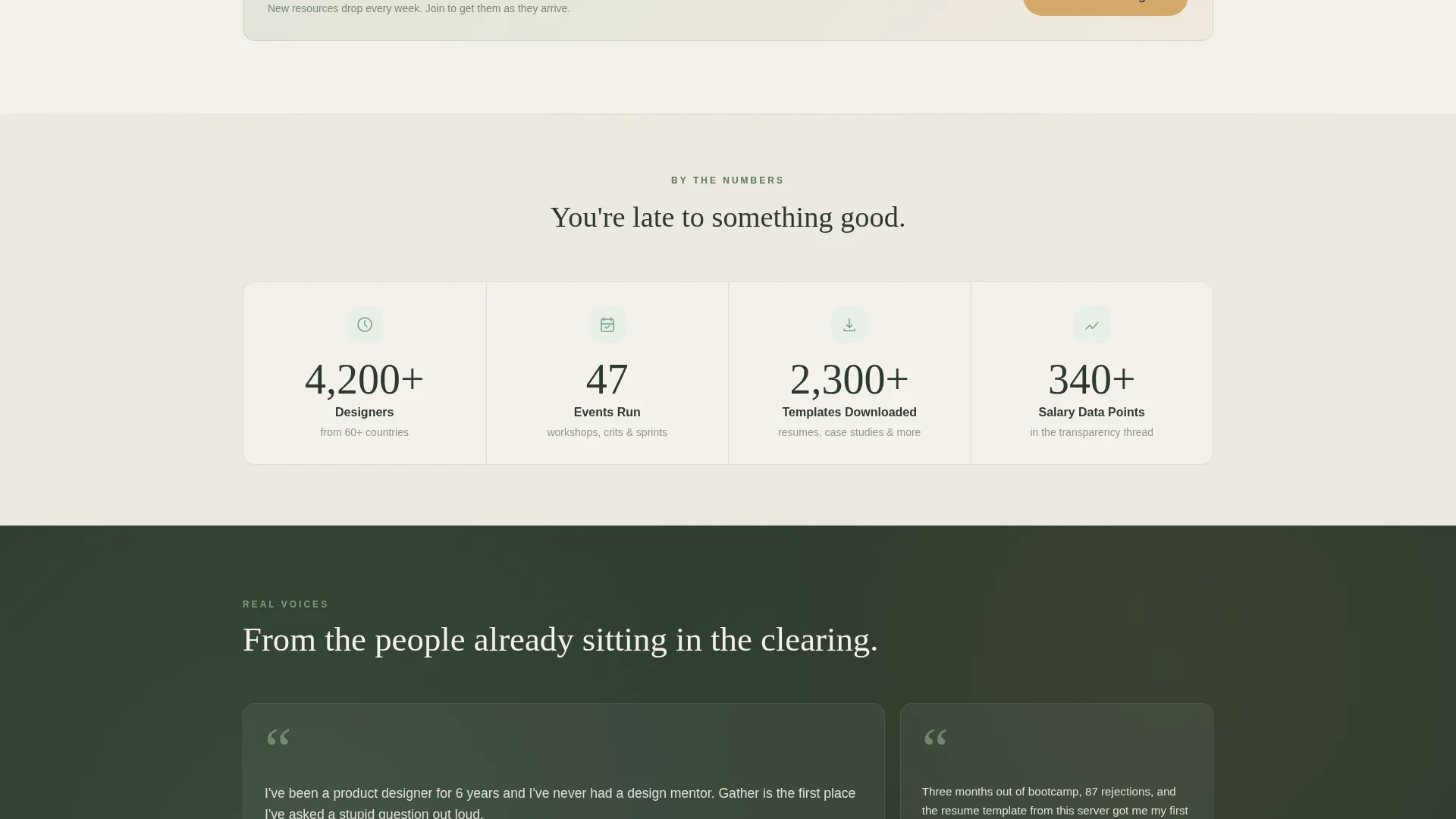
Animated Community Stat Counters
A dedicated section displays community activity through animated counter elements, member counts, event attendance figures, and download totals. These counters provide proof of activity without requiring visitors to leave the page.
Asymmetric Member Quote Layout
Real member quotes are displayed in an asymmetric testimonial section. Each quote includes a role label, grounding the social proof in recognizable professional identities rather than anonymous praise.
Sticky Call-to-Action Bar
A bottom bar appears on scroll and persists as the visitor moves through the page. It carries the primary "Join the Clearing" action in amber on loam. A secondary anchor link, "Browse This Week's Resources", offers an alternative path for visitors not yet ready to commit.
Page sections overview
| Section | Purpose |
|---|---|
| Hero Split | Introduce the community with a warm photo and direct headline |
| Mission Statement | Open the manifesto with a single provocative design question |
| Masonry Resource Grid | Show real community resources in a tagged, scrollable grid |
| Belief Statement Blocks | Reinforce shared values between resource rows with large type |
| Member Quotes | Build trust with role-labeled, honest testimonials |
| Community Stats | Prove activity with animated counters and real numbers |
| Manifesto Call to Action | Close with a final belief statement and primary join button |
| Page Footer | Wrap the page with a split-layout footer panel |
Design & branding system
The visual identity follows a Healing Space theme grounded in the Forest Trust color system. The palette feels unhurried and honest, built to make a skeptical designer feel safe enough to read every word.
- Deep loam (#2D3A2E) anchors all body typography and primary backgrounds
- Lichen green (#7A9E7E) washes over card backgrounds and section dividers; birch white (#F4F1EB) breathes between masonry blocks
- Soft amber (#D4A96A) appears only on buttons and hover states, directing attention without competing with content
Typography uses Fraunces for serif headlines and DM Sans for all body copy. The combination feels editorial and readable without leaning into corporate polish.
Mobile & speed optimization
The template is structured desktop-first, with a responsive layout that adapts cleanly for mobile visitors. Designers use both contexts, so neither is treated as secondary.
- The masonry grid reflows into a single-column stack on smaller screens without losing the staggered rhythm
- Scroll-reveal animations, masonry hover states, and the sticky call-to-action bar are handled via client-side components, keeping static sections lean
- Counter animations trigger on viewport entry so they feel intentional rather than automatic on load
How this template helps you convert
The page is built around a clear principle: show the community before you sell it. Every structural decision supports that principle.
- The hero immediately signals who this space is for, filtering out the wrong visitors and validating the right ones before they read a single resource tile
- The masonry grid with real screenshots, download counts, and event recaps makes the visitor feel they are already late to something good, which is the most honest form of urgency
- The sticky call-to-action bar removes friction at the moment of decision, so the visitor never has to scroll back up to find a way in
Other information about this template
This template was designed specifically for the user experience designers free Discord community niche, within the broader Community and Nonprofit category. It sits at the intersection of community landing page design and craft-focused designer culture.
- The page uses no form fields, the entire conversion funnel runs through a single Discord invite button
- The template style is Masonry and Pinterest-inspired, making it well suited for content-rich community pages with multiple resource types
- The creative direction follows a Vision and Mission arc, meaning the page reads like a document with a point of view rather than a brochure
- The lp direction is Content and Resource delivery, so the grid is the product, not a teaser for a product behind a paywall
- This template is part of the Community and Nonprofit template category and is well matched to subcategories involving designer communities, peer learning groups, and craft-focused online spaces
Theme
Healing Space
Creative direction
Vision & Mission
Color system
Forest Trust
Style
Masonry/Pinterest
Direction
Content/Resource
Page Sections
Half-page Photo and Text Hero
Masonry Resource Grid with Tags
Manifesto Belief Statement Blocks
Animated Community Stat Counters
Asymmetric Member Quote Section
Sticky Scroll-triggered Call-to-action Bar
Related questions
Does this template require any sign-up forms?
Can I replace the resource tiles in the masonry grid?
Is this template only suitable for Discord communities?
What typography does this template use?
Does the sticky call-to-action bar appear on mobile screens?


