Wedding Marketing & Agency Specialist Pre-Launch Website Template
Gazette is a horizontal scroll landing page for a boutique wedding PR agency. Built around a manifesto-driven layout, an animated ink-illustration header, and a fixed waitlist form, it speaks directly to luxury wedding planners, high-profile couples, and destination venues ready to turn their weddings into editorial headlines.
by Rocket studio
Quick summary
Gazette is a single-page, horizontal scroll landing page template for a wedding PR agency. It combines an animated editorial illustration header with manifesto-style panel copy and a fixed waitlist call-to-action. The design uses a restrained Obsidian and Gold color system to signal exclusivity and craft from the first scroll.
Who this template is for
This template is built for agencies and individuals who operate at the intersection of luxury weddings and editorial media. It speaks a language that high-end clients immediately recognize.
- Boutique wedding PR agencies positioning themselves as editorial tastemakers
- Luxury wedding planners seeking a polished waitlist page for a new service launch
- High-profile couples and destination venues that want their story treated as a cultural moment
What problem this template solves
Most wedding agency pages look like vendor directories. They lead with pricing grids and gallery carousels rather than a point of view. Gazette solves the credibility gap between a premium service and a forgettable online presence.
- Generic portfolio pages fail to communicate editorial authority or selective intake
- Standard landing pages cannot convey the scarcity and prestige that luxury clients expect
- Couples and planners need a page that reads like a publication, not a booking form
What you get with this template
Gazette delivers a fully structured single-page layout that works as a waitlist page and a brand statement at the same time. Every component is designed to feel purposeful and considered.
- A horizontal scroll frame with manifesto-style typography panels that read as one unbroken declaration
- An animated ink-illustration header featuring hand-drawn editorial line work dissolving into a magazine spread
- A fixed gold pill call-to-action button that stays visible throughout the entire scroll
- A minimal waitlist form with name, studio or wedding name, a publication dropdown, and a freeform story field
Feature list
This template ships with a focused set of purposeful components. Each one supports the editorial identity and the waitlist conversion goal.
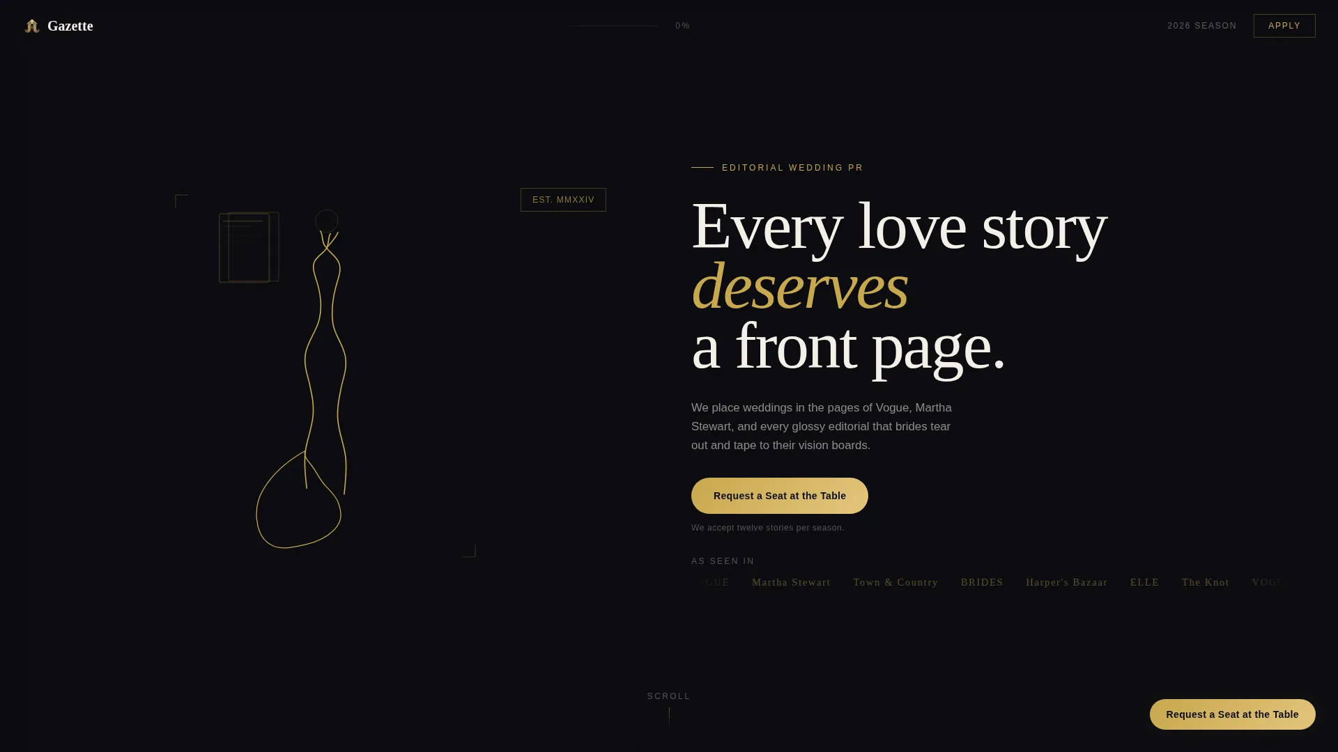
Animated Ink Illustration Header
A slow, hand-drawn gold line traces itself across the viewport. It forms a couple mid-first-dance, then dissolves into a fanned magazine spread with fluttering pages. The animation uses editorial sketch-style line work drawn in gold against obsidian black, with no photograph or face, only the gesture of romance.
Horizontal Scroll Manifesto Panels
Each scroll panel holds one sentence of the agency's philosophy, typeset at display scale. Every sentence pairs with a single cropped image detail, a veil, a table setting, a barcode, never a full scene. The format feels like a manifesto posted to an industry door.
Fixed Waitlist Call-to-Action Button
A gold pill button labeled "Request a Seat at the Table" remains fixed as visitors scroll through every panel. Clicking it opens the waitlist form without leaving the page, keeping the conversion flow uninterrupted.
Minimal Scarcity-Driven Waitlist Form
The form collects only what matters: name, wedding or planning studio name, a dropdown asking "What publication matters most to you?", and a textarea labeled "Tell us the story." A single line beneath the form reads "We accept twelve stories per season," making submission feel like an application.
Obsidian and Gold Color System
Deep editorial black dominates the background. Warm champagne gold appears only on interactive elements and pull-quotes, as if hand-leafed. Soft vellum cream holds text blocks like cotton paper stock, and muted graphite keeps body text readable against lighter panels.
Editorial Typography Layout
The headline "Every love story deserves a front page" is set in a sharp serif that anchors the brand statement immediately. Manifesto sentences are typeset enormous across panels. Body text sits in graphite on cream, maintaining the print-quality reading experience throughout.
Page sections overview
| Section | Purpose |
|---|---|
| Animated header panel | Introduces agency identity through editorial ink animation and headline |
| Manifesto scroll panels | Communicates agency philosophy across a series of full-viewport horizontal panels |
| Cropped detail pairings | Pairs each manifesto sentence with a single fragmentary image to trigger imagination |
| Fixed call to action button | Keeps the waitlist action accessible at every point in the scroll journey |
| Waitlist form overlay | Collects applicant details through a minimal, scarcity-framed entry form |
Design & branding system
The visual identity follows a Lens and Frame theme built on the Obsidian and Gold color system. Every color choice references the tactile weight of a foil-stamped invitation on a marble console.
- Obsidian black (#0B0B0F) fills the background, providing editorial negative space throughout
- Champagne gold (#C9A84C) is reserved for interactive elements and pull-quotes, applied sparingly as if hand-leafed
- Vellum cream (#F5F0E8) holds all text blocks, referencing cotton paper stock, while muted graphite (#3A3A3C) keeps body copy effortless on lighter panels
Mobile & speed optimization
The horizontal scroll format is designed to translate cleanly across screen sizes. The layout is structured so the reading experience remains intentional on smaller viewports.
- The fixed gold pill button stays accessible and correctly positioned on mobile screens throughout the scroll
- The manifesto panels reflow so that oversized display type scales without breaking the line rhythm
- The waitlist form overlay is touch-friendly, with fields sized and spaced for easy input on handheld devices
How this template helps you convert
Gazette is built around a single conversion goal: getting a qualified person to submit a waitlist form. Every design and copy decision supports that goal.
- The scarcity mechanic, "We accept twelve stories per season", frames the form as an application to something exclusive, raising the perceived value of clicking
- The fixed gold pill button stays visible across every panel, so the path to conversion is never more than one tap away regardless of scroll position
- The manifesto copy speaks directly to the ideal client's self-image, filtering out casual visitors and warming the right ones before they ever reach the form
Other information about this template
Gazette is a strong fit for creative professionals who want their landing page to function as both a brand statement and a qualified lead capture tool. A few additional details worth knowing:
- The template is categorized under Portfolio and Agency, specifically within the Wedding Marketing and Agency subcategory
- It uses the Horizontal Scroll template style, which is uncommon in the wedding category and immediately distinguishes the agency from standard portfolio layouts
- The Waitlist and Coming Soon direction makes it appropriate for agencies launching a new editorial season, a rebrand, or a selective intake campaign
- The Lens and Frame theme and Manifesto creative direction work together to position the agency as a cultural voice rather than a service vendor
- No launch date is built into the page, keeping the scarcity timeless and sustainable across multiple seasons


Theme
Lens & Frame
Creative direction
Manifesto
Color system
Obsidian & Gold
Style
Horizontal Scroll
Direction
Waitlist/Coming Soon
Page Sections
Animated Ink Illustration Header
Horizontal Scroll Manifesto Panels
Fixed Waitlist Call-to-action Button
Scarcity-framed Waitlist Form
Obsidian and Gold Color System
Editorial Display Typography
Related questions
What type of business is this template designed for?
Can this template be used as a permanent agency homepage?
How does the horizontal scroll work on mobile devices?
Is the waitlist form connected to any external service?
Can the manifesto copy and publication dropdown be customized?


