Sensitive Skin Beauty Reviews Website Template
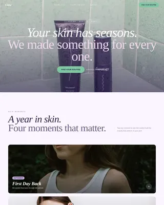
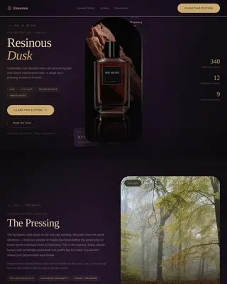
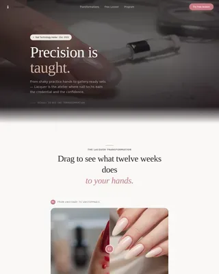
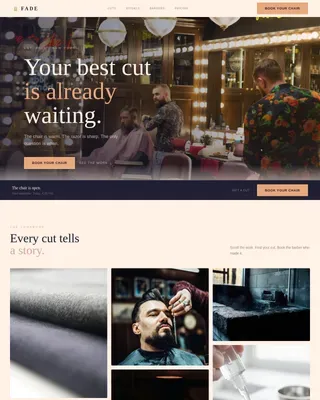
Gentle is a masonry-style landing page template built for a dermatologist-curated, fragrance-free skincare subscription box. It guides reactive-skin subscribers through sensory imagery, ingredient transparency cards, a clinical trust badge, and a two-step skin-type quiz that flows into a personalized box preview and a single subscribe confirmation.
by Rocket studio
Quick summary
Gentle is a single-page, scroll-driven template for a quarterly sensitive skin subscription box. It pairs an Organic Flow visual theme with a Sunset Gradient color palette, a masonry tile layout, and a Direct Sales conversion path. A full-bleed header photo, sensory macro imagery, and ingredient transparency cards build trust before a clay-mauve call-to-action button ever appears.
Who this template is for
This template is designed for founders and brand teams launching or growing a sensitive skin subscription box. It speaks directly to buyers who have been burned by mainstream skincare and now hold ingredient lists to a higher standard.
- Subscription box brands curating patch-tested, fragrance-free skincare for reactive skin
- Dermatologists or clinicians building a direct-to-consumer product line for sensitive skin
- Beauty entrepreneurs targeting women in their thirties and forties who have abandoned traditional skincare routines
What problem this template solves
Most skincare landing pages look polished but feel hollow. They rely on glossy product shots and vague claims like "hypoallergenic" without offering any proof. Visitors with sensitive skin have been disappointed too many times to click on marketing that does not show its work.
- No visible ingredient proof or clinical context to reassure reactive-skin buyers
- Generic subscription flows that skip skin profiling and feel impersonal and risky
- Heavy visual layouts that overwhelm cautious shoppers instead of calming them
What you get with this template
You get a fully structured, single-page layout that moves a hesitant visitor from curiosity to subscription through calm, trust-building design. Every section has a defined purpose, from the intimate header image to the final subscribe confirmation.
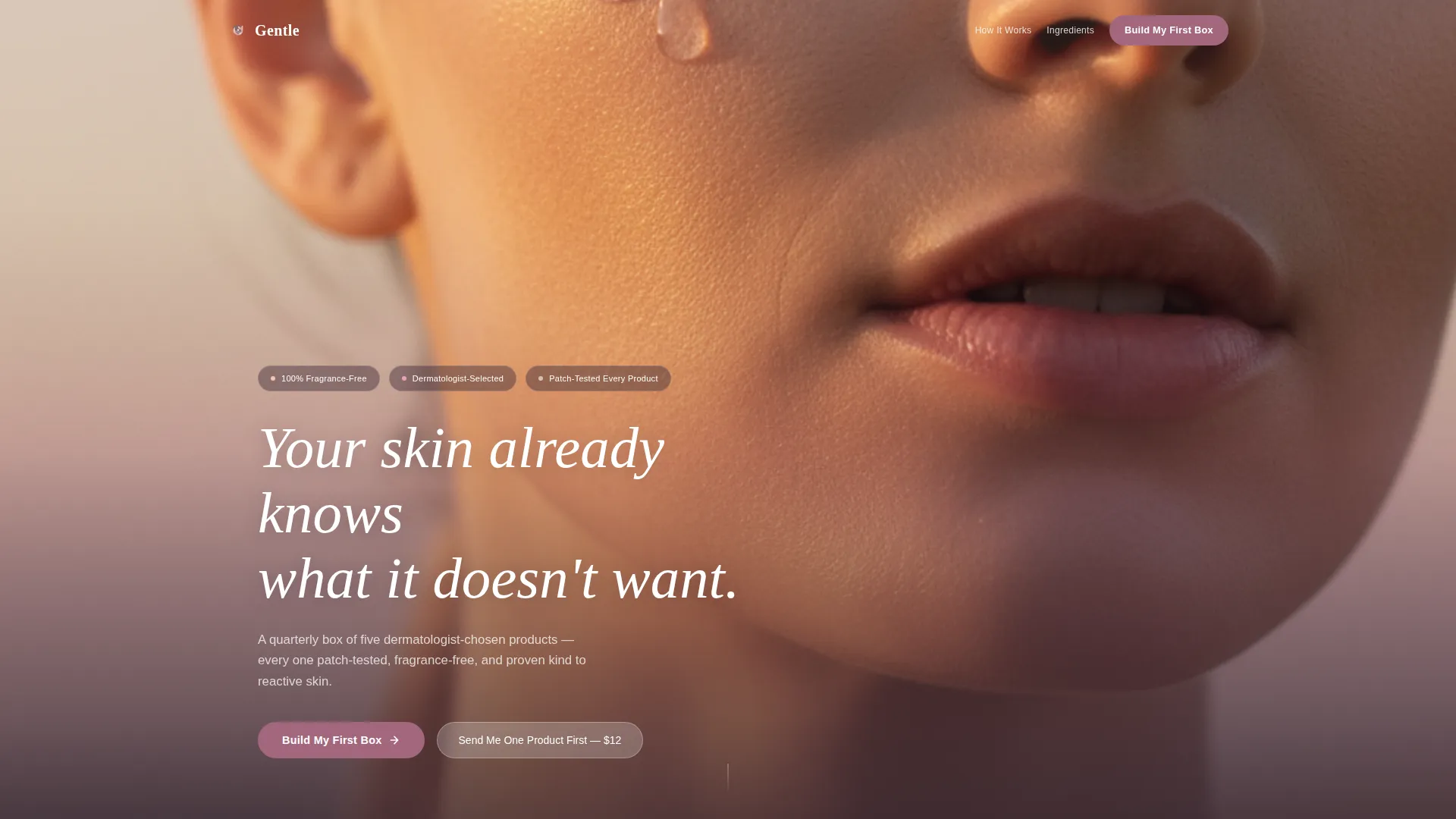
- Full-bleed golden-hour header with serif headline type fading in over the composition
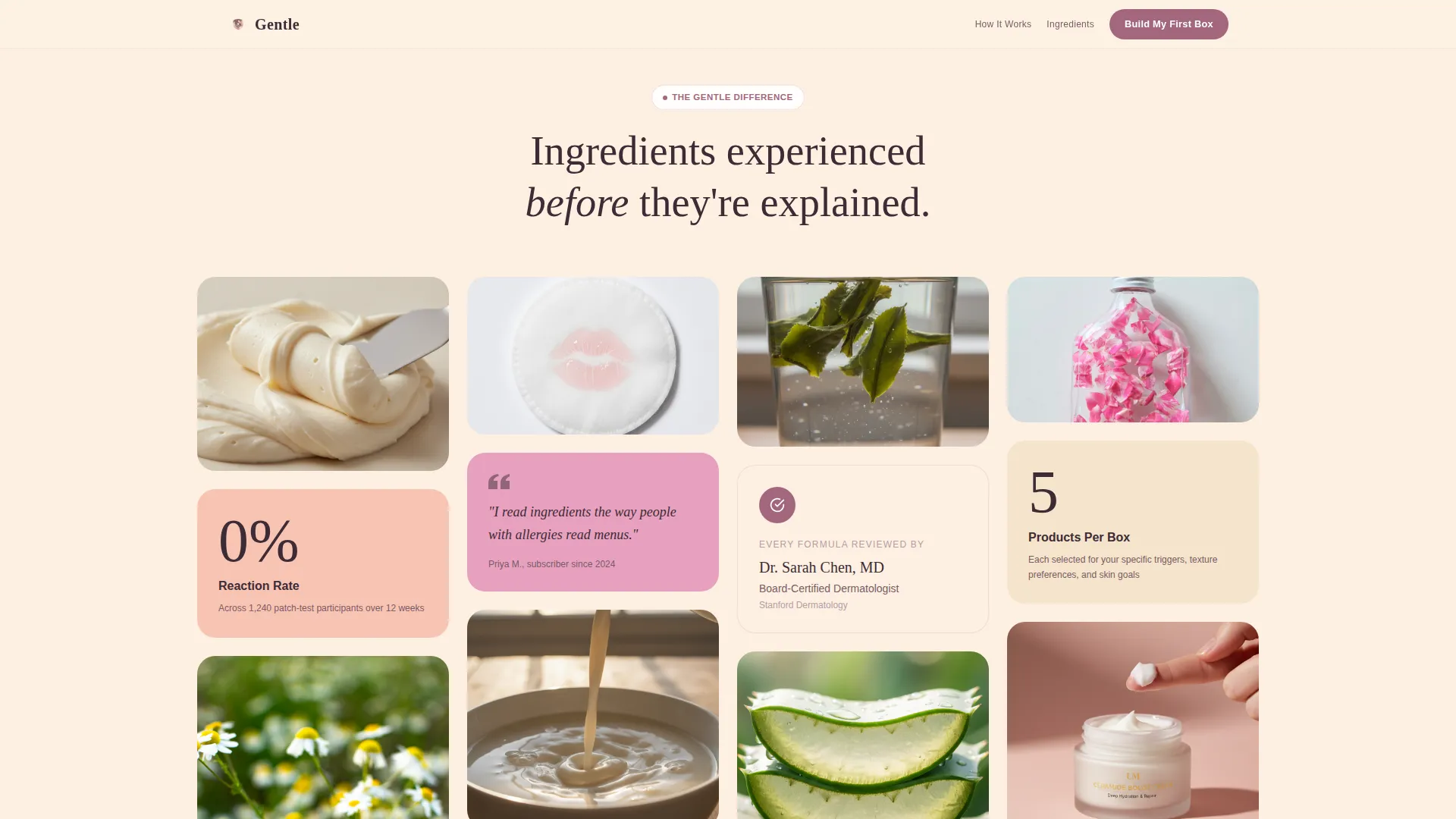
- A masonry tile grid alternating sensory macro photos with product ingredient transparency cards
- A two-step skin-type quiz flow leading into a personalized five-product box preview and a subscribe button
Feature list
This template delivers a carefully sequenced set of design and conversion components, each grounded in the source brief. Together they guide reactive-skin visitors toward a confident first subscription.
Full-Bleed Header with Fade-In Typography
The header fills the viewport with a close-up of dewy skin on a collarbone, lit by golden-hour window light. A single drop of serum is caught mid-roll. A serif headline fades in over the composition, setting an intimate, reassuring tone before any product is shown.
Masonry Tile Grid with Sensory Imagery
The layout uses a Pinterest-style masonry grid to alternate between macro texture photographs and product context cards. Shea butter, chamomile petals, and cotton-pad close-ups appear before product descriptions, so ingredients feel experienced before they are explained.
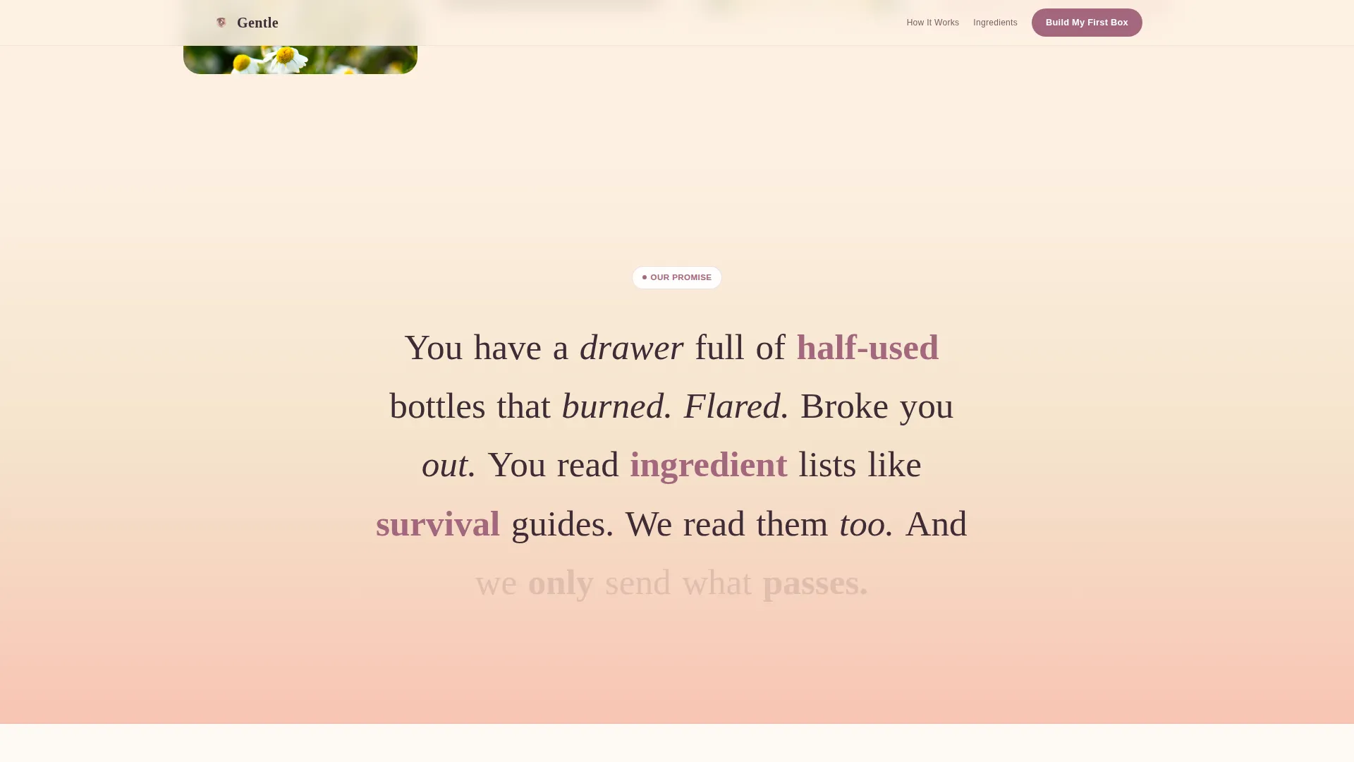
Gradient Scroll Transition
The page background shifts gradually from soft peach dawn at the top to clay mauve tones toward the bottom. This transition mirrors the journey from raw ingredients to the unboxing moment, keeping scroll momentum feeling intentional and warm.
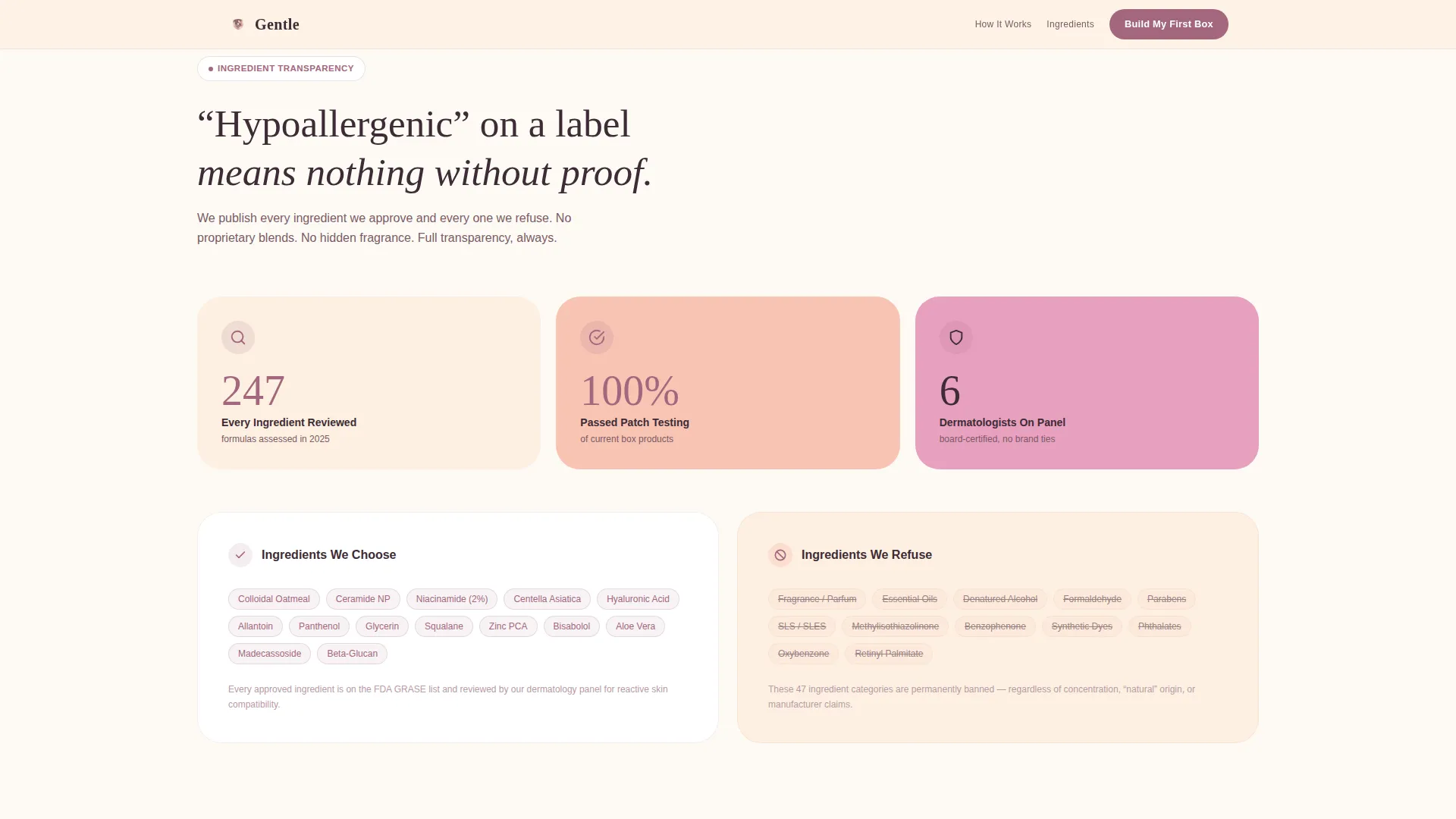
Ingredient Transparency Cards
Dedicated cards appear within the masonry grid to surface key ingredient details and dermatologist context. These cards appear before the primary call-to-action, giving reactive-skin visitors the proof they need before committing.
Clinical Trust Badge
A visible "0% reaction rate" clinical badge is placed after the third masonry row. It signals verified safety at the exact moment a visitor has absorbed enough context to act on it.
Two-Step Quiz and Box Preview Flow
Clicking the primary call-to-action opens a four-question skin-type quiz covering sensitivity level, biggest trigger, texture preference, and scent tolerance. Results flow directly into a box preview showing exactly which five products were selected and why, followed by a single subscribe confirmation.
Page sections overview
| Section | Purpose |
|---|---|
| Full-Bleed Header | Establishes intimate, calming first impression with serif headline |
| Sensory Masonry Tiles | Builds ingredient familiarity through macro texture photography |
| Transparency Ingredient Cards | Provides dermatologist-backed ingredient proof within the scroll |
| Clinical Trust Badge | Signals verified safety before the primary call-to-action appears |
| Primary call to action Row | Presents "Build My First Box" button in clay mauve after trust is earned |
| Skin-Type Quiz | Four-question flow that feels diagnostic and personal, not commercial |
| Box Preview Screen | Shows five selected products with reasons before subscribe confirmation |
| Trial Sachet Path | Secondary "Send Me One Product First" option for hesitant visitors |
| Unboxing Imagery Section | Shifts scroll from raw ingredients to tissue paper and kraft packaging |
Design & branding system
The template follows an Organic Flow theme expressed through a Sunset Gradient color system. Every color decision is intentional: backgrounds stay warm and quiet, interactive elements use the deepest tone in the palette.
- Soft peach dawn (#F8C4B4) and rosewater mist (#E8A0BF) alternate across masonry card backgrounds, while warm oat milk (#FDF0E2) washes across page backgrounds
- Clay mauve (#A3677E) is reserved strictly for buttons and active states, so every interactive element is immediately identifiable
- Serif typography carries the headline and key callouts, supporting the intimate, portrait-distance visual direction established in the header
Mobile & speed optimization
The masonry layout and full-bleed imagery are structured with a mobile scroll experience in mind. Sensory tiles and quiz steps are sized and sequenced to work naturally on a phone screen.
- Masonry columns reflow for single-column reading on smaller viewports so texture tiles and product cards stack cleanly
- The two-step quiz and box preview are designed as tap-friendly flows, with four-tap skin profiling and a single subscribe confirmation step
- The gradient scroll transition and fade-in header type are designed to feel smooth across the vertical scroll experience on mobile devices
How this template helps you convert
The page earns trust before it asks for anything. Conversion elements are revealed progressively, so each one lands at the right moment in the visitor's confidence arc.
- Sensory macro imagery and ingredient transparency cards build credibility during the early scroll, well before a subscribe button appears, so the primary call-to-action feels like a natural next step rather than a push.
- The two-step quiz personalizes the offer in real time. Visitors see their own five-product box before they are asked to confirm a subscription, which reduces hesitation at the final decision point.
- The secondary trial sachet path captures hesitant visitors who are not ready to commit to a quarterly box, converting curiosity into an address capture and a $12 entry-level purchase.
Other information about this template
This template is built specifically for the sensitive skin subscription box niche within the broader Beauty and Personal Care category. It is suited to brands whose value proposition depends on clinical proof and ingredient honesty rather than aspirational lifestyle imagery.
- The template style is Masonry and Pinterest-influenced, making it distinct from standard hero-and-grid skincare layouts
- The creative direction is Immersive Visual, meaning scroll progression drives sensation before information, which is appropriate for a product category where trust must be felt before it is read
- The header concept is Full-Bleed Photo with no product packaging visible, keeping the focus on skin itself rather than branding
- The landing page direction is Direct Sales, with a clear price point ($48 per quarter for the full box, $12 for the trial sachet set) surfaced only after ingredient and clinical trust signals have been delivered
Theme
Organic Flow
Creative direction
Immersive Visual
Color system
Sunset Gradient
Style
Masonry/Pinterest
Direction
Direct Sales
Page Sections
Full-bleed Header with Serif Headline
Masonry Tile Grid with Sensory Imagery
Ingredient Transparency Cards
Clinical Trust Badge
Two-step Quiz and Box Preview
Trial Sachet Secondary Path
Related questions
What kind of business is this template built for?
What does the two-step quiz flow include?
Can hesitant visitors try before committing to a quarterly box?
What does the header section look like?
Where does the clinical trust badge appear on the page?