Bauhaus Architecture Professional Website Template
Gestalt is a storybook landing page template for a Bauhaus furniture workshop. It guides visitors through a gallery-walk experience, presenting each tubular steel piece through orthographic drawings, darkroom photograph reveals, and short design essays. A scroll-earned catalogue download and an ungated essay archive together serve collectors, interior architects, and university design departments.
by Rocket studio
Quick summary
Gestalt is a full-page, content-led landing page template built for a Bauhaus furniture workshop. It educates visitors first and converts them second, using a gallery-walk scroll flow, cursor-reactive abstract geometry, and a monochrome steel palette. The primary call to action is a catalogue download earned only after the visitor has moved through at least three furniture pieces.
Who this template is for
This template is designed for design studios and craftspeople whose work demands intellectual credibility before a sales conversation. It suits any presenter whose audience reads before they buy.
- Interior architects sourcing pieces for mid-century restoration projects
- Design collectors researching production-numbered, hand-crafted originals
- University design departments equipping studios and teaching through primary sources
What problem this template solves
Most product pages ask for attention before they offer anything worth attending to. For a workshop producing furniture with a direct lineage to 1925, a standard product grid or hero-banner layout fails to communicate the weight of that history.
- Visitors leave before understanding the material provenance or edition logic behind each piece
- A brochure-style layout cheapens work that belongs in a monograph or a museum catalogue
- There is no natural path for institutional buyers such as specifiers and educators who need depth, not a quick pitch
What you get with this template
This template delivers a complete, section-led single page that moves a visitor from first impression to catalogue request through a structured editorial journey. Every section has a defined role, and no section asks for commitment before it has given something of value.
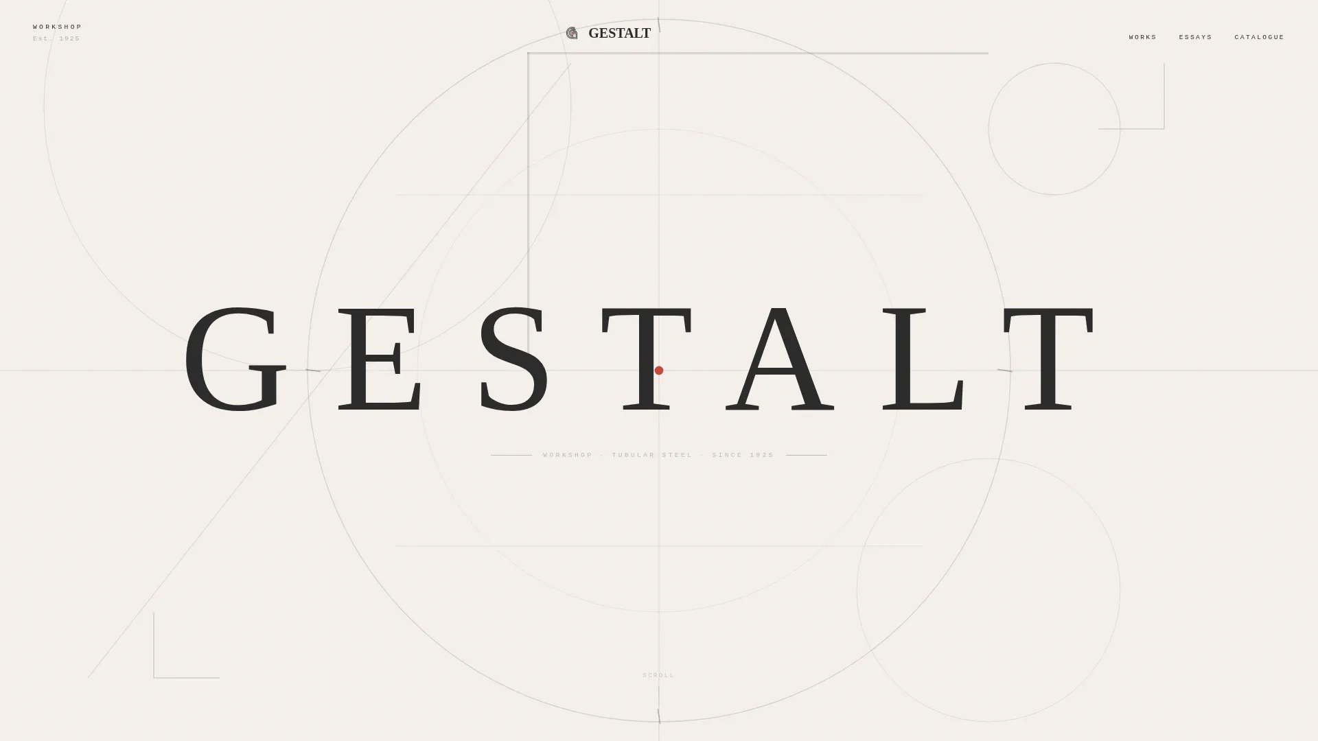
- A cursor-reactive hero with abstract geometric SVG composition and a single tracked surname in Bayer-style typography
- Three full-viewport gallery sections, each with an orthographic drawing, a darkroom photograph reveal, and an accompanying design essay
- A Bauhaus movement timeline interlude with clickable nodes, a scroll-earned catalogue form, and an ungated design essays archive
Feature list
A brief introduction to what makes this template work: each feature listed below is present in the template as described in the source brief and is built to serve the specific needs of a design-serious, desktop-first audience.
Cursor-Reactive Parallax Hero
The full-viewport header renders intersecting circles, right-angle bars, and a single diagonal in graphite and cold-rolled steel. As the cursor moves, the SVG elements shift with a subtle parallax, turning the opening screen into a live composition rather than a static image.
Gallery Walk Scroll Flow
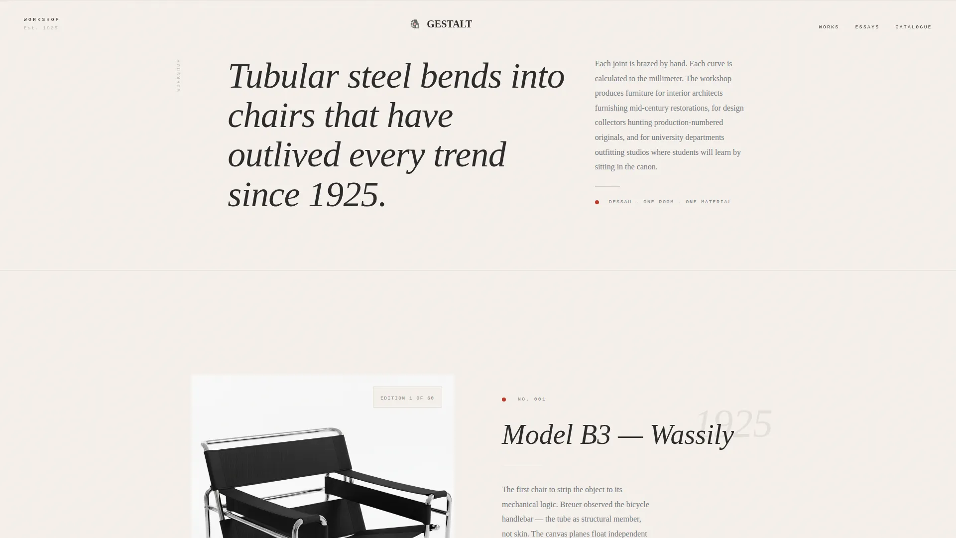
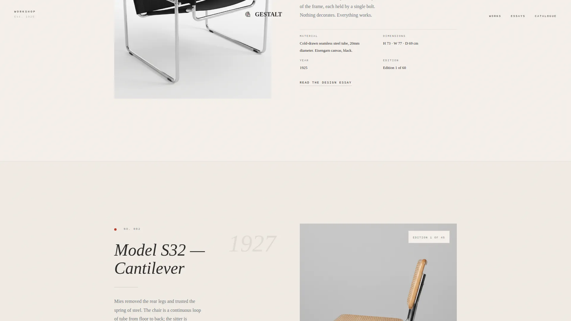
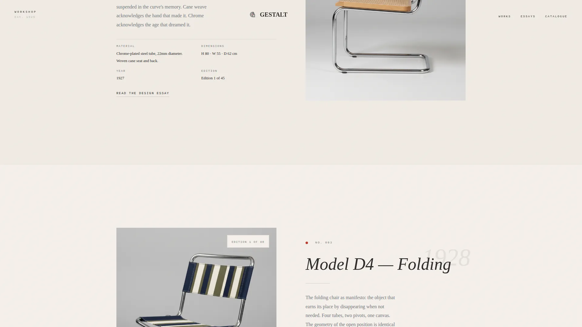
Each of the three furniture sections occupies a full viewport. An orthographic line drawing appears first, then a studio photograph develops over it using a clip-path darkroom reveal. A short design essay sits alongside each piece, covering material origin, structural logic, year, and edition count.
Bauhaus Timeline Interlude
Midway through the page, an interactive timeline maps the designer's body of work against the Bauhaus movement. Each node is clickable, opening additional context for that year. The interlude gives institutional visitors and collectors a navigable record of the workshop's history.
Scroll-Earned Catalogue Form
The catalogue download call to action appears only after the visitor has scrolled past three furniture pieces. The form requests an email address and a single toggle between "Collector" and "Specifier." The ask is earned, not forced.
Ungated Design Essays Archive
A secondary section offers free access to the full editorial archive without a form. This path builds trust with researchers, educators, and specifiers who need reference material before they are ready to request a catalogue.
Monochrome Steel Typography System
Headlines use DM Serif Display italic. Essay body text uses Fraunces. Labels and captions use JetBrains Mono. The three-typeface system mirrors the contrast between a monograph's display type, its running text, and its technical annotations.
Page sections overview
| Section | Purpose |
|---|---|
| Hero geometric composition | Opens with cursor-reactive abstract SVG and tracked surname |
| Gallery piece one | Presents first furniture piece with drawing, photograph reveal, and essay |
| Gallery piece two | Presents second furniture piece with the same sequential reveal structure |
| Gallery piece three | Presents third furniture piece before the catalogue ask is unlocked |
| Timeline interlude | Maps workshop history against the Bauhaus movement with clickable year nodes |
| Catalogue download form | Delivers the scroll-earned call to action with email field and role toggle |
| Design essays archive | Provides ungated editorial access to build trust with specifiers and researchers |
| Footer | Minimal horizontal flow with essential workshop links |
Design & branding system
The visual identity follows an Ink and Paper theme built on a Monochrome Steel color system. The feeling is a freshly printed letterpress broadsheet laid on a zinc worktable: no decorative warmth, every mark placed with intention, every area of negative space deliberately held.
- Color palette: uncoated stock white (#F5F0EB), pressed graphite (#2C2C2C), cold-rolled steel (#71797E), with Bauhaus red (#BE3A2B) reserved exclusively for interactive elements and geometric accent marks
- Typography: DM Serif Display italic for headlines, Fraunces for design essay body text, JetBrains Mono for labels and captions
- Visual language: abstract geometric forms drafted as if with a ruling pen on cartridge paper, orthographic line drawings, and darkroom-style photograph reveals
Mobile & speed optimization
This template is built desktop-first, reflecting the reality that its primary audience of collectors and architects typically works on large screens. A mobile fallback is included so the page remains functional and readable on smaller devices.
- Animations including cursor parallax and scroll-triggered reveals are handled by client components, keeping static sections lightweight
- Server components are used for static content sections, separating rendering concerns between interactive and non-interactive parts of the page
How this template helps you convert
This template converts by proving intellectual seriousness before making any request. The sequence is deliberate: the visitor earns understanding, then the template earns the ask.
- The gallery-walk structure holds attention across three full-viewport furniture sections, each deepening the visitor's connection to the work before any form appears
- The scroll-earned catalogue form appears only after sufficient depth has been demonstrated, making the download feel like a reward rather than a gate
- The ungated essays archive provides a no-pressure secondary path that keeps researchers and specifiers engaged and builds long-term credibility with institutional decision-makers
Other information about this template
This template is categorized under Architecture and Design, with a specific focus on the Bauhaus Architecture subcategory and the Bauhaus furniture designer niche. It is built as a storybook, full-page layout with a high level of animation and interactivity.
- The template style is Storybook and Full-Page, suited to content-led destinations that prioritize editorial depth over transactional speed
- The creative direction follows a Gallery Walk model: one piece per wall, slow rhythm, reverent pacing
- The header concept is Abstract Geometric, using SVG-based compositions rather than photography or product imagery
- The landing page direction is Content and Resource, meaning the primary goal is to inform and qualify the visitor before any conversion action
Theme
Ink & Paper
Creative direction
Gallery Walk
Color system
Monochrome Steel
Style
Storybook/Full-Page
Direction
Content/Resource
Page Sections
Cursor-reactive Parallax Hero
Gallery Walk Scroll Flow
Bauhaus Timeline Interlude
Scroll-earned Catalogue Form
Ungated Design Essays Archive
Monochrome Steel Typography System
Related questions
Who is this template built for?
Can I adapt the gallery sections to show more or fewer than three pieces?
Is the catalogue form connected to any external service?
Does the template work on mobile devices?
Can the timeline interlude be customized with my own workshop history?