Romantic Valentine's Day Travel Landing Page Template
Getaway is a Neo-Retro Valentine's Day travel landing page built for romantic travel boutiques. It uses a modular card grid with Before/After reveal interactions, a cinematic hero image, and warm citrus branding to guide couples from wanderlust to booking. Each destination card carries its own call to action, and a sticky quiz bar captures visitors who want a custom escape.
by Rocket studio
Quick summary
Getaway is a single-page Valentine's Day travel marketplace template designed for boutique travel brands. It pairs a filmic hero section with a scrollable card grid, each card flipping between everyday life and a curated romantic escape. Blood orange, grapefruit pink, and warm cream deliver a 1960s airline poster mood that feels warm and instantly trustworthy.
Who this template is for
This template suits travel boutiques and independent trip curators who sell handpicked romantic experiences. It works especially well for sellers offering a range of packages at different price points and styles.
- Boutique travel brands packaging romantic couple escapes
- Independent trip curators selling proposal trips or surprise getaways
- Valentine's Day travel sellers managing multiple destination packages at once
What problem this template solves
Most travel pages list destinations without making the visitor feel anything. Couples browsing Valentine's Day packages need to imagine themselves in the moment before they will commit to a booking. This template bridges that gap.
- Generic travel grids fail to communicate the emotional transformation of a romantic trip
- Visitors leave before booking because no single page connects wanderlust to a clear next step
- Sellers with multiple packages struggle to present variety without overwhelming the visitor
What you get with this template
You get a complete, ready-to-customize single-page layout built around emotional storytelling and direct conversion. Every section works together to move a visitor from curiosity to a confirmed booking click.
- A cinematic hero section with a handwritten-style headline and filmic Kodachrome-grade imagery
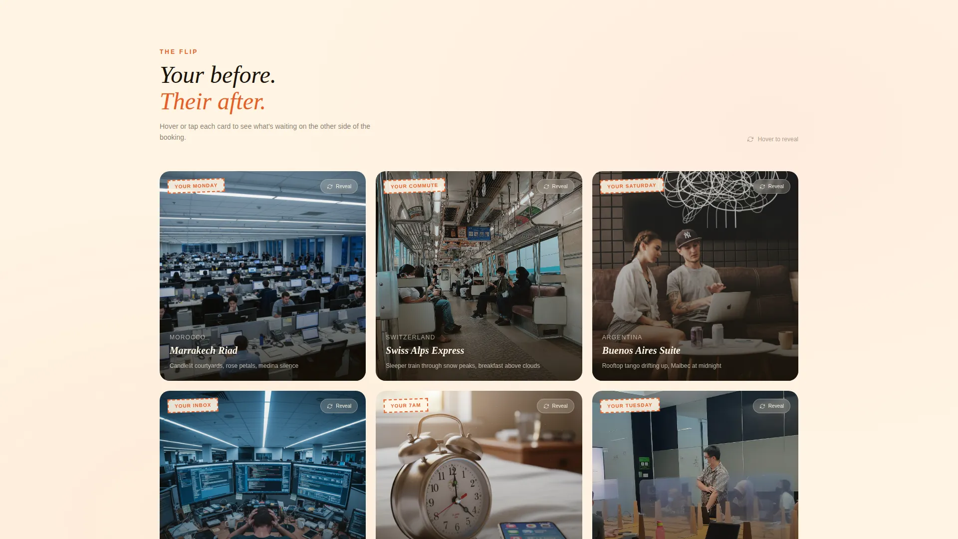
- A modular destination card grid with Before/After reveal interactions and individual "Book This Escape" calls to action
- A sticky bottom bar offering a secondary "Build Your Own Trip" quiz path for visitors who want a guided recommendation
Feature list
This template includes a focused set of purpose-built components. Each one serves the romantic travel buyer journey from the first scroll to the final booking click.
Cinematic Hero Section
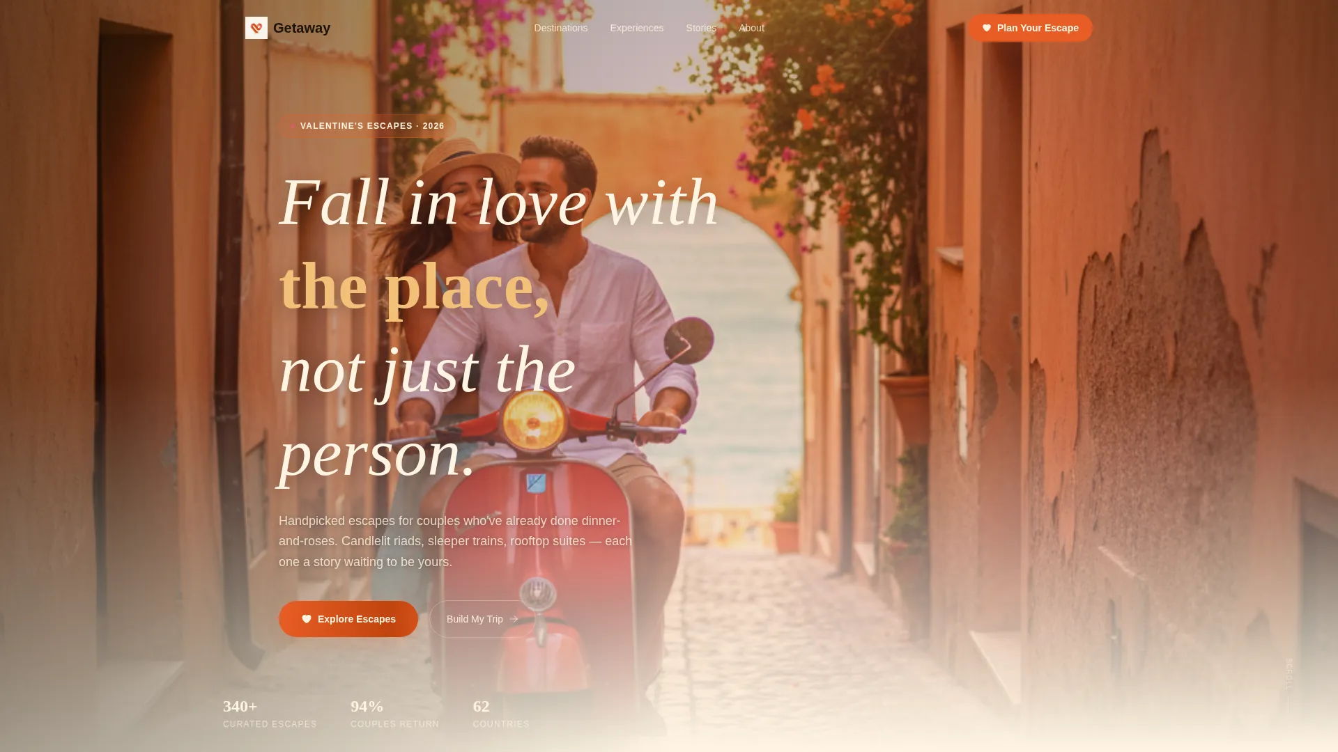
The header opens with a lifestyle shot of two people on a Vespa at golden hour. A handwritten-style headline fades in over the sky. The image uses a filmic halation glow and visible grain to evoke a found roll of Kodachrome.
Before/After Destination Cards
Each card in the modular grid flips between the couple's ordinary life and the escape waiting on the other side. Visitors swipe or tap to reveal the "after" state. Cards escalate in scale as the visitor scrolls, from weekend city breaks to private villa packages.
Per-Card Booking Calls to Action
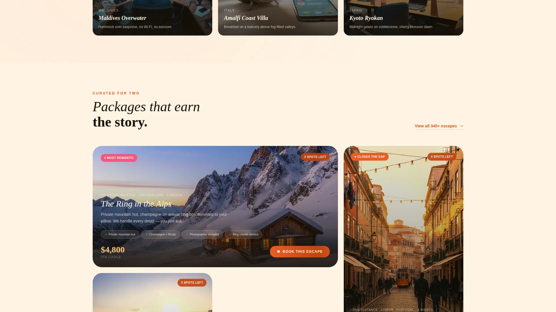
Every destination card carries its own "Book This Escape" button linking directly to that package's checkout. This removes friction for visitors who are ready to decide quickly without browsing the full page.
Urgency Availability Badges
Early cards display "2 spots left" badges rendered in deep tangerine shadow. These badges compress the decision window naturally without aggressive pop-ups or interruptive overlays.
Sticky Quiz Conversion Bar
A persistent bottom bar stays visible throughout the scroll. It invites visitors to "Build Your Own Trip" and opens a short quiz covering travel month, budget range, and trip vibe. This secondary path catches visitors who need guidance before committing.
Neo-Retro Citrus Branding System
The full color palette, blood orange for headlines and price tags, grapefruit pink for card borders and selected states, warm cream for the background, and deep tangerine shadow for hover and active states, is pre-applied across every component. Typography follows a midcentury style to match the visual era.
Page sections overview
| Section | Purpose |
|---|---|
| Hero Lifestyle Shot | Sets the romantic, cinematic tone and introduces the headline |
| Destination Card Grid | Displays all package options with Before/After reveal interactions |
| Urgency Availability Badges | Creates time pressure on high-demand early cards |
| Per-Card Booking calls to action | Links each destination directly to its own checkout flow |
| Sticky Quiz Bar | Captures undecided visitors with a guided trip-builder path |
Design & branding system
The template follows a Neo-Retro visual identity built around a Citrus Burst color system. The overall mood references a 1960s airline poster left in warm sunlight: faded glamour with electric, fruit-stand warmth.
- Blood orange (#E85D26) anchors headlines and price tags; warm cream (#FFF5E4) dominates the background like aged postcard stock
- Grapefruit pink (#F7567C) washes across card borders and selected states; deep tangerine shadow (#C1440E) appears only on hover and active interactions
- Midcentury typography meets saturated color to create a browsable grid that feels like flipping through a vintage record shop
Mobile & speed optimization
The modular card grid is built to work naturally on smaller screens. Swipe-to-reveal interactions are designed for touch, so the Before/After experience translates directly to mobile without requiring a mouse.
- Cards reflow into a single-column layout on narrow screens, keeping the grid readable and tap-friendly
- The sticky quiz bar remains accessible at the bottom of the screen on mobile, preserving the secondary conversion path throughout the scroll
How this template helps you convert
The page earns the booking click by proving the transformation before asking for anything. Every structural decision pushes a hesitant visitor one step closer to a decision.
- The Before/After card reveal makes the emotional contrast tangible. Visitors see their current life and the escape side by side, which motivates action far more effectively than a static destination photo.
- Urgency badges on early cards create natural scarcity without interrupting the browsing experience. Seeing "2 spots left" while swiping a card makes the decision feel time-sensitive and real.
- The sticky quiz bar ensures no visitor leaves empty-handed. Couples who are not ready to pick a specific package can still engage with the brand and move toward a personalized recommendation.
Other information about this template
This template is categorized under Retail and E-Commerce with a Valentine's Day Business focus. It is built to serve as a click-through marketplace hub, meaning its primary job is to route visitors to individual package checkout pages rather than collecting leads on-page.
- The template style follows a Gallery and Detail approach, combining a browsable grid with enough per-card detail to support a confident booking decision
- The creative direction uses a Before/After Reveal pattern, one of the most emotionally effective formats for travel and experience-based retail
- The header concept is a Lifestyle Shot rather than a product shot, which aligns with how couples make emotional purchase decisions around experiences
Theme
Neo-Retro
Creative direction
Before/After Reveal
Color system
Dopamine Pop
Style
Gallery + Detail
Direction
Click-Through
Page Sections
Cinematic Hero Section
Before/after Destination Cards
Per-card Booking Ctas
Urgency Availability Badges
Sticky Quiz Conversion Bar
Neo-retro Citrus Branding System
Related questions
Can I add more destination cards to the grid?
Does the Before/After reveal work on mobile devices?
Can I update the color palette to match my brand?
How does the sticky quiz bar work for visitors?
Can this template be used outside of Valentine's Day campaigns?



