Turkey Travel Advanced Professional Website Template
Gezgin is a storybook-style, full-page landing page template built for Turkey budget travel guides. It leads visitors through five destination chapters, from Istanbul to Eastern Anatolia, using hero photography, three-line budget breakdowns, and a two-path conversion flow. The design combines deep Aegean teal, hammam copper, and sun-bleached limestone for an immersive, journal-like experience.
by Rocket studio
Quick summary
Gezgin is a full-page landing page template for Turkey budget travel guides. It presents five destination chapters as scroll-through journal spreads, each with a hero photo, a local tip, and a budget snapshot. Two conversion paths, a full route planner and a quick email capture, work together to turn curious visitors into booked travelers.
Who this template is for
This template is built for travel creators, bloggers, and independent guides who want to present Turkey as an affordable, deeply local destination. It suits anyone who needs a conversion-focused page that feels personal and editorial rather than corporate.
- Solo travel bloggers building their first Turkey guide and needing a polished, ready-to-use page
- Digital nomads and budget travel advisors offering custom itinerary services for regions like Antalya and İzmir
- Couples and backpackers documenting overland routes who want to monetize their journey knowledge
What problem this template solves
Most budget travel pages fail because they look generic or overwhelm the reader with text. Potential travelers lose trust, lose momentum, and close the tab before they ever commit to a trip. Gezgin solves this by making the page feel like a trusted friend's travel journal rather than a listicle.
- Visitors can't visualize the trip cost until it's too late, so they hesitate; this template puts a three-line budget breakdown inside every destination chapter
- Single-call to action pages lose readers who aren't ready to book; the dual-path flow captures both committed planners and casual browsers through separate conversion routes
- Generic travel pages feel impersonal; the five-chapter curated collection format builds geographic progression and quiet urgency as daily costs drop moving east
What you get with this template
You get a complete, single-page storybook layout structured around five destination chapters. Every visual and functional element is sourced from the brief and ready to populate with your own photos and content.
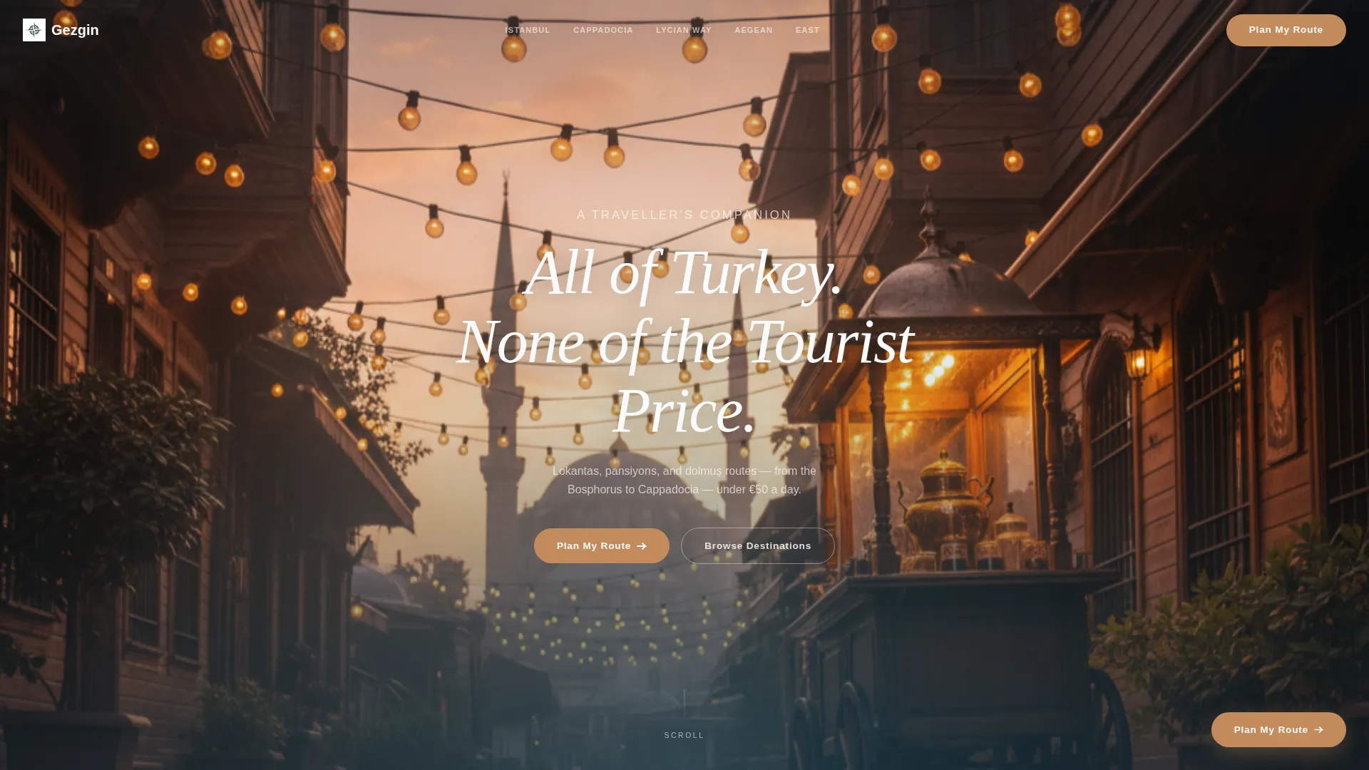
- A full-bleed golden-hour header with a centered handwritten-style headline and no overlay gradient
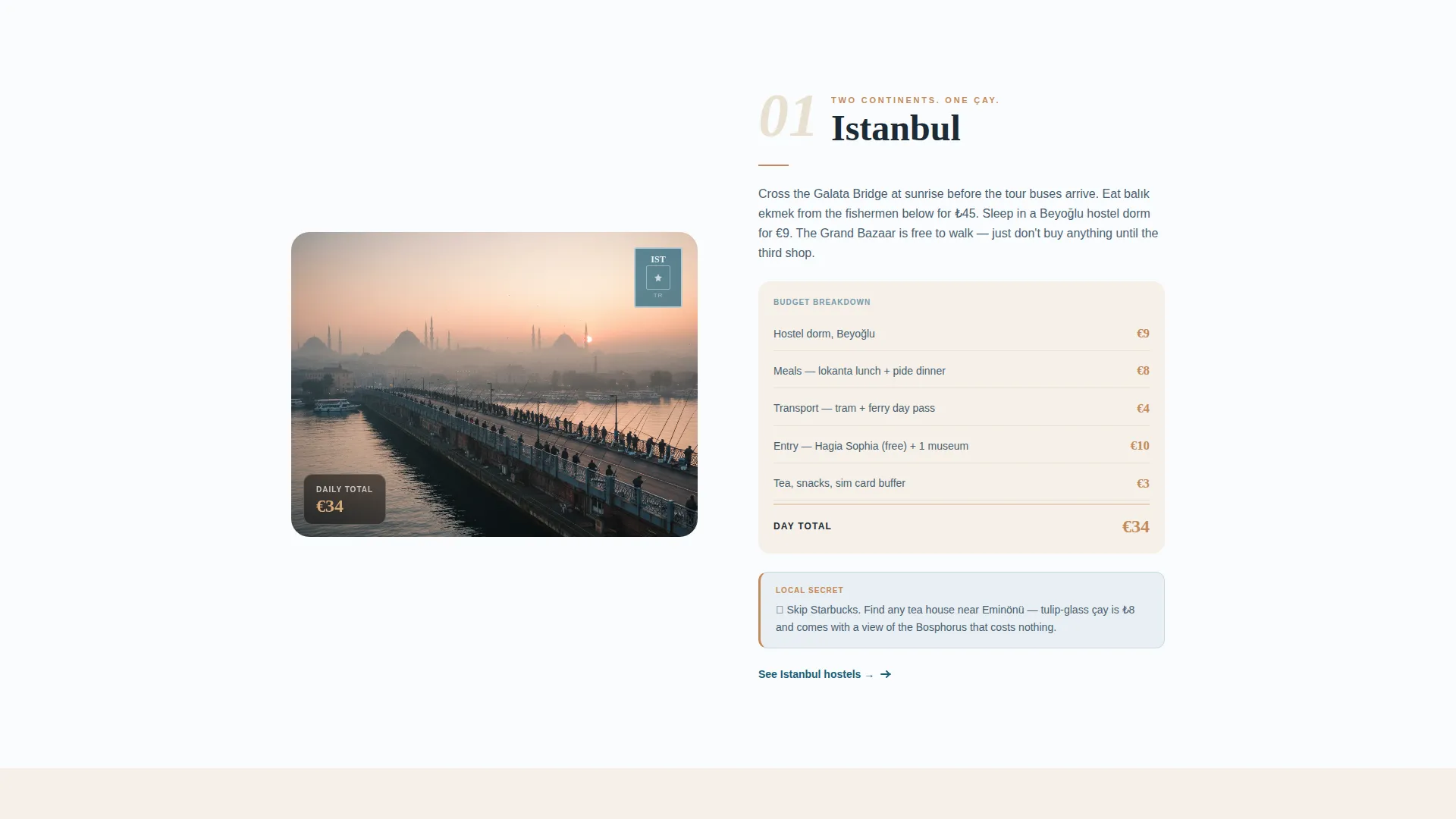
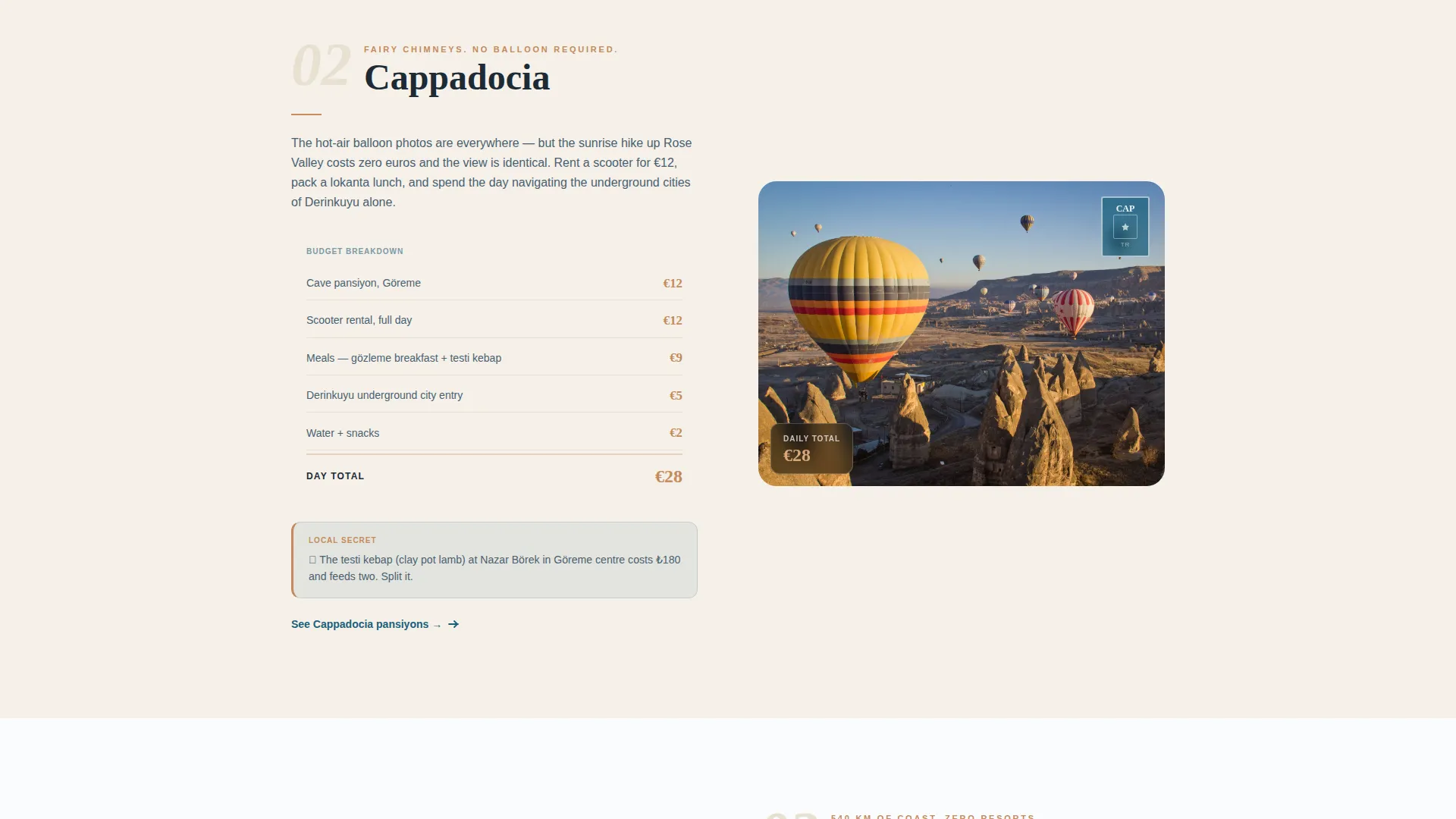
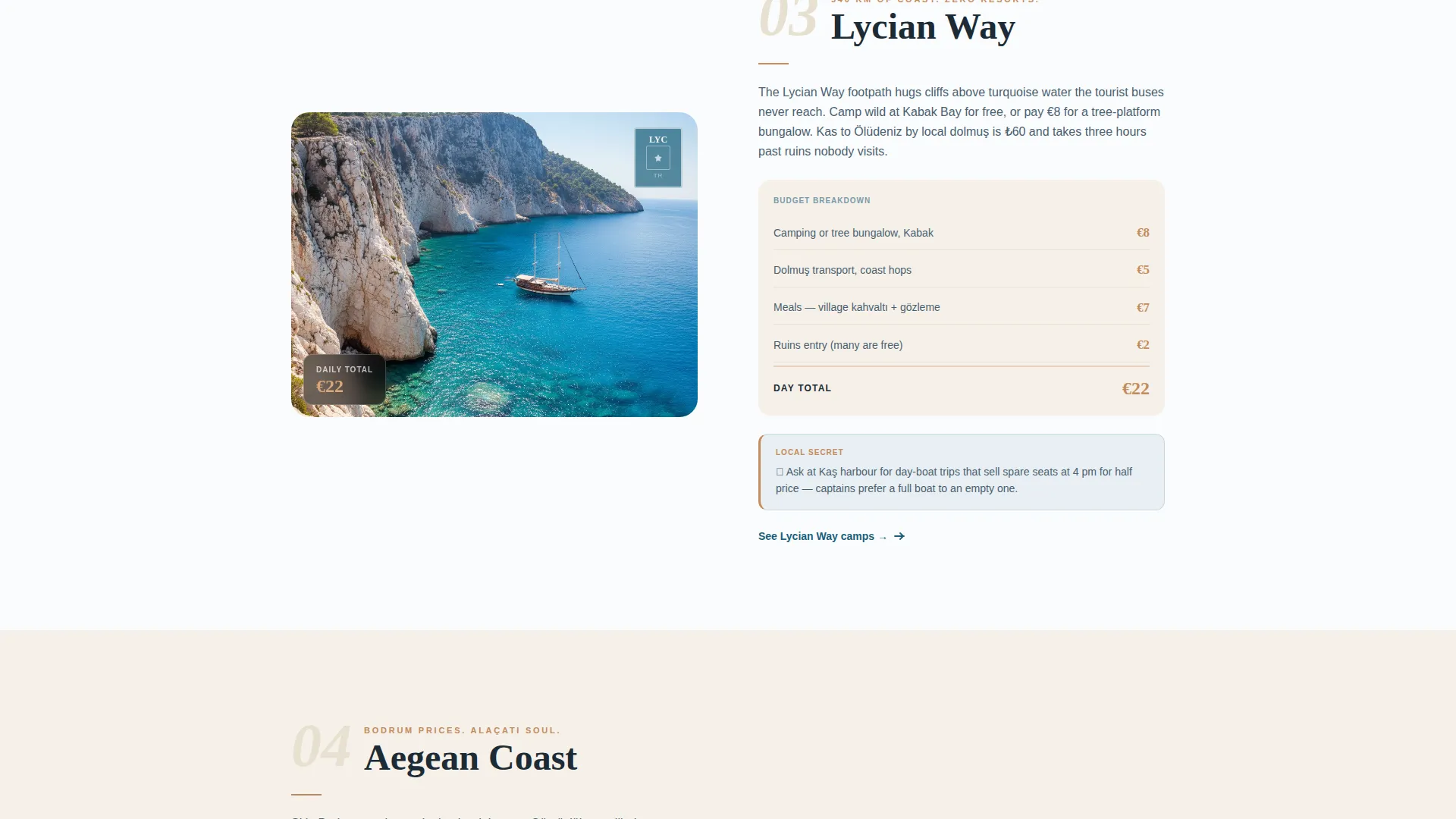
- Five destination chapters covering Istanbul, Cappadocia, the Lycian Way, the Aegean Coast, and Eastern Anatolia, each with a hero photo, budget breakdown, local secret, and booking action
- A three-step route planning flow (region selection on an illustrated map, calendar window picker, and email entry) plus a low-friction secondary email capture path
Feature list
This template delivers a focused set of purpose-built components. Each one serves the core goal of moving a curious visitor toward planning and booking a budget trip through Turkey.
Full-Bleed Golden-Hour Header
The header opens with an edge-to-edge Istanbul street photograph. A single handwritten-style headline fades in at center with no gradient overlay, so the image breathes fully and the composition pulls the reader's eye directly into the first scroll.
Five-Chapter Destination Sequence
Each of the five chapters is formatted as a postcard-sized story spread. It holds one hero photo, a three-line budget breakdown, a local insider tip, and a single booking action. The sequence builds from Istanbul westward to Eastern Anatolia, with daily costs visibly dropping as the reader progresses.
Dual Conversion Path System
A floating copper "Plan My Route" button appears after the second chapter and again as a full-width closing section. A secondary "Just Send the Guide" option captures email-only leads. The two paths reduce friction for visitors at different stages of travel intent.
Three-Step Route Planning Flow
Clicking the primary call to action opens a guided three-step flow. The visitor picks regions on an illustrated map, selects a travel window from a calendar, and enters an email address to receive a custom budget itinerary with hostel and transport links.
Copper Price Callout System
Every interactive element and price callout uses hammam copper (#C48B5C) as a consistent visual marker. This creates an intuitive reading pattern where the eye naturally moves to cost figures and action buttons without needing extra instruction.
Organic Flow Scroll Rhythm
The page is structured so that scrolling feels like turning pages in a travel journal. Each section transition is paced to build anticipation. The design uses generous Marmara white margins between chapters so full-page photography has room to register before the next section loads.
Page sections overview
| Section | Purpose |
|---|---|
| Full-Bleed Header | Opens with an immersive Istanbul street photo and a single handwritten headline |
| Istanbul Chapter | First destination spread with hero photo, budget breakdown, local secret, and booking action |
| Cappadocia Chapter | Second destination chapter; floating "Plan My Route" button appears here |
| Lycian Way Chapter | Third chapter featuring coastal pansiyon stays and dolmuş route tips |
| Aegean Coast Chapter | Fourth chapter covering Antalya and İzmir apartment and activity budgets |
| Eastern Anatolia Chapter | Fifth chapter with the lowest daily cost figures, building final booking urgency |
| Plan My Route Flow | Three-step interactive flow for region selection, calendar, and email capture |
| Guide Email Capture | Secondary low-friction section for visitors who want the guide without committing to dates |
| Full-Width Closing call to action | Final "Plan My Route" section reinforcing the primary conversion action |
Design & branding system
The visual identity follows an Organic Flow theme built around the Ocean Calm color system. The palette draws directly from the Turkish coast: deep water, pale stone, warm copper, and open white space.
- Four-color palette: deep Aegean teal (#1A5F7A) for section backgrounds and navigation, sun-bleached limestone (#F5F0E8) for body text fields, hammam copper (#C48B5C) for interactive elements and price callouts, and Marmara white (#FAFCFD) for generous margins
- Typography uses a handwritten-style display face for the headline and chapter titles, paired with a clean body font that keeps long budget breakdowns easy to scan
- Full-page photography anchors each chapter, with no overlay gradients, so images carry the full atmospheric weight of each destination
Mobile & speed optimization
The Organic Flow layout is designed to translate naturally to smaller screens. Full-bleed photography and chapter-by-chapter scroll structure adapt well to vertical mobile reading without losing the journal feel.
- Single-column chapter stacking on mobile keeps the destination story intact and budget breakdowns visible without horizontal scrolling
- The three-step route planning flow is structured as a linear sequence, which maps cleanly to a mobile tap-through experience
- Copper callout buttons remain full-width on smaller screens, keeping the primary and secondary conversion paths easy to reach with one thumb
How this template helps you convert
The page is built around a single behavioral insight: travelers need to believe the trip is possible before they will take any action. Every design and copy choice moves the visitor from curiosity to confidence.
- The five-chapter destination sequence reveals progressively lower daily costs, creating a quiet urgency that makes the trip feel increasingly achievable as the reader scrolls deeper into the page.
- The dual conversion path removes the binary choice between "book now" and "leave." Visitors who aren't ready to commit dates can still convert through the lighter email-only path, keeping them in the funnel without pressure.
- The three-step planning flow breaks a potentially overwhelming decision into three simple inputs, reducing the cognitive load that stops budget travelers from committing to an itinerary.
Other information about this template
This template is a strong fit for travel creators who want to position Turkey as a viable destination for under fifty euros a day. It is equally suited for guides focused on the classic Istanbul-to-Cappadocia overland route and for regional specialists covering the Lycian Way or the Aegean Coast.
- The template style is Storybook and Full-Page, meaning each section is designed as a self-contained visual chapter rather than a scrolling content feed
- The header concept follows a Full-Bleed Photo approach, which requires one high-quality landscape photograph for each of the five destination chapters plus the opening hero image
- The Curated Collection creative direction means content editors can swap destination chapters independently without rebuilding the page structure
- The Booking and Scheduling landing-page direction means the primary goal is always to move the visitor toward the route planning flow or the email capture, not to serve as a general content archive
Theme
Organic Flow
Creative direction
Curated Collection
Color system
Ocean Calm
Style
Storybook/Full-Page
Direction
Booking/Scheduling
Page Sections
Full-bleed Golden-hour Header
Five-chapter Destination Sequence
Dual Conversion Path System
Three-step Route Planning Flow
Copper Price Callout System
Organic Flow Scroll Rhythm
Related questions
Can I replace the five destination chapters with my own travel regions?
Do I need a backend system to activate the email capture?
Is this template suited for an individual travel blogger or only for agencies?
What kind of photography works best with this template?
Can the three-step planning flow be reduced to a single email field?


