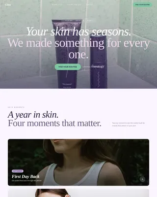
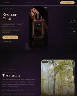
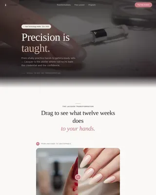
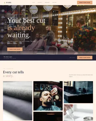
Beauty Tech & Device Blog Website Template
Glam is a luxe minimal landing page template built for virtual makeup try-on apps. It uses a cinematic card grid layout, editorial golden-hour visuals, and a Desert Rose color system to move beauty-curious visitors from first scroll to in-browser AR session. No sign-up gate, no friction, just one tap to try every shade on their own face.
by Rocket studio
Quick summary
Glam is a single-page, card-grid landing page template for virtual makeup try-on apps. It blends editorial beauty campaign aesthetics with a high-interactivity modular layout. The Desert Rose color system, shimmer animations, and a sticky liquid-gold call-to-action bar work together to move visitors straight into an in-browser augmented reality experience.
Who this template is for
This template is built for anyone launching or promoting a virtual makeup try-on experience. It speaks directly to the people building and selling beauty tech products, and to the professionals who rely on them.
- Beauty tech founders and indie cosmetic brands who need to showcase AR shade-testing without manufacturing samples
- Professional makeup artists building client mood boards or preparing for bridal consultations
- Beauty-curious consumers in their twenties and thirties who want to explore shades on their own face before buying
What problem this template solves
Shoppers hesitate before buying makeup online because they cannot see how a shade looks on their skin. A generic product page does not solve that doubt. This template is designed to dissolve that hesitation the moment a visitor lands.
- It removes the "will this work for my skin tone?" barrier with a skin-tone swatch selector built into the pre-entry flow
- It eliminates sign-up friction by routing the primary call to action directly into the in-browser AR experience
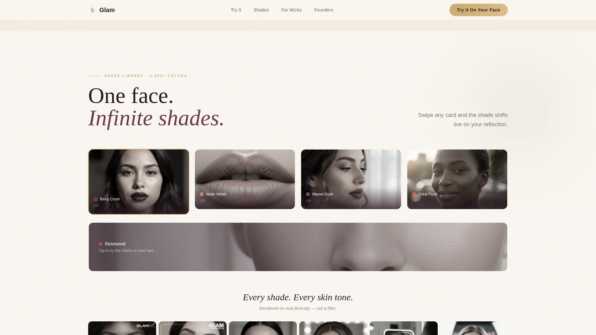
- It communicates infinite shade choice without overwhelming visitors, using a mosaic card grid that scales from four shades to dozens across diverse skin tones
What you get with this template
You get a fully structured, section-led landing page that combines editorial visual storytelling with a click-through conversion flow. Every layout decision serves one goal: get the visitor into the live try-on experience as fast as possible.
- A cinematic card grid layout with modular bento sections, looping video cards, and scroll-linked stagger animations
- A complete Desert Rose design system including typography pairing, color tokens, hover states, and interactive borders
- Five distinct page sections covering hero, facial landmark demo, shade grid, evening-look sequence, and a use-case bento split
Feature list
This template includes a tightly scoped set of components and design behaviors derived directly from its source brief.
Editorial Hero with Shimmer Animation
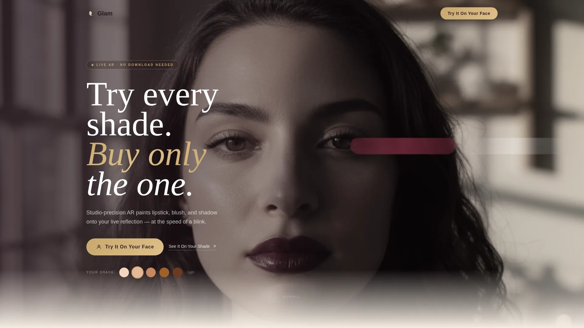
The header uses a tight editorial close-up with an asymmetric composition and shallow depth of field. A shimmer animation pulses along the rendered lip color, signaling live AR rather than a static photograph. The headline drifts in over the bare side of the face to create immediate visual tension.
Cinematic Modular Card Grid
The scroll experience unfolds like a beauty campaign film. Each row of cards is a distinct scene, moving from facial landmark mapping to shade swatching to evening smoky-eye loops. Cards scale smaller and denser mid-page to communicate broad SKU coverage, then slow to a single card at the end for emotional payoff.
Skin-Tone Swatch Selector
A secondary entry path labeled "See It On Your Shade" lets visitors pick from five skin-tone swatches before launching the AR experience. This pre-selection step reduces the doubt that stops first-time visitors from clicking through.
Sticky Liquid-Gold call to action Bar
The primary call to action, "Try It On Your Face," appears beneath the hero and reappears as a sticky bottom bar after the second scroll. It uses the liquid-gold accent color to stand out against every section background without interrupting the editorial feel.
Looping Smoky-Eye Video Cards
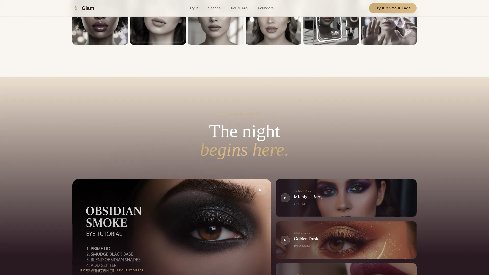
The evening section uses card-sized looping videos styled like single shots from a perfume commercial. They create a darkened, cinematic rhythm that contrasts the warmer, brighter upper sections and sustains scroll engagement.
Use-Case Bento Split
A dedicated bento grid separates three distinct user types: the casual beauty explorer, the professional makeup artist, and the indie cosmetic founder. Each panel speaks to a different reason to use the app, broadening appeal without diluting the core message.
Page sections overview
| Section | Purpose |
|---|---|
| Hero Lifestyle Shot | Introduce the app with an editorial close-up and headline |
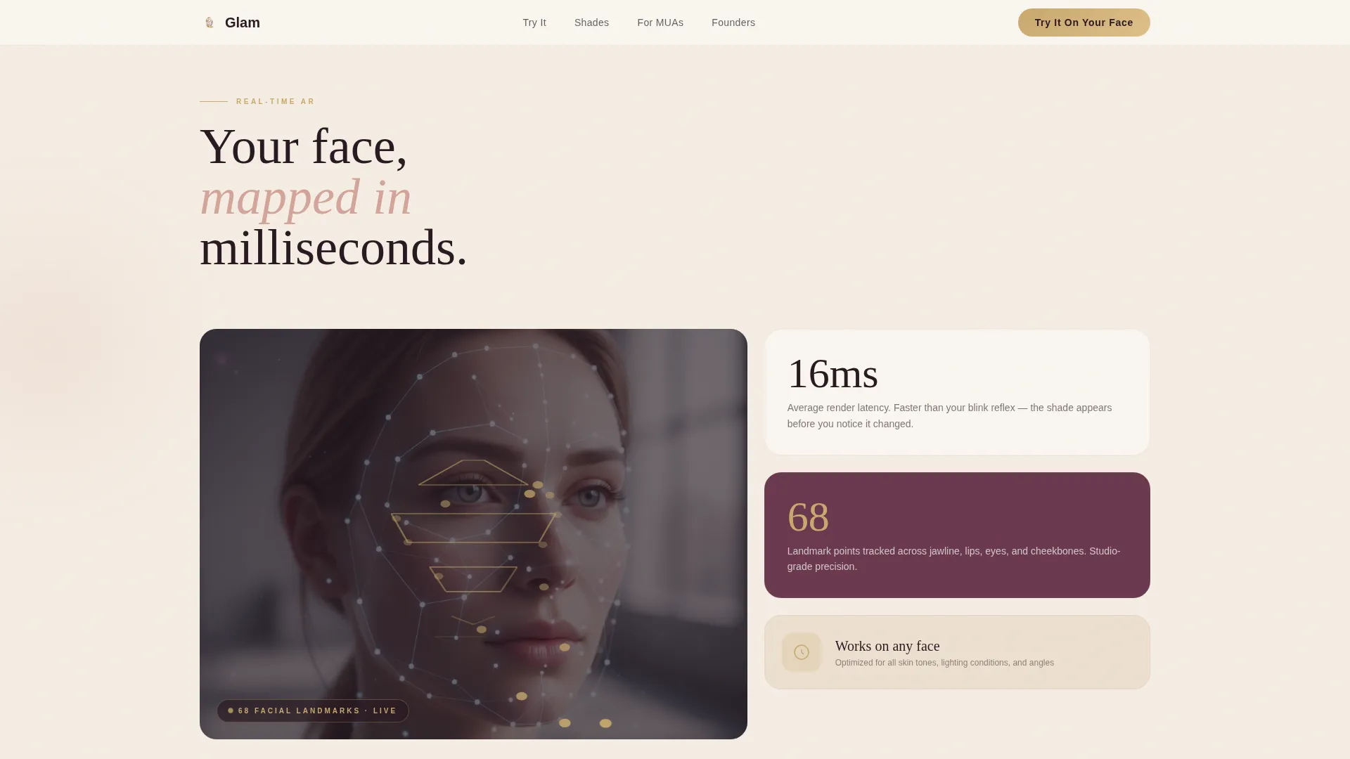
| Landmark Demo | Show real-time facial mapping with constellation dot animation |
| Shade Grid Mosaic | Display four shades across diverse skin tones in a bento card layout |
| Cinematic Evening Sequence | Present smoky-eye looks via looping, perfume-commercial-style video cards |
| Use Cases Bento | Split panel addressing casual users, professional MUAs, and indie founders |
| Footer | Horizontal footer pattern with brand and navigation links |
Design & branding system
The visual identity follows a Luxe Minimal direction rooted in a Desert Rose color palette. Every surface feels warm and tactile, like a matte compact opening against cool marble.
- Color tokens: sun-warmed nude (#D4A59A) as the primary tone, soft sand (#F5EDE3) for card backgrounds and page canvas, deep mauve (#6B3A4E) for depth and shadow, and liquid gold (#C9A96E) reserved for calls to action, hover states, and interactive borders
- Typography pairing: Fraunces editorial serif for headlines and display text, DM Sans clean sans-serif for body copy and user interface labels
- Animations include shimmer pulse on the hero lip render, constellation dot face-mapping on scroll entry, grayscale-to-color hover transitions on cards, and stagger reveal sequences driven by scroll position
Mobile & speed optimization
The template is built mobile-first, reflecting the core audience of people swiping shades on their lunch break. Desktop layouts preserve the editorial polish while the mobile experience stays fluid and tap-friendly.
- Card grid reflows cleanly across breakpoints, keeping the mosaic structure readable on small screens
- Scroll-linked animations use Intersection Observer and CSS transforms to keep motion smooth without heavy scripting
- The sticky call-to-action bar is positioned for thumb reach on mobile, appearing after the second scroll rather than on page load
How this template helps you convert
Every design and copy decision in this template reduces the gap between first impression and first tap. The conversion flow is intentionally frictionless.
- The hero places the primary "Try It On Your Face" call to action immediately below the editorial header, capturing visitors before they scroll
- The skin-tone swatch selector addresses the most common objection, "will this look right on me?", before the visitor commits to entering the AR experience
- The sticky bottom bar keeps the call to action visible throughout the entire scroll journey, so a visitor who pauses mid-page to watch a looping video card can convert without scrolling back up
Other information about this template
This template is well-suited for beauty tech product launches, AR app promotions, and direct-to-consumer cosmetic campaigns targeting mobile-first audiences. It ships as a complete, single-page layout with no backend dependencies or form gates in the conversion path.
- The no-sign-up conversion flow means the click launches the web-based AR experience directly in the browser, removing every layer of pre-entry friction
- Real user testimonials with photos and specific shade names are included as a social proof section, featuring diverse skin tones to reinforce the template's inclusive positioning
- The template style is Card Grid (Modular), making individual sections easy to reorder, swap, or scale as your product catalog or campaign focus evolves
- The creative direction is Cinematic Sequence, which means the scroll rhythm is intentional, it builds pace, creates contrast between sections, and ends on a single still moment to let the brand impression settle
Theme
Luxe Minimal
Creative direction
Cinematic Sequence
Color system
Desert Rose
Style
Card Grid (Modular)
Direction
Click-Through
Page Sections
Editorial Hero with Shimmer Animation
Cinematic Modular Card Grid
Skin-tone Swatch Selector
Sticky Liquid-gold Call to Action Bar
Looping Smoky-eye Video Cards
Use-case Bento Split
Related questions
Does this template include a sign-up form or email gate?
Can I use this template if I offer more than four lip shades?
Is this template suitable for a professional makeup artist, not just a consumer app?
What animation types are included in this template?
Can an indie cosmetic founder use this template to test new colorways?