Endocrinologist Reviews Website Template
Gland is a single-page endocrinologist patient education landing page built around condition comparison tables. It translates thyroid panels, insulin curves, and cortisol rhythms into plain language through side-by-side data tables, animated hormone metric counters, expert quote blocks, patient testimonials, and condition-specific call-to-action flows.
by Rocket studio
Quick summary
Gland is a Medical Clarity landing page designed for endocrinologist patient education. It opens with an animated hormone panel dashboard and leads visitors through condition comparison tables covering hypothyroidism, polycystic ovary syndrome (PCOS), adrenal fatigue, and Type 2 diabetes. Every section builds interpretive confidence before routing patients to deeper condition guides.
Who this template is for
This template is built for endocrinology practices, hormone health educators, and patient advocacy platforms that want to replace confusing lab printouts with clear, guided content.
- Endocrinologists and hormone specialists who want to educate patients before and after appointments
- Health content teams building condition-specific resource hubs for newly diagnosed patients
- Practices serving perimenopausal women, thyroid patients, and families navigating adolescent hormone referrals
What problem this template solves
Patients receive lab results they cannot interpret. They leave appointments with numbers but no narrative. This template closes that gap by placing symptom-to-lab comparisons and plain-language expert commentary directly in front of the people searching for answers at midnight.
- Patients struggle to connect how they feel to what their labs actually show
- Misconceptions about normal ranges lead to delayed diagnoses and missed follow-ups
- Practices lack a structured digital space to educate patients between visits
What you get with this template
You get a fully structured, single-page layout that moves visitors from confusion to clarity through a deliberate sequence of data, comparison, and expert context.
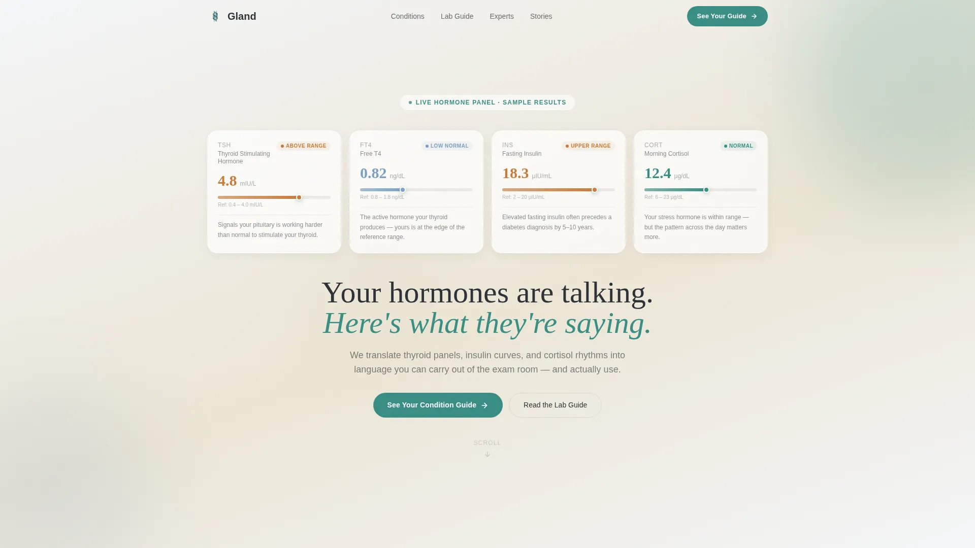
- An animated hormone panel header with counters for TSH, free T4 (thyroxine), fasting insulin, and cortisol
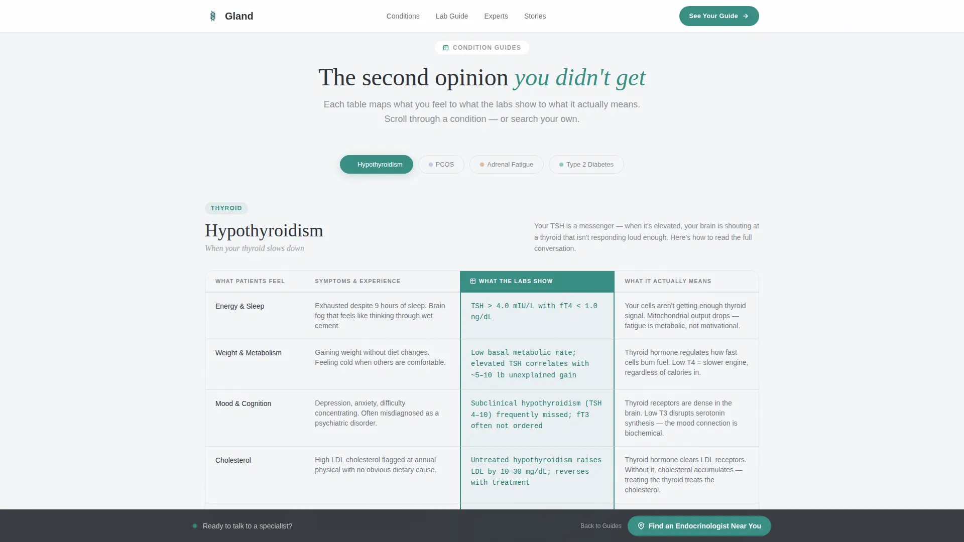
- Four condition comparison table sections with symptom-versus-lab columns and treatment path comparisons
- Expert quote blocks, horizontal-scroll patient testimonial cards, sticky call-to-action bar, and accordion FAQ
Feature list
Animated Hormone Panel Dashboard
The header presents a stylized lab readout showing TSH, free T4, fasting insulin, and cortisol values. Counter animations tick each metric into position like results populating a patient portal. A teal pulse on each metric landing draws the eye naturally before the headline fades in.
Condition Comparison Tables
Four tabbed comparison table sections cover hypothyroidism, PCOS, adrenal fatigue, and Type 2 diabetes. Each table places patient-felt symptoms beside lab findings, shows normal reference ranges next to common misreadings, and compares treatment paths side by side. Staggered row reveal animations make each section feel like a second opinion unfolding.
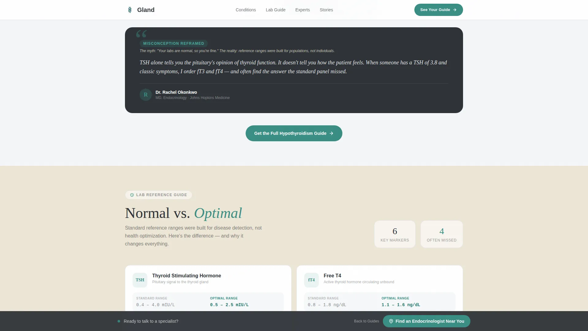
Expert Commentary Blocks
Between each comparison table, attributed endocrinologist quote blocks reframe common misconceptions. These blocks add interpretive authority and give visitors the feeling of reading a real clinical explanation rather than a generic article.
Patient Testimonial Cards
A horizontal scroll-snap card row displays patient testimonials with names and conditions noted. The format keeps social proof visible without interrupting the educational flow of the page.
Click-Through Call-to-Action System
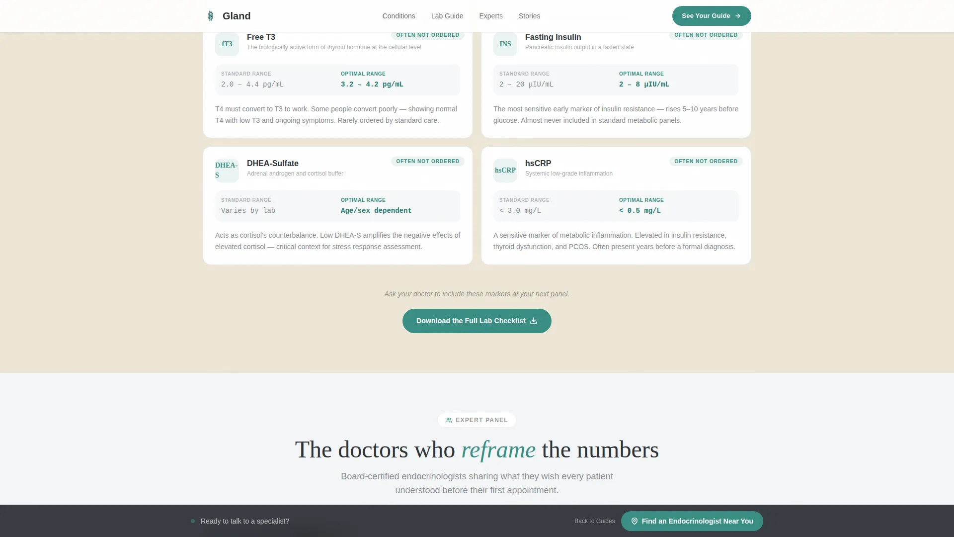
A primary call-to-action button labeled "See Your Condition Guide" appears after every comparison table. A sticky bottom bar holds a secondary call-to-action: "Find an Endocrinologist Near You." Both placements are designed to earn the click through demonstrated depth, not pressure.
Accordion FAQ Section
An interactive accordion FAQ sits at the bottom of the page. It handles the layered questions patients arrive with and keeps the page feeling like a complete consultation rather than a brief overview.
Page sections overview
| Section | Purpose |
|---|---|
| Hero Dashboard Header | Animated hormone metric counters with headline fade-in |
| Hypothyroidism Table | Symptom-versus-lab comparison with treatment paths |
| Expert Quote Block | Endocrinologist commentary reframing thyroid misconceptions |
| PCOS Comparison Table | Side-by-side symptom, lab range, and treatment data |
| Expert Quote Block | Attributed commentary on PCOS misdiagnosis patterns |
| Adrenal Fatigue Table | Cortisol rhythm context and lab interpretation columns |
| Expert Quote Block | Clinical reframe of adrenal fatigue lab variability |
| Type 2 Diabetes Table | Fasting insulin and glucose range comparison section |
| Patient Testimonials | Horizontal scroll-snap cards with names and conditions |
| Primary Call-to-Action Block | "See Your Condition Guide" with condition guide routing |
| Sticky Bottom Bar | Persistent "Find an Endocrinologist Near You" call-to-action |
| Accordion FAQ | Interactive answers to common patient lab questions |
| Footer | Vercel Horizontal Flow pattern layout |
Design & branding system
The Soft Mist color system keeps the page warm and readable without feeling clinical or cold. Backgrounds use fog white (#F4F6F8) and warm sand (#D9CBAE). Body text lives in grounded charcoal (#2E3338). Diagnostic teal (#3A8F85) appears only on interactive highlights, comparison column headers, hormone level indicators, and call-to-action buttons.
- Typography pairs Fraunces serif display headlines with DM Sans body text for a balance of warmth and readability
- Calm vein blue (#7BA0C4) supports secondary user interface elements and reference range indicators
- The overall tone feels like morning light through a clean exam room window: quiet, clear, and trustworthy
Mobile & speed optimization
This template is built mobile-first, reflecting the reality that most patients search for hormone information on a phone late at night. All animations are CSS-first to keep motion smooth without heavy scripting overhead.
- Counter animations, scroll reveals, and staggered table rows are all handled with CSS-first techniques
- The sticky call-to-action bar and comparison table tabs are optimized for touch interaction on small screens
- Horizontal scroll-snap testimonial cards adapt naturally to narrow viewports without layout shifts
How this template helps you convert
The page earns clicks by demonstrating interpretive value before making any ask. Visitors who read through a full comparison table already understand their condition better than they did before arriving.
- The animated hormone dashboard creates an immediate personal connection, making visitors feel the page is about their own results from the first scroll
- Repeating the "See Your Condition Guide" call-to-action after every comparison table captures intent at the exact moment a visitor reaches peak understanding
- The sticky bottom bar keeps the secondary conversion option visible throughout the entire scroll without interrupting the educational experience
Other information about this template
This template is part of the Gland Medical Clarity design system, suited for practices that prioritize patient comprehension as a core service offering.
- The template style is a Comparison Table layout, making it straightforward to adapt for additional hormone conditions beyond the four included sections
- Page copy and table content are fully editable, so practices can update reference ranges, add conditions, or adjust expert quotes to reflect their clinical voice
- The footer follows the Vercel Horizontal Flow pattern for a clean, professional close to the page
Theme
Medical Clarity
Creative direction
Expert Panel
Color system
Soft Mist
Style
Comparison Table
Direction
Click-Through
Page Sections
Animated Hormone Panel Dashboard
Condition Comparison Tables
Expert Commentary Blocks
Patient Testimonial Scroll Cards
Click-through Call-to-action System
Accordion FAQ Section
Related questions
Can I add more condition sections beyond the four included?
Is this template suitable for a solo endocrinologist practice?
Do I need coding knowledge to customize the table content?
How does the sticky call-to-action bar behave on mobile?
Can the condition guide links route to external pages or internal anchors?



