Endocrinologist Complete Booking Website Template
Gland is a curated endocrinologist provider directory landing page built for patients who are exhausted, misdiagnosed, or simply lost. A guided five-question assessment matches visitors to subspecialist providers by symptom cluster. Comparison tables break down real clinical differences between specialties, helping patients arrive at their first appointment with clarity and confidence.
by Rocket studio
Quick summary
Gland is a patient-facing endocrinologist directory landing page. It combines a guided quiz assessment, subspecialty comparison tables, and warm testimonial-led design to match overwhelmed patients with the right specialist. The scroll-through flow moves visitors from confusion to a shortlist of matched providers, one clear step at a time.
Who this template is for
This template is built for directory operators, healthcare platforms, and patient-advocacy services that connect people with endocrinology specialists. It works especially well for teams serving patients who have struggled to find answers through the standard referral system.
- Patient-matching platforms focused on thyroid, diabetes, polycystic ovary syndrome (PCOS), adrenal, or pediatric growth conditions
- Healthcare directories that want to earn patient trust before asking for a zip code
- Operators who need a high-interactivity landing page with a guided assessment flow built in
What problem this template solves
Patients searching for an endocrinologist often arrive overwhelmed and skeptical. They have seen multiple doctors, received conflicting advice, and lost trust in the referral process. A plain provider list does not help them choose. They need context, reassurance, and a clear path forward.
- Patients cannot tell which endocrinology subspecialty they actually need
- Newly diagnosed patients face too many choices with too little guidance
- Generic directories match by location alone, ignoring symptom clusters and clinical nuance
What you get with this template
The template delivers a complete single-page assessment and directory experience. Every section is designed to remove one layer of patient overwhelm before asking them to act.
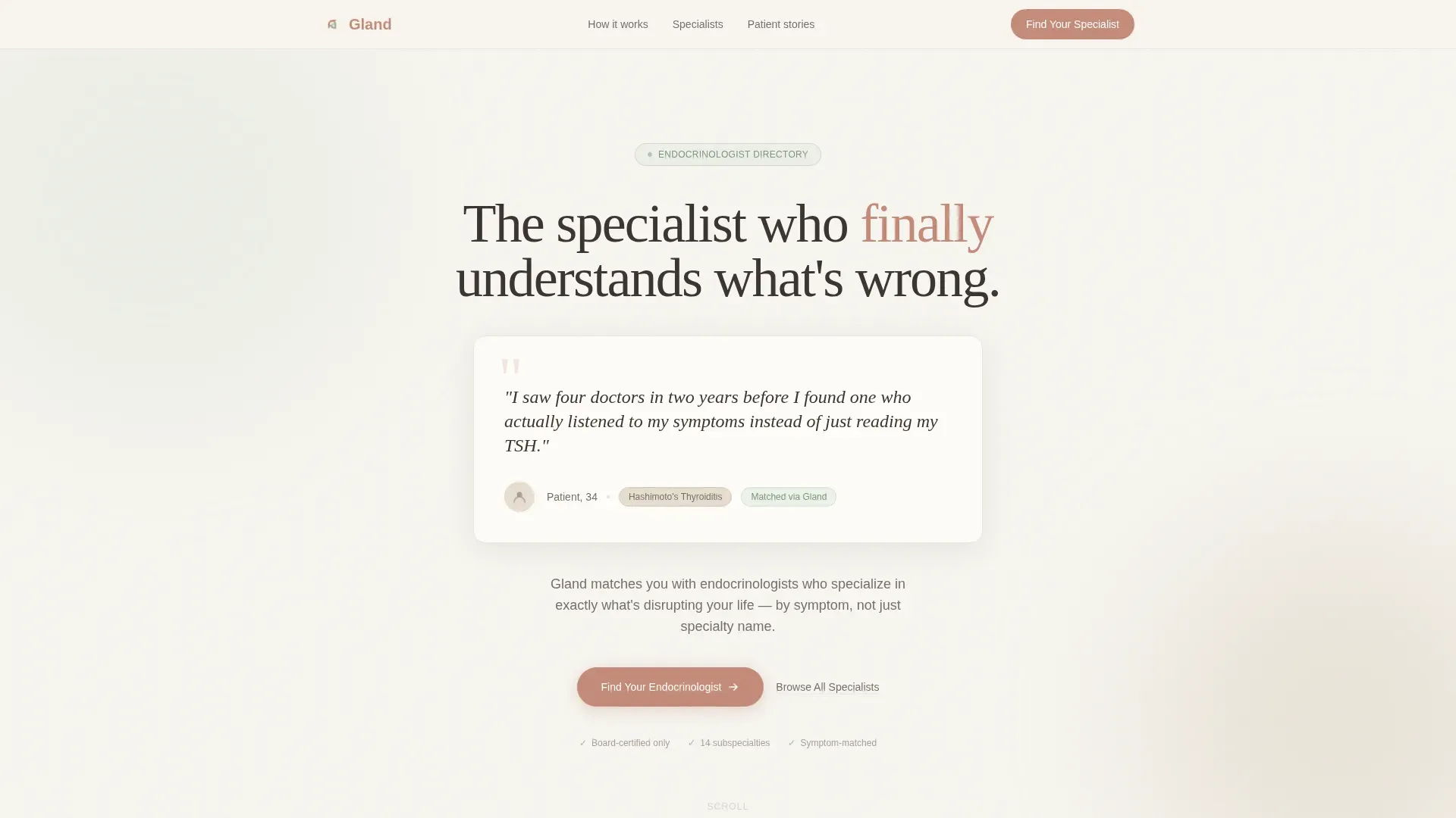
- A hero section built around an oversized testimonial card with a condition tag and specialty badge
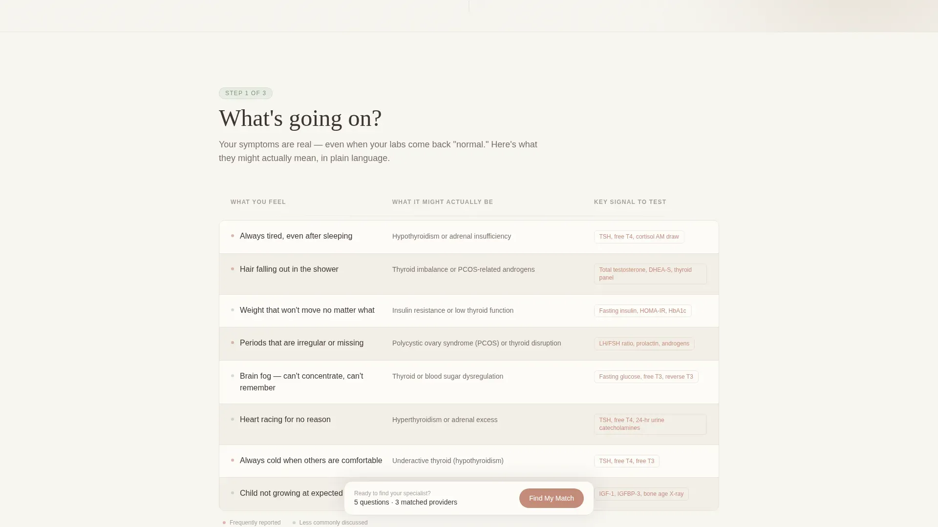
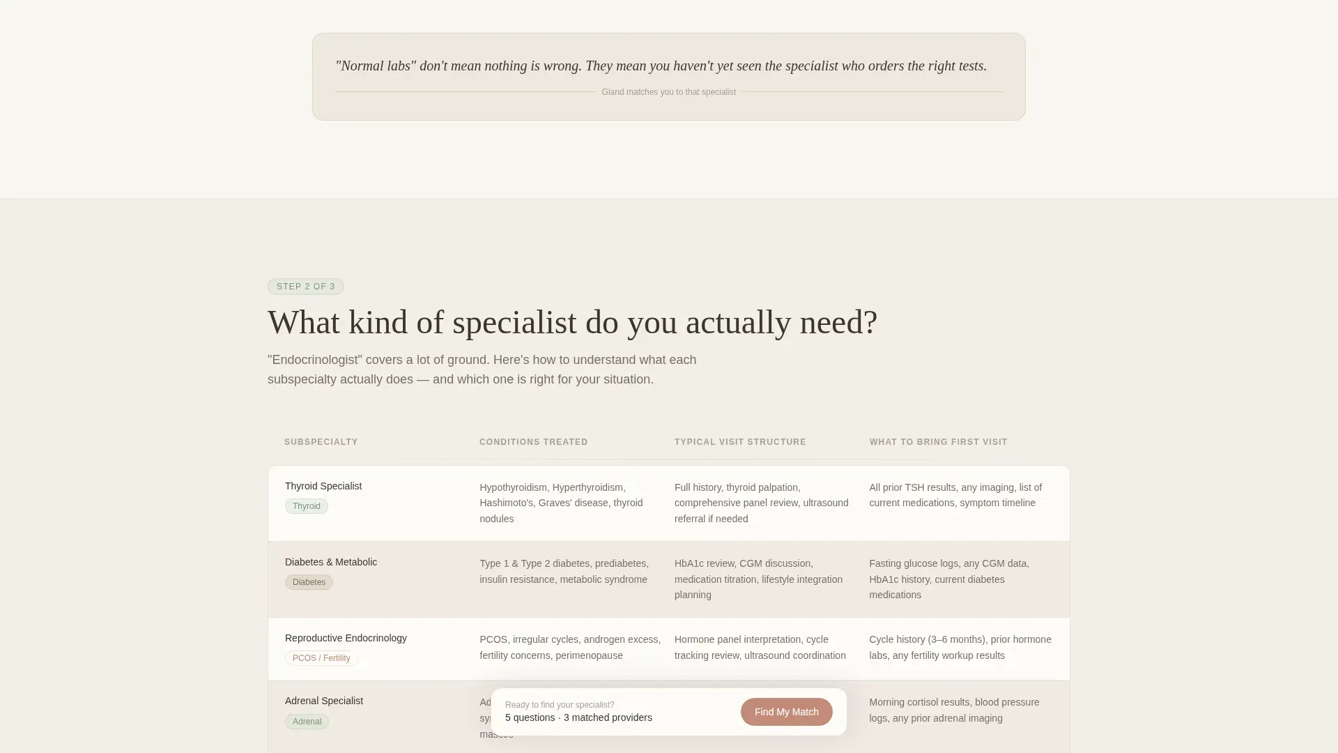
- Two structured comparison tables covering symptom causes and subspecialty differences
- A five-step guided quiz modal that narrows a full provider list down to three matched specialists
Feature list
This template includes purpose-built components designed for patient trust and guided decision-making.
Oversized Testimonial Hero Card
The page opens with a single floating card showing a real patient quote in a warm serif typeface. A condition tag and specialty badge sit beneath the quote. There is no stock photography, only human words and the specific condition they describe.
Symptom Comparison Table
The "What's Going On?" section presents a side-by-side table that translates vague symptoms into clinical causes. Rows contrast things like general fatigue with thyroid-related energy disruption, helping patients recognize their own experience before they choose a specialist.
Subspecialty Comparison Table
The "What Specialist Do You Actually Need?" section breaks endocrinology into its real subspecialties. Columns cover condition focus, typical visit structure, and what to bring to a first appointment. Each row builds clinical credibility and helps patients self-identify the right type of provider.
Five-Step Guided Quiz Assessment
The primary call to action opens a focused quiz modal. Questions appear one at a time, covering symptom cluster, duration, current diagnosis status, insurance type, and zip code. A soft progress bar tracks advancement, and results deliver a shortlist of three matched providers with specialty alignment scores.
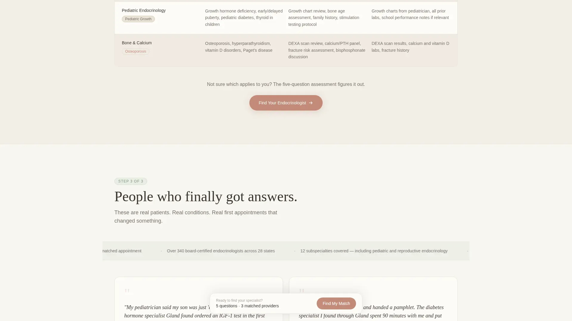
Patient Stories Section with Outcome Ticker
Testimonial cards with specific condition tags are grouped in a social proof section. An animated outcome metrics ticker scrolls alongside them, reinforcing directory credibility through real patient context rather than generic statistics.
Sticky Assessment Call-to-Action Bar
After the comparison tables, a fixed bottom bar keeps the "Find Your Endocrinologist" prompt visible throughout the scroll. A secondary text link, "Browse All Specialists," offers a direct path for visitors who already know what they need.
Page sections overview
| Section | Purpose |
|---|---|
| Hero testimonial card | Opens with patient voice and condition tag to establish immediate trust |
| "What's Going On?" table | Translates vague symptoms into named clinical causes |
| Subspecialty comparison table | Helps patients identify the right type of endocrinologist |
| Patient stories section | Reinforces trust through condition-specific testimonials and a metrics ticker |
| Quiz assessment call to action | Drives engagement with the five-step guided provider-matching modal |
| Sticky bottom bar | Keeps the primary call to action accessible throughout the full scroll |
| Footer | Single-row linear pattern with essential directory links |
Design & branding system
The visual identity follows a Healing Space theme. The palette is built around softness and warmth, chosen specifically to feel unlike a clinical environment while still communicating medical seriousness.
- Vapor white (#F7F5F0) backgrounds, muted sage (#A3B9A2) for section dividers and trust indicators, warm linen (#D6C9B6) behind cards and table rows, and clay rose (#C48B7A) reserved for calls to action and active states
- Typography uses Fraunces, a warm serif, for quotes and headlines, and DM Sans for body text and interface elements
- Scroll-triggered reveals, a spotlight card effect on the testimonial hero, and a marquee ticker in the patient stories section add motion without clinical sterility
Mobile & speed optimization
This template is designed mobile-first, reflecting how most patients search for care: on a phone, mid-symptom, often in a hurry. The quiz modal and interactive tables are built as client components, keeping the static base fast while isolating interactivity where it is needed.
- Single-column scroll layout on small screens keeps comparison tables readable without horizontal scrolling
- The sticky bottom bar is especially effective on mobile, where it stays anchored above the keyboard and thumb reach
- Quiz questions appear one at a time, reducing cognitive load on small screens and keeping the assessment feel focused rather than overwhelming
How this template helps you convert
The page is structured as a progressive trust-building journey. Each section earns the next click rather than demanding it upfront.
- The testimonial hero card leads with patient language, not a form, so visitors feel recognized before they are asked to do anything.
- The comparison tables answer the most common pre-conversion questions (what is wrong with me, which type of doctor do I need) in the page itself, removing friction before the quiz begins.
- The sticky call-to-action bar and repeated "Find Your Endocrinologist" button ensure the primary action is always one tap away, while "Browse All Specialists" catches visitors who are already further along in their decision.
Other information about this template
This template is built for the United States market, with quiz logic designed around English-language patient phrasing, USD context, and USA zip code input. The five-question assessment uses plain patient language throughout, such as "unexplained weight changes" rather than clinical terminology like "metabolic syndrome," to reduce drop-off during the quiz.
- The quiz modal supports multi-select checkboxes for symptom clustering, single-screen question flow, and a results screen showing three matched providers with specialty alignment scores
- The footer uses a Pattern 1 linear single-row layout, keeping the page clean and uncluttered at the bottom
- Animation level is medium: scroll-triggered section reveals, a spotlight hover effect on the hero card, and a marquee ticker in the social proof section add life without overwhelming the calm aesthetic
Theme
Healing Space
Creative direction
Step-by-Step Guide
Color system
Cloud Canvas
Style
Comparison Table
Direction
Quiz/Assessment
Page Sections
Oversized Testimonial Hero Card
Symptom Versus. Cause Comparison Table
Subspecialty Comparison Table
Five-step Guided Quiz Modal
Patient Stories with Metrics Ticker
Sticky Bottom Call-to-action Bar
Related questions
What kind of patient is this template designed for?
How does the guided quiz assessment work?
Can visitors skip the quiz and browse the full provider list?
What comparison tables are included in this template?
Is this a single-page layout or a multi-page site?



