Multi-Line Insurance Agency Coverage Discovery Website Template
Glasshold is a bento grid landing page template built for insurance agencies that manage multiple coverage lines. It combines a dark, glass-panel aesthetic with capability-focused tiles covering policy tracking, claims, renewals, and bundling. The freemium conversion model lets visitors explore value before signing up, making it ideal for agencies targeting small businesses, families, and fleet managers.
by Rocket studio
Quick summary
Glasshold is a single-page insurance agency portfolio template built on a bento grid layout. It uses a dark Tech Glass visual system and a freemium conversion flow to turn first-time visitors into registered users. Every section is designed to show capability before asking for commitment, which makes the experience feel genuinely useful rather than salesy.
Who this template is for
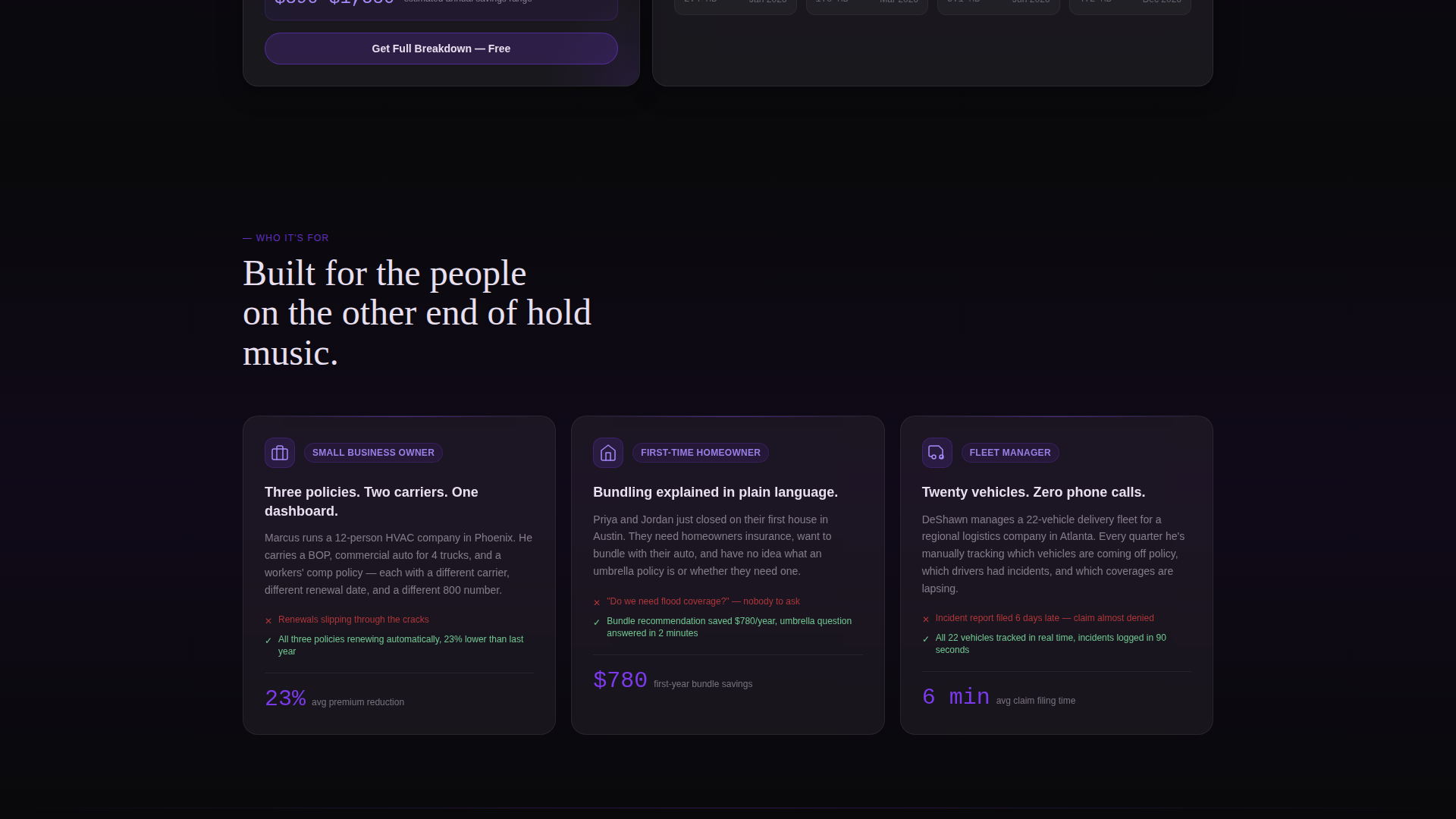
This template is built for modern insurance agencies that want their digital presence to match the complexity of what they actually offer. It suits agencies that handle multiple lines and need a landing page that communicates breadth without confusion.
- Independent insurance agencies managing life, auto, home, and commercial lines
- Agencies targeting small business owners, young homebuying families, and fleet managers
- Insurance teams replacing outdated brochure sites with an interactive portfolio experience
What problem this template solves
Most insurance agency pages overwhelm visitors with dense text or push a single product at a time. Clients carrying multiple policies across different carriers have no easy way to understand how everything connects. This template addresses that gap directly.
- Visitors cannot quickly see all coverage options and how they relate to each other
- Bundling benefits and renewal timelines are rarely communicated in plain, scannable language
- Conversion paths demand too much commitment upfront, before any value is shown
What you get with this template
You get a complete, single-page bento grid layout that functions as both a visual portfolio and a soft conversion engine. Every component is designed around a specific insurance use case, so the page never feels generic.
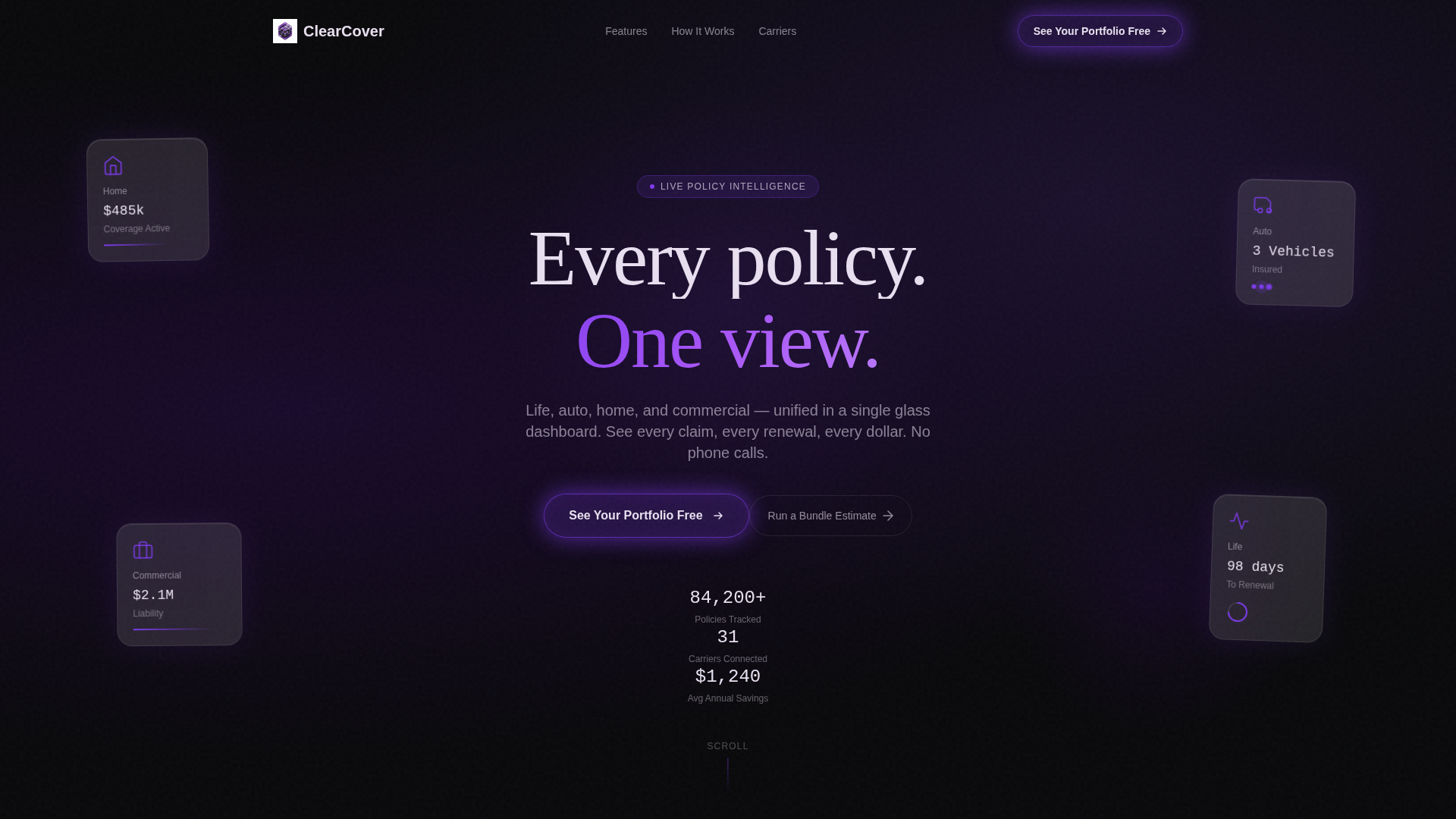
- A header section with four frosted-glass panels representing life, auto, home, and commercial lines
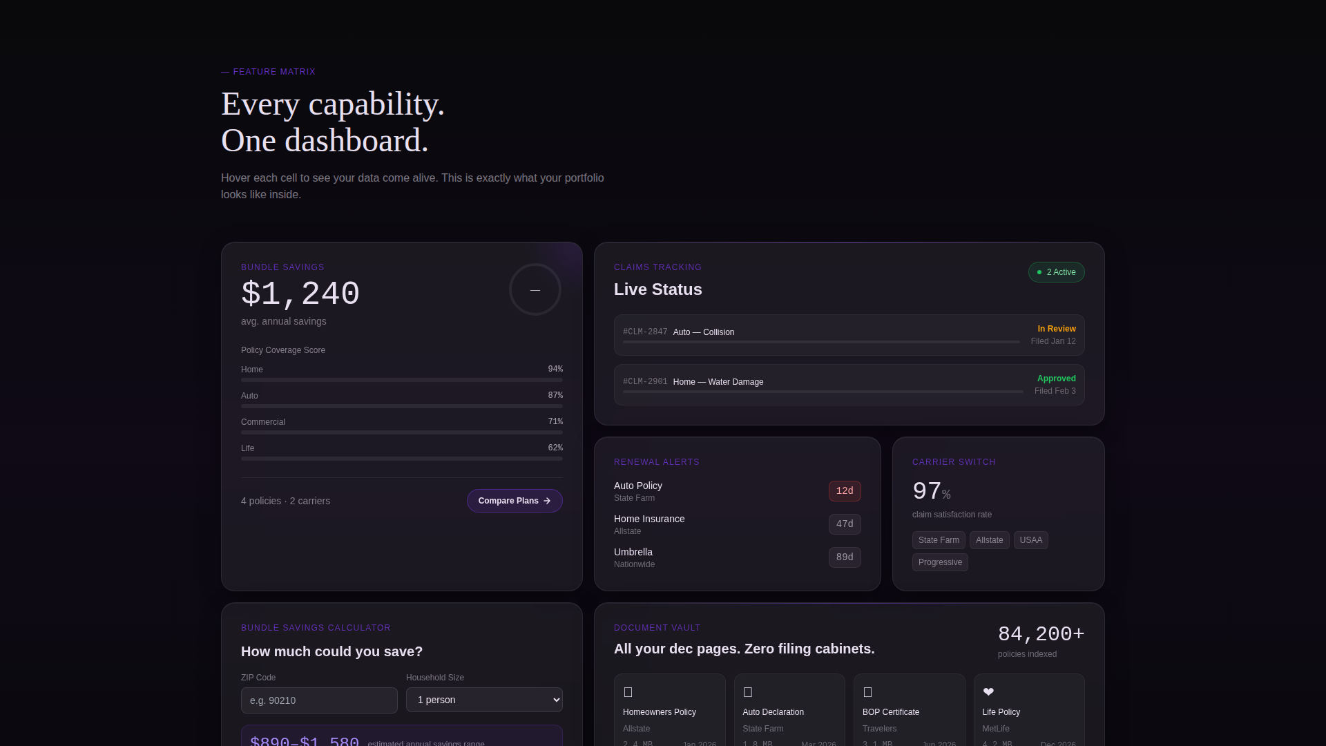
- Six bento capability tiles covering policy comparison, claims tracking, renewal alerts, carrier switching, bundle savings, and document vault
- A freemium conversion path with a three-step progressive form and a secondary bundle estimate calculator
Feature list
This template ships with a focused set of purpose-built components. Each one is designed to do exactly one job well.
Dark Glass Panel Header
Four frosted-glass rectangles float against a void-black background, each reflecting a different insurance line icon. The panels respond to mouse movement with a subtle parallax depth effect. Violet light catches the panel edges on hover, creating a premium first impression without using any stock photography.
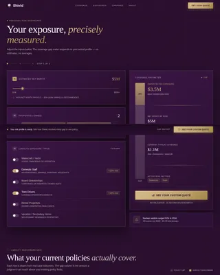
Bento Grid Capability Tiles
Six self-contained cards fill the grid below the header, each representing one core capability. Every tile rewards hover interaction with a micro-animation, such as a progress ring filling, a premium counter ticking down, or a coverage bar expanding. The grid gives visitors freedom to explore rather than forcing them through a linear scroll.
Three-Step Progressive Form
The primary call to action opens a focused three-step form. Step one collects email and zip code. Step two presents checkboxes for selecting which coverage lines the visitor carries. Step three lets them connect an existing carrier or upload a declaration page. Each step is brief so drop-off stays low.
Bundle Savings Calculator
A secondary conversion path lets visitors enter only a zip code and household size to receive an instant savings estimate range. The full breakdown is gated behind account creation, which turns the calculator into a natural lead-capture moment without feeling forced.
Sticky Mobile Call-to-Action Bar
On mobile viewports, a sticky bottom bar keeps the primary call to action visible at all times. This prevents visitors from losing the conversion path while scrolling through the grid. The bar uses the same violet border treatment as the desktop version for visual consistency.
Void and Violet Branding System
The color system uses absolute void black, deep plum, electric violet, and frosted panel white at controlled opacity levels. Violet appears only on active indicators, hover states, call-to-action borders, and toggle elements. This restraint makes every violet accent feel intentional and directs attention precisely where it belongs.
Page sections overview
| Section | Purpose |
|---|---|
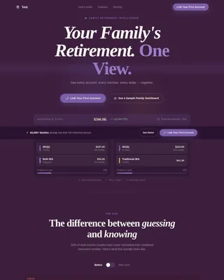
| Glass Panel Header | Introduces four insurance lines with frosted-panel icons and the headline "Every policy. One view." |
| Policy Comparison Tile | Shows side-by-side coverage options within a single bento card |
| Claims Tracking Tile | Displays active claim status with an animated progress ring |
| Renewal Alerts Tile | Presents upcoming renewal dates with a countdown visual |
| Carrier Switching Tile | Highlights the option to compare and switch carriers from one view |
| Bundle Savings Tile | Houses the savings calculator entry point and estimate output |
| Document Vault Tile | Represents secure policy document storage as a core capability |
| Progressive Sign-Up Form | Three-step form triggered by the primary call-to-action button |
| Sticky Mobile Bar | Keeps the "See Your Portfolio Free" call to action accessible on scroll |
Design & branding system
The visual identity is built around a Tech Glass theme that feels like a premium device screen viewed in a dark room. Every color decision is intentional, and the palette is tightly controlled to keep the experience focused.
- Void black (#09090B) and deep plum (#1A0A2E) anchor all backgrounds, keeping the surface dark and composed
- Frosted panel white (#E8E0F0) at 12% opacity gives card surfaces a translucent, layered depth without washing out the void
- Electric violet (#7C3AED) is reserved for hover states, active indicators, call-to-action borders, and toggles, so every violet accent signals an action
Mobile & speed optimization
The bento grid adapts to a single-column stack on mobile without losing its glass-panel character. The sticky bottom bar ensures the conversion path is never out of reach during a mobile scroll session.
- Grid columns collapse to a single column on small viewports, maintaining the stacked card depth and frosted-glass surface treatment
- Micro-animations are kept lightweight so the hover and scroll interactions do not create visual noise on touch devices
- The sticky mobile call-to-action bar persists across the full scroll length, keeping the primary conversion path always visible
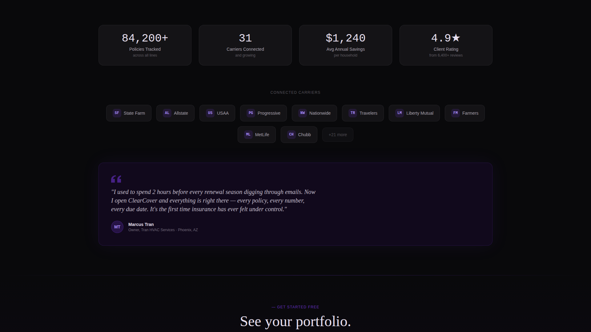
How this template helps you convert
The conversion model is built on showing value before asking for anything. Visitors experience a working demo of the dashboard concept before they ever see a sign-up gate.
- The bento grid acts as a live preview of the full dashboard, so visitors understand what they are signing up for before clicking anything
- The bundle savings calculator delivers an instant estimate using only zip code and household size, which creates a low-friction first engagement and gates the full result behind account creation
- The three-step progressive form breaks sign-up into small, low-commitment steps, reducing abandonment at each stage of the flow
Other information about this template
This template is categorized under insurance agency website templates and is specifically designed for the insurance agency portfolio page niche. It sits within the Technology category on the marketplace, reflecting its emphasis on interface-driven design over traditional agency brochure layouts.
- The template style is a bento grid, a layout format that suits complex multi-product offerings by giving each capability its own visual space
- The header concept, Dark Glass Panels, is a deliberate departure from hero images and stock photography, favoring architectural light and geometry instead
- The freemium and trial conversion direction means the template is structured to demonstrate product value before requesting any user data beyond a zip code
- Typography uses a thin geometric sans-serif to match the precision of the dark glass aesthetic, keeping headlines minimal and architectural
Theme
Tech Glass
Creative direction
Feature Matrix
Color system
Void & Violet
Style
Bento Grid
Direction
Freemium/Trial
Page Sections
Dark Glass Panel Header
Bento Grid Capability Tiles
Three-step Progressive Form
Bundle Savings Calculator
Sticky Mobile Call-to-action Bar
Related questions
Can I use this template for a single insurance line rather than multiple?
Does the template include actual dashboard or calculator logic?
Who is the primary audience this template is designed to attract?
What makes the bento grid format a good fit for an insurance portfolio page?
Can the sticky mobile call-to-action bar be customized?