Gleam - Crystalclear Windowcleaning Landing Page Template
Gleam is a single-column landing page template built for Austin window cleaning services. It leads with bold trust metrics, walks visitors through a transparent three-step process, and channels every scroll toward one action: booking an appointment. The Executive Suite visual theme and Cloud Canvas color system make the page feel as clean as the service it represents.
by Rocket studio
Quick summary
Gleam is a click-through landing page designed for Austin window cleaning businesses. It opens with three oversized credibility stats, guides visitors through a transparent process walkthrough, and closes with a persistent booking call to action. The layout is a focused single-column flow that earns trust through specificity before asking for the click.
Who this template is for
This template is built for window cleaning operators who serve a mixed commercial and residential market. It speaks equally well to solo owner-operators scaling up and to established crews managing a full city portfolio.
- Property managers overseeing Class A office buildings who need a professional first impression online
- Homeowners with hard-to-reach windows who want a service they can confidently schedule
- Restaurant owners with floor-to-ceiling storefronts who need a quick, trustworthy booking path
What problem this template solves
Most window cleaning service pages look generic. They list prices, show a stock photo, and hope for a call. Gleam solves the trust gap by showing visitors exactly how the work gets done before asking them to commit.
- Visitors arrive skeptical and leave informed, reducing hesitation before booking
- Commercial prospects need proof of professionalism before sending a bid request
- Mobile users need a frictionless path to a calendar without filling out a long form
What you get with this template
You get a fully structured single-column landing page designed to convert browsers into booked appointments. Every section is purposeful, and nothing is filler.
- A stats header with three oversized credibility figures and a parallax drift effect
- A three-part transparent process section with glass-panel content cards and generous whitespace
- A click-through call-to-action system with a primary booking button, a secondary bid-request path, and a persistent mobile bottom bar
Feature list
This template packs a focused set of high-impact components into one clean, scrollable flow.
Oversized Stats Header with Parallax Drift
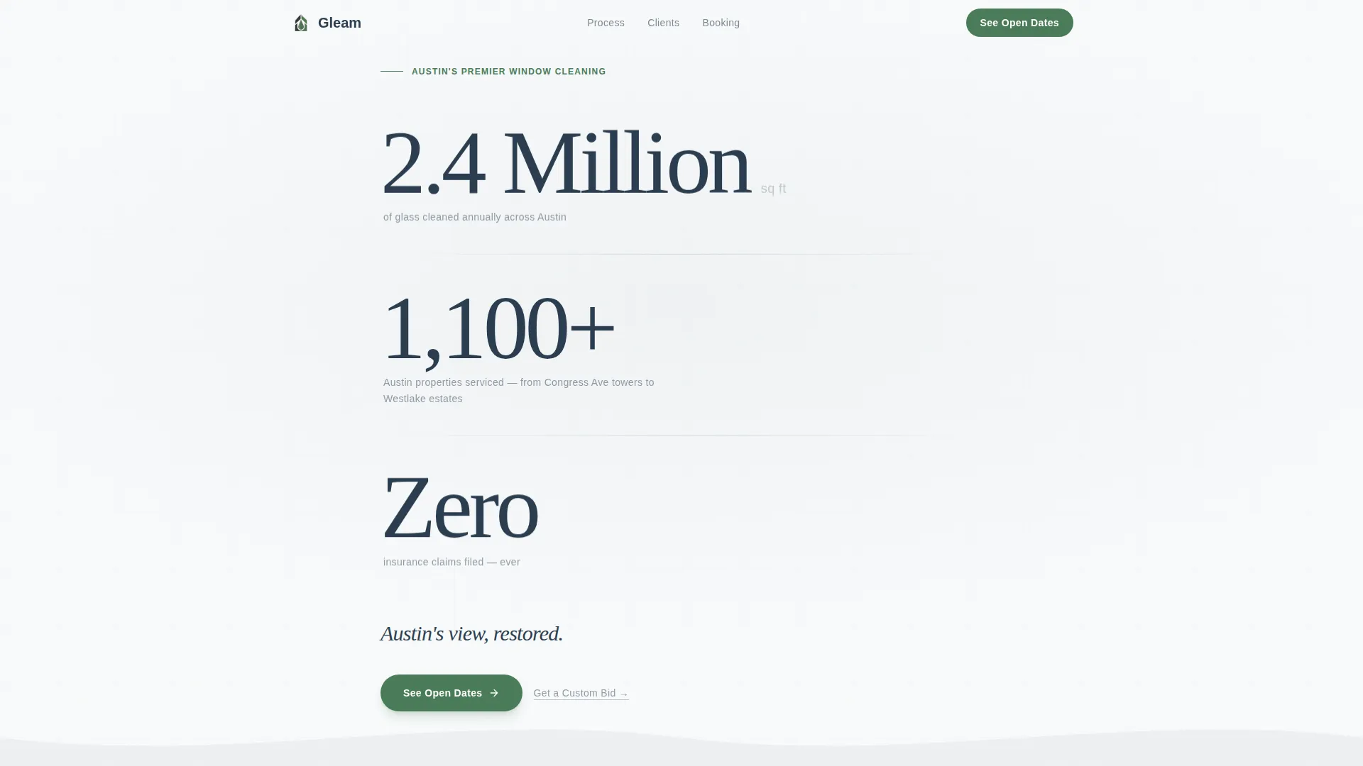
Three bold credibility numbers sit above the fold in a thin, expansive sans-serif typeface. The figures float with a subtle parallax drift that makes the header feel like content viewed through glass. A single tagline, "Austin's view, restored," anchors the section below.
Transparent Three-Step Process Section
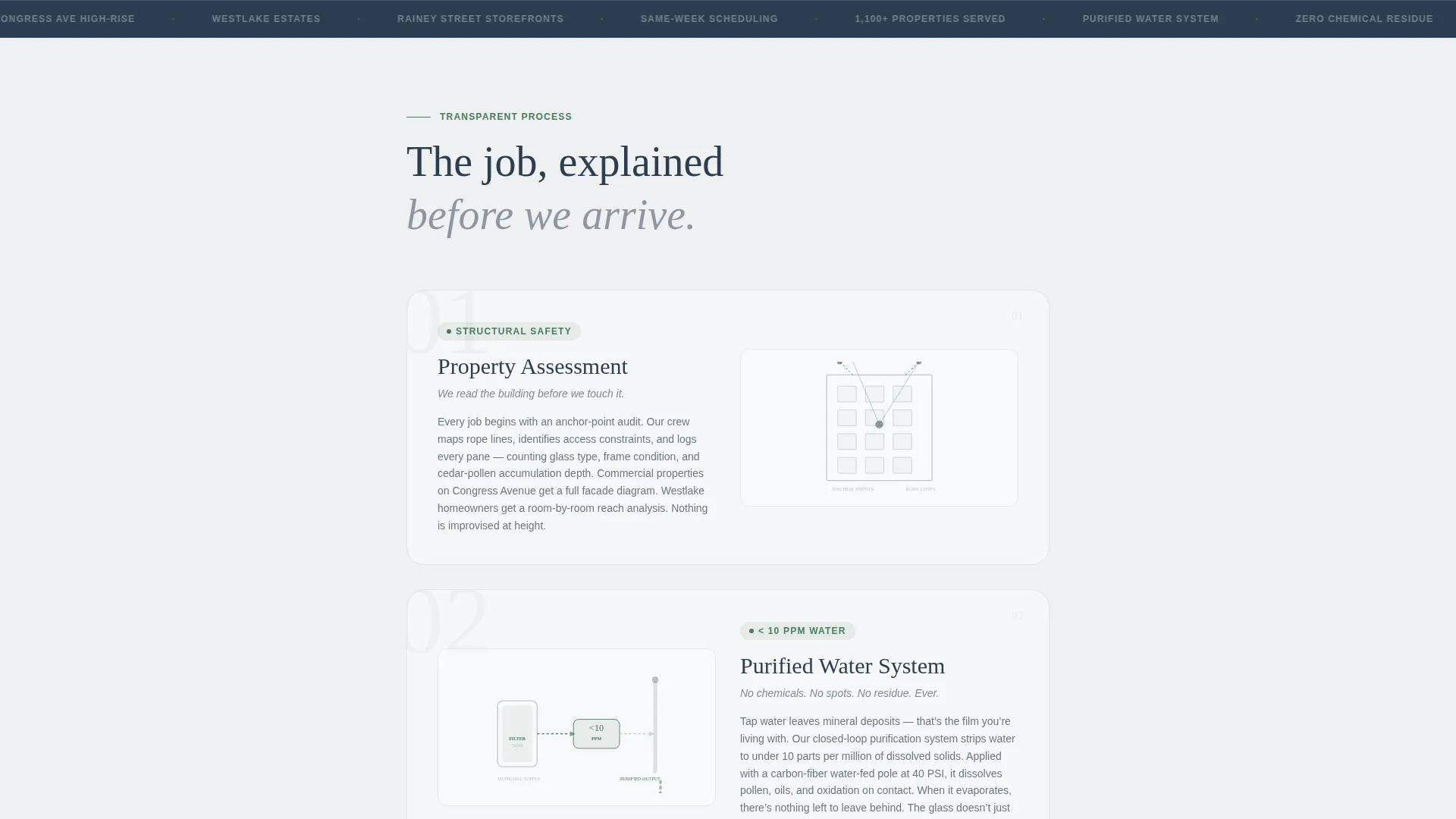
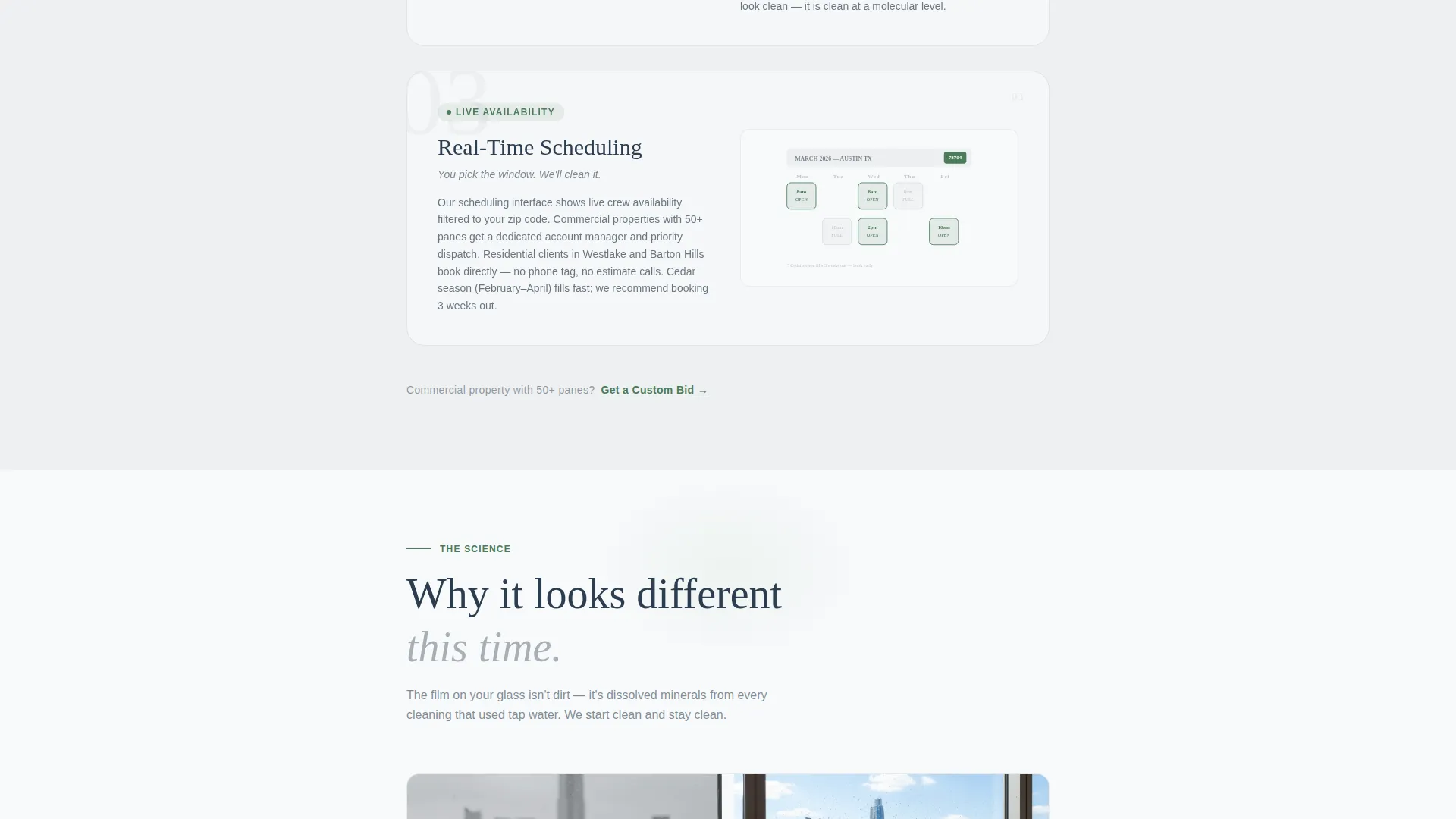
The scroll becomes a walkthrough of how the job actually gets done. Section one covers property assessment with a crew diagram. Section two explains the purified water system and why it leaves no spots or residue. Section three shows a real-time scheduling interface mock filtered to available dates this week.
Glass-Panel Content Cards
Each process step lives inside a content card with barely-there borders and generous internal whitespace. The motif reinforces the brand identity visually while keeping the layout open and easy to read at every scroll depth.
Dual Call-to-Action Path
The primary call to action, "See Open Dates," appears after the header stats and again after the process reveal. A secondary path, "Get a Custom Bid," routes commercial visitors with larger properties to a short intake form. Both paths are low-friction by design.
Persistent Mobile Bottom Bar
On mobile viewports, the primary booking button reappears as a fixed bottom bar. Visitors never have to scroll back up to take action, keeping the conversion path within reach at all times.
Alternating Background System
Page sections alternate between morning sky white and a faint warm gray to create visual rhythm without adding visual noise. Chrome divider lines and icon strokes separate sections cleanly.
Page sections overview
| Section | Purpose |
|---|---|
| Stats metrics header | Establish credibility with three oversized annual performance figures |
| Tagline anchor line | Reinforce brand promise with a single focused statement |
| Primary call to action block | Drive first click toward the booking calendar above the fold |
| Property assessment section | Show how the crew evaluates each job with a diagram |
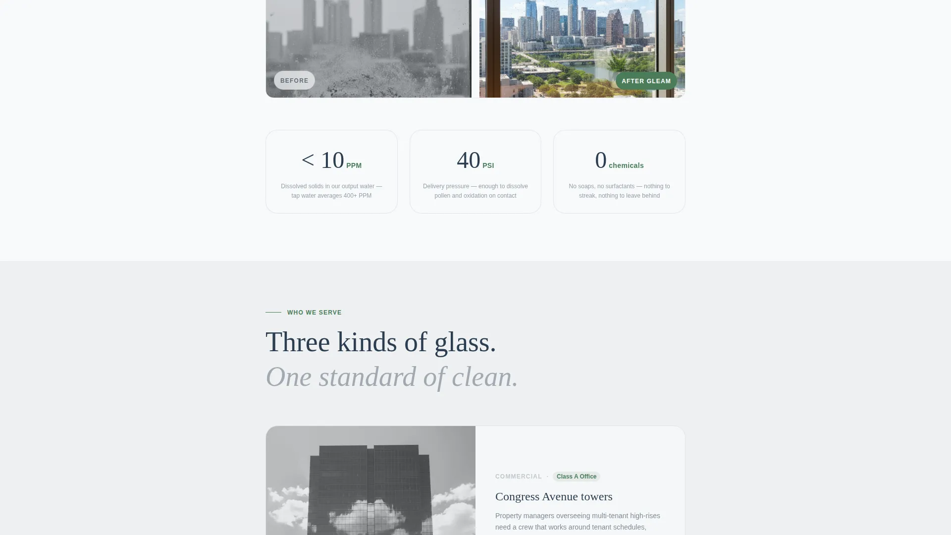
| Purified water section | Explain the spot-free cleaning process and its benefits |
| Scheduling interface mock | Preview available booking dates to reduce hesitation |
| Second call to action block | Recapture visitors after the process reveal with the booking button |
| Custom bid path | Route commercial prospects to a short intake form |
| Mobile bottom bar | Keep the booking action persistent on smaller screens |
Design & branding system
The Executive Suite theme uses the Cloud Canvas color system to create a page that feels like a freshly cleaned corner office. Every color choice is deliberate, and no element competes with the content it frames.
- Boardroom charcoal (#2C3E50) for all body text, polished chrome (#C0C7CE) for dividers and icon strokes, and morning sky white (#F8FAFB) for primary backgrounds
- Texas live oak green (#4A7C59) appears only on buttons and trust badges, keeping the accent color meaningful and easy to spot
- Section backgrounds alternate between sky white and a warm gray (#EEF0F2) to create rhythm while preserving the clean, minimal feel
Mobile & speed optimization
The single-column layout adapts naturally to smaller screens. No complex grid rearrangements are needed because the flow was designed vertically from the start.
- The persistent bottom bar keeps the primary call to action reachable without scrolling back to the top
- Glass-panel cards and generous whitespace remain intact on mobile, preserving the premium feel at any screen size
How this template helps you convert
Every design and copy decision in this template moves visitors one step closer to booking. There are no distractions, no dead ends, and no unnecessary form fields on the landing page itself.
- The stats header front-loads proof: 2.4 million square feet cleaned annually, 1,100-plus properties serviced, and zero insurance claims filed establish credibility before visitors read a single marketing claim.
- The transparent process walkthrough replaces vague promises with specific operational detail, so visitors understand exactly what they are paying for before they click.
- The dual call-to-action path means residential and commercial visitors each have a relevant next step, reducing drop-off caused by a one-size-fits-all form.
Other information about this template
This template is part of a broader family of professionally themed local service landing pages designed for high-trust, appointment-driven businesses.
- The template is built as a single-column flow, making it straightforward to adapt the copy and stats for any window cleaning market beyond Austin
- The scheduling interface section is designed as a mock layout, giving you a clear visual placeholder to connect your preferred booking tool
- The "Get a Custom Bid" secondary path is structured as a short intake form link, suitable for commercial prospects managing portfolios with more than fifty panes
Theme
Executive Suite
Creative direction
Transparent Process
Color system
Cloud Canvas
Style
Single Column Flow
Direction
Click-Through
Page Sections
Oversized Stats Header with Parallax Effect
Three-part Transparent Process Section
Glass-panel Content Cards
Dual Call-to-action Path
Persistent Mobile Bottom Bar
Alternating Background and Chrome Divider System
Related questions
Is this template suitable for both residential and commercial window cleaning?
Does this template include an actual booking calendar?
Can I change the stats in the header to match my own business numbers?
Will the persistent mobile bottom bar work on all phone screen sizes?
Can I use this template for a window cleaning business outside of Austin?



