Car Wash Franchise Landing Page Template
Gleam is a masonry-layout landing page template built for car wash franchise sellers. It pairs a Luxe Minimal visual identity with scarcity-driven territory tiles, a two-step qualifier form, and a persistent mobile call-to-action. The result is a page that turns passive interest into active franchise inquiries by making every open territory feel like inventory that is running out.
by Rocket studio
Quick summary
Gleam is a single-page franchise sales template designed around urgency and visual luxury. A full-bleed tunnel header, a masonry territory grid, and a two-step qualifier form work together to move serious franchise buyers from curiosity to a submitted inquiry. The aesthetic is Luxe Minimal, anchored in a soft lavender and deep plum-black palette.
Who this template is for
This template is built for franchise development teams and independent franchise owners who need to generate qualified leads fast. It speaks directly to buyers who are already evaluating income-generating businesses, not casual browsers.
- Serial entrepreneurs searching for semi-passive income opportunities
- Multi-unit franchise owners looking to add a recession-resilient vertical
- Retired executives who want an owner-operator or absentee business model
What problem this template solves
Most franchise landing pages look like corporate brochures. They list facts without creating momentum. Gleam solves the specific problem of low-urgency, low-trust pages that fail to convert informed buyers who need a clear reason to act now.
- Generic pages bury territory availability, removing the natural scarcity that drives decisions
- Long lead forms scare off qualified prospects before they self-identify
- Flat visual design fails to communicate the premium quality of the franchise offer
What you get with this template
You get a fully structured, single-page sales layout that covers every stage of the franchise buyer journey, from first impression to form submission. Every section serves a specific conversion role.
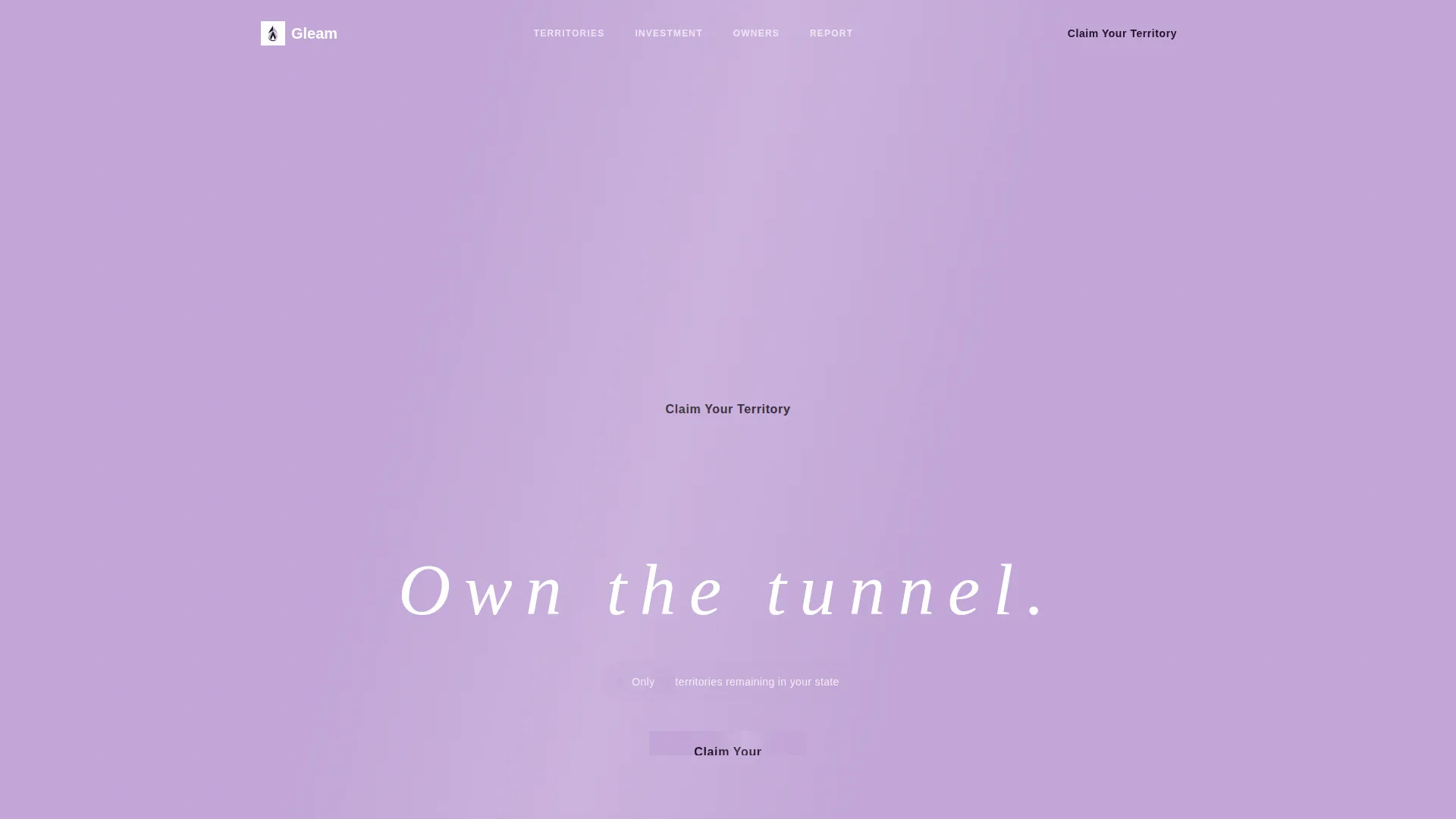
- A full-bleed tunnel header with a headline reveal and a live territory counter
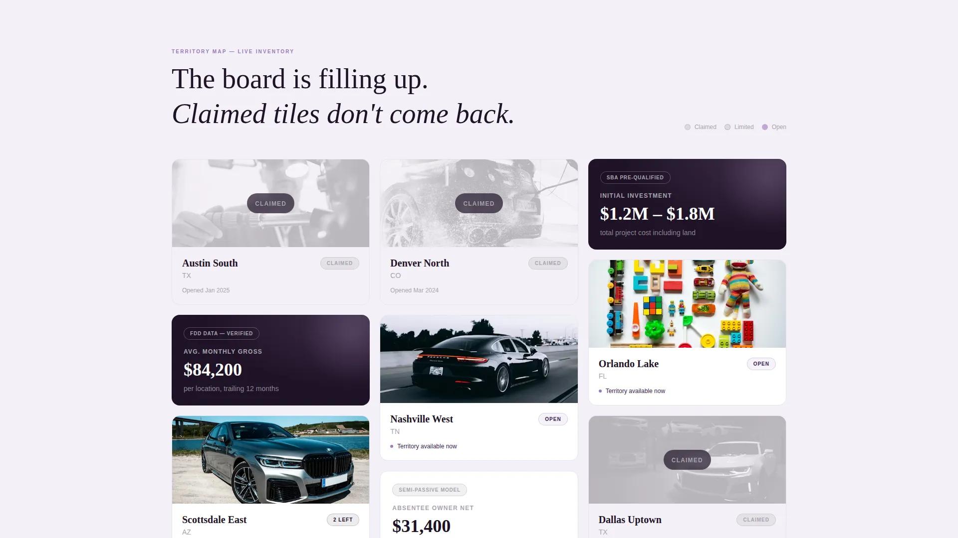
- A masonry grid of territory tiles stamped with real-time availability statuses
- A two-step qualifier form plus a secondary email-capture path for cooler leads
Feature list
Gleam ships with a focused set of components, each built around the franchise sales flow described in the brief.
Full-Bleed Tunnel Header
The header opens with a low-angle photograph shot from inside the wash tunnel. A black sedan is silhouetted against lavender foam curtains lit by LED strips. A single tracked-out headline, "Own the tunnel," appears after the image holds alone. Below it, a pulsing territory counter reinforces scarcity before the visitor scrolls.
Masonry Territory Grid
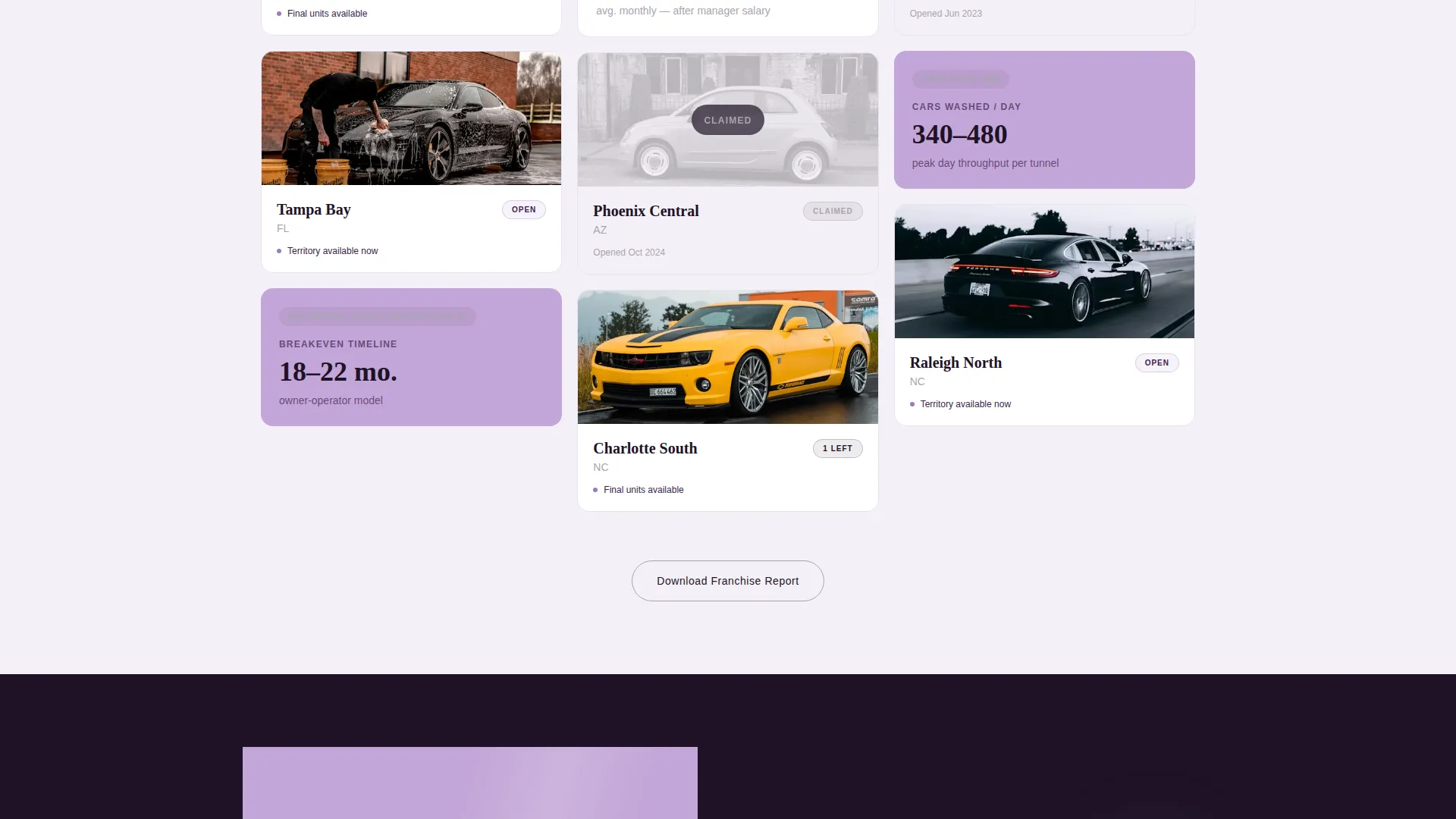
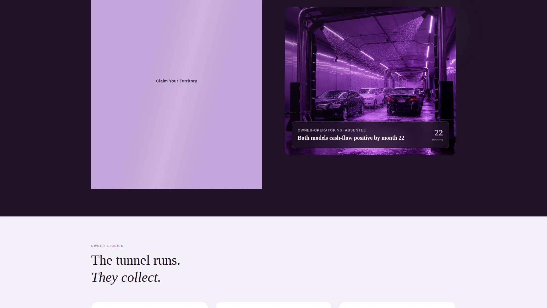
The page's core section is a Pinterest-style masonry grid of territory tiles. Each tile is stamped with an availability status such as "CLAIMED," "2 LEFT," or "OPEN." Claimed tiles outnumber open ones visually, making available territories feel like disappearing inventory. Revenue tiles appear between rows, showing average monthly gross, breakeven timelines, and owner-operator versus absentee model comparisons.
Persistent Mobile Call-to-Action
The primary call-to-action button, "Claim Your Territory," is pinned to the bottom of the viewport on mobile. It also repeats after every third masonry row on desktop. This keeps the conversion path accessible at every point in the scroll without interrupting the visual rhythm.
Two-Step Qualifier Form
Clicking the primary call-to-action opens a two-step form. Step one collects preferred state and investment range via dropdown menus. Step two asks for name, email, phone number, and liquid capital confirmation. The staged approach reduces form abandonment by easing buyers in with low-commitment questions first.
Secondary Lead Capture Path
A "Download the Franchise Report" option sits alongside the primary call-to-action. It captures cooler leads with just an email address. This secondary path ensures the page converts visitors who are not yet ready to commit, without distracting high-intent buyers from the primary flow.
Countdown and Scarcity Badges
Revenue tiles carry a subtle countdown badge noting when franchise disclosure document pricing is locked. Combined with claimed territory tiles and the live counter in the header, the scarcity signals are geographic and structural, not manufactured pop-ups.
Page sections overview
| Section | Purpose |
|---|---|
| Full-Bleed Header | Open with tunnel photo and headline reveal |
| Territory Counter | Show remaining territories in target state |
| Masonry Territory Grid | Display claimed and open territory tiles |
| Revenue Comparison Tiles | Show gross, breakeven, and ownership models |
| Scarcity Badge Strip | Reinforce pricing deadline across grid rows |
| Primary call to action Block | Drive clicks to two-step qualifier form |
| Two-Step Qualifier Form | Qualify leads by state, budget, and capital |
| Secondary Email Capture | Convert cooler leads with report download |
| Persistent Mobile call to action | Pin claim button to bottom of mobile viewport |
Design & branding system
The visual identity follows a Luxe Minimal theme. Every color and spacing decision references the feeling of a luxury sedan interior at twilight, ambient and refined without being loud.
- Soft digital lilac (#C3A6D8) on section backgrounds; deep plum-black (#1E1226) for typography and anchor blocks; misted pearl (#F4F0F7) as the dominant negative space
- Liquid chrome (#A8A4B0) on borders, dividers, and hover states for a brushed-aluminum effect
- Thin, tracked-out white type on dark imagery keeps the typographic voice premium and unhurried
Mobile & speed optimization
The layout is designed to perform cleanly on mobile screens, where many franchise prospects first encounter an offer while commuting or between meetings.
- The "Claim Your Territory" button is pinned to the bottom of the mobile viewport for constant access
- The masonry grid reflows for smaller screens so territory tiles remain legible and tappable
- The two-step form breaks a longer qualification process into two short, manageable screens
How this template helps you convert
Gleam is engineered around a single truth: scarcity and social proof together close franchise deals faster than information alone.
- The header drops visitors into the tunnel experience immediately, building desire before any pricing or details appear, so emotional buy-in precedes the rational evaluation.
- The masonry grid of claimed territories creates visual proof that others are already acting, making open tiles feel urgent and finite rather than available and passive.
- The staged two-step form reduces friction by separating low-stakes preference questions from personal contact details, which increases completion rates for high-intent prospects.
Other information about this template
Gleam is built as a direct-sales landing page for franchise agreements, not a general awareness page. It is best suited for operators who have territories to sell and a franchise disclosure document ready to share.
- The template supports both owner-operator and absentee investor messaging within the same page layout
- Territory tile statuses and revenue figures are editable, so the grid stays accurate as real inventory changes
- The "Download the Franchise Report" path is designed to feed a separate nurture sequence for prospects who are not yet ready to commit
- The page works equally well for a single-market launch or a multi-state territory rollout campaign
Theme
Neo-Retro
Creative direction
Comparison Journey
Color system
Ink & Paper
Style
Overlap/Layered
Direction
Click-Through
Page Sections
Full-bleed Tunnel Header with Headline Reveal
Masonry Territory Grid with Availability Stamps
Two-step Qualifier Form
Persistent Mobile Call-to-action Button
Secondary Email Capture for Cooler Leads
Scarcity Badges on Revenue Tiles
Related questions
Can I update the territory tiles as locations sell?
Does the page support both high-intent and early-stage prospects?
What does the two-step qualifier form collect?
Is this template specific to car wash franchises only?
How does the scarcity messaging avoid feeling artificial?



