Trustworthy Sanitization Landing Page Template
Spotless is a modular card-grid landing page built for living room cleaning specialists. It uses an Engineering Blueprint visual theme with a Forest Trust color palette to present every cleaning phase as a transparent, numbered protocol. The page is designed to earn bookings by showing visitors exactly what happens before asking them to schedule a deep clean.
by Rocket studio
Quick summary
Spotless is a single-page booking template for living room cleaning specialists. It pairs a line-art header illustration with a modular card grid that maps each cleaning phase in precise detail. The Forest Trust palette and Engineering Blueprint theme build quiet authority. Visitors see the full process before they ever reach the form, making the decision to book feel natural.
Who this template is for
This template is built for cleaning professionals who serve clients with specific, recurring needs. It speaks directly to the people doing detailed, room-focused work rather than generic house cleaning.
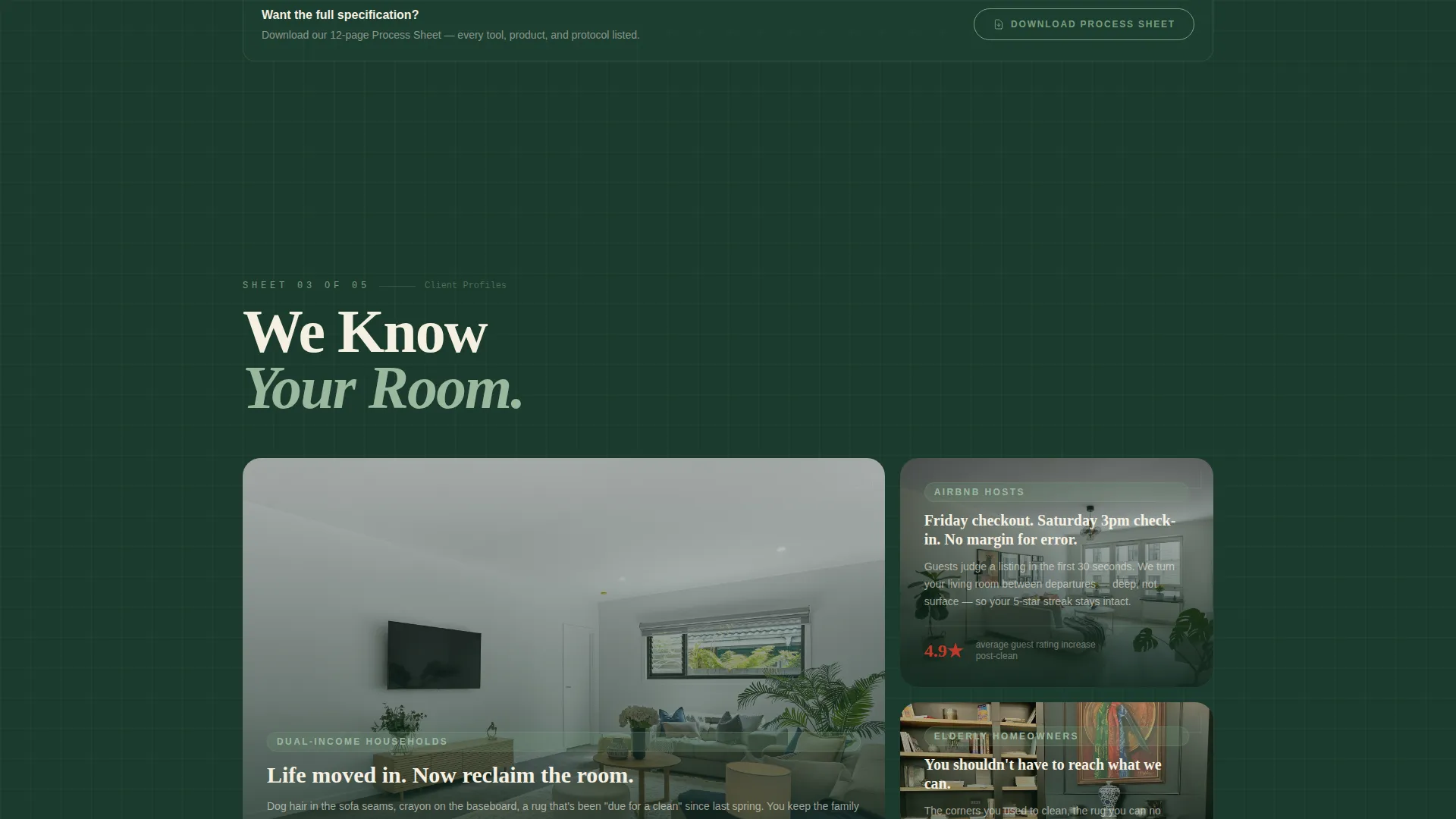
- Living room cleaning specialists targeting busy dual-income households, Airbnb hosts, and elderly homeowners
- Independent cleaning crews or small teams who want to communicate a methodical, trustworthy process
- Service providers ready to replace vague promises with a clear, step-by-step protocol that converts visitors into bookings
What problem this template solves
Most cleaning service pages look the same: a stock photo, a price list, and a phone number. That approach fails clients who want to know exactly what they are paying for. Spotless solves the trust gap.
- Visitors often leave cleaning pages unsure of what is actually included, so they call competitors instead of booking
- Busy clients like Airbnb hosts or working parents need fast, clear answers about timing, scope, and process
- Generic layouts do not differentiate a specialist crew that details baseboards and lifts rugs from a basic sweep-and-mop service
What you get with this template
You get a fully structured landing page that walks every visitor through the cleaning operation like an open schematic. Nothing is hidden, and nothing is assumed.
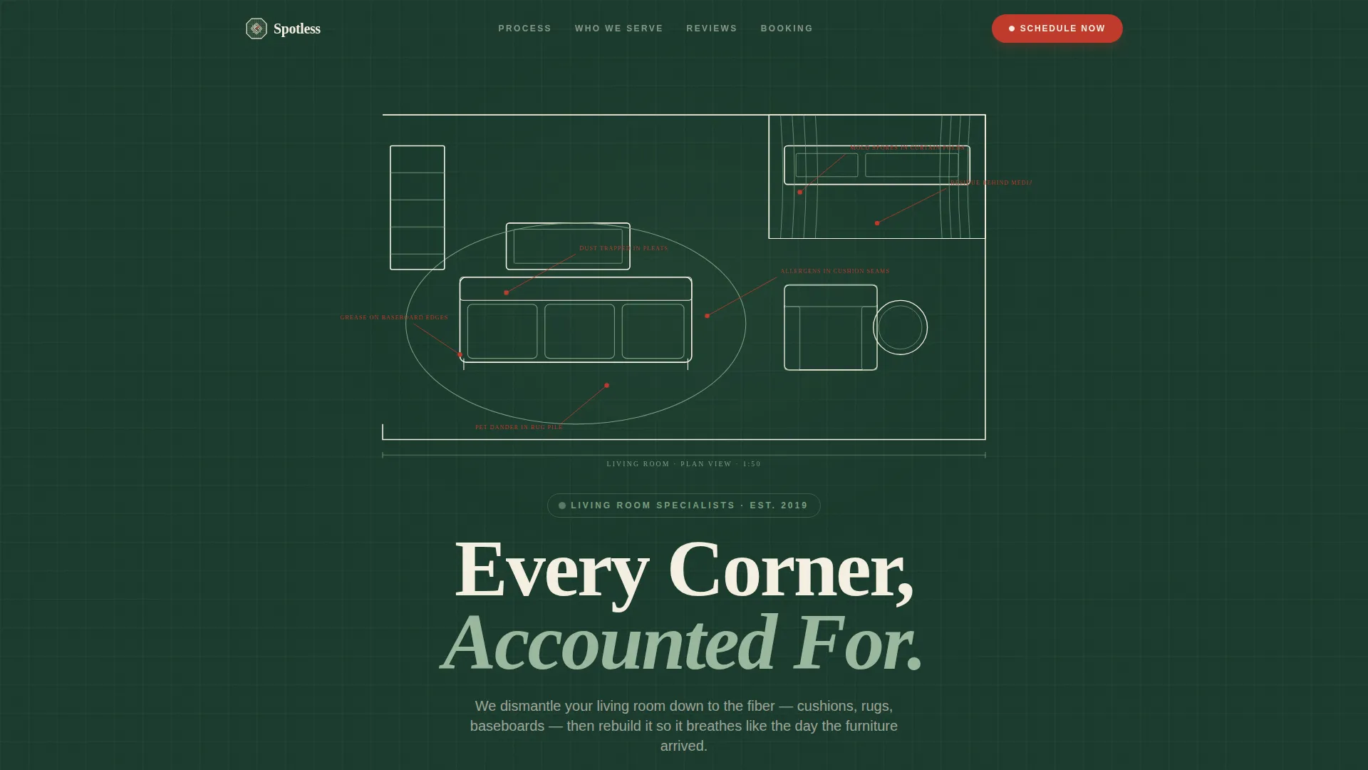
- A full-viewport line-art header illustrating a living room with annotated grime zones, drawn with a sequential animation
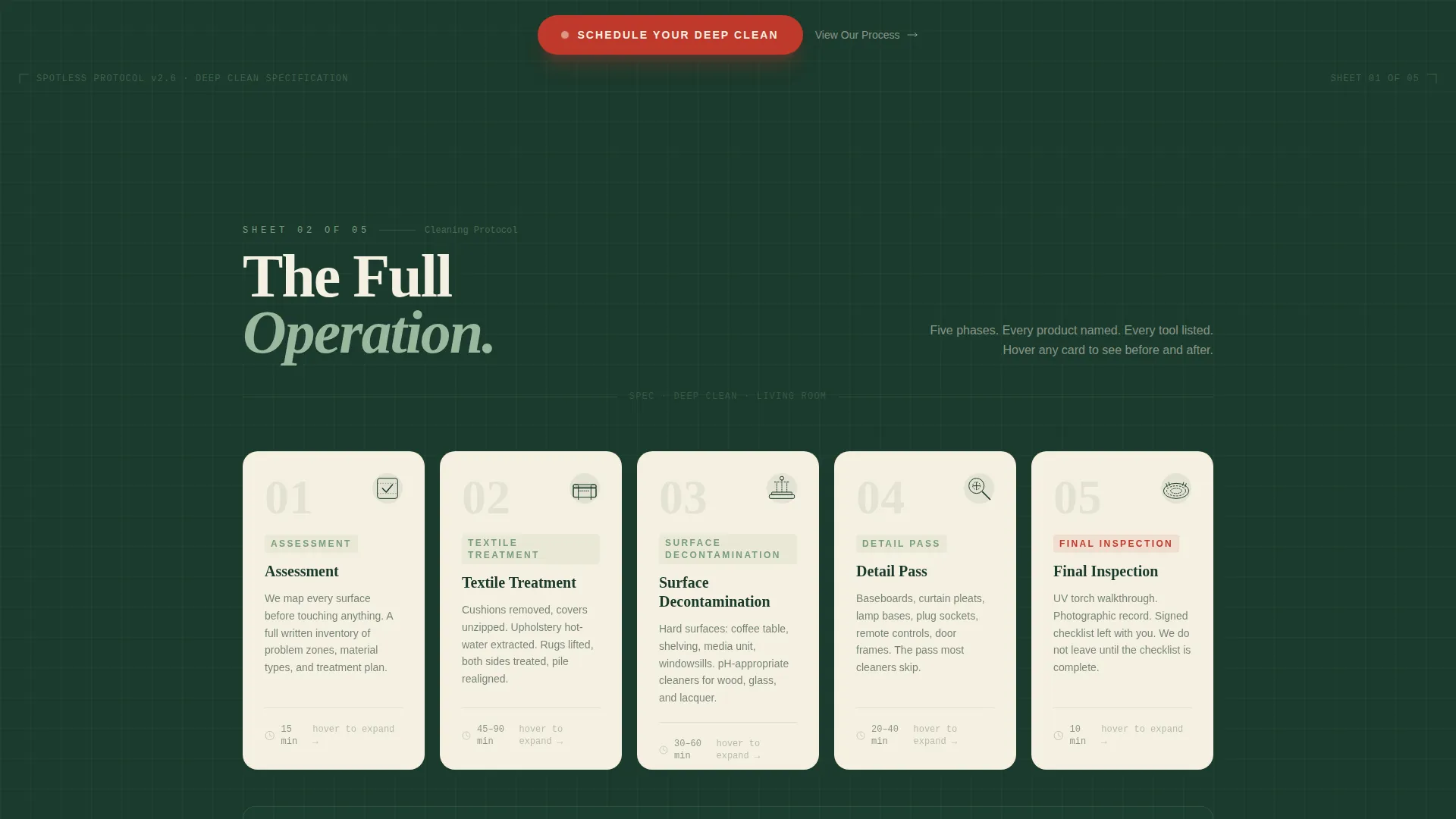
- A modular card grid covering five cleaning phases, each with a line-art icon, numbered step, estimated duration, and named tools and products
- A three-step inline booking form with a living room size selector, date and time toggle, and contact fields, plus a secondary email-capture path for undecided leads
Feature list
This template packages every visual and functional element described in the brief into one cohesive, ready-to-use layout.
Animated Line-Art Header
The header fills the full viewport with a thin cream-stroke architectural illustration of a living room set against deep pine. Dotted leader lines point to hidden grime zones with plain text labels. A subtle sequential animation draws each line as if a hand is drafting the room in real time, establishing authority before a single word is read.
Modular Cleaning Phase Cards
Each card in the grid represents one protocol phase: Assessment, Textile Treatment, Surface Decontamination, Detail Pass, and Final Inspection. Every card shows a numbered step, a line-art icon, an estimated duration, and the specific products and tools used, named plainly. Cards flip or expand on hover to reveal before-and-after details.
Three-Step Inline Booking Form
The primary call to action opens a compact inline form directly on the page. Step one lets visitors select their living room size. Step two offers a preferred date with a morning-or-afternoon toggle. Step three collects a name and phone number. The form stays within the page flow rather than redirecting visitors away.
Sticky Mobile Booking Bar
On mobile devices, the primary call-to-action button is pinned to the bottom of the screen at all times. This keeps the "Schedule Your Deep Clean" action within reach as visitors scroll through the protocol cards, reducing friction at the moment of decision.
Secondary Lead Capture Path
A "Download Our Process Sheet" prompt offers a lower-commitment entry point for visitors who are not ready to book immediately. It captures an email address and keeps the lead warm without pressuring an early decision.
Forest Trust Color System
The palette uses deep pine for section backgrounds, drafting-paper cream for card surfaces, lichen gray-green for borders and iconography, and surveyor's red exclusively for calls to action and active-state indicators. Color is used as a functional system, not decoration.
Page sections overview
| Section | Purpose |
|---|---|
| Line-Art Header | Introduces the brand with an animated architectural illustration of a living room and annotated grime zones |
| Process Card Grid | Displays each of the five cleaning phases as individual modular cards with icons, durations, and tool details |
| Phase Detail Panels | Reveals before-and-after information when a card is hovered or expanded |
| Inline Booking Form | Guides visitors through a three-step form to select room size, preferred date, and contact details |
| Sticky Mobile Bar | Keeps the primary booking call to action pinned to the bottom of the screen on mobile |
| Lead Capture Prompt | Offers a process sheet download in exchange for an email address |
Design & branding system
The Engineering Blueprint theme treats the page like a technical document: precise, organized, and quietly confident. Every visual decision reinforces the idea that this crew knows your living room better than you do.
- Forest Trust palette: deep pine (#1B3A2D) for backgrounds, drafting-paper cream (#F5F0E1) for cards, lichen gray-green (#7A9E7E) for borders and icons, and surveyor's red (#C0392B) reserved strictly for calls to action and active states
- All illustration work uses thin cream linework on pine, with no photography or stock imagery anywhere on the page
- Typography and layout follow a blueprint grid logic, keeping spacing, alignment, and visual hierarchy as ordered as an engineering schematic
Mobile & speed optimization
The template is designed with mobile visitors as a primary use case, not an afterthought. Airbnb hosts and busy parents are often checking service pages on a phone between tasks.
- The sticky bottom bar keeps the booking call to action visible at all times on smaller screens, removing the need to scroll back up
- The card-grid layout reflows naturally for narrow viewports, keeping each phase card readable and tappable at any screen size
- The three-step inline form is structured to minimize typing, using selectors and toggles for the first two steps so mobile completion stays fast
How this template helps you convert
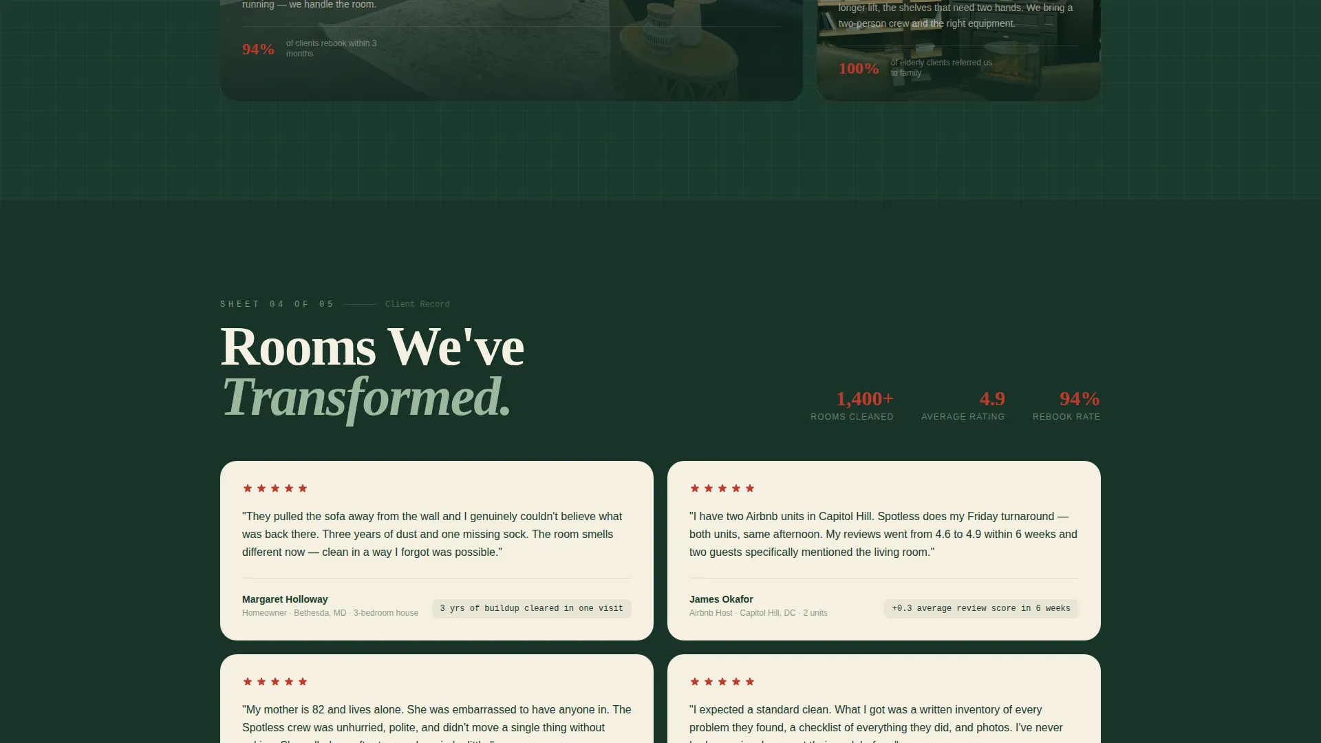
Spotless is engineered around a single insight: people book cleaning services when they trust what will happen, not just who will show up. The page earns that trust before it asks for anything.
- The animated header creates immediate visual authority, signaling that this is a specialist operation rather than a general cleaning service, so visitors stay rather than bounce.
- The protocol card grid answers every "what's included" question up front, removing the hesitation that sends undecided visitors to a competitor's contact form instead.
- The two-path conversion system meets visitors wherever they are: the three-step booking form captures ready clients, while the process sheet download captures leads who need one more reason to commit.
Other information about this template
This template sits inside the Construction and Home category, aligned to the Living Room Renovation subcategory and the Living Room Cleaning Specialist niche. A few additional details are worth knowing before you customize and launch.
- The Intersection Match Score for this template is 13, reflecting a strong alignment between the template style, creative direction, and niche intent
- The card-grid structure is modular, meaning individual phase cards can be reordered or relabeled to match your own cleaning protocol without breaking the layout
- The "Download Our Process Sheet" secondary path is designed to function as a standalone lead-generation element, useful for campaigns targeting clients who research before booking
- The surveyor's red call-to-action color appears only on interactive elements, keeping the visual hierarchy clean and preventing button blindness from overuse
Theme
Engineering Blueprint
Creative direction
Transparent Process
Color system
Forest Trust
Style
Card Grid (Modular)
Direction
Booking/Scheduling
Page Sections
Animated Line-art Header Illustration
Modular Cleaning Phase Card Grid
Three-step Inline Booking Form
Sticky Mobile Call-to-action Bar
Secondary Email Lead Capture
Forest Trust Color System
Related questions
Who is this landing page template designed for?
Can I change the cleaning phases shown in the card grid?
How does the booking form work?
What is the secondary lead-capture option for?
Does this template use any photography?



