Local Brick & Mortar Business Professional Website Template
Glide is a curated mobility landing page template built for wheelchair, rollator, and scooter retailers. It guides visitors through seasonal bundle stories, overlapping product cards, and a smooth direct-to-cart flow. The soft gradient palette and layered layout make complex mobility choices feel personal, calm, and approachable rather than clinical or catalog-like.
by Rocket studio
Quick summary
Glide is a single-page mobility store template designed to turn a product catalog into a guided shopping experience. Seasonal sections, layered product cards, and a clear bundle-first structure help visitors feel understood rather than overwhelmed. The calm teal-and-lavender palette keeps the page warm, confident, and far removed from the sterile look of standard medical retail.
Who this template is for
This template is built for mobility equipment retailers who want their online presence to feel personal and purposeful. It works equally well for established showrooms launching a direct sales channel and for smaller specialty shops building their first curated storefront.
- Adult children researching wheelchairs or rollators for aging parents
- Spinal cord injury survivors and independent buyers rebuilding daily routines
- Occupational therapists and discharge planners spec-ing equipment for clients
What problem this template solves
Mobility retail pages often look like raw inventory dumps. Products sit in grids with no context, no story, and no guidance for buyers who are already navigating a stressful life transition. Glide replaces that experience with a structured, emotionally intelligent flow.
- Visitors feel lost in catalogs with no sense of what to buy first
- Medical-looking layouts create anxiety rather than confidence
- Isolated product listings fail to show how items work together as a complete setup
What you get with this template
The template delivers a full single-page layout structured around seasonal moments and curated bundles. Every section is designed to move a visitor from curiosity to cart without friction.
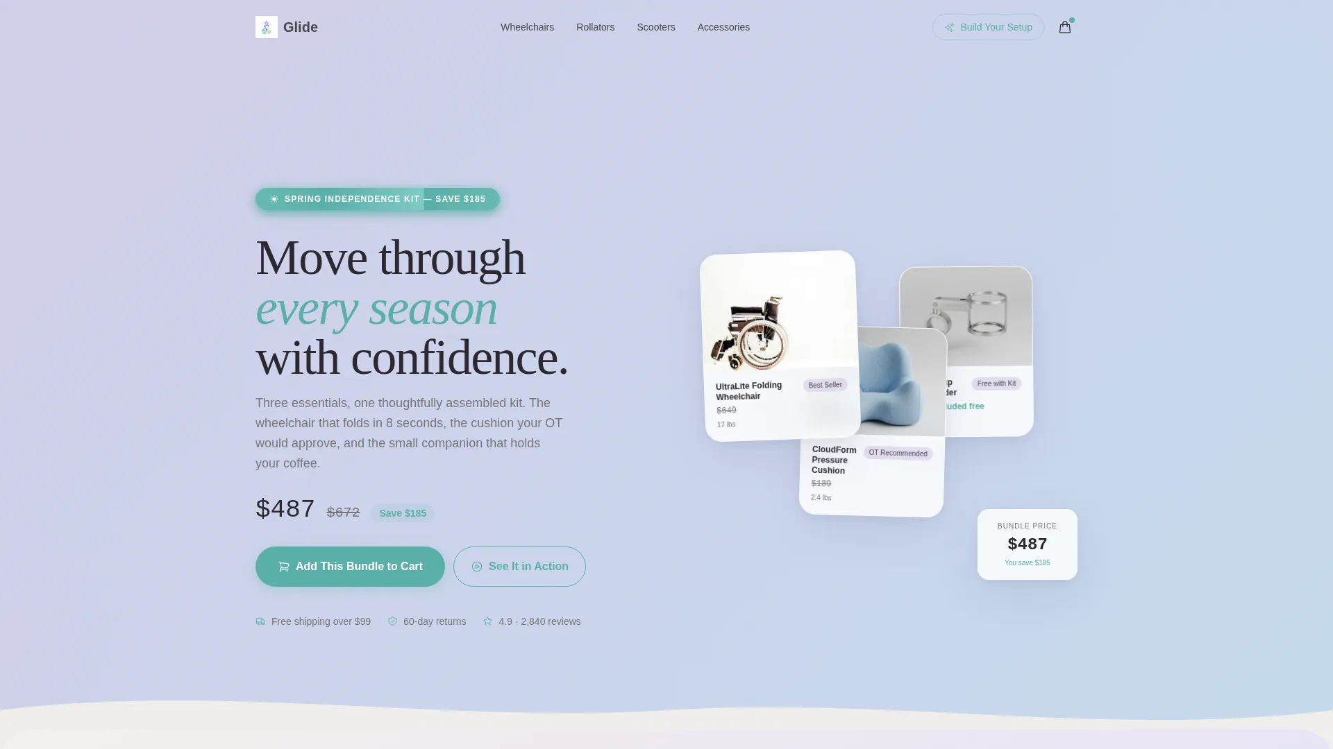
- A header bundle composition featuring three best-selling products with a seasonal savings ribbon
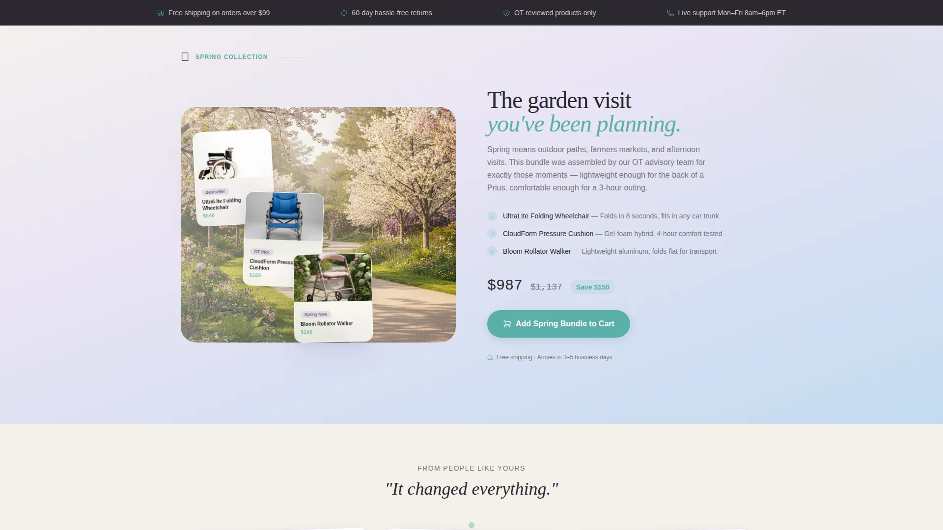
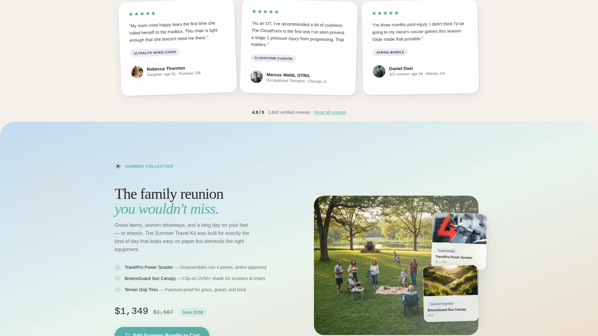
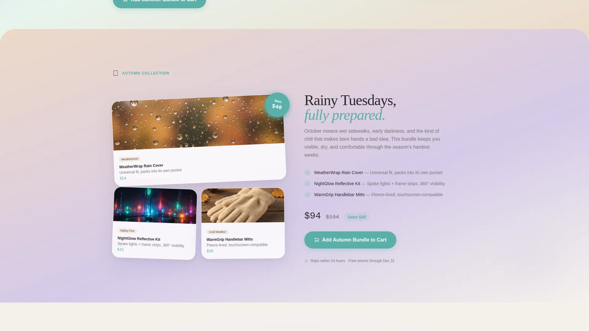
- Three seasonal story sections, each anchored by a lifestyle image and a pre-configured bundle
- A sticky mobile bottom bar showing the active bundle, item count, and total savings
- A secondary guided quiz path with three questions that recommends a personalized setup
- Testimonial cards placed between sections, overlapping like handwritten notes between pages
Feature list
A short paragraph introduces the key capabilities built into this template. Each feature below is drawn directly from the page structure and design direction described in the brief.
Layered Bundle Header
The header opens with three best-selling products stacked in a gently overlapping composition. Each card casts a soft diffused shadow onto the layer beneath it. A seasonal ribbon reads "Spring Independence Kit" with the savings amount clearly shown alongside a struck-through original price.
Seasonal Story Sections
Three full content sections move through spring, summer, and autumn. Each section pairs a curated lifestyle photo with a relevant product bundle. Visitors experience a narrative arc through their year rather than scrolling through disconnected product rows.
Sticky Mobile Bundle Bar
On mobile devices, a fixed bottom bar displays the current bundle, item count, and total savings at all times. This keeps the purchase decision visible without requiring the visitor to scroll back to the top.
Guided Setup Quiz
A secondary call to action labeled "Build Your Own Setup" leads into a three-question quiz. Questions cover primary user type, indoor or outdoor use preference, and transport needs. The quiz returns a recommended bundle matched to those answers.
Direct-to-Cart Call to Action
Each seasonal section includes an "Add This Bundle to Cart" button in calm teal, with the relevant bundle pre-loaded. The free-shipping threshold is introduced early in the page and reinforced at the cart stage.
Overlapping Testimonial Cards
Customer testimonial cards are placed between seasonal sections. They sit at a slight visual overlap, styled like handwritten notes tucked between the pages of a book. This placement keeps social proof flowing naturally through the scroll rather than isolating it in a single block.
Page sections overview
| Section | Purpose |
|---|---|
| Header Bundle Composition | Introduces top three products as a layered seasonal kit with savings ribbon |
| Spring Garden Section | Showcases outdoor-path lifestyle image with spring mobility bundle |
| Summer Reunion Section | Features travel-friendly scooters over a warm family lifestyle image |
| Autumn Accessories Section | Presents rain covers and reflective strips as a rainy-day bundle |
| Testimonial Cards | Places buyer quotes between sections as visual social proof |
| Guided Quiz Entry | Offers a three-question personalization path to a recommended bundle |
| Free Shipping Reminder | Reinforces shipping threshold early and again near cart entry |
| Sticky Mobile Bar | Keeps active bundle summary visible at the bottom of mobile screens |
Design & branding system
The visual identity follows a Soft Gradient theme built on the Cloud Canvas color system. The palette moves from warm cloud white through soft lavender and pale sky, with gradients shifting across section transitions to create depth without visual weight. The overall effect is calm, unhurried, and quietly reassuring.
- Warm cloud white (#F4F1EC) as the dominant background, gentle stone (#7A7578) for body text
- Soft lavender mist (#D5CAE8) bleeding into pale sky (#C4DBF0) across gradient transitions
- Calm teal (#5AAFA8) used for buttons, interactive highlights, and the primary call to action
Mobile & speed optimization
The template is designed with mobile visitors as a primary consideration. Generous whitespace and a layered card structure translate cleanly to smaller screens without losing the sense of depth and story.
- Sticky bottom bar keeps bundle information and savings totals visible throughout the entire mobile scroll
- Overlapping product cards and seasonal lifestyle images are sized and spaced to avoid clutter on narrow viewports
How this template helps you convert
Every design and layout decision in Glide points toward a single outcome: helping a visitor commit to a bundle rather than leaving empty-handed.
- The bundle-first structure presents a complete, curated setup at every scroll point, reducing the decision fatigue that comes with open-ended product browsing.
- The guided quiz gives hesitant visitors a low-pressure secondary path, converting uncertainty into a personalized recommendation rather than an exit.
- Repeated teal call-to-action buttons at each seasonal section keep the purchase action one tap away at any moment in the scroll.
Other information about this template
This template sits within the Retail and E-Commerce category, specifically designed for local brick-and-mortar mobility showrooms that are extending into direct online sales. It is a single landing page rather than a multi-page store, making it straightforward to publish and manage.
- The page type is a single-page landing page with a section-led scroll flow
- Suitable for wheelchair retailers, rollator specialists, and scooter showrooms serving local and regional buyers
- Designed to serve multiple buyer types simultaneously, from independent adult buyers to family caregivers and healthcare professionals
- The seasonal creative direction makes the template easy to refresh each quarter with minimal copy and image updates
Theme
Neo-Retro
Creative direction
Unboxing Experience
Color system
Citrus Burst
Style
Masonry/Pinterest
Direction
Marketplace/Multi
Page Sections
Layered Seasonal Bundle Header
Three Seasonal Story Sections
Sticky Mobile Bundle Bar
Three-question Guided Quiz
Overlapping Testimonial Cards
Repeated Direct-to-cart Buttons
Related questions
Who is the Glide template designed for?
Can I use this template to sell individual products instead of bundles?
What does the guided quiz do?
Is this template suitable for a first-time online store launch?
How does the free-shipping threshold appear on the page?



