Local Brick & Mortar Business Professional Website Template
Glide is a warm, card-grid landing page built for mobility and wheelchair retailers. It organizes products around life moments, summer outings, school years, wedding days, rather than spec sheets. A mosaic photo header, seasonal card rows with flip-reveal details, and a guided quiz path make it easy for every visitor to find the right chair and take the next step.
by Rocket studio
Quick summary
Glide is a single-page, card-grid template designed for local mobility and wheelchair showrooms. It leads with a real-photo mosaic header, organizes products by seasonal life moments, and uses flip cards to deliver specs only after desire is sparked. A sticky quiz bar keeps every visitor moving toward the right fit.
Who this template is for
This template is built for brick-and-mortar mobility retailers who sell wheelchairs, scooters, and power chairs. It serves shops that want their online presence to feel as personal and welcoming as a good showroom visit.
- Mobility stores serving recently discharged patients, family caregivers, and adaptive athletes
- Local dealers who want to move beyond clinical product listings and connect with real customer stories
- Showroom owners looking to guide online visitors toward in-store fittings and insurance consultations
What problem this template solves
Most mobility retail pages overwhelm visitors with specification tables before they have imagined themselves in the chair. This template reverses that order. It leads with feeling, then delivers the facts.
- Visitors comparing wheel sizes instead of picturing their next outing lose confidence quickly
- Caregivers researching at midnight need a clear, warm path to a shortlist, not an endless catalog
- New patients handling insurance paperwork for the first time need a gentle next step, not a wall of product data
What you get with this template
You get a fully structured, section-led landing page that covers every key moment in the buying journey, from first impression to guided next step. The layout is modular, meaning each card row and section can be refreshed independently.
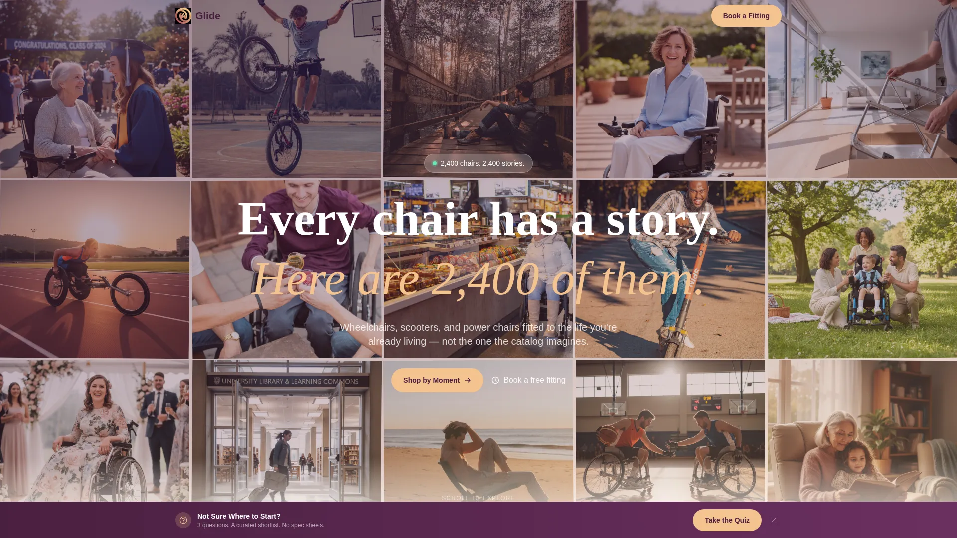
- A user-generated-content photo mosaic header with a single floating headline
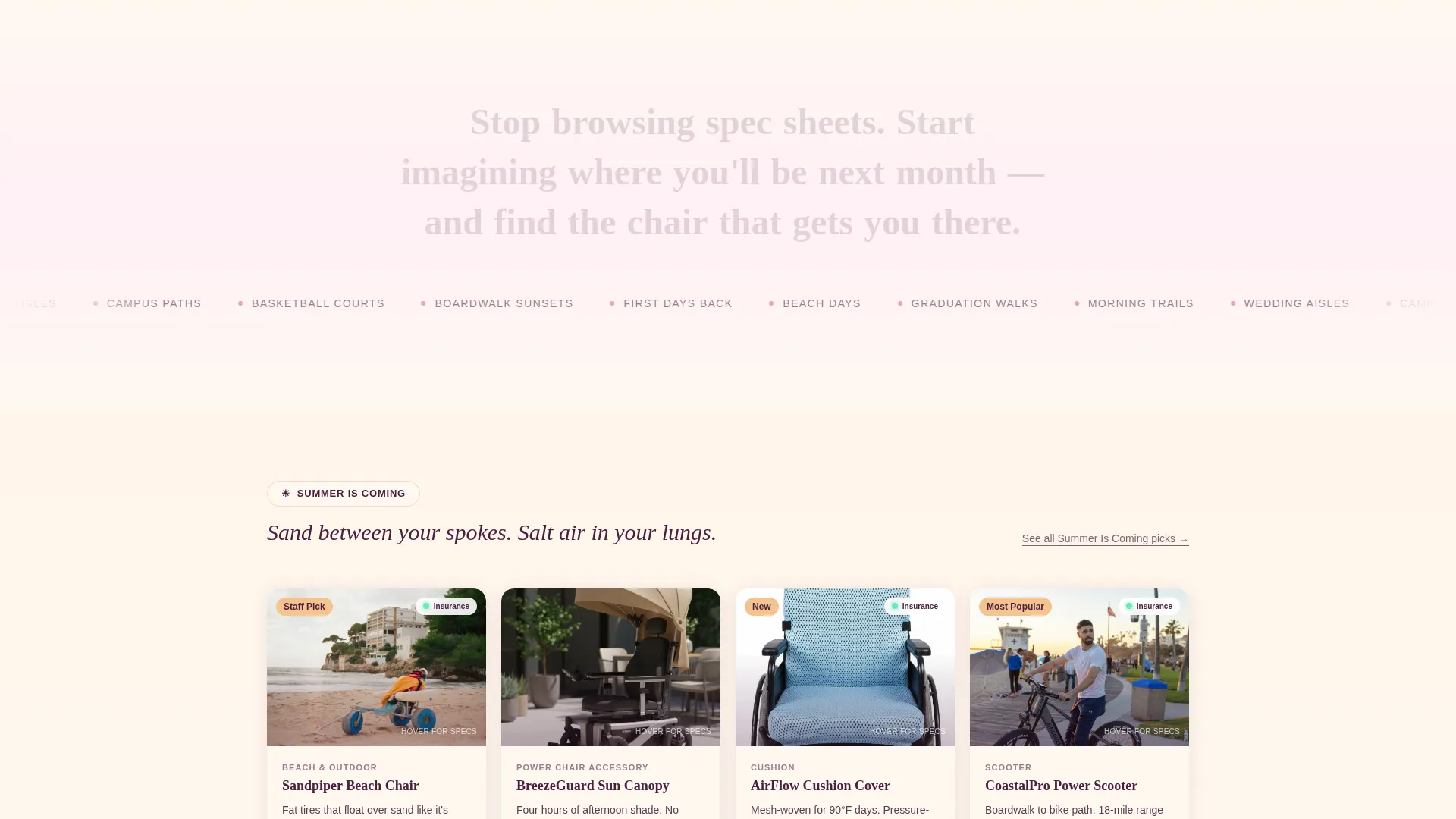
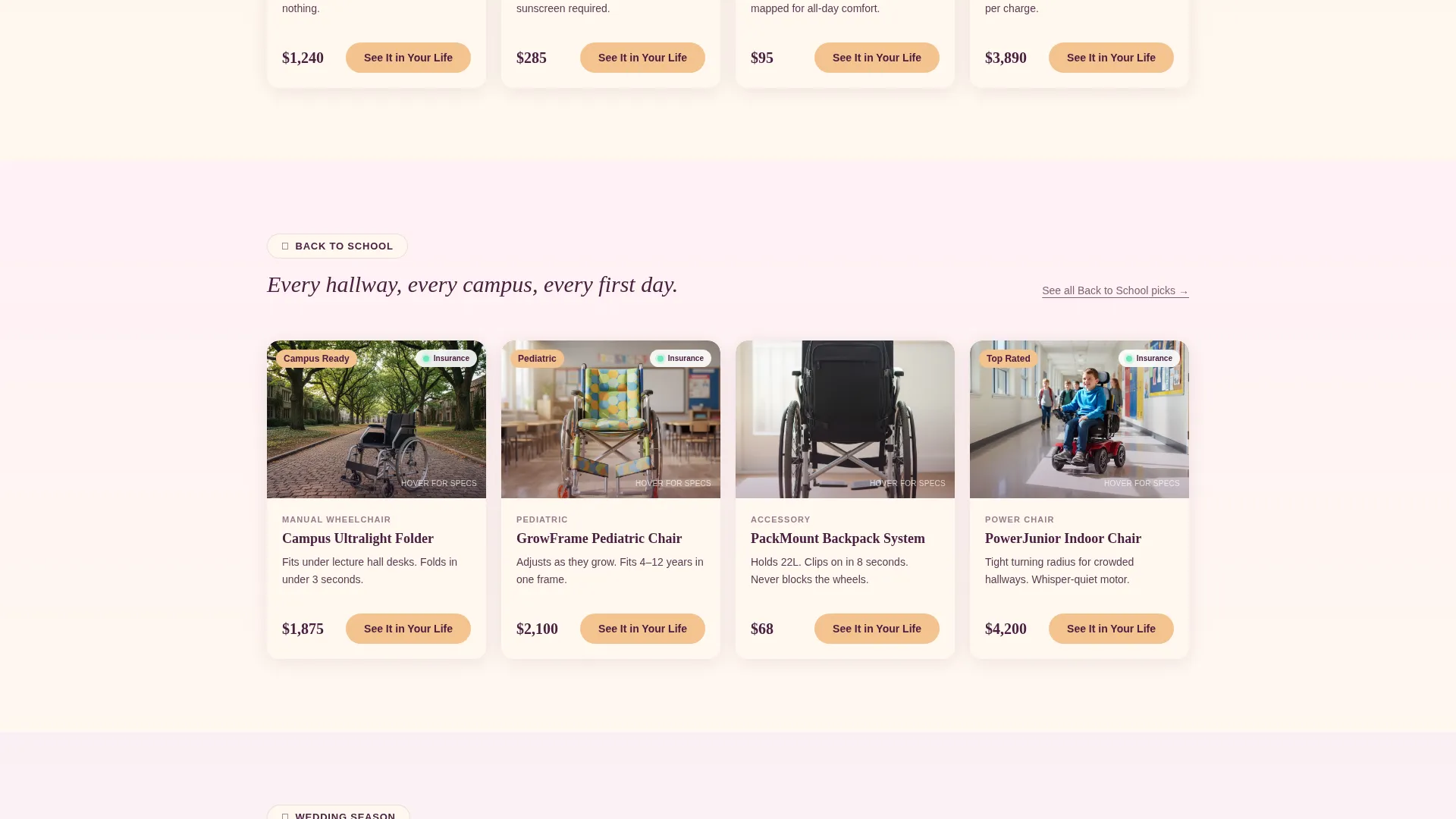
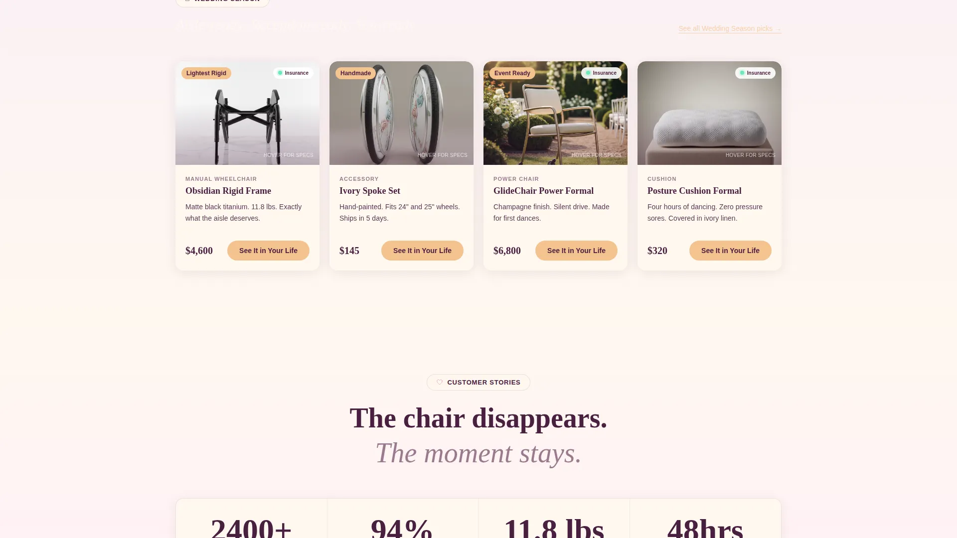
- Seasonal card rows (Summer, Back to School, Wedding Season) that organize products around life moments
- Flip-on-hover product cards that reveal weight, fold dimensions, and insurance eligibility
- A sticky bottom bar with a three-question guided quiz leading to a curated product shortlist
- Click-through product cards with a "See It in Your Life" call-to-action routing to detailed product pages
Feature list
This template packs several distinct design and layout capabilities into one cohesive page. Each feature works together to reduce friction and build trust at every scroll point.
Mosaic Photo Header
The header tiles real customer photographs edge to edge, slightly overlapping like a family photo wall. A single plum-colored headline floats over the mosaic, grounding the emotional tone before any product appears.
Seasonal Moment Card Rows
Products are grouped into labeled seasonal rows rather than category trees. Each row, Summer, Back to School, Wedding Season, refreshes quarterly and helps visitors stop spec-comparing and start imagining where they will be next month.
Flip-Reveal Product Cards
Each product card displays lifestyle imagery on the front. On hover, the card flips to show weight, fold dimensions, and insurance eligibility. Specs arrive only after the visitor has already pictured the moment.
Sticky Guided Quiz Bar
A persistent bottom bar offers a secondary path for undecided visitors. The three-question quiz asks about indoor or outdoor use, self-propelled or powered preference, and the one place the visitor most wants to go, then recommends a curated shortlist.
Click-Through Card Layout
Every product card carries a single clear call-to-action: "See It in Your Life." Each click routes to a detailed product page featuring 360-degree views, insurance pre-qualification, and in-store fitting scheduling.
Sunset Gradient Branding System
The entire page uses a soft gradient color system built from dusky rose, warm apricot, and deep plum. Cards sit on a creamy horizon white, and interactive elements glow in apricot on hover, creating a warm and cohesive visual experience throughout.
Page sections overview
| Section | Purpose |
|---|---|
| Photo Mosaic Header | Opens with real customer photos and a single emotional headline |
| Summer Is Coming | First seasonal card row featuring beach and outdoor mobility products |
| Back to School | Pediatric frames, folding chairs, and campus-friendly accessories |
| Wedding Season | Sleek rigid frames and formal chair accessories for special occasions |
| Sticky Quiz Bar | Persistent bottom bar guiding undecided visitors to a curated shortlist |
Design & branding system
The visual identity follows a Soft Gradient theme built around a Sunset Gradient color system. Every color choice moves away from clinical sterility toward warmth and approachability.
- Dusky rose (#E8A0BF) bleeds into warm apricot (#F4C28F) across section backgrounds, with deep plum (#4A2040) anchoring all text and navigation
- Cards use a creamy horizon white (#FFF8F0) surface, sitting like polaroids on a linen tablecloth against the gradient backgrounds
- Buttons, hover states, and toggles glow in apricot, making every interactive element feel warm and responsive to the touch
Mobile & speed optimization
The modular card-grid layout scales naturally across screen sizes. Seasonal rows stack cleanly on smaller viewports, and the sticky quiz bar remains accessible at the bottom of the screen on mobile devices.
- Card grid columns reflow to single-column stacks on narrow screens, keeping product imagery and flip details readable
- The sticky bottom bar stays anchored on mobile, ensuring the guided quiz path is never more than one tap away
How this template helps you convert
The template is designed to move hesitant visitors toward a confident next step by showing the destination before the vehicle.
- Seasonal moment rows replace intimidating spec catalogs with relatable life scenarios, helping visitors self-identify with a product before they ever tap a card.
- Flip-reveal cards hold specs behind a lifestyle image, so desire is built first and product details confirm the choice rather than create confusion.
- The sticky quiz bar catches visitors who feel lost, guiding them through three simple questions to a recommended shortlist and a clear path to booking an in-store fitting.
Other information about this template
This template is designed for the Retail and E-Commerce category within the Local Brick-and-Mortar Business subcategory. It is well-suited for mobility showrooms that serve diverse customers, from adaptive athletes to family caregivers.
- The card-grid structure is modular, meaning seasonal rows can be swapped or updated without redesigning the full page
- The "See It in Your Life" call-to-action language is baked into every product card, keeping the brand voice consistent across the full catalog
- The page concept was built around a showroom philosophy: let visitors feel at home before presenting them with choices
- This template works as a standalone landing page for a physical store location or as the primary digital storefront for a showroom with an adjacent product catalog
Theme
Neo-Retro
Creative direction
Unboxing Experience
Color system
Citrus Burst
Style
Masonry/Pinterest
Direction
Marketplace/Multi
Page Sections
Mosaic UGC Photo Header
Seasonal Moment Card Rows
Flip-reveal Product Cards
Sticky Guided Quiz Bar
Click-through Card Layout
Sunset Gradient Branding System
Related questions
Can I update the seasonal card rows myself?
How does the guided quiz work for visitors?
What types of products fit this template?
Does the photo header require professional photography?
What happens when a visitor clicks a product card?



