Subscription Box Services Pre-Launch & Coming Soon Website Template
Glow is a dermatologist-curated skincare subscription landing page built on an overlap and layered card structure. It combines a real-time search-driven hero, scroll-triggered product reveals, a ticking countdown banner, and a single-step checkout overlay to turn curious visitors into committed subscribers fast.
by Rocket studio
Quick summary
Glow is a single-page template designed for a monthly skincare subscription box. It opens with an interactive search hero, builds urgency through a persistent countdown banner, and stacks product reveals as visitors scroll. The checkout is a frictionless single-step overlay. The citrus color system makes every section feel warm, deliberate, and premium without being precious.
Who this template is for
This template is built for founders and marketers running a curated skincare subscription service. It speaks directly to customers who are done with trial and error and want a structured, expert-backed routine delivered monthly.
- Skincare subscription brands selling dermatologist-selected full-size products
- Direct-to-consumer beauty founders who need a page that sells without a sales team
- Gift box operators who want a clean secondary purchase path alongside the main subscription
What problem this template solves
Most subscription landing pages ask for payment before they earn trust. Visitors arrive skeptical, skim a generic benefits list, and leave. This template flips that sequence by showing exactly what is inside the box before the first call to action appears.
- Visitors do not know what they are subscribing to until it is too late to object
- Countdown pressure feels fake when the page does not show why the deadline matters
- Checkout friction kills conversions when account creation is required upfront
What you get with this template
You get a fully structured, single-page layout with every section pre-built and purpose-assigned. No placeholder filler. Every component in the brief is accounted for and positioned in the scroll sequence.
- A search-driven hero with product card shuffle behavior tied to typed skin concerns
- A persistent blood-orange countdown banner that announces the curation window closing
- Stacked, scrollable product reveal cards with ingredient breakdowns that slide in from behind each image
- A swipeable past-boxes gallery mid-page for social proof and scarcity reinforcement
- A single-step checkout overlay with skin type toggle, frequency selector, and payment, with no account required
- A secondary gift path with a date picker and personal note field
Feature list
A brief overview of what makes this template work as a conversion tool, not just a visual showcase.
Interactive Skin Concern Search Hero
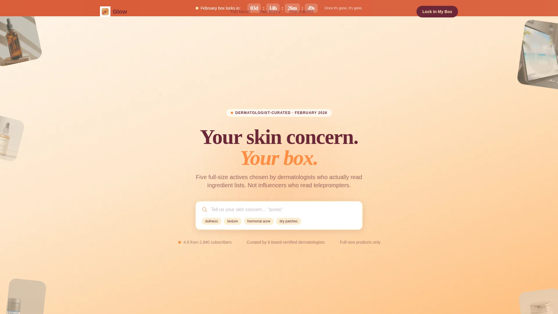
The header centers a search field on a scattered flat-lay of product tubes, droppers, and sheet masks. As a visitor types a skin concern like dullness or texture, product cards rise from the layered stack beneath the field. The experience feels like a personal concierge assembling a box in real time.
Scroll-Triggered Product Reveal Stack
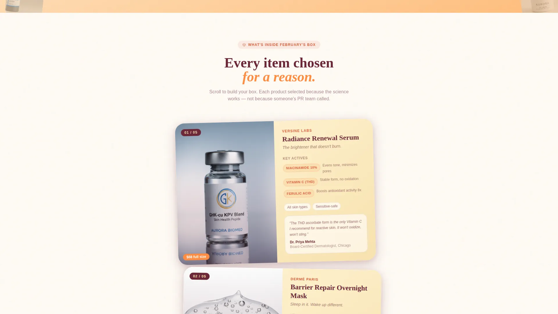
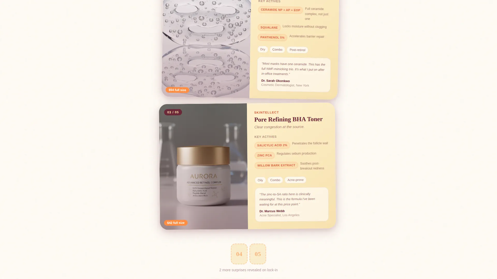
Each scroll beat reveals one product from the upcoming box. New cards layer on top of previous ones, building a visible stack as the visitor moves down the page. Ingredient breakdowns slide in from behind each product image, adding context without interrupting the visual rhythm.
Persistent Countdown Urgency Banner
A blood-orange banner sits below the header and stays visible as the visitor scrolls. It displays the exact time remaining before the curation window closes. The countdown makes the deadline feel real because the rest of the page keeps proving what will be missed.
Single-Step Checkout Overlay
The primary call to action opens a single overlay rather than redirecting to a new page. The overlay includes a skin type toggle, a frequency selector for monthly or quarterly delivery, and payment input. No account creation is required until after the purchase is complete.
Gift This Box Secondary Path
A secondary call to action allows visitors to send the box as a gift. The gift flow includes a delivery date picker and a personal note field. It serves a distinct buyer intent without cluttering the primary subscription path.
Past Boxes Swipe Gallery
A mid-page gallery lets visitors swipe through previous months of curation. Each past box reinforces that the selection changes every month and that once a box is gone it cannot be ordered again. Scarcity becomes visible rather than just stated.
Page sections overview
| Section | Purpose |
|---|---|
| Search-driven hero | Opens with typed skin concern input and live product card shuffle |
| Countdown urgency banner | Displays closing deadline in real time to establish time pressure |
| First product reveal | Introduces product one with layered card and ingredient slide-in |
| Second product reveal | Adds product two to the growing visual stack |
| Third product reveal | Completes the mid-page stack and triggers the sticky bottom bar |
| Past boxes gallery | Swipeable archive of previous months to reinforce scarcity |
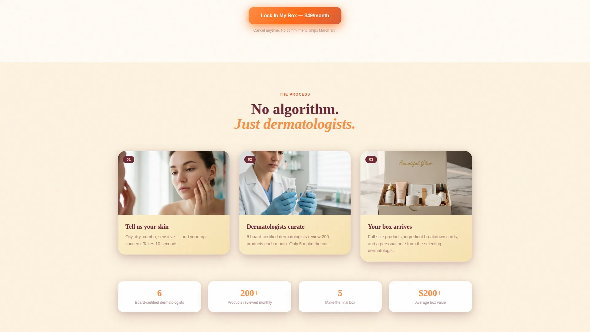
| Primary call to action section | Repeats "Lock In My Box" before the checkout overlay opens |
| Checkout overlay | Single-step skin type, frequency, and payment flow |
| Gift this box section | Secondary path with date picker and personal note field |
Design & branding system
The visual identity uses a citrus burst color system that feels warm and edible without being loud. Every color has a specific job so the palette stays cohesive across the full scroll journey.
- Sun-bleached tangerine (#FF8C42) washes across hero backgrounds and primary call-to-action buttons
- Blood orange (#D95D39) is reserved for the countdown banner and urgency badges to signal time pressure
- Meyer lemon pith (#F7E1AE) softens card surfaces and ingredient callout backgrounds
- Deep grapefruit rind (#6B2737) anchors headlines and body copy so brightness never tips into visual chaos
- Layered cards cast soft shadows at staggered depths, giving each product tile a physical, tactile quality
Mobile & speed optimization
The overlap and layered card structure is designed to translate cleanly to smaller screens. Staggered depths and soft shadows that create depth on desktop collapse into a readable single-column stack on mobile without losing the scroll-reveal behavior.
- The sticky bottom bar with the primary call to action remains accessible on mobile after the third product reveal
- The single-step checkout overlay is sized to fit a phone screen without horizontal scrolling or pinching
How this template helps you convert
This template earns the click by sequencing information in the order that builds trust fastest. Every design and layout decision is aimed at reducing the gap between arrival and subscription.
- The search hero personalizes the experience immediately. Visitors see products that match their concern before any sales message appears, which lowers skepticism before the first call to action is shown.
- The scroll-stack structure turns passive reading into active discovery. The deeper a visitor goes, the more invested they feel in what they have already seen, and the countdown banner keeps reminding them that waiting has a cost.
Other information about this template
This template is a strong starting point for any skincare subscription service that relies on editorial authority and limited availability to drive sign-ups. A few additional details worth knowing before you customize it.
- The template style is Overlap and Layered, which gives it a tactile, physical feel that flat grid layouts cannot replicate
- The Directory and Discovery theme means the search-first hero doubles as a discovery engine, not just a visual hook
- The page direction is single-page with a section-led flow, so all conversion points live in one continuous scroll experience
- The gift path is a built-in secondary revenue channel that requires no separate page or duplicate build
- The checkout overlay is designed to eliminate the friction of account creation as a pre-purchase barrier
Theme
Neo-Retro
Creative direction
Curated Collection
Color system
Lavender Dream
Style
Overlap/Layered
Direction
Marketplace/Multi
Page Sections
Interactive Skin Concern Search Hero
Scroll-triggered Product Reveal Stack
Persistent Countdown Urgency Banner
Single-step Checkout Overlay
Gift This Box Secondary Path
Past Boxes Swipe Gallery
Related questions
Can I change the color palette to match my brand?
Does the countdown timer reset on every visit?
Can visitors skip the search step and scroll directly?
Is the gift path separate from the main subscription flow?
Can I adjust the number of product reveal cards in the stack?



