Beauty & Cosmetics Brand Blog Website Template
Glow is a masonry-style beauty subscription landing page built for ingredient-conscious skincare brands. It uses an editorial portrait header, a Pinterest-style gallery grid, and a low-friction freemium signup flow to convert visitors into subscribers. The warm Cloud Canvas palette and Organic Flow design system create an unhurried, premium feel that matches the expectations of your audience.
by Rocket studio
Quick summary
Glow is a single-page landing template for beauty subscription box brands. It pairs an editorial full-viewport portrait header with a scrolling masonry gallery and a no-credit-card-required signup form. The design is warm, botanical, and deliberately unhurried, built to build desire through visual accumulation before asking for commitment.
Who this template is for
This template is made for founders and marketers running a curated beauty or skincare subscription. It fits brands whose audience reads ingredient lists and cares about what goes on their skin.
- Small-batch or indie beauty brands launching a monthly subscription box
- Skincare founders targeting women aged roughly 28 to 42 who value considered, botanical formulations
- Gift-box curators looking for a premium editorial presentation that feels distinct from typical e-commerce pages
What problem this template solves
Most subscription landing pages lead with a list of benefits and a signup form. That approach works for utility products, but it falls flat for premium beauty. Your audience wants to feel something before they commit.
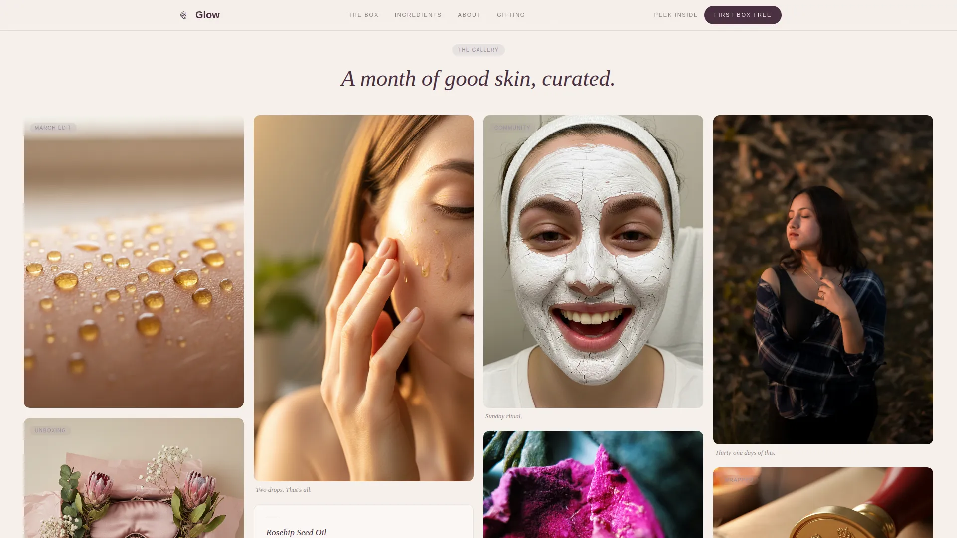
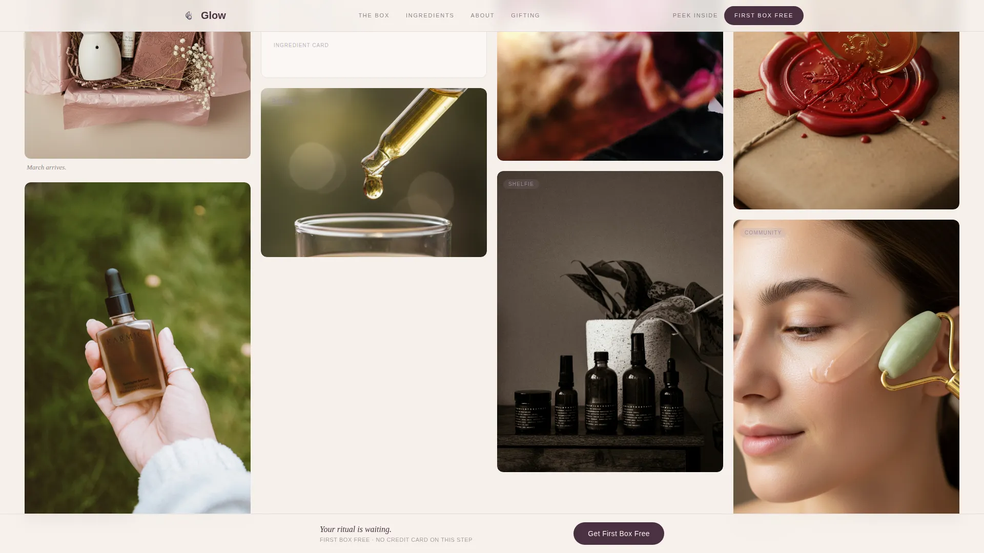
- The masonry gallery solves the "I can't see what I'm getting" problem by showing macro shots, flat-lays, and real subscriber moments side by side
- The low-friction freemium model removes the credit card barrier on the first step, reducing drop-off before visitors are fully convinced
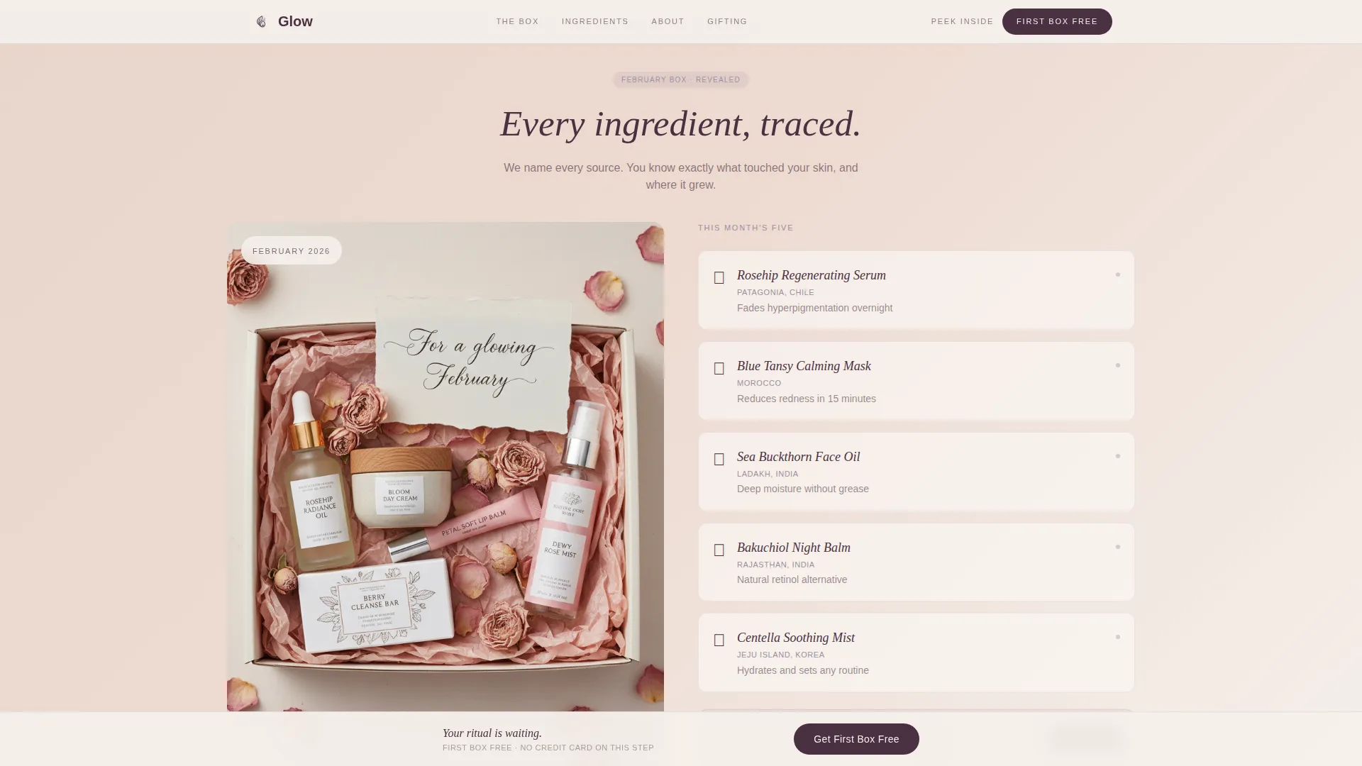
- The full-width box reveal card answers the "but what's actually inside?" question at exactly the right moment in the scroll
What you get with this template
You get a complete, ready-to-customize landing page that walks a visitor from first impression to signup without a single hard sell. Every section is purposeful and every visual moment earns the next.
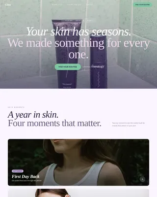
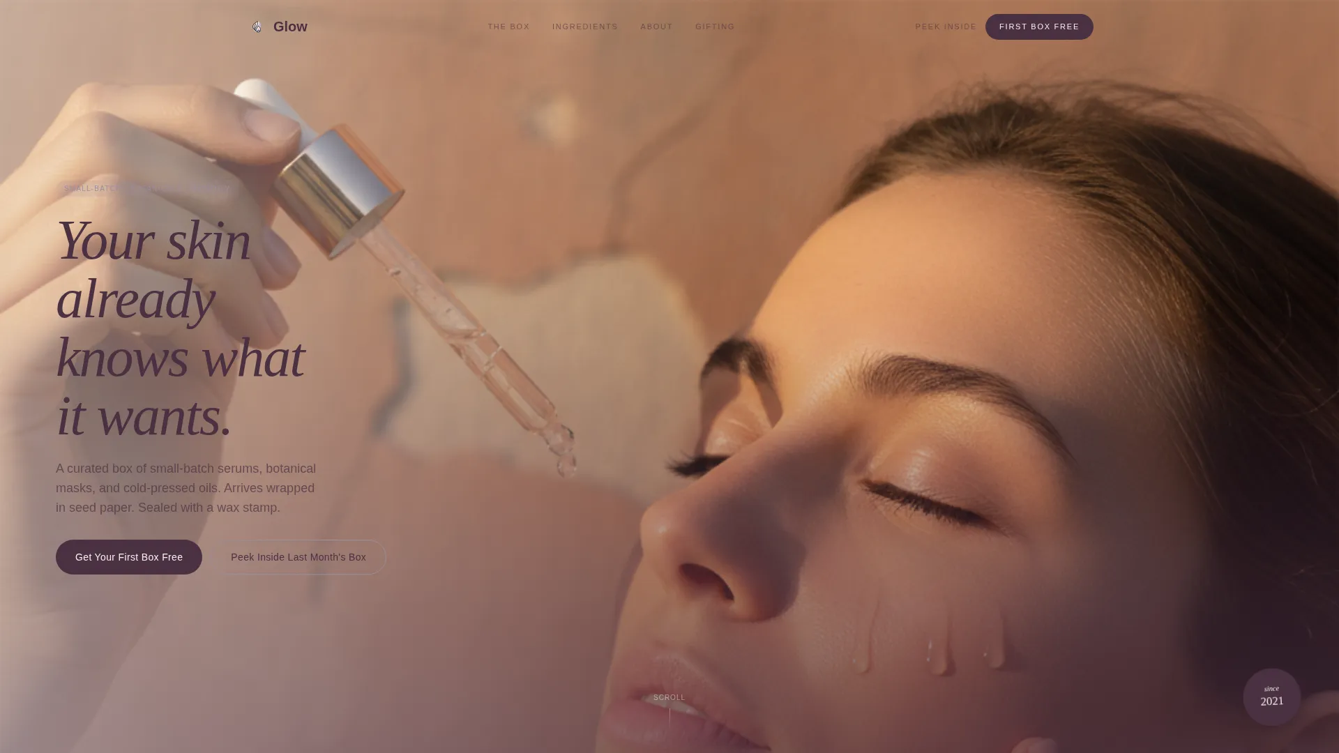
- A full-viewport editorial portrait section with a serif headline and dual call-to-action buttons
- A masonry gallery grid with varied card sizes, a mid-grid full-width reveal card, and a user-generated content section beneath it
- A sticky bottom call-to-action bar and a single-step modal form with a skin-type icon selector, first name field, and email field
Feature list
This template includes the following built-in features, all grounded in the design brief.
Full-Viewport Editorial Hero
The header fills the entire screen with a vertical portrait composition. Golden-hour lighting, a sun-bleached terracotta background, and a single fig-colored serif headline create an immediate editorial tone. Two calls to action sit directly beneath the portrait to capture early intent.
Masonry Gallery Grid
The gallery section uses a Pinterest-style grid with cards of varied sizes and aspect ratios. Each card holds one sentence of text at most. The layout is designed to accumulate visual desire rather than explain or persuade through words.
Mid-Grid Full-Width Reveal Card
A full-width pause card breaks the masonry flow at the midpoint. It names and sources every product from a past box, satisfying the ingredient-conscious visitor who wants proof before committing. The grid then resumes with subscriber-generated content.
Sticky Call-to-Action Bar
After the third masonry row, a sticky bar enters from the bottom of the screen. It keeps the primary call to action visible without interrupting the browsing experience. This ensures a conversion path is always reachable during the scroll.
Low-Friction Skin-Type Modal Form
The signup modal collects only a first name, an email address, and a skin type. Skin type is selected through four illustrated icons, oily, dry, combination, and sensitive, rather than a dropdown. No credit card is required at this step.
Scroll Anchor Secondary Path
A secondary call to action labeled "Peek Inside Last Month's Box" acts as a scroll anchor. It brings hesitant visitors directly to the reveal card, building product desire before the signup form is introduced a second time.
Page sections overview
| Section | Purpose |
|---|---|
| Editorial Portrait Hero | Opens with full-viewport image and dual calls to action |
| Masonry Gallery Grid | Builds desire through varied editorial and product cards |
| Full-Width Box Reveal | Names and sources past box contents for ingredient-curious visitors |
| User-Generated Content Grid | Extends the gallery with subscriber photography that mirrors the editorial feel |
| Sticky Call-to-Action Bar | Keeps the primary conversion path visible throughout the scroll |
| Skin-Type Signup Modal | Captures first name, email, and skin type with no credit card required |
| Minimal Footer | Closes the page with a clean horizontal layout |
Design & branding system
The visual identity uses the Organic Flow theme with the Cloud Canvas color palette. Every tone is borrowed from something botanical, soft parchment for backgrounds, whispered blush for secondary surfaces, dried lavender for accents, and deep fig for headlines and key text.
- Typography pairs Fraunces serif headlines with DM Sans body text for a balance of editorial warmth and clean readability
- Lavender marks hover states, dividers, and tags, while fig anchors all primary headlines and call-to-action buttons
- Scroll-triggered fade reveals and masonry stagger animations add motion that feels unhurried rather than flashy
Mobile & speed optimization
This template is designed with a mobile-first approach, reflecting the reality that beauty subscription browsing happens primarily on phones.
- Image lazy loading is built into the gallery so the masonry grid loads progressively as visitors scroll
- The sticky call-to-action bar and modal form are sized and spaced for thumb-friendly interaction on small screens
- Smooth scroll behavior is handled with CSS scroll-behavior so the anchor link to the reveal card feels seamless on mobile
How this template helps you convert
The page earns the click by showing instead of telling. By the time a visitor sees the call to action a second time, they have already experienced the product through the screen.
- The masonry gallery accumulates sensory detail across multiple card types, macro shots, flat-lays, short video loops, and subscriber selfies, so visitors feel the product before they read about it
- The mid-grid reveal card names real ingredients and sources, meeting ingredient-conscious visitors at the exact moment their curiosity peaks
- The low-friction modal removes the biggest barrier to trial signups by asking only for a name, email, and skin type, with no credit card on the first step
Other information about this template
This template is built specifically for the beauty subscription niche and reflects the expectations of a direct-to-consumer skincare audience in the US market.
- The page is set up for English-language copy and United States dollar pricing
- The footer uses a minimal horizontal layout suitable for essential links and a brief brand statement
- The template supports social proof through subscriber count placement, named product sourcing in the reveal card, and a dedicated user-generated content grid section
Theme
Organic Flow
Creative direction
Gallery Walk
Color system
Cloud Canvas
Style
Masonry/Pinterest
Direction
Freemium/Trial
Page Sections
Full-viewport Editorial Hero
Masonry Gallery Grid
Mid-grid Full-width Reveal Card
Sticky Call-to-action Bar
Low-friction Skin-type Modal
Scroll Anchor Secondary Path
Related questions
Does this template require a credit card field on the signup form?
How does the skin-type selector work in the modal?
Can I customize the colors and fonts in this template?
What types of media does the masonry grid support?
Is this template suitable for a gift-box audience as well as regular subscribers?