Radiant Teen | Free Website Template | Rocket
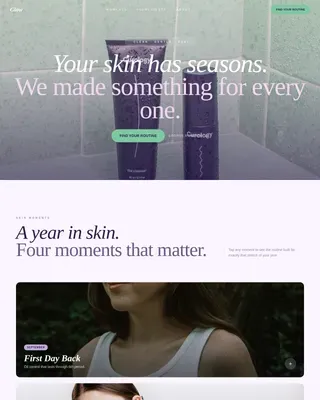
Glow is a single-page landing page template built for teen skin product lines. It combines an overlapping card layout, a Soft Mist color palette, and a built-in routine quiz to guide first-time skincare buyers toward a personalized 2-3 product bundle. The design feels warm, honest, and easy to trust, for teens, parents, and dermatologists alike.
by Rocket studio
Quick summary
Glow is a fully designed landing page template for a gentle teen skincare line. It uses overlapping layered panels, a pastel Soft Mist palette, and a quiz-led conversion flow. Visitors move through three product chapters, read real teen testimonials, and finish with a personalized routine recommendation they can add to cart in one click.
Who this template is for
This template is built for founders and brand teams launching a skincare line aimed at younger audiences. It speaks to multiple buyer types at once without losing focus or clarity.
- Teen skincare brands offering gentle, low-irritant formulas for first-time routines
- Parents and dermatologists looking for transparent ingredient information before recommending a product
- Beauty entrepreneurs who want a polished, trust-building landing page without starting from scratch
What problem this template solves
Most skincare landing pages are built for adults. They use clinical language, dense ingredient grids, and aggressive urgency tactics that alienate teen buyers and worry their parents. This template solves that mismatch directly.
- It replaces generic product grids with a guided quiz that makes product selection feel personal and low-pressure
- It presents ingredient transparency and a dermatologist endorsement badge alongside every routine result
- It gives parents a dedicated sharing path so they can review recommendations before purchasing
What you get with this template
You get a complete, ready-to-customize single-page layout designed around the full teen skincare buying journey. Every section is purpose-built for this niche.
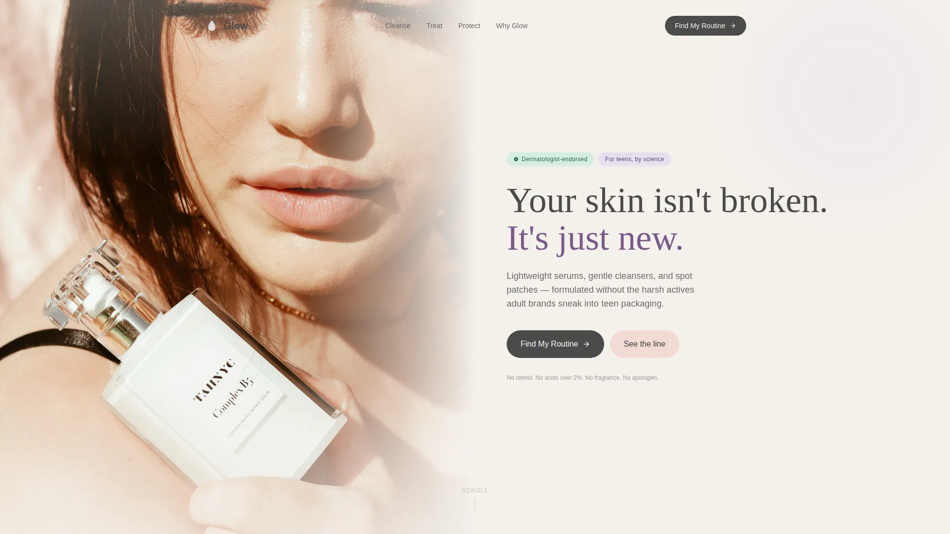
- A full-viewport portrait header with an honest, un-retouched teen photo and a headline that fades in over negative space
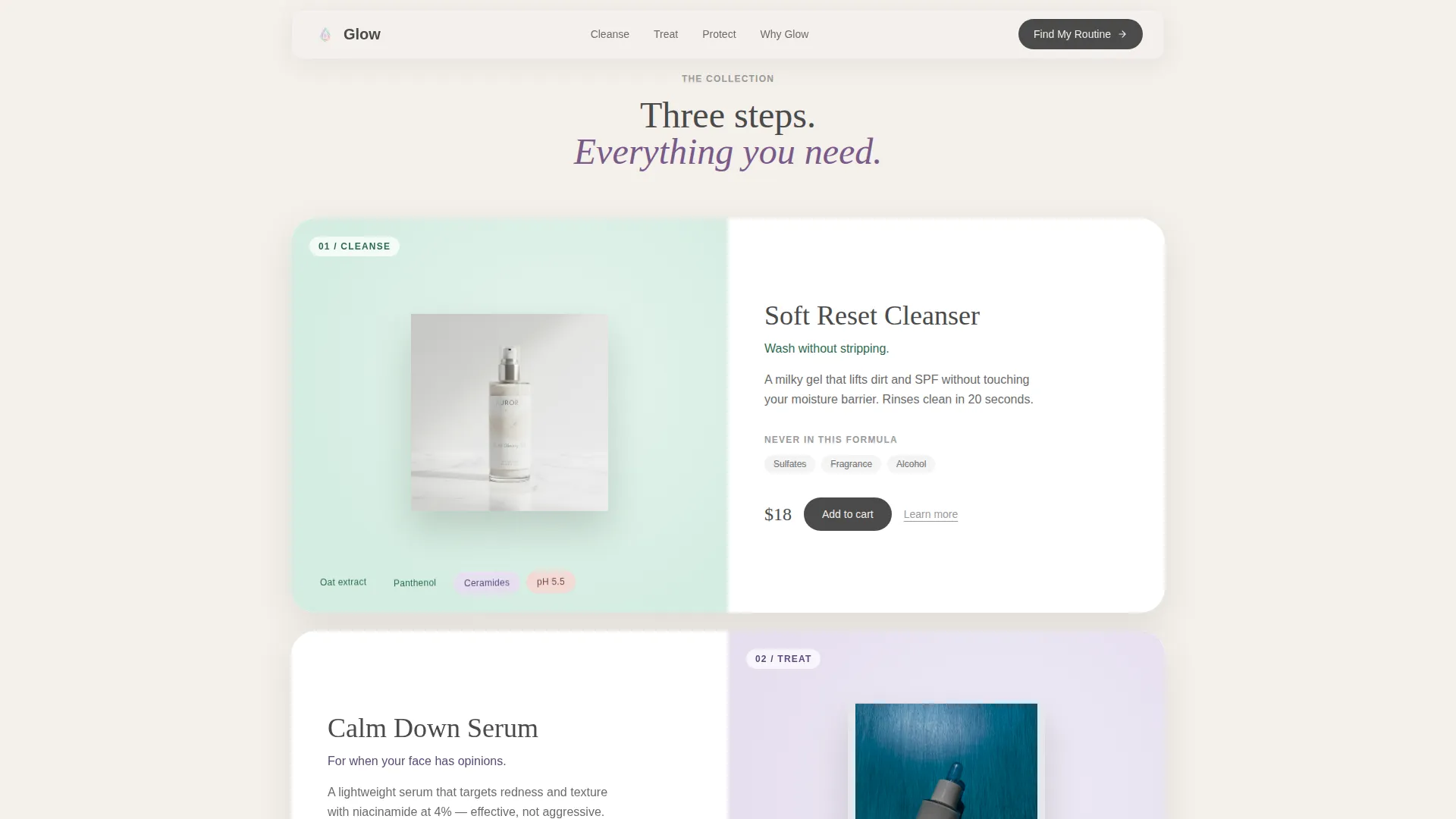
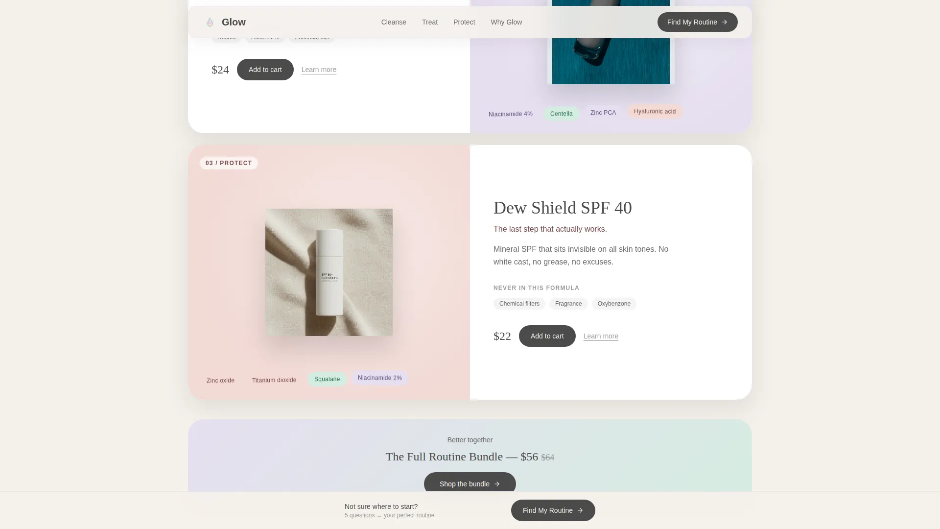
- Three scrollable product chapters (Cleanse, Treat, Protect) built as overlapping cards with floating ingredient pills
- A layered quiz modal with five illustrated questions, animated background tints, and a one-click bundle result
Feature list
This template ships with six core design and conversion features, each grounded in the brief and ready to use.
Full-Viewport Portrait Header
The header fills the entire screen height with a tight shoulder-up portrait. The composition is slightly off-center so the headline "Your skin isn't broken. It's just new." has room to breathe. A fade-in animation brings the text in over soft negative space.
Overlapping Layered Product Cards
Products are organized into three chapters: Cleanse, Treat, and Protect. Each chapter uses stacking rounded panels with soft shadows. Cards peel away as the visitor scrolls, building a sense of curated depth without visual clutter.
Floating Ingredient Pills
Mint and lavender pill-shaped labels appear beside each product card. They surface key ingredient call-outs at a glance, helping teens and parents quickly understand what is and is not in the formula.
Real Teen Testimonial Slides
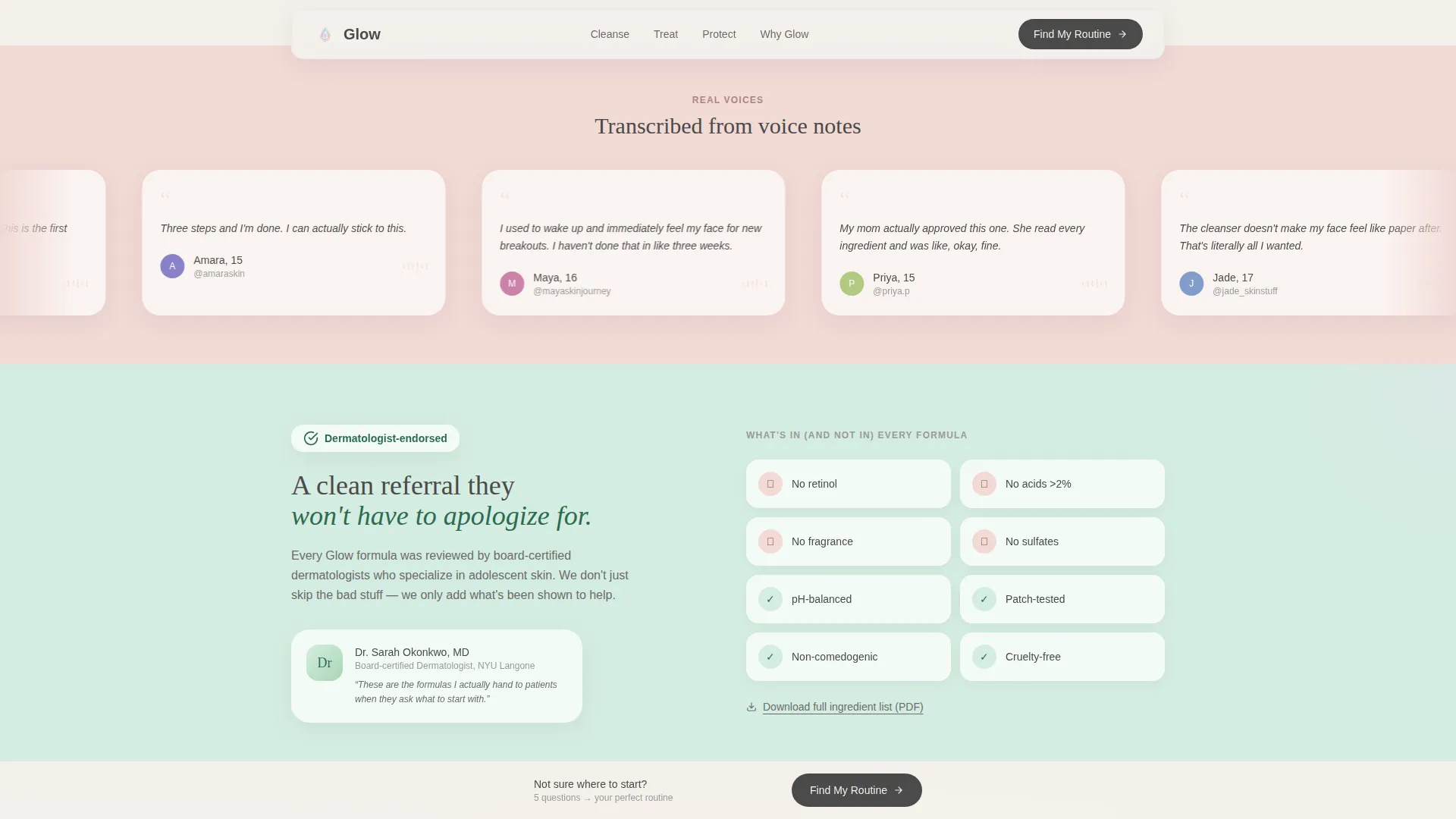
Between each product chapter, a single-line testimonial slides in on a warm blush background strip. These are written as transcribed voice notes, not polished marketing quotes, which keeps the tone grounded and believable.
Interactive Routine Quiz Modal
The primary call to action opens a five-question illustrated modal. Each answer slightly shifts the background tint toward the matching collection color. The result page delivers a 2-3 product routine with a one-click "Add My Routine to Cart" bundle.
Send-to-Parent Sharing Path
The quiz result includes a secondary action: "Send to My Parent." This emails the full recommendation with ingredient transparency details and a dermatologist endorsement badge, addressing the trust gap between teen buyers and parental approval.
Page sections overview
| Section | Purpose |
|---|---|
| Portrait Header | Introduce brand voice and primary call to action |
| Find My Routine call to action | Drive quiz engagement immediately after header |
| Cleanse Chapter Cards | Showcase cleanser products with ingredient pills |
| Teen Testimonial Strip | Build social proof between product chapters |
| Treat Chapter Cards | Present serum products with floating labels |
| Teen Testimonial Strip | Reinforce trust before the final chapter |
| Protect Chapter Cards | Display spot patches with ingredient call-outs |
| Sticky Quiz Bar | Re-engage scrollers with a persistent bottom call to action |
| Quiz Modal | Deliver personalized routine via five questions |
| Routine Result Panel | Present bundle with cart and parent-share actions |
Design & branding system
The Soft Mist palette drives every visual decision on this page. The goal is a bathroom-vanity mood: dewy, pastel, and calm without being bland.
- Five core colors: cloud-white (#F4F0EB), barely-there lavender (#E6DFF0), dew-drop mint (#D5EDE1), warm blush (#F2D9D5), and soft graphite (#4A4A4A) for body text
- Lavender and mint alternate as section background washes; blush activates on hover states and interactive elements
- Rounded card panels with soft drop shadows create layered depth, and cloud-white breathing space prevents the layout from feeling crowded
Mobile & speed optimization
The layout is designed with a vertical-first portrait header and a card-based scroll structure that naturally translates to narrower screens.
- Overlapping card panels reflow gracefully on smaller viewports without losing the layered visual feel
- The quiz modal is illustrated and touch-friendly, keeping the five-question flow easy to tap through on a phone
- Sticky bottom bar placement ensures the "Find My Routine" call to action stays visible without blocking content on mobile
How this template helps you convert
Every design choice on this page points toward one outcome: a visitor building and buying their first routine.
- The quiz replaces passive browsing with an active, personalized experience that ends at a ready-to-buy product bundle
- The "Send to My Parent" path removes the approval barrier that often stops teen purchases, turning a single visitor into a household conversion
- Real testimonials, ingredient pills, and a dermatologist badge address the three trust questions (Does it work? Is it safe? Can I trust this brand?) before the visitor reaches the cart
Other information about this template
This template is part of a broader Marketplace Grid theme family. It uses the Curated Collection creative direction, which means the scroll experience feels like browsing a carefully edited shelf rather than a product catalog dump.
- The Overlap/Layered template style is distinct from flat grid layouts; depth and motion are central to the visual language
- The Quiz/Assessment landing page direction makes this template particularly well-suited for brands with more than one product SKU and a need to match buyers to the right formula
- The header concept follows a Vertical/Portrait composition, which prioritizes an honest human face over styled flat lays or abstract brand imagery
Theme
Marketplace Grid
Creative direction
Curated Collection
Color system
Soft Mist
Style
Overlap/Layered
Direction
Quiz/Assessment
Page Sections
Full-viewport Portrait Header
Overlapping Layered Product Cards
Floating Ingredient Pill Labels
Interactive Routine Quiz Modal
Personalized Bundle Result
Real Teen Testimonial Strips
Related questions
Can I change the quiz questions to match my product range?
Is this template only for teen skincare brands?
Does the Send to My Parent feature require a connected email service?
How many products can I feature in each chapter?
What makes this different from a standard product grid landing page?