Rich Skin Wellness Blog | Free Website Template | Rocket
Piel is a single-column skincare landing page template built for melanin-rich Latina skin. It opens with a draggable Before/After Slider, flows through a cinematic editorial sequence, and closes with an inline seven-question routine quiz. The design speaks the language of hyperpigmentation, melasma, and generational beauty wisdom, earning trust before asking for anything.
by Rocket studio
Quick summary
Piel is a skincare landing page template rooted in the intersection of abuela remedies and modern dermatology. It is built for first-generation Latinas who search for hyperpigmentation solutions, compare ingredient percentages, and deserve a skincare space that finally sees their skin. The landing page flows as a single editorial column, intimate, cinematic, and purpose-built to convert through genuine connection.
Who this template is for
This landing page template is for beauty bloggers, skincare educators, and content creators serving melanin-rich Latina audiences. It suits founders who want to lead with education and earn email subscribers through real value rather than pressure tactics. Whether you write about skin care science, share traditional remedies, or combine both, Piel gives your landing page the design language to match your voice.
- First-generation Latina beauty bloggers covering hyperpigmentation, melasma, and acne scarring
- Skincare educators and estheticians building a lead-capture landing page with a quiz-first strategy
- Independent beauty founders offering skin care products, digital guides, or subscription skin care services to a Latina or Hispanic audience
What problem this template solves
Most skincare landing page designs are built around one universal skin type. They use pale, flat imagery. They speak in generic terms about "glow" and "radiance" without acknowledging that melanin-rich skin burns differently, scars differently, and needs different care. Visitors who actually live those experiences land on those pages and feel invisible. They leave immediately. That missed connection is the problem Piel solves.
This skincare landing page template addresses the specific gap between what melanin-rich skin users need and what standard beauty landing pages actually deliver:
- Generic beauty landing pages fail to mention hyperpigmentation, post-inflammatory scarring, or the skin care concerns most common for deeper complexions
- Standard page design patterns reject cultural touchpoints, leaving Latina visitors without the sense of recognition that builds trust
- Most beauty landing pages bury their value proposition, asking for an email before delivering anything useful, which visitors reject immediately
What you get with this template
You get a complete, single-column skincare landing page with five structured sections, high-interactivity design elements, and bilingual copy scaffolding. The template is built with an Organic Flow visual identity that uses warm, earthy colors to complement deeper skin tones rather than wash them out. Every design decision, from the draggable hero slider to the seven-question inline quiz, serves one goal: making your landing page feel like it was made for your reader, because it was.
- A hero section with a draggable Before/After Slider, a floating trust badge, and a bold call to action that is immediately visible upon entry
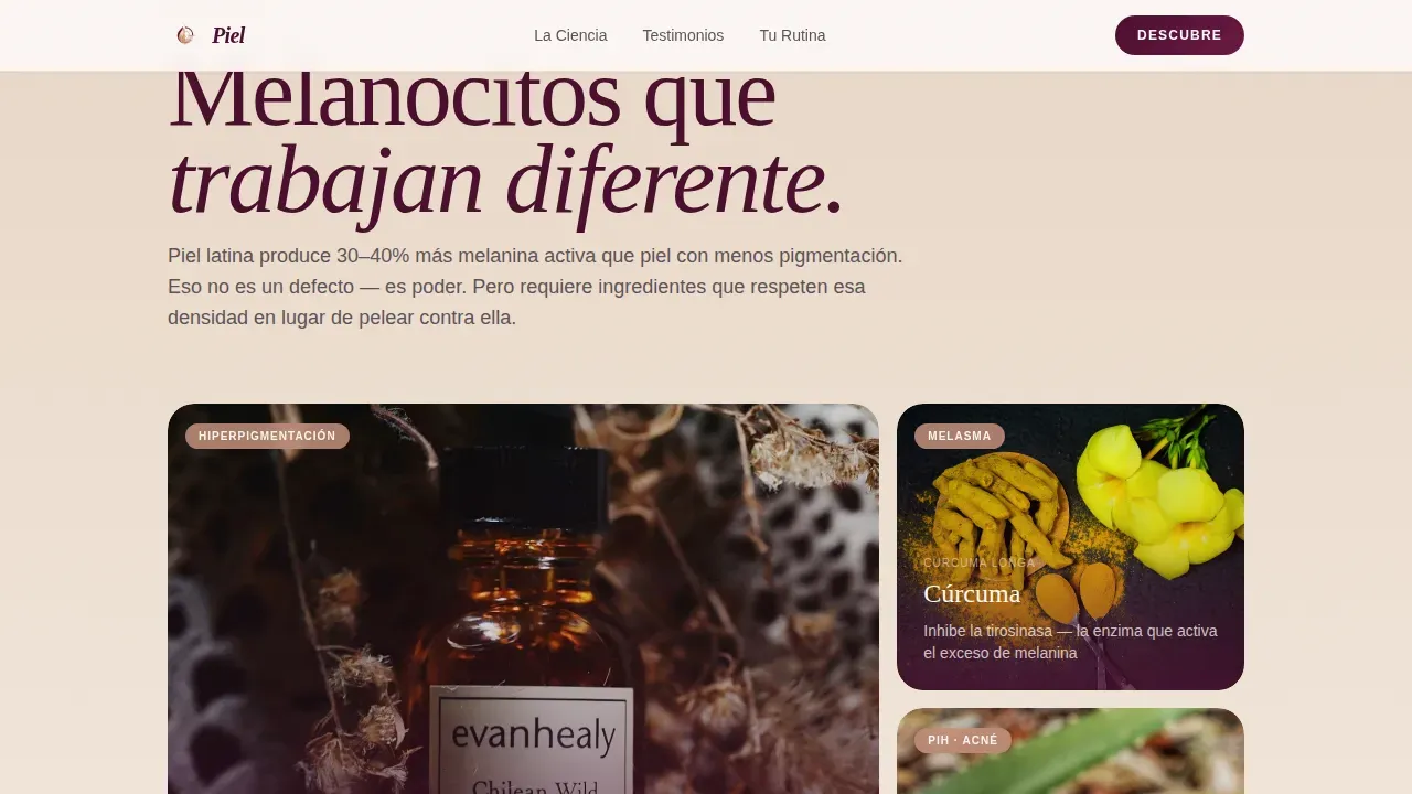
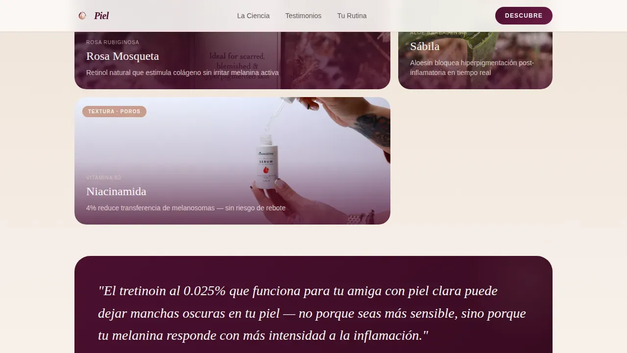
- A cinematic editorial sequence called "La Ciencia" that alternates full-bleed ingredient imagery with tight editorial text blocks about skin science
- A "Testimonios" section with real reader stories in staggered card format, a seven-question inline quiz ("Descubre Tu Rutina"), and a bilingual footer
Feature list
This template packs a focused set of design and layout features that work together to build trust, spark recognition, and guide visitors toward quiz completion and email sign-up. Every feature listed here comes directly from the Piel brief. None are speculative.
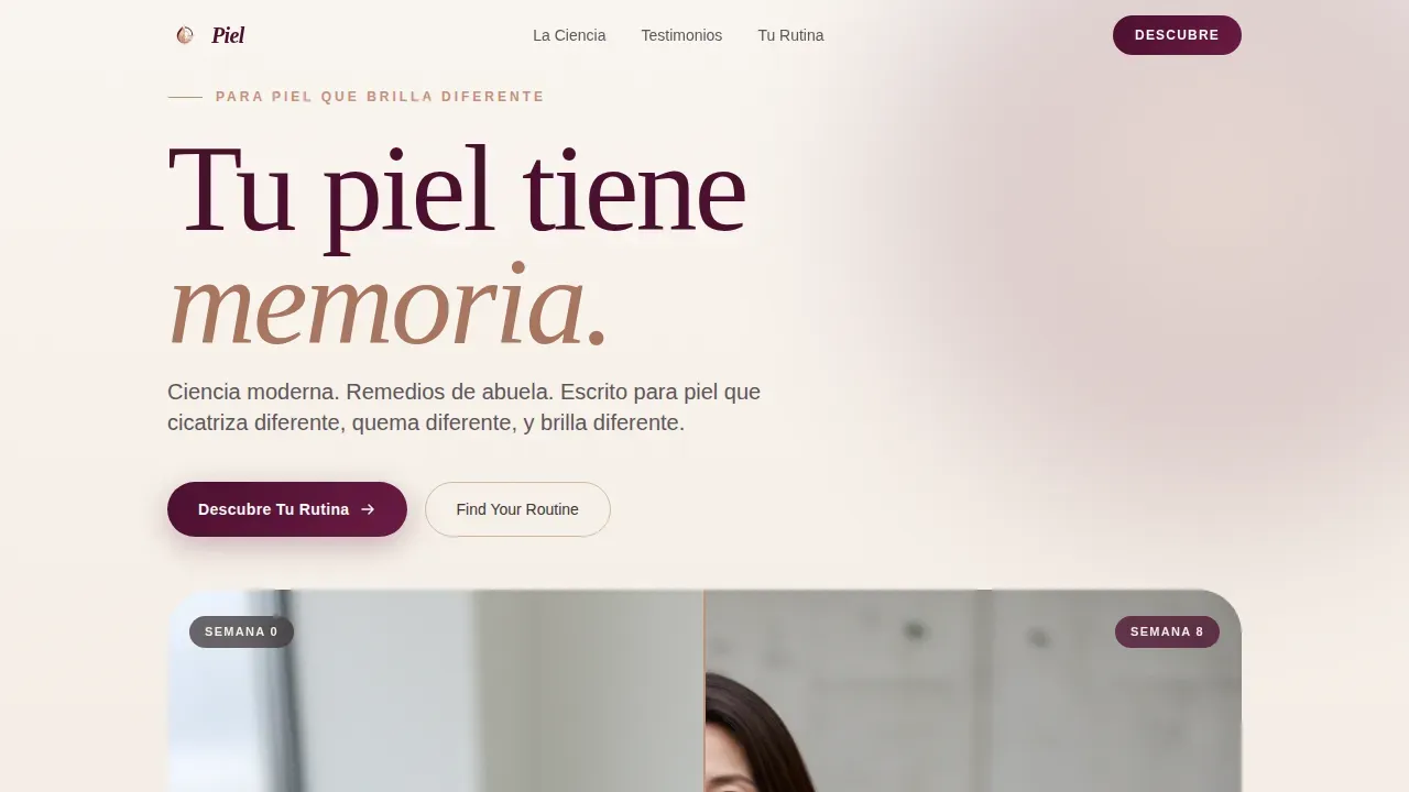
Draggable Before/After Slider Hero
The landing page opens with a side-by-side comparison of the same face under two different conditions. The left side shows visible melasma and post-inflammatory hyperpigmentation under flat fluorescent light. The right side shows the same skin eight weeks later, luminous under soft window light. A thin rose-gold handle lets visitors drag the divider slowly. The skin texture is real, the pores are visible, and the lighting shift does the storytelling. This type of hero section builds immediate trust because it does not hide what real skin looks like. A landing page that leads with authentic before-and-after imagery resonates far more deeply than one that leads with filtered stock photography. Authentic representation in beauty blogging is crucial for individuals with melanin-rich skin to feel seen and valued.
Cinematic Scroll Sequence
Below the hero, a cinematic editorial sequence called "La Ciencia" unfolds across multiple scroll stages. Each reveal acts like a scene in a telenovela. First, the science of Latino skin's unique melanocyte density. Then close-up ingredient photography, turmeric mid-sift, aloe split open and glistening, shot with the care of food editorial. Then real reader testimonials filmed vertically in their own bathrooms. The pacing alternates between slow full-bleed imagery that lets the eye rest and tight text blocks that read like confessions. This sequence ensures your landing page guides visitors from awareness to interest to action, following the logical flow that effective beauty landing pages require.
Inline Seven-Question Routine Quiz
The primary conversion tool is an inline quiz that opens without redirecting away from the landing page. It begins by asking visitors to select their skin tone range, then their main skin care concern, then their current routine complexity. Seven questions total, each displayed on its own card with a rose-gold progress bar. The final screen delivers a personalized ingredient map and routine order before asking for an email to save results. Value is delivered first. Trust is earned. Then the exchange happens. An interactive "Find Your Routine" tool like this can significantly boost visitor engagement and email capture rates on a beauty skincare landing page.
Testimonios Social Proof Cards
The "Testimonios" section presents real reader stories in staggered card format. Cards include real names, specific skin concern labels, and star ratings. Testimonials and reviews that showcase quotes about specific results, improving dark spots, managing melasma, finding a morning routine that works, are far more persuasive than generic praise. Social proof structured this way enhances trust on beauty landing pages and gives new visitors the confidence to complete the quiz and share their email.
Merlot and Smoke Color System
The entire landing page design uses a four-color palette that complements deeper complexions: deep merlot for background sections, charcoal smoke for body text, warm bisque as the skin-tone neutral that breathes through every section, and rose-gold on buttons, hover states, and the quiz progress bar. Warm color palettes with earthy tones and jewel tones complement deeper complexions better than the typical pastels that dominate most skincare landing page templates. Every color choice in Piel reinforces the emotional identity of the page.
Bilingual Copy Scaffolding
The landing page carries bilingual copy across its key moments. The primary call-to-action reads "Descubre Tu Rutina," with a secondary English variant, "Find Your Routine," appearing contextually throughout. This dual-language approach serves first-generation Latina users who move fluidly between Spanish and English. No other standard skincare landing page template in this category makes that cultural accommodation as a built-in design feature.
Page sections overview
| Section | Purpose |
|---|---|
| Hero Slider | Draggable before/after skin comparison that builds immediate trust with authentic real-skin imagery |
| La Ciencia Editorial | Alternating full-bleed ingredient visuals and science text blocks that educate visitors about melanin-rich skin |
| Testimonios Cards | Staggered reader story cards with names, skin concern labels, and star ratings for social proof |
| Descubre Tu Rutina | Inline seven-question quiz delivering a personalized ingredient map before requesting an email |
| Footer Pattern | Horizontal flow footer with bilingual navigation and closing brand elements |
Design & branding system
The Piel design system follows an Organic Flow visual theme. Every element, from typography scale to spacing, carries a sense of warmth, intimacy, and editorial care. The page design feels like a beauty journal, not a sales funnel. Visual hierarchy is established through a combination of size, color, and deliberate white space, ensuring that key elements receive the attention they deserve without feeling crowded. A minimalist approach with ample breathing room keeps the layout clean and focused even as the landing page carries rich visual content.
- Typography uses Fraunces for serif display headings and DM Sans for body text, creating a contrast between editorial elegance and readable clarity
- The four-color Merlot and Smoke palette, deep merlot, charcoal smoke, warm bisque, and rose-gold, sets a tone that feels earthy, intimate, and alive with undertone
- Unfiltered imagery guidelines show real pores, real skin texture, and real lighting shifts to display the natural glow of melanin-rich skin without artificial retouching
Mobile & speed optimization
The landing page is built mobile-first, which reflects how the primary audience actually uses the internet. Many users in this demographic browse on their phones late at night, searching for skin care answers in the bathroom at midnight. Mobile optimization is not optional for this audience, it is the primary design context. The template is structured with mobile interaction in mind: the Before/After Slider is draggable by thumb, the quiz cards are sized for single-hand navigation, and the scroll-reveal animations use CSS scroll behavior and IntersectionObserver for smooth performance on mobile devices.
- The single-column layout scales cleanly from large desktop screens down to small phone screens without requiring separate mobile templates
- Quiz card sizing and button touch targets are built for phone-first navigation, allowing visitors to complete the full quiz with ease on any device
- Staggered card animations and full-bleed section transitions use lightweight CSS techniques to maintain a smooth scrolling experience on mobile
How this template helps you convert
A well-structured skincare landing page does not ask for trust before it offers value. Piel is built around the principle that value must come first. The landing page earns attention through authentic imagery, builds recognition through culturally specific editorial content, deepens engagement through ingredient education, and only then presents an exchange. This sequence is what separates a high-converting skincare landing page from a standard beauty page that visitors abandon after three seconds.
- The hero slider delivers immediate emotional resonance by showing real skin transformation without filters or flattery, establishing trust before a single word of copy is read
- The cinematic scroll sequence deepens engagement section by section, making visitors feel that this landing page understands their specific skin care concerns, hyperpigmentation, melasma, texture, before the quiz ever appears
- The inline quiz delivers personalized value first (an ingredient map and routine order) and requests an email only after the visitor has already received something genuinely useful, making the exchange feel fair and the conversion feel natural
Other information about this template
Piel sits in a category that very few skincare landing page templates attempt to serve honestly. Most beauty landing pages in the ecommerce space are designed around a single universal skin ideal. They use stock photography that does not reflect melanin-rich skin tones. They offer one-size skincare advice without acknowledging that individuals with melanin-rich skin require specific routines to address their unique needs. Sunscreen is essential for melanin-rich skin to prevent sun damage and hyperpigmentation, yet many mainstream skincare landing pages still fail to mention SPF for deeper skin tones. Piel is designed for the beauty blogger or brand that wants to reject that pattern and build something more honest.
The template is well-suited to the ecommerce context too. If you sell skin care products, offer subscription skincare services, or provide digital guides, the quiz flow supports product or routine recommendation before the email capture. This makes the landing page a traffic source that works across multiple business models, from a solo beauty blogger building an email list to a small beauty ecommerce brand looking to personalize the shopping experience. Unlike generic skincare landing page templates, Piel is built around a specific traffic source: Latina women who search for hyperpigmentation solutions, walk through their skin care concerns in real time, and need a landing page that actually speaks their language.
The no-code context matters here. No-code tools allow users to build and customize this type of landing page without traditional programming skills. Many users discovered that building a production-ready beauty landing page once required a developer and significant budget. No-code platforms have turned that assumption on its head, allowing beauty bloggers and independent brand founders to access sophisticated page design, interactivity, and quiz functionality without writing a single line of code. Templates for beauty blogs found on no-code platforms make it easier for users to create tailored content that resonates with their specific audience.
The landing page is built as a single-column flow, not a multi-section website, which keeps the visitor on a guided path from the moment they arrive. There are no sidebar distractions, no multi-page navigation to get lost in. Every scroll is a deliberate step toward the quiz. This design decision reflects a clear understanding of how beauty traffic behaves: visitors who land from a social media post or search result want to feel immediately understood. If the landing page fails that test in the first three seconds, they leave. Piel is designed to pass that test.
This template is relevant for a range of use examples:
- A beauty blogger who writes about skin care ingredients safe for use during lactation and wants to capture emails from Latina mothers who search those queries at night
- A skincare esthetician offering personalized skin care services who wants a quiz-first landing page that delivers ingredient recommendations before requesting contact information
- A small ecommerce brand selling melanin-safe skin care products, vitamin C serums, niacinamide treatments, squalane moisturizers, who needs a landing page that speaks to the specific concerns of deeper skin tones
- An affiliate content site that uses the quiz as a traffic source qualifier, routing visitors to relevant product pages based on their quiz answers
The Piel landing page template also gives beauty brands a way to mention their cultural positioning without forcing it. The bilingual design, the abuela-remedy editorial tone, and the cinematic scroll sequence all communicate cultural fluency without turning the landing page into a statement piece. It simply looks like it was made for this world, and for the people in it.
Skin care content that resonates with melanin-rich audiences needs to cover specific topics: hyperpigmentation treatments, gentle exfoliation methods that improve skin texture without triggering post-inflammatory response, moisturizers with natural oils that lock in hydration, and a clear SPF-for-all position. Piel's editorial framework is designed to support all of that content naturally. The La Ciencia section in particular gives beauty bloggers a structured space to cover ingredient science, niacinamide, vitamin C, hyaluronic acid, squalane, in a way that feels editorial rather than clinical.
The Testimonios section gives beauty brands the opportunity to feature culturally attuned testimonials with real-life skin care results. Reader quotes that mention specific concerns, a hairline breakout cleared, a melasma patch faded, a morning routine simplified, build authentic connections with future visitors who recognize their own experience in someone else's words. This type of social proof, combined with the design strength of the Piel visual system, creates a landing page that does not just look credible, it feels credible.
Thanks to the quiz completion model, the template is built around a value-first exchange. Visitors get their personalized routine information before they are ever asked for an email. This design choice builds the kind of trust that long-form lead capture pages have struggled to achieve for years. The quiz also ensures that the landing page collects more qualified leads, users who have already demonstrated intent by completing seven questions about their skin are far more valuable as email subscribers than users who filled in a generic pop-up form.

Theme
Organic Flow
Creative direction
Cinematic Sequence
Color system
Merlot & Smoke
Style
Single Column Flow
Direction
Quiz/Assessment
Page Sections
Draggable Before/after Hero Slider
Cinematic Scroll Sequence
Inline Seven-question Routine Quiz
Testimonios Social Proof Section
Merlot and Smoke Design System
Bilingual Copy Scaffolding
Related questions
Does this template include the quiz logic and question flow?
Can I customize the copy and colors for my own brand?
Is this landing page suitable for a skincare ecommerce brand or just bloggers?
Do I need coding skills to use this template?
Is the Before/After Slider included in the template?


