Diabetes Patient Education Landing Page Template
Glucolog is a split-screen landing page template built for diabetes patient education platforms. It combines line art illustrations, scroll-linked checklist animations, and a calm educational tone to guide newly diagnosed and long-term patients toward a personalized diabetes audit. The design converts confusion into clarity without shame, pressure, or complex medical jargon.
by Rocket studio
Quick summary
Glucolog is a single-page, split-screen landing page template for diabetes self-management education platforms. It walks visitors through five pillars of daily diabetes care using illustrated checklists and honest audit questions. The page directs every visitor toward one clear action: starting a free, personalized diabetes audit. No forms, no friction.
Who this template is for
This template is built for digital health educators and chronic disease platforms that need to earn patient trust quickly. It speaks directly to people who are overwhelmed, exhausted, or quietly carrying the weight of someone else's diagnosis.
- Newly diagnosed Type 2 patients who feel lost with a glucose meter and don't know where to start
- Long-managing Type 1 individuals experiencing decision fatigue from years of daily self-management
- Caregiving partners and spouses who carry the mental load of a loved one's chronic condition
What problem this template solves
Most diabetes education content is either too clinical to feel human or too vague to be useful. Patients leave generic health pages still unsure what to do tomorrow morning. This template fixes that by making every section feel personally relevant.
- Visitors see checklist items that reflect their real daily life, not textbook definitions
- The scroll-linked checkbox animation creates a visual record of knowledge gaps, building gentle urgency without blame
- The single click-through call to action removes decision paralysis by offering one clear next step
What you get with this template
You get a fully structured, single-page layout designed around the five core pillars of diabetes self-management. Every section is purposeful and patient-centered.
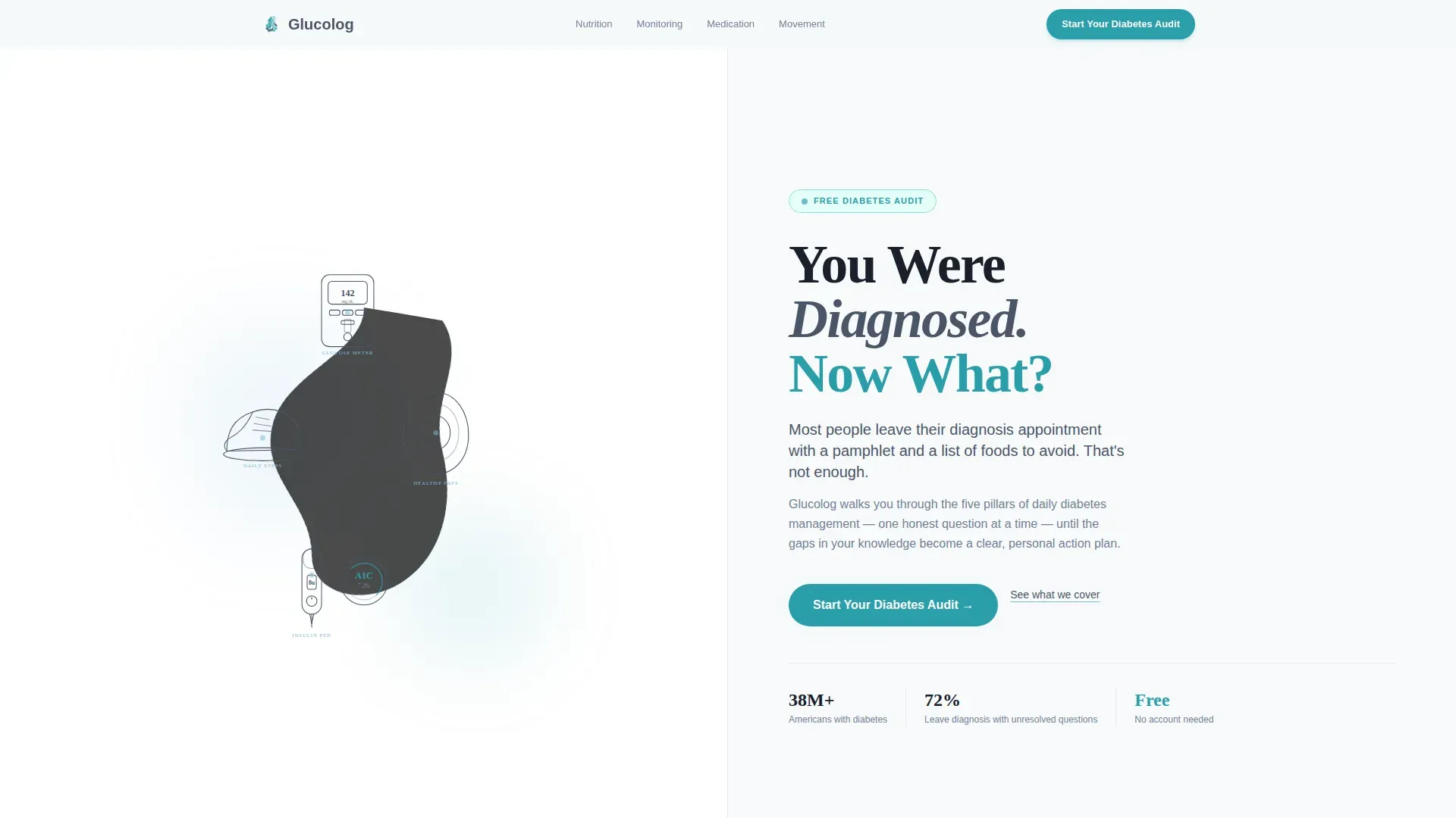
- A full-viewport split-screen hero with SVG line art on the left and a serif headline with a pulsing teal call-to-action button on the right
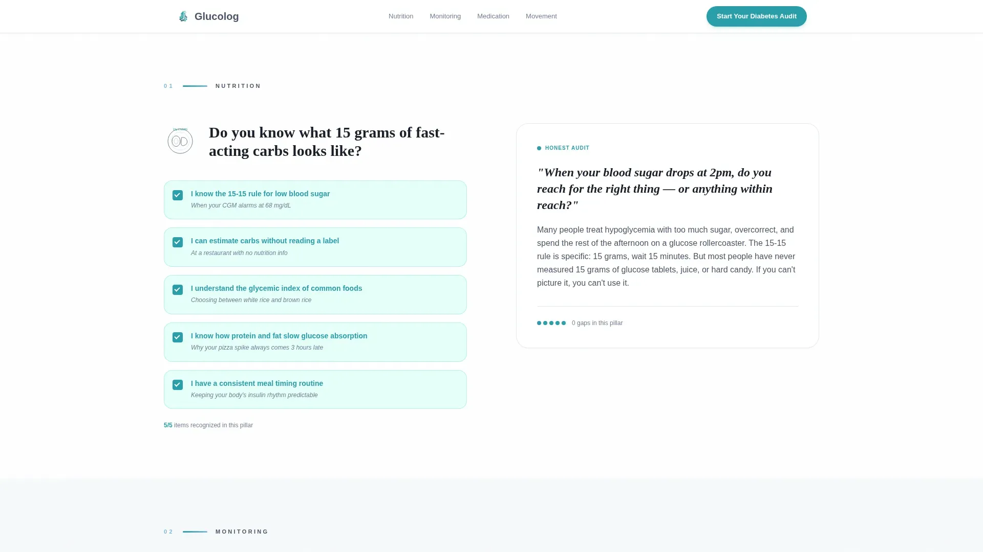
- Five checklist audit sections covering nutrition, blood sugar monitoring, medication, movement, and mental health, each paired with an honest audit paragraph
- A scroll-linked checkbox fill animation, a midpoint call-to-action repeat, and a final anchored call to action with an unanswered-items counter
Feature list
This section describes the specific, built-in capabilities of the Glucolog template.
Split-Screen Hero Layout
The hero fills the full viewport and divides into two equal halves. The left side holds delicate SVG line art illustrations, a glucose meter, a walking shoe, a halved avocado, and an insulin pen, connected by a single dotted patient-pathway line. The right side carries a large serif headline, one supporting sentence, and a soft-pulsing teal call-to-action button.
Scroll-Linked Checkbox Animation
As the visitor scrolls through each checklist audit section, unchecked boxes gradually fill with warm affirmation teal. This animation creates a visible accumulation of knowledge gaps. The effect builds motivation to act without using shame or alarm.
Checklist Audit Sections
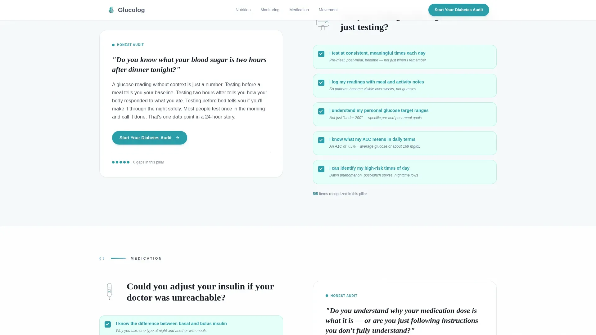
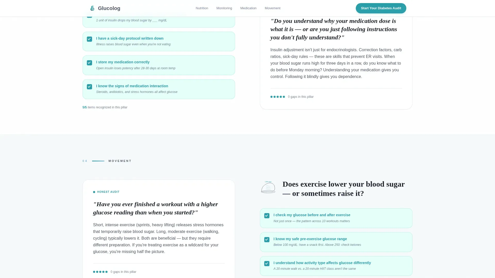
Five pillar sections cover nutrition, monitoring, medication, movement, and mental health. Each section pairs an illustrated checklist on the left with a short audit paragraph on the right. Every checklist item references a specific daily scenario, such as knowing what 15 grams of fast-acting carbohydrates looks like in a real meal.
Repeating Click-Through Call to Action
The primary call to action, "Start Your Diabetes Audit," appears three times across the page. It shows first in the hero, again at the midpoint after the nutrition and monitoring sections, and finally at the bottom of the page. This placement ensures the prompt to act is always within reach.
Unanswered-Items Counter
The final call-to-action block includes a live counter that displays how many checklist items the visitor has not yet addressed. This counter reinforces the value of the audit without pressure. It turns unchecked boxes into a personalized reason to click.
Educational Line Art Visual System
All visuals are custom SVG line illustrations drawn in thin slate strokes on white. There is no photography or stock imagery anywhere on the page. This illustration style signals that diabetes management is learnable, not just clinical.
Page sections overview
| Section | Purpose |
|---|---|
| Split-Screen Hero | Introduce the platform and present the primary call to action |
| Nutrition Audit | Present meal timing and carbohydrate knowledge checklist |
| Monitoring Audit | Cover blood sugar tracking and glucose meter confidence |
| Medication Audit | Address insulin adjustment and medication routine gaps |
| Movement Audit | Guide visitors through physical activity self-assessment |
| Mental Health Audit | Surface emotional load and decision fatigue awareness |
| Trust and Stats | Build credibility with specific, scenario-grounded statistics |
| Final Call to Action | Anchor the audit prompt beside the unanswered-items counter |
| Footer | Provide linear single-row navigation and supporting links |
Design & branding system
The visual identity follows an Educational Guide theme. The palette is described as feeling like a hospital morning after the blinds have been opened: sterile enough to trust, warm enough to breathe in.
- Slate (#4A5568) for body text and grounding elements, sky blue (#7EB8DA) as the primary accent, and cloud white (#F7FAFC) across open backgrounds
- Warm affirmation teal (#2B9EAA) reserved for completed checklist fills and all call-to-action buttons
- Fraunces serif for headlines to convey calm authority, paired with DM Sans for clean, readable body copy
Mobile & speed optimization
The template is designed desktop-first to support the split-screen hero layout, but it stacks cleanly into a single-column flow on smaller screens. Scroll-linked animations and entrance reveals are handled through client-side components only where interactivity is required.
- The split-screen hero collapses into a stacked layout on mobile, with line art above and headline content below
- Static sections use server-rendered components to keep the page load lean where animation is not needed
- The blob cursor parallax and scroll-animation features are scoped to client components so they do not affect static rendering
How this template helps you convert
Every design and copy decision in this template serves one goal: moving a confused or exhausted patient toward clicking "Start Your Diabetes Audit."
- The scroll-linked checklist reveals knowledge gaps progressively, so visitors feel personally recognized before they ever reach a call to action
- Three strategically placed call-to-action instances mean the prompt to act is present at the moment of highest engagement, whether that is the hero, midpage, or the final anchor
- The unanswered-items counter at the bottom turns passive scrolling into a personalized reason to act, replacing generic urgency with a specific, visible gap the visitor wants to close
Other information about this template
This template is a strong fit for digital health startups, patient advocacy organizations, and chronic disease education platforms launching a free assessment or self-management tool.
- The no-form, click-through structure means the landing page itself carries zero friction; all qualification happens inside the linked questionnaire
- The checklist-and-audit layout can be adapted to other chronic condition education contexts, such as hypertension, kidney health, or cardiovascular self-management
- Typography choices (Fraunces and DM Sans) are available through standard web font libraries and do not require custom licensing for most commercial uses
- The footer follows Pattern 1, a linear single-row layout, keeping the bottom of the page clean and uncluttered
Theme
Educational Guide
Creative direction
Checklist & Audit
Color system
Slate & Sky
Style
Split Screen (50/50)
Direction
Click-Through
Page Sections
Split-screen Hero with Line Art
Scroll-linked Checkbox Fill
Five-pillar Checklist Audit Layout
Unanswered-items Counter
Three-point Call-to-action Placement
No-form Click-through Structure
Related questions
Does this template include the diabetes audit questionnaire itself?
Can I update the five checklist pillars to match my own content?
Is there a form or email capture included on this landing page?
Who is this landing page template best suited for?
Does the scroll animation work on mobile devices?



