Diabetes Digital Therapy App Landing Page Template
Glucopath is a hub and spoke landing page template built for diabetes digital therapy apps. It pairs a half-page photo and text hero with five anchor-linked spoke sections, a sticky assessment bar, and a five-step quiz modal. The design follows a Medical Clarity visual system that feels calm, trustworthy, and clinically grounded without being cold.
by Rocket studio
Quick summary
Glucopath is a single-page, anchor-navigated landing page template for diabetes digital therapy apps. It opens with a photo and text hero, walks visitors through five spoke sections, and closes with a personalized five-step glucose profile assessment. The Medical Clarity design system keeps the experience calm, specific, and conversion-ready from the first scroll.
Who this template is for
This template is built for digital health teams launching a diabetes management app or glucose coaching product. It fits teams that need to earn clinical trust quickly while guiding users toward a personalized sign-up flow.
- Founders and product teams building a diabetes digital therapy app for Type 1, Type 2, or pre-diabetic users
- Health marketers who need a landing page that communicates clinical credibility without heavy copywriting effort
- Growth teams looking for a quiz-led conversion structure with a ready-made progressive assessment modal
What problem this template solves
People managing diabetes arrive at a landing page carrying real anxiety. A generic hero and a static sign-up form fail them. This template solves the trust gap by replacing vague claims with transparent, section-by-section disclosure.
- Newly diagnosed users feel overwhelmed; the calm visual tone and plain-language section flow reduce that friction immediately
- Long-managing patients are skeptical of hype; the science section and before and after A1C social proof replace marketing language with evidence
- Pre-diabetics with a flagged lab number need specificity; the five-step quiz delivers a result shaped by their own answers, not a generic demo
What you get with this template
The template ships as a fully structured hub and spoke landing page with six primary sections, a sticky conversion bar, and a quiz modal. Every section is wired to its anchor nav label so visitors can jump directly to what matters most.
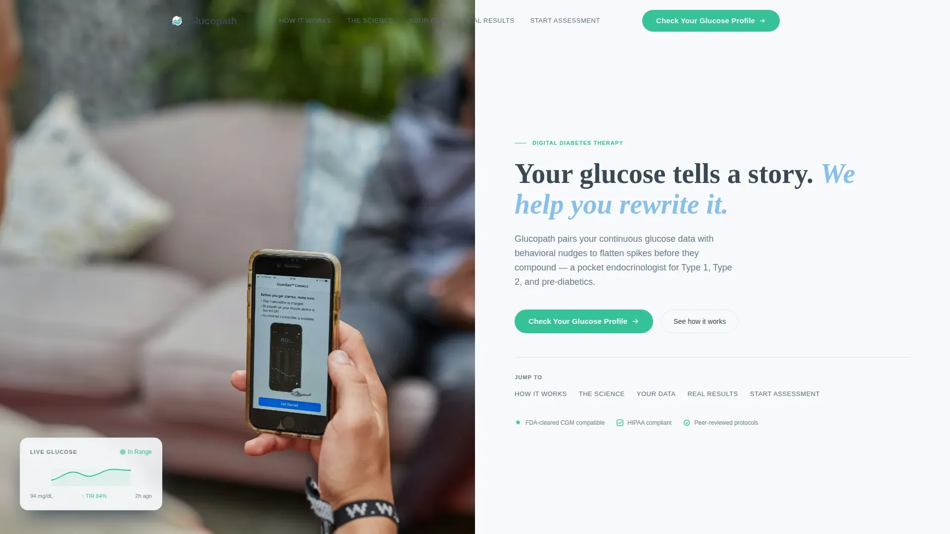
- A half-page photo and text hero with headline, anchor navigation, and a primary call-to-action button
- Five spoke content sections covering product flow, clinical science, sample data dashboard, real member results, and the assessment entry point
- A five-step progressive quiz modal with a micro-progress ring, conditional answer logic, and an email capture step for the personalized therapy preview
Feature list
This template delivers six purpose-built components that move a skeptical diabetes patient from first impression to completed assessment.
Half-Page Hero with Anchor Navigation
The hero splits the viewport into a product photograph on the left and the headline with anchor nav on the right. The photo shows a real hand holding a phone displaying a clean glucose trend line, with a blurred breakfast in the background. Five anchor labels link directly to each spoke section below.
Five-Step Progressive Quiz Modal
Clicking "Check Your Glucose Profile" opens a modal with five sequential steps: diabetes type selection, current management tools via checkboxes, biggest daily frustration via single select, last A1C range via a slider, and an email field for the personalized preview. A vitals-green micro-progress ring tracks completion at every step.
Sticky Assessment Bar
After the visitor scrolls past the second spoke section, a sticky bar appears at the bottom of the screen and repeats the primary call to action. The bar transitions in smoothly and stays visible through the remaining sections, keeping the conversion path in reach without interrupting reading.
Transparent Process Spoke Sections
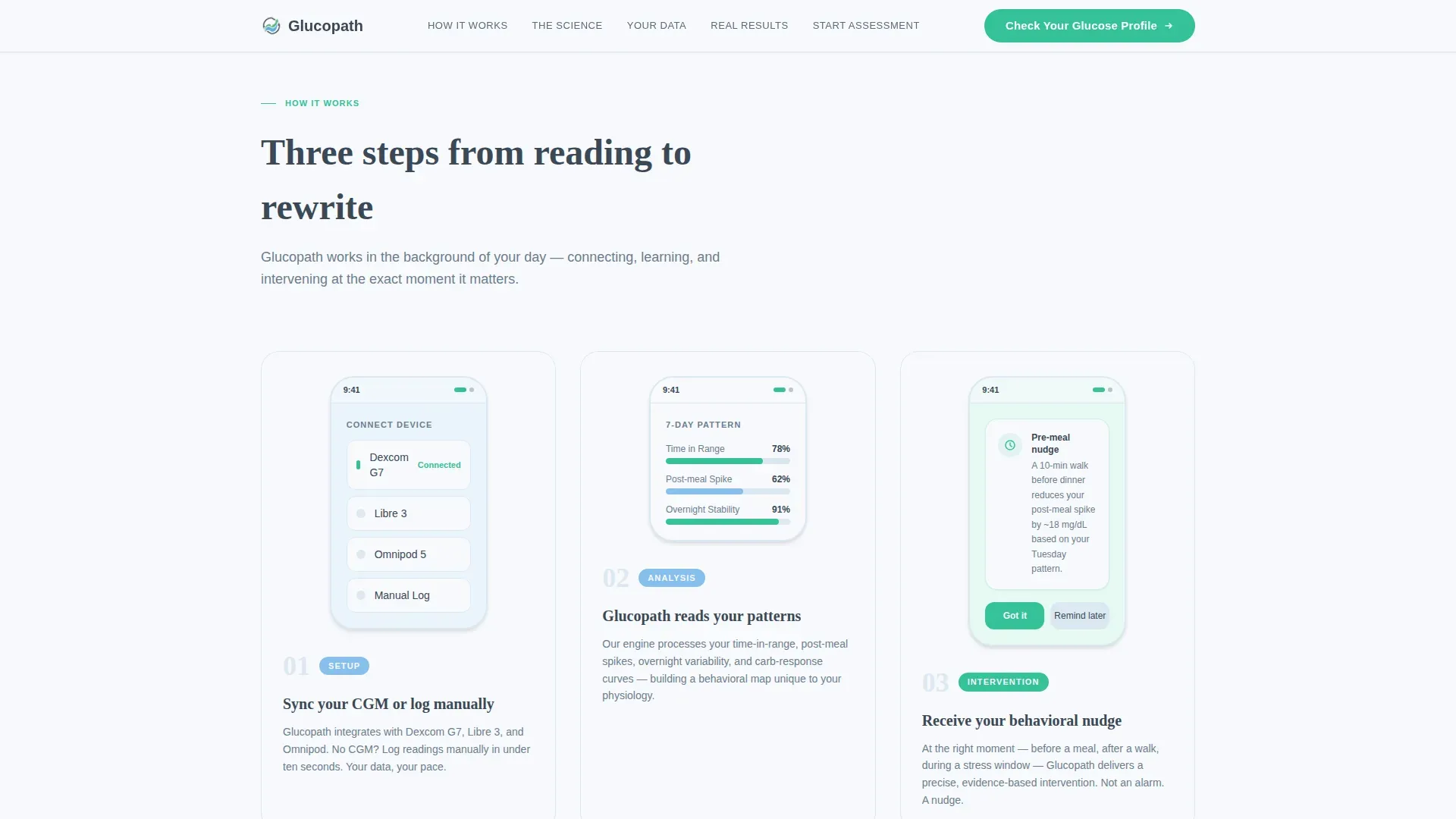
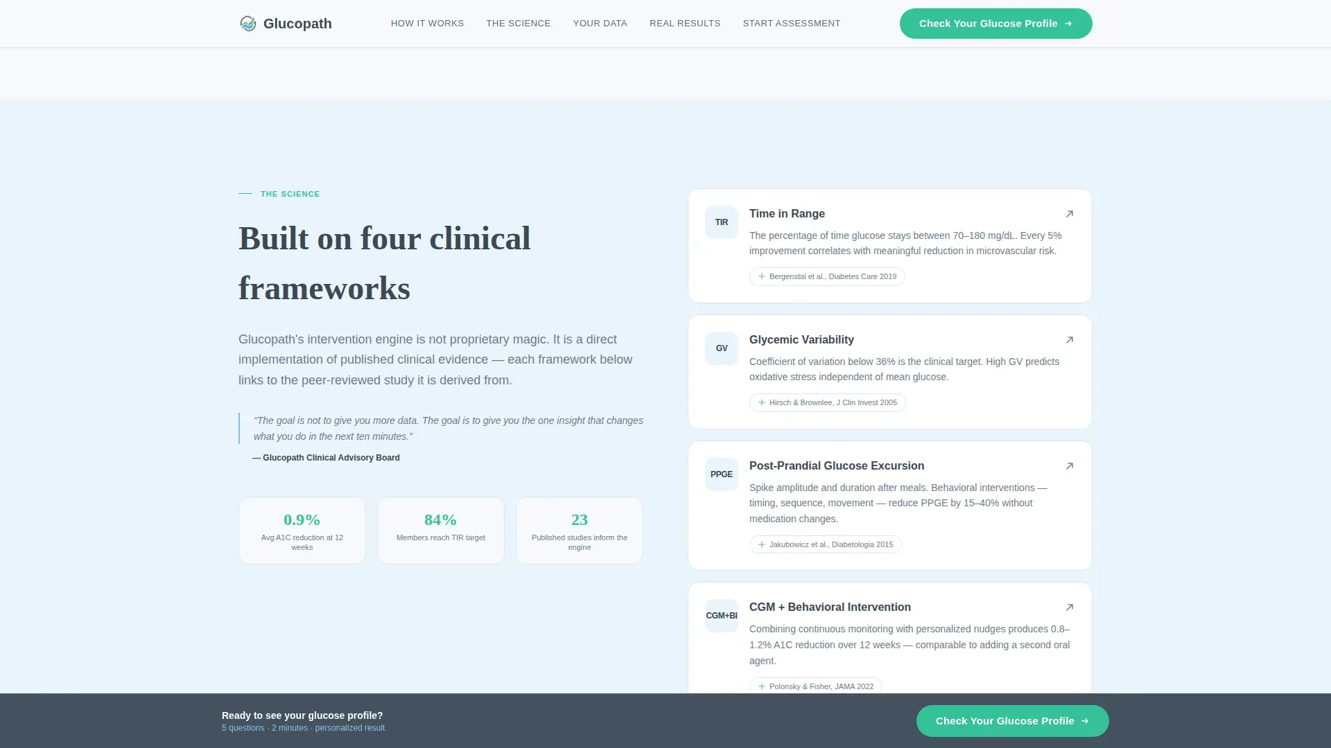
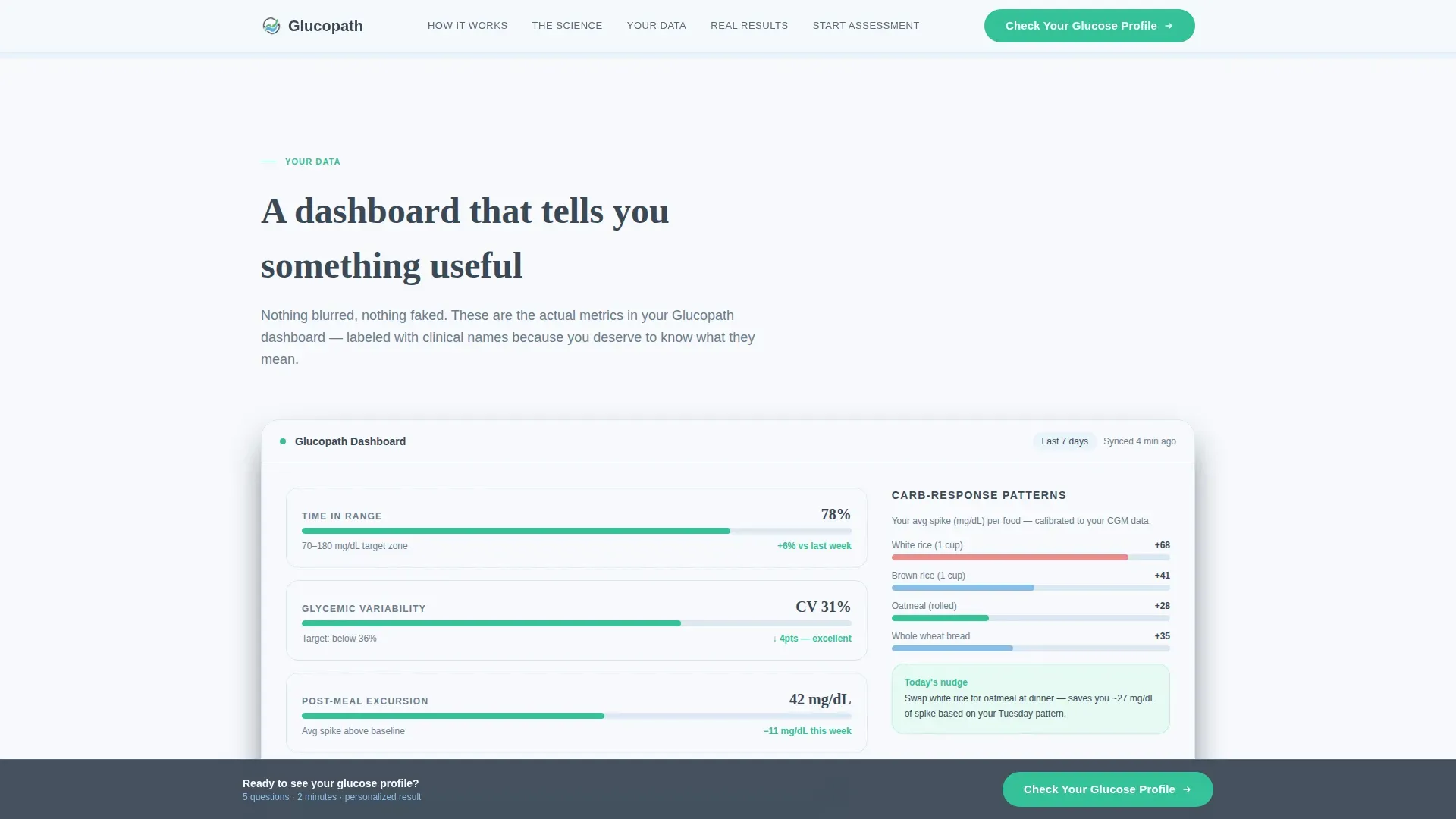
Each of the five spoke sections peels back one layer of how the therapy works. "How It Works" shows three sequential device screens. "The Science" names clinical frameworks and links published studies. "Your Data" displays a sample dashboard with real metric labels including time in range, glycemic variability, and carb-response patterns.
Before and After Social Proof Block
"Real Results" presents before and after A1C numbers alongside member testimonials that include diagnosis dates. This structure replaces vague endorsements with specific, time-stamped evidence that skeptical patients and caregivers can evaluate directly.
Scroll-Reveal Animation System
Sections animate into view as the user scrolls, using a medium-weight reveal system. The device screen carousel in "How It Works" and the sticky bar transition are part of the same coordinated motion layer, keeping the page feeling alive without distracting from content.
Page sections overview
| Section | Purpose |
|---|---|
| Hero split layout | Introduce the product and anchor nav |
| How It Works | Show three sequential device screens |
| The Science | Present clinical frameworks and study links |
| Your Data dashboard | Display real metric labels and sample data |
| Real Results | Surface before and after A1C social proof |
| Start Assessment | Deliver the sticky bar and quiz modal entry |
| Footer horizontal flow | Close with navigation and legal links |
Design & branding system
The Medical Clarity visual identity uses a four-color Slate and Sky system designed to feel like a modern endocrinology office with natural light. Typography pairs DM Sans for body text and interface elements with Fraunces for editorial headlines.
- Clinical Slate (#3B4856) anchors all body text and navigation; Atmospheric Sky (#87BFED) washes alternating section backgrounds; Sterile White (#F7F9FC) provides breathing room between content blocks
- Vitals Green (#34C198) appears only in positive states: completed quiz steps, improving data trends, and call-to-action buttons
- DM Sans keeps interface copy readable at small sizes; Fraunces gives section headlines the editorial weight they need to stop a scroll
Mobile & speed optimization
The template is built mobile-first because continuous glucose monitor users check their phones constantly throughout the day. Desktop parity is maintained so the same experience holds on larger screens.
- The quiz modal is touch-optimized with large tap targets for each answer step, and the micro-progress ring scales cleanly across screen sizes
- Images are optimized for fast initial load; the hero photograph and device screen assets are prepared for efficient delivery
- Quiz state is managed in React, keeping the five-step flow responsive and smooth without full-page reloads between steps
How this template helps you convert
The conversion architecture is built around specificity. Visitors who feel seen by a quiz are far more likely to complete it than visitors handed a generic sign-up form.
- The hero places the primary call to action "Check Your Glucose Profile" at the top of the page, then the sticky bar repeats it after the second spoke so the prompt is always within one tap.
- The five-step assessment collects diabetes type, management tools, daily frustration, A1C range, and email, giving the app enough signal to deliver a genuinely personalized therapy preview rather than a standard demo.
- Each spoke section between hero and quiz entry removes a layer of doubt, replacing it with transparent process disclosure, clinical evidence, real data labels, and timestamped member results.
Other information about this template
This template is built for the Health and Medical category with a Diabetes Care subcategory focus. It is localized for English (US) and uses imperial units throughout, including milligrams per deciliter (mg/dL) for glucose readings and A1C percentage for long-term control metrics.
- The footer follows a horizontal flow pattern that accommodates navigation links, legal text, and brand identity without adding visual weight to the conversion flow
- Animation is set at medium intensity: scroll-reveal sections, the sticky bar entrance, and the device carousel are all included, with nothing so heavy that it slows perceived load
- The template is structured to support a B2C software-as-a-service positioning, where the primary conversion event is quiz completion rather than a direct purchase
Theme
Medical Clarity
Creative direction
Transparent Process
Color system
Slate & Sky
Style
Hub & Spoke (Anchor Nav)
Direction
Quiz/Assessment
Page Sections
Half-page Hero with Anchor Navigation
Five-step Progressive Quiz Modal
Sticky Assessment Bar
Transparent Process Spoke Sections
Before and After Social Proof Block
Scroll-reveal Animation System
Related questions
Who is this landing page template designed for?
Does the template include the five-step quiz modal?
Can I customize the color system and typography?
What social proof elements are included in the template?
Is this template suitable for a pre-diabetic audience as well?



