Glyce - Artisan Confectionery Landing Page Template
Glyce is a gallery and detail landing page template built for artisan diabetic-friendly confectionery brands. It combines a nine-tile parallax photo mosaic header, six expandable product cards with animated glycemic index meters, and an event registration form. The design draws from Japanese Zen minimalism, using warm ceramic tones, matcha green, and yuzu gold to create a sensory, high-end experience.
by Rocket studio
Quick summary
Glyce is a single-page gallery and detail template designed for small-batch, diabetic-friendly confectionery brands. It guides visitors through a curated sensory journey, six product reveals with animated glycemic index meters, before presenting a tasting event registration form. The Haute Craft aesthetic balances luxury food branding with clear, science-grounded ingredient storytelling.
Who this template is for
This template is built for specialty food brands that need to communicate both indulgence and nutritional intention in the same breath. It suits direct-to-consumer confectionery businesses where the product story is just as important as the purchase.
- Artisan confectionery founders targeting diabetic communities, including Type 1, Type 2, gestational, and prediabetic customers
- Small-batch food brands running virtual tasting events or pre-mailed sample box campaigns
- Endocrinology-adjacent brands seeking a polished page that a healthcare professional could confidently recommend
What problem this template solves
People living with diabetes have long faced a frustrating trade-off: give up sweets entirely, or settle for chalky, joyless sugar-free substitutes. A generic food template cannot convey that something is both scientifically calibrated and genuinely beautiful. Glyce solves this by letting the product do the convincing before any form appears.
- There is no standard template that pairs glycemic impact data with a luxury sensory gallery in one cohesive flow
- Most event registration pages feel clinical or transactional, which is a poor fit for a brand built on taste and emotion
- Visitors need to feel the product before they commit to registering, and this template builds that trust through scroll-driven revelation
What you get with this template
Glyce delivers a complete single-page layout structured around sensory storytelling and event-driven conversion. Every section is purposeful, and every interaction is tied directly to the brand's promise of indulgence without blood sugar compromise.
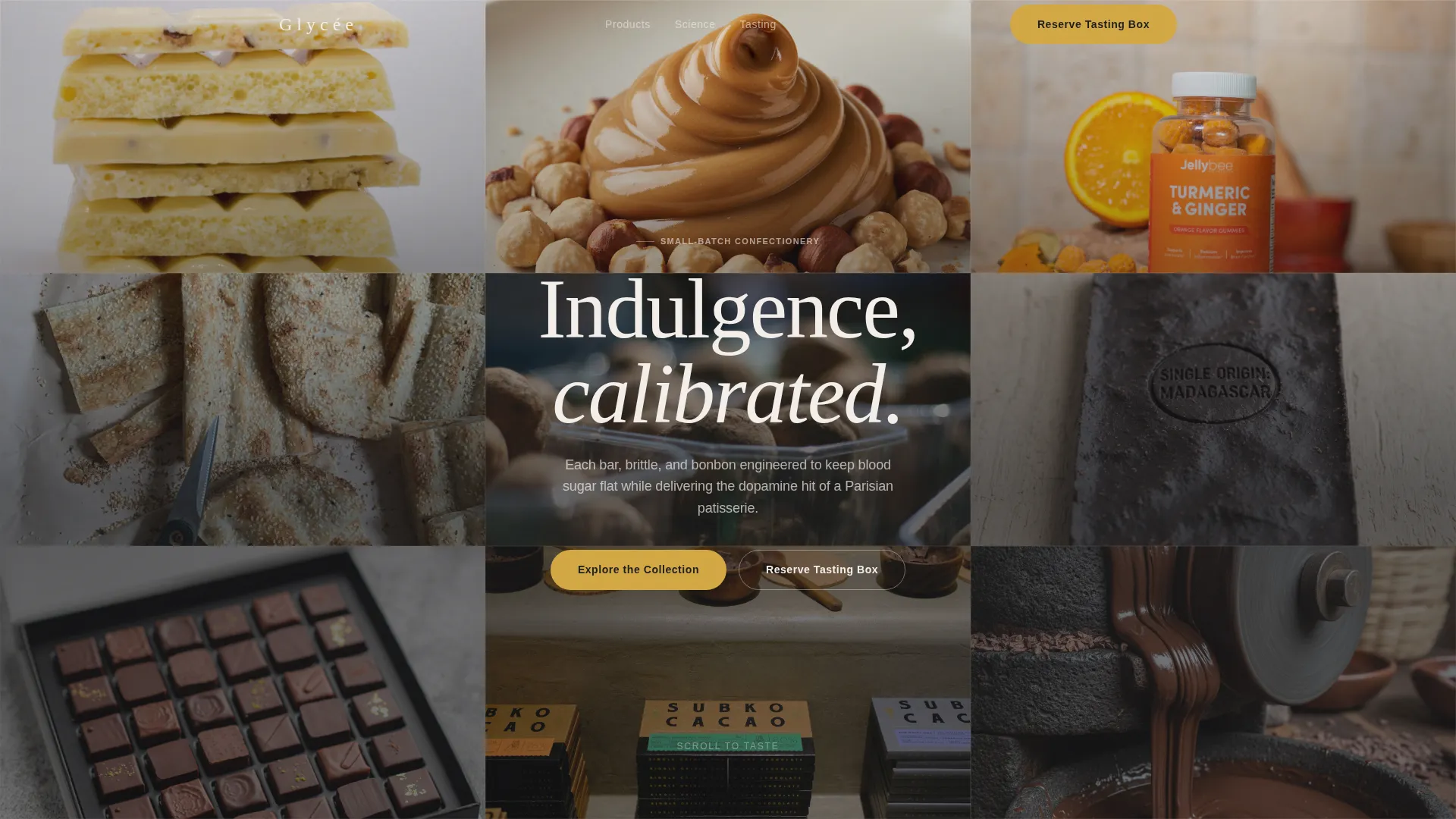
- A nine-tile parallax photo mosaic hero that fills the full viewport with tightly cropped macro product imagery
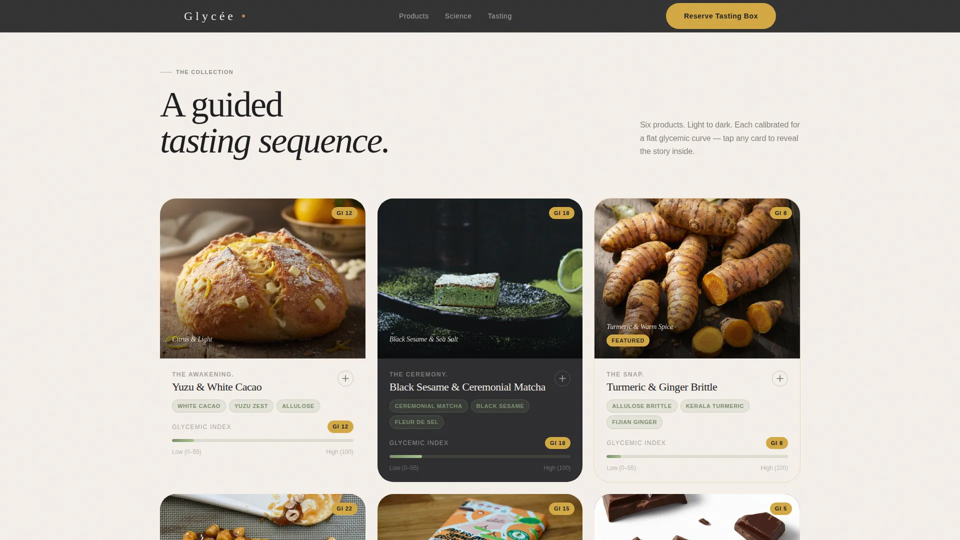
- Six expandable product gallery cards, each with a detail panel, flavor naming in large serif type, ingredient origin copy, and an animated glycemic index meter
- A tasting event registration form collecting name, shipping address, dietary profile, and a calendar-picker session date, plus a waitlist path for sold-out sessions
Feature list
This section describes the core built-in components that ship with the Glyce template.
Nine-Tile Parallax Photo Mosaic
The hero section fills the entire viewport with nine square image tiles. Each tile shifts at a slightly different scroll speed, creating a parallax effect that mimics the gentle unfolding of a bento box. No text overlays appear in the grid, keeping the visual impact clean and immersive.
Expandable Product Gallery Cards
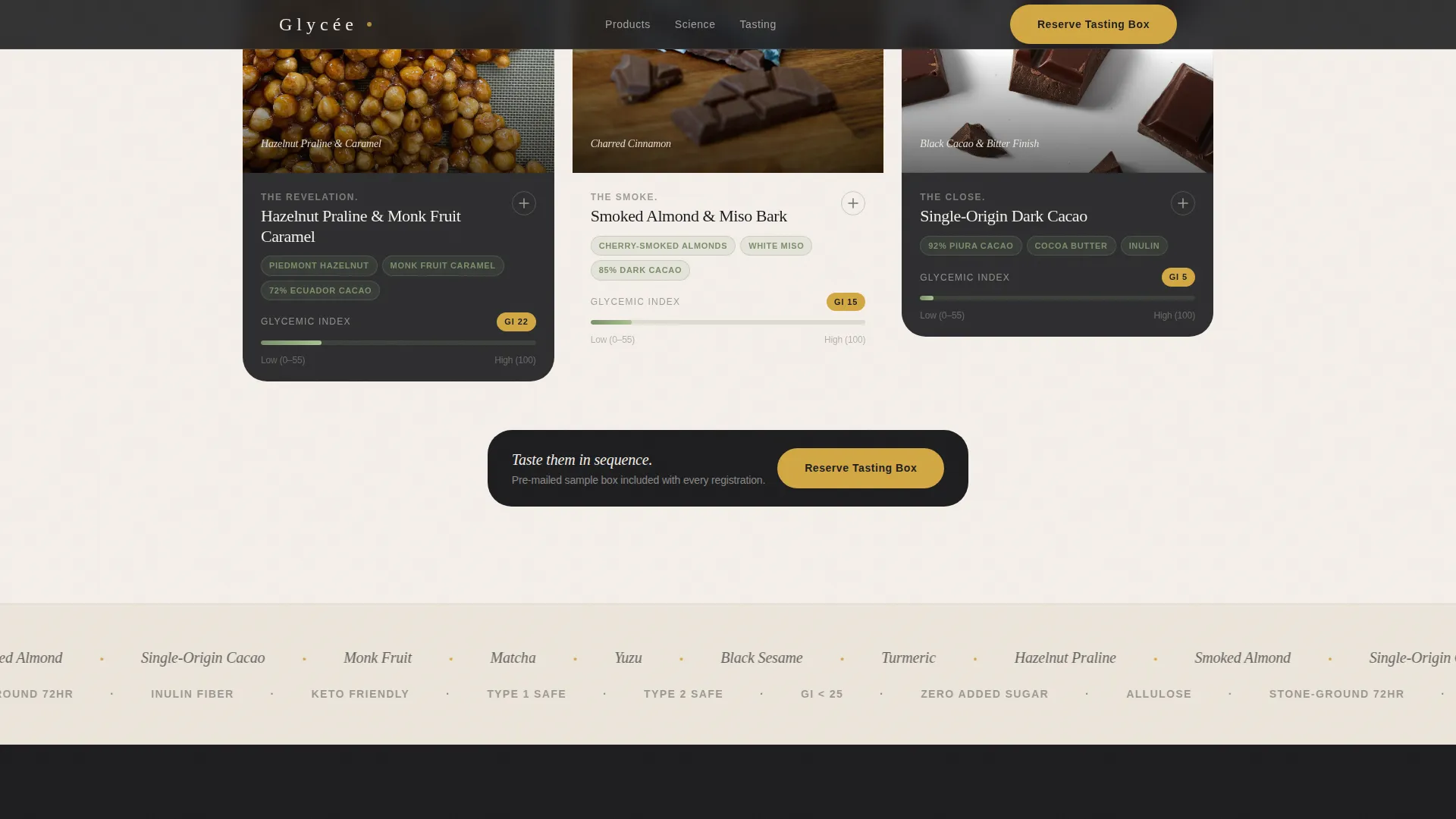
Six product cards sit in the main gallery. Each card expands into a full detail panel on interaction, revealing a dominant flavor name in large serif display type, an ingredient origin story, and a glycemic index meter that animates from zero to its final reading. The scroll sequence moves from light citrus profiles at the top to deep smoked and dark cacao profiles at the bottom.
Animated Glycemic Index Meters
Each product detail panel includes a glycemic index meter that animates on scroll entry. The meter communicates the product's blood sugar impact visually, grounding the science in the tasting experience rather than separating it into a separate data section.
Scroll-Linked Color Transitions
Background colors shift subtly as the visitor scrolls between product reveals. Warm ceramic white and deep charcoal alternate section by section, with each transition carrying the feeling of a new course arriving at a kaiseki dinner. The effect uses scroll-linked behavior tied to section entry.
Tasting Event Registration Form
The primary call to action, "Reserve Your Tasting Box," appears after the third product reveal and anchors the closing section. The form collects name, shipping address, dietary specifics, and a preferred session date via a calendar picker. A secondary "Join the Waitlist" option handles sold-out sessions.
Science and Social Proof Sections
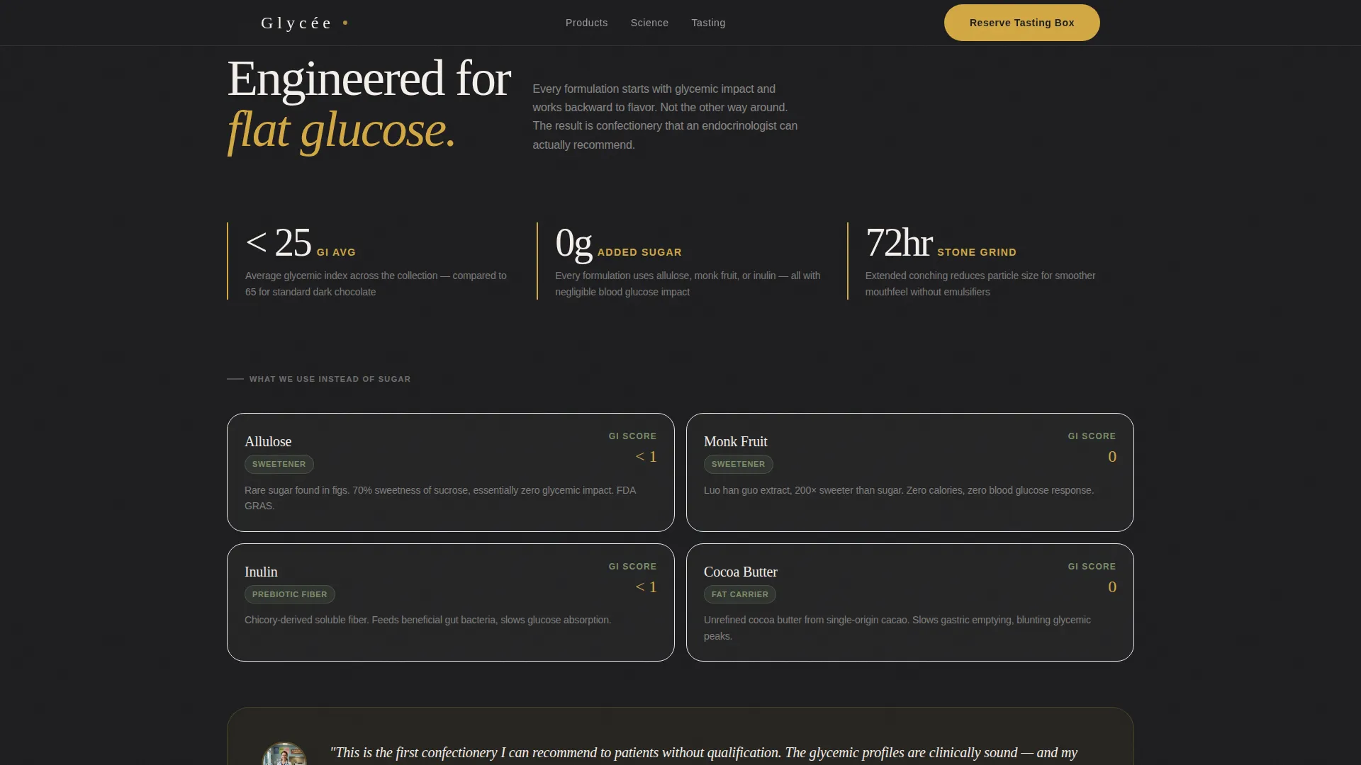
A dedicated section explains how glycemic index engineering works and traces ingredient origins. A social proof section follows, designed to hold endocrinologist quotes, community member testimonials, and any awards or recognitions the brand carries.
Page sections overview
| Section | Purpose |
|---|---|
| Parallax Mosaic Hero | Opens with nine macro-shot tiles filling the viewport at varying scroll speeds |
| Product Gallery Cards | Six expandable cards walk visitors through flavor profiles and glycemic data |
| Science and Ingredients | Explains glycemic index engineering and ingredient origin stories |
| Social Proof Block | Holds doctor endorsements, member testimonials, and award mentions |
| Event Registration Form | Collects visitor details and preferred tasting session date |
| Single-Row Footer | Closes the page with a clean, linear footer layout |
Design & branding system
The visual language draws from Haute Craft meets Japanese Zen minimalism. Every color, typeface, and spacing decision is deliberate, evoking a handmade wooden box lined with washi paper rather than a standard food e-commerce page.
- Color palette: unglazed ceramic white (#F5F0EB) and shou sugi ban charcoal (#1C1C1E) form alternating section backgrounds; matcha ceremony green (#7B8F6A) appears exclusively on nutritional data and ingredient tags; yuzu gold (#D4A843) is reserved for call-to-action buttons and glycemic index badges
- Typography: Fraunces serif handles display headings and flavor names, giving the page a high-end editorial feel; DM Sans handles all body copy, keeping ingredient and science text legible and clean
- Backgrounds alternate between ceramic white and charcoal throughout the scroll, with text always living in the contrasting tone for readability
Mobile & speed optimization
The template is designed desktop-first, with mobile excellence as a stated priority. Interactions that rely on scroll behavior and parallax are adapted so the sensory experience carries across screen sizes.
- Intersection Observer drives animation triggers for the parallax mosaic, glycemic index meter animations, and staggered product card reveals, keeping animations tied to actual viewport entry
- CSS scroll-behavior handles smooth transitions between sections without requiring heavy scripting
- The product card expansion, calendar picker, and form inputs are all built for touch interaction, not just pointer devices
How this template helps you convert
The conversion strategy in Glyce is deliberate and sequenced. The form does not appear until the visitor has already moved through six product experiences in sensory detail.
- The parallax mosaic and product gallery build desire before any purchase or registration ask appears, so visitors arrive at the form already engaged and curious rather than cold
- The "Reserve Your Tasting Box" call to action appears first after the third product reveal, timed to catch visitors at peak interest, then repeats as a closing anchor so late scrollers never miss it
- The waitlist path for sold-out sessions captures intent from visitors who would otherwise leave empty-handed, extending the event's reach beyond its capacity
Other information about this template
Glyce is a ready-to-customize template that covers a specific intersection rarely addressed by general food brand templates. The details below may help in evaluating fit before building.
- Template style is Gallery and Detail, a format suited to brands where product imagery and ingredient storytelling carry conversion weight
- The landing page direction is Event Registration, meaning the primary goal is a form submission tied to a physical or virtual tasting experience
- The header concept is Photo Grid Mosaic, which works best with high-resolution macro product photography; image quality will directly affect the hero's impact
- Animation level is high, relying on parallax, staggered reveals, and scroll-linked color transitions; the template is designed for a rich, interactive desktop experience with mobile adaptation
- Localization defaults are English, United States dollars, and a United States shipping context for the sample box form
- The footer follows a Pattern 1 Linear Single-Row layout, keeping the close of the page restrained and consistent with the minimal visual system
Theme
Haute Craft
Creative direction
Taste & Aroma
Color system
Japanese Zen
Style
Gallery + Detail
Direction
Event Registration
Page Sections
Nine-tile Parallax Mosaic Hero
Expandable Product Detail Cards
Animated Glycemic Index Meters
Scroll-linked Background Transitions
Tasting Event Registration Form
Science and Social Proof Sections
Related questions
Who is this landing page template designed for?
What does the event registration form collect?
Can I use this template for a different type of specialty food brand?
What photography style works best with the mosaic hero?
Does the template include the waitlist path for sold-out sessions?



