Immersive Logo Design Agency Landing Page Template
Glyph is a full-width immersive landing page template built for logo design agencies and brand identity studios. It pairs a Void and Violet color system with a gallery-walk scrolling experience, guiding visitors through curated case studies one viewport at a time. Two conversion paths, a brand brief modal and a process deck download bar, work together to turn high-intent visitors into qualified leads.
by Rocket studio
Quick summary
Glyph is a single-page, full-width immersive landing page template for logo design agencies. It opens with a massive typographic header, moves visitors through a darkened gallery of case studies, and closes with a focused lead-capture form. The Void and Violet palette and frosted-glass user interface make every logo specimen feel like an exhibit worth studying.
Who this template is for
This template is built for design studios and branding agencies whose primary output is logo and brand identity work. It speaks directly to the professionals who serve demanding, brand-conscious clients.
- Logo design studios targeting startup founders and growth-stage companies
- Branding agencies pitching mid-market SaaS teams and venture-backed businesses
- Independent brand strategists who want a high-conviction, portfolio-led presence
What problem this template solves
Most agency landing pages look like brochures. They list services, show a grid of thumbnails, and bury the work under navigation and boilerplate copy. Glyph removes that friction entirely.
- Generic portfolio layouts dilute the perceived quality of strong logo work
- Visitors leave before conviction builds because the page never gives the work room to breathe
- B2B prospects hesitate to inquire because the contact path feels premature or generic
What you get with this template
Glyph delivers a complete, single-page layout structured around taste and trust. Every section is designed to earn the conversion before it asks for it.
- A full-viewport gallery-walk section structure with immersive case study rooms
- A frosted-glass brand brief modal with a budget selector and a single strategic textarea
- A persistent bottom bar offering a secondary download path for visitors not yet ready to commit
Feature list
This section covers the core built-in features that make Glyph function as a B2B conversion tool and a portfolio showcase simultaneously.
Animated Typographic Hero
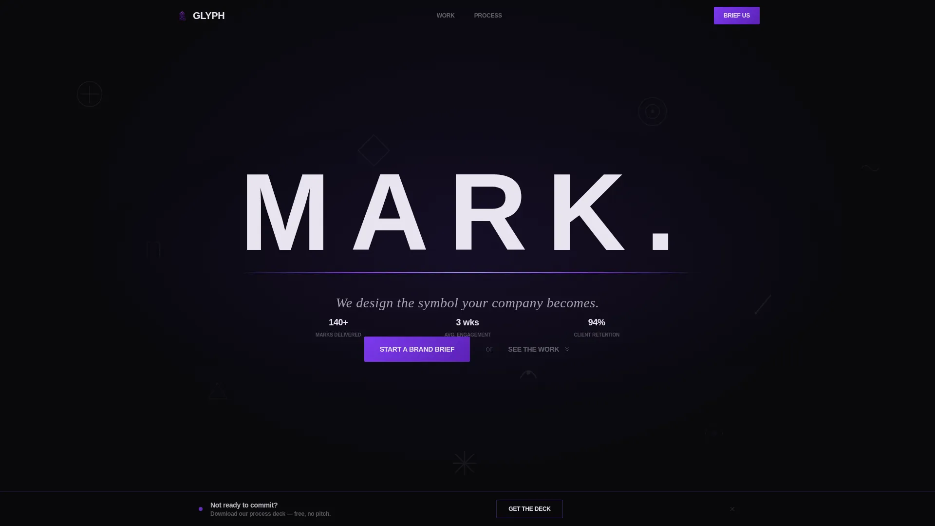
The header sets a single word, "MARK.", in a wide-kerned grotesque typeface across the full viewport. A slow-drifting mosaic of logomarks sits behind the text at roughly ten percent opacity. A violet underline draws itself in, then the subhead fades up: "We design the symbol your company becomes."
Full-Viewport Case Study Rooms
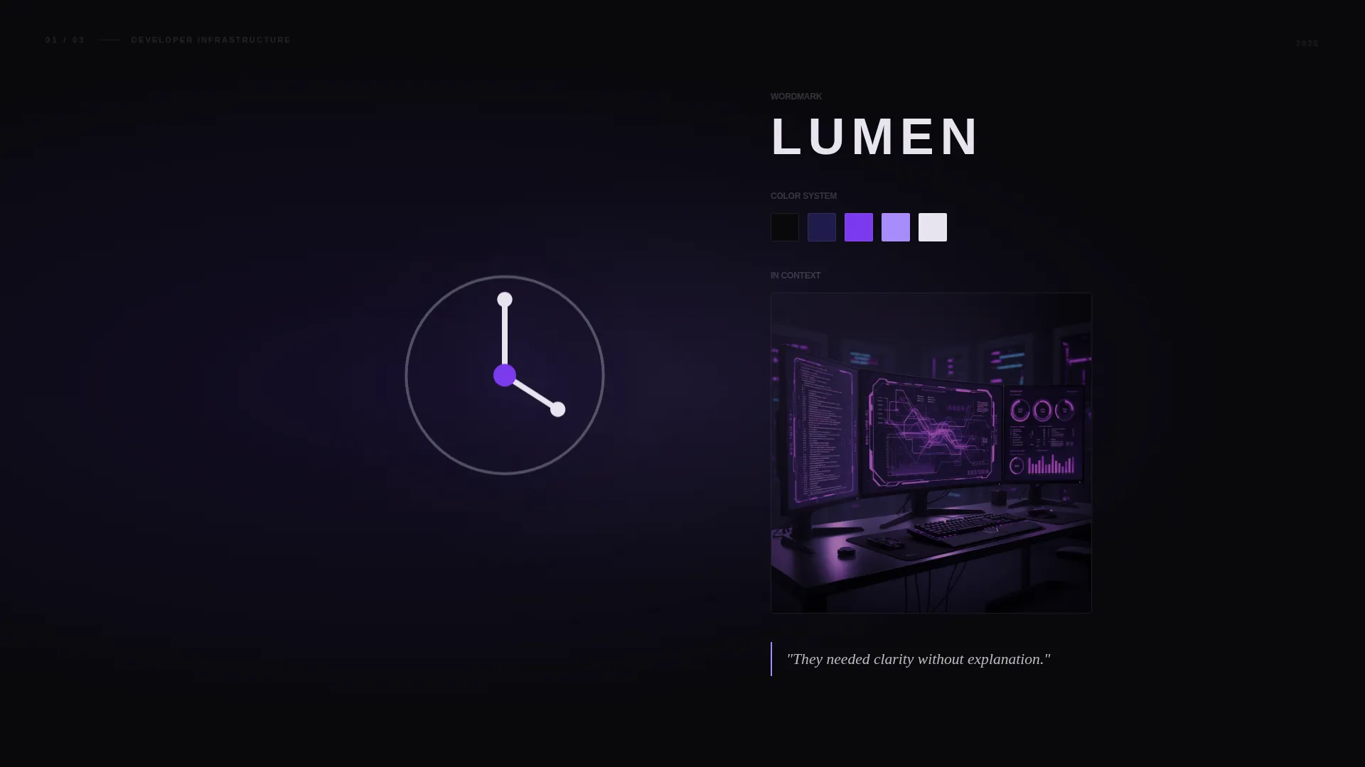
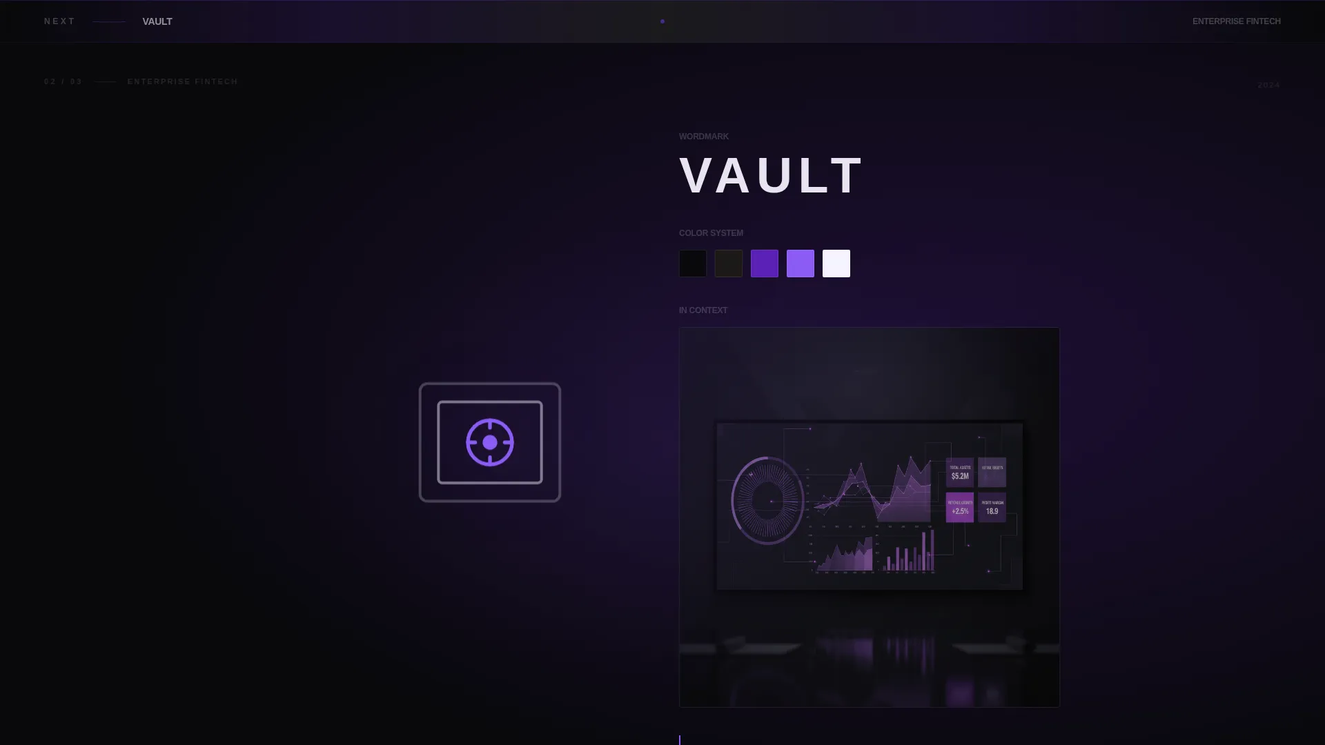
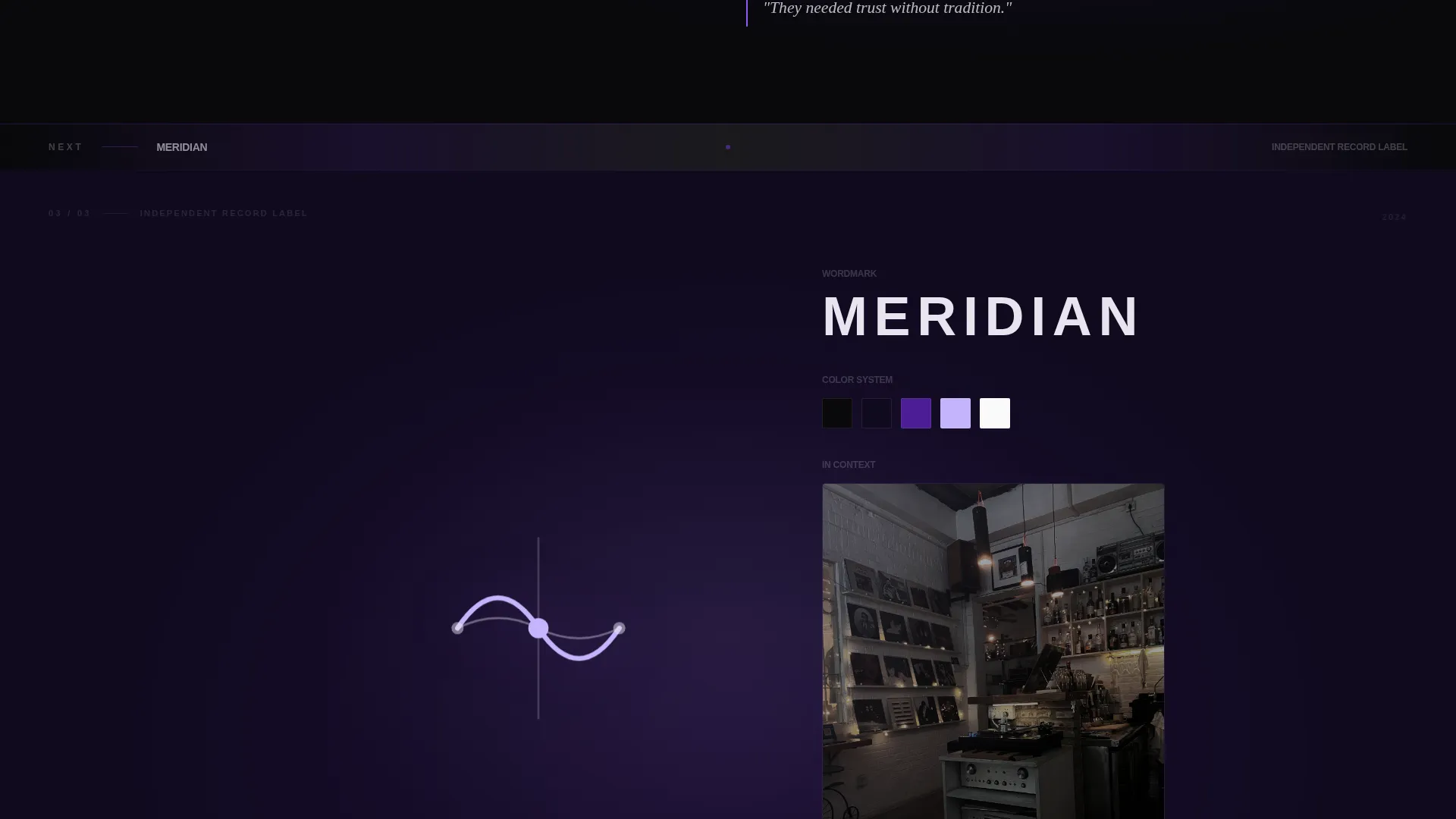
Each case study occupies the entire viewport like a room the visitor steps into. The finished logo appears first, enormous and centered. Scrolling deeper reveals a brand color palette, the wordmark in context, and a single strategy sentence. Each room shifts the violet background tone slightly warmer or cooler to give the gallery a lighting-design feel.
Frosted-Glass Lead Capture Modal
The primary call to action, "Start a Brand Brief," opens a modal layered over the void background. The form collects company name, industry vertical, a textarea asking what is broken about the current brand, and a three-tier budget range selector covering under twenty-five thousand, twenty-five to seventy-five thousand, and seventy-five thousand or more.
Persistent Process Deck Bottom Bar
A fixed bottom bar offers a secondary conversion path throughout the entire scroll. It captures only an email address and company name in exchange for the agency's process deck. This keeps lower-intent visitors engaged without interrupting the gallery experience.
Frosted-Glass Divider System
Between each case study room, thin frosted-glass divider bars display client names and industries. They reinforce business-to-business credibility while maintaining the gallery's mood and pacing.
Void and Violet Interactive Accents
Hover states and interactive elements use electric violet at hex code #7C3AED. Section dividers carry faint violet gradients. Logo specimens glow against the void black background the way app icons glow on an OLED screen at night. The result is a color system that feels both technical and editorial.
Page sections overview
| Section | Purpose |
|---|---|
| Hero Header | Opens with oversized type and a drifting logomark mosaic |
| Case Study Room One | Introduces the first logo exhibit with full-viewport immersion |
| First Brand Brief call to action | Places the primary lead-capture prompt after early conviction builds |
| Case Study Room Two | Deepens the gallery with a second brand narrative and context shots |
| Case Study Room Three | Completes the core trio; triggers peak conviction before the call to action |
| Mid-Gallery call to action | Surfaces "Start a Brand Brief" at the highest-intent scroll point |
| Extended Gallery Rooms | Adds range-proving marks: nonprofit, record label, enterprise |
| Frosted Divider Bars | Reinforces client names and industry credentials between rooms |
| Final Brand Brief call to action | Closes the page with a full repeat of the primary conversion path |
| Persistent Bottom Bar | Offers process deck download throughout the entire scroll journey |
Design & branding system
Glyph is built on the Void and Violet color system, a palette that reads as both premium and technical. The darkness is intentional; it makes every mark glow rather than simply appear.
- Core colors: absolute void black (#09090B), deep ultraviolet (#2D1B69), electric violet (#7C3AED) for hover and interactive states, and frosted glass white (#E8E4F0) for typography and user interface chrome
- Typography uses a wide-kerned grotesque typeface in the hero; all type is set in frosted glass white for maximum contrast against the void background
- Section dividers use faint violet gradients, and user interface overlays use a frosted-glass treatment that keeps the dark background visible beneath interactive elements
Mobile & speed optimization
The immersive full-width layout is designed to translate across screen sizes without losing its gallery quality. Viewport-filling sections reflow cleanly so the case study experience holds on smaller screens.
- Full-viewport case study sections scale to mobile widths while preserving the centered logo and strategy-sentence layout
- The persistent bottom bar remains accessible on mobile, keeping the process deck download path reachable throughout the scroll
- Frosted-glass modals and hover accent states adapt for touch interaction so the brief form remains easy to complete on any device
How this template helps you convert
Glyph is structured around the principle that conviction must precede the ask. By the time a visitor reaches the first call to action, they have already spent time inside the agency's work.
- The gallery-walk structure delays the call to action until after the third case study, precisely when a visitor's confidence in the agency's quality peaks. This sequencing makes the "Start a Brand Brief" prompt feel earned rather than pushy.
- The dual conversion architecture separates high-intent leads from early-stage browsers. The brand brief modal captures qualified prospects ready to discuss budget, while the process deck bottom bar collects lower-friction contact details from visitors who need more time.
Other information about this template
Glyph is part of a broader category of high-craft agency landing page templates designed for studios where the work itself is the primary sales tool. A few additional points worth knowing:
- The template is built for a single-page flow; all sections are contained within one scrollable experience
- The budget range selector in the brief modal covers three tiers, making it useful for agencies that serve both growth-stage startups and larger enterprise clients
- The nonprofit and record label case study rooms are included in the layout structure to demonstrate range across consumer, enterprise, and mission-driven brand categories
- The page type is a landing page, not a multi-page website, so all navigation is intentionally absent on load to keep visitor focus on the gallery
Theme
Tech Glass
Creative direction
Gallery Walk
Color system
Void & Violet
Style
Full-Width Immersive
Direction
Partnership/B2B
Page Sections
Animated Typographic Hero Section
Full-viewport Gallery Walk
Frosted-glass Brand Brief Modal
Persistent Process Deck Bottom Bar
Frosted-glass Divider Bars
Void and Violet Interactive Color System
Related questions
What type of agency is Glyph built for?
How does the lead capture work in this template?
Does the page include a navigation menu?
Can the gallery walk show different types of clients?
What does the brand brief form ask visitors?



