Design Portfolio Pre-Launch & Coming Soon Website Template
Glyph is an overlap/layered landing page template built for independent type foundries. It opens with a full-viewport proof image and a massive specimen headline, then scrolls through a manifesto-style narrative that builds craft credibility layer by layer. A low-friction waitlist form with an intent toggle closes the page, capturing early-access leads before a typeface releases.
by Rocket studio
Quick summary
Glyph is a single-page, overlap/layered landing page template designed for a one-person type foundry. It leads with a dramatic Type Over Image header, moves through a typographic manifesto scroll, and ends with a minimal waitlist form. Every layout decision reinforces the idea that letterforms are made by hand, not assembled from defaults.
Who this template is for
This template was built for type designers and small foundries who sell retail type families or license custom cuts. It speaks directly to the people buying those licenses, not just browsing them.
- Editorial art directors hunting for an exclusive display typeface
- Brand and creative agencies licensing custom type for luxury clients
- Independent publishers who want their covers to feel authored rather than assembled
What problem this template solves
Most portfolio pages present work neutrally. A type foundry with a strong point of view needs a page that argues for its craft before asking for a sale. Glyph solves the problem of looking like everyone else.
- Generic portfolio grids flatten the story behind a typeface into thumbnail previews
- Standard "coming soon" pages give no reason to wait and no reason to care
- Visitors leave without understanding the philosophy, the process, or the scarcity
What you get with this template
You get a fully structured, single-page layout that moves a visitor from first impression to waitlist signup through layered visual storytelling. Every section has a defined role in that arc.
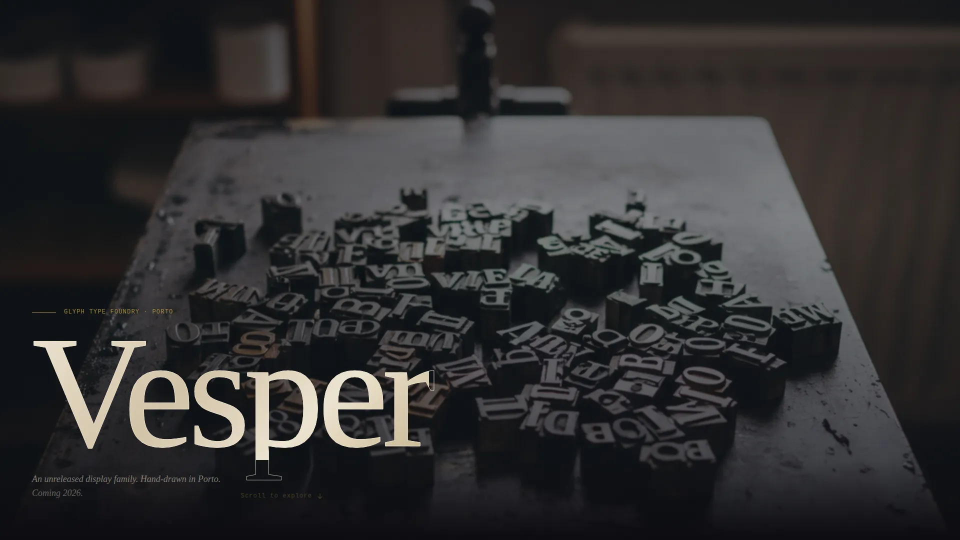
- A full-viewport Type Over Image header with a specimen word set at roughly 20vw
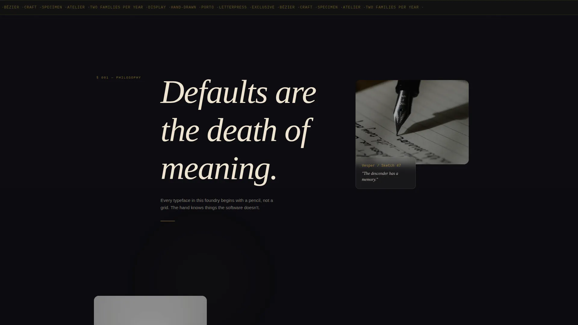
- A manifesto scroll sequence where provocative sentences and process imagery overlap at staggered z-depths
- A minimal waitlist form asking only for an email and a single intent toggle
Feature list
This template is built around a set of intentional design decisions. Each feature below comes directly from the brief.
Full-Viewport Specimen Header
The header fills the entire screen with a photograph of inked metal sorts on a proofing press. A massive specimen word, set in the foundry's unreleased typeface at roughly 20vw, sits knocked out in parchment with a subtle paper texture mask on top. No navigation is visible until the visitor begins to scroll.
Manifesto Scroll Sequence
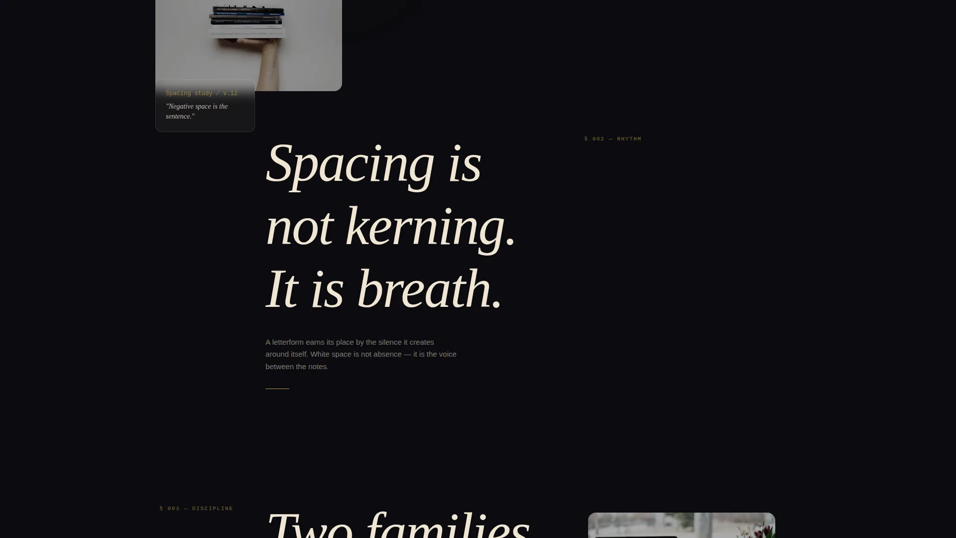
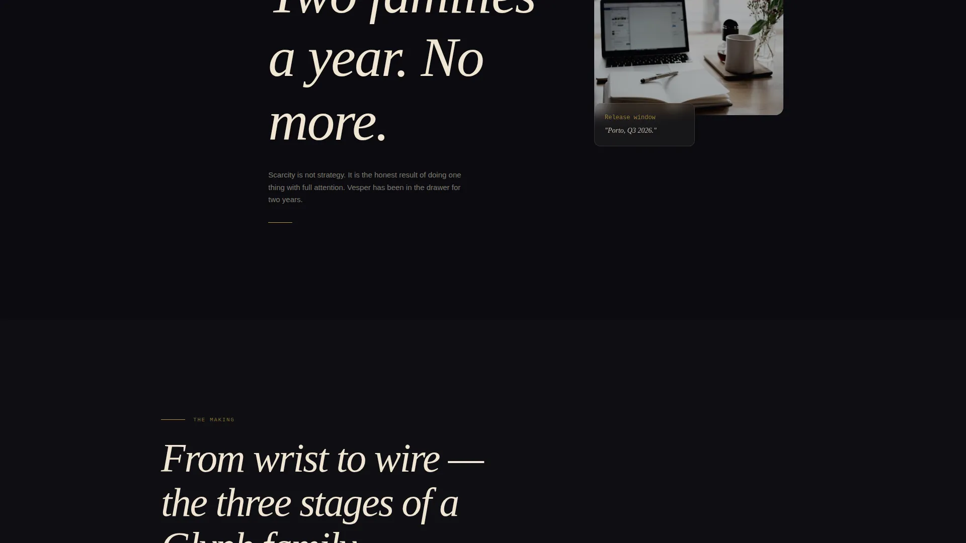
After the header, a single provocative sentence slides into view. Each subsequent section layers a new manifesto line over process imagery, pencil sketches overlapping digital proofs, spacing tables bleeding behind paragraph specimens. Cards and image planes overlap at staggered z-depths so the page feels assembled by hand.
Fixed Gold Pill Call-to-Action Button
A "Reserve Early Access" button appears as a fixed gold pill after the first scroll fold. It stays accessible as the visitor moves through the manifesto sequence without interrupting the reading experience.
Three-Weight Specimen Proof Panel
Just above the waitlist form, the upcoming typeface is shown at three weights as a final proof. The letterforms themselves act as the last persuasion before a visitor decides to sign up.
Low-Friction Waitlist Form
The form captures only two inputs: an email address and a single toggle between "I'm licensing for a brand" and "I'm licensing for personal work." The toggle segments intent with nearly zero added friction.
Layered Overlap Layout System
The entire page uses an overlap/layered template style. Components physically overlap at varying z-depths, giving the layout the feeling of a flat file drawer opened in a working studio rather than a website built on a grid.
Page sections overview
| Section | Purpose |
|---|---|
| Full-Viewport Header | Presents the specimen word and proof image as the opening statement |
| First Manifesto Line | Delivers a single provocative craft conviction after the header |
| Process Imagery Layers | Overlaps pencil sketches and digital proofs to show method and obsession |
| Spacing Table Bleed | Bleeds typographic data behind paragraph specimens to build craft credibility |
| Fixed call to action Pill | Keeps "Reserve Early Access" accessible throughout the scroll journey |
| Three-Weight Specimen | Displays the upcoming release at three weights as final proof before signup |
| Waitlist Form Panel | Captures email and licensing intent with a two-input form |
Design & branding system
The color system is built around a deep obsidian black ground and warm parchment surfaces. Every accent and interaction point references tarnished gold, which gives the page a sense of age and value without feeling decorative.
- Deep obsidian black (#0B0B0F) as the dominant background, evoking a composing stone after hours
- Warm parchment (#F0E6D3) for text blocks and layered cards, paired with tarnished gold (#B8963E) on accent rules and hover states
- Muted graphite (#3A3A42) for secondary surfaces, completing a palette that feels like a letterpress workshop at night
Mobile & speed optimization
The overlap/layered layout is designed so that staggered z-depth panels and specimen type remain legible across screen sizes. The page structure stays clear even when large typographic elements reflow on smaller viewports.
- The specimen headline at roughly 20vw scales relative to viewport width, remaining impactful on tablet and large-phone screens
- The fixed gold pill button adapts position so the call to action stays reachable without covering critical content
- The two-input waitlist form stays compact and easy to complete on a touch screen
How this template helps you convert
The page is designed to build conviction before it asks for anything. By the time a visitor reaches the form, they have already moved through philosophy, process, and proof.
- The manifesto scroll builds emotional investment section by section, making the unreleased typeface feel worth waiting for before a price is ever mentioned.
- The three-weight specimen panel just above the form acts as a final visual argument, letting the letterforms close the sale on their own terms.
- The single intent toggle on the form segments brand licensees from personal-use buyers at the point of signup, giving the foundry useful data with no extra steps for the visitor.
Other information about this template
This template sits inside the Portfolio & Agency category with a specific focus on the Design Portfolio subcategory and the Type Design Portfolio niche. It is built around an Atelier Studio theme, making it a strong fit for independent creatives who want their online presence to reflect the same level of craft they put into their work.
- The Atelier Studio theme and Obsidian & Gold color system are matched intersection context fields, meaning this template was designed with this exact niche pairing in mind
- The Overlap/Layered template style is intentional to the brief, not a default layout choice
- The Manifesto creative direction means the copy structure and scroll sequence are part of the template design, not just a visual skin
- The Waitlist/Coming Soon landing page direction means the primary goal is lead capture before a product is available, not a direct sale
Theme
Atelier Studio
Creative direction
Manifesto
Color system
Obsidian & Gold
Style
Overlap/Layered
Direction
Waitlist/Coming Soon
Page Sections
Full-viewport Type Over Image Header
Manifesto Scroll with Layered Panels
Fixed Gold Pill Reserve Button
Three-weight Specimen Proof Panel
Low-friction Intent-segmenting Form
Overlap and Layered Layout System
Related questions
Can I use this template even if my typeface is already released?
Does the template include the typeface shown in the preview?
How many people are needed to launch this template?
Is the waitlist form connected to an email platform out of the box?
What makes this template different from a standard portfolio grid?



