Artisan Hungarian Cuisine Landing Page Template
Gulys is a warm artisan landing page built for a Hungarian goulash restaurant. It blends cinematic food photography, a draggable before-and-after dish gallery, and a tri-tab conversion hub so visitors can order delivery, reserve a table, or buy a nationwide goulash kit from one beautifully designed page.
by Rocket studio
Quick summary
Gulys brings the soul of a Magyar kitchen to the screen. This landing page template is crafted for a Hungarian goulash restaurant that serves slowly cooked, paprika-rich beef stew alongside hand-cut csipetke dumplings. The design balances artisan warmth with Japanese Zen restraint, turning every scroll into an appetite-building journey from raw ingredients to steaming bowl.
Who this template is for
This template is built for food and beverage businesses that want to present authentic Hungarian cuisine with the visual weight it deserves. If your kitchen runs on tradition and your broth simmers for six hours, this page was made for you.
- Restaurant owners and operators serving Hungarian goulash or European specialty food who need a compelling online presence without heavy development work.
- Food entrepreneurs selling meal kits, goulash recipe boxes, or artisan pantry ingredients shipped nationwide.
- Hospitality teams managing both dine-in reservations and delivery orders from a single conversion-focused page.
What problem this template solves
Most restaurant pages bury their personality under generic layouts. Visitors land, scan a flat menu, and leave without placing an order or booking a table. The Hungarian goulash dish deserves better. It carries over a thousand years of history, and the page should communicate that at a glance.
- No strong visual narrative around the dish, its ingredients, or its story means potential customers never feel hungry enough to act.
- Juggling delivery, reservation, and kit-purchase paths on separate pages fragments the experience and loses conversions.
- Mobile visitors abandon pages where the call to action disappears mid-scroll, especially when they are deciding between food options on a lunch break.
What you get with this template
You get a fully structured, high-interactivity landing page that guides each visitor toward the right conversion path for them. The layout is deliberately sequential: the photography earns trust first, the dish gallery builds appetite, and the conversion hub closes the decision.
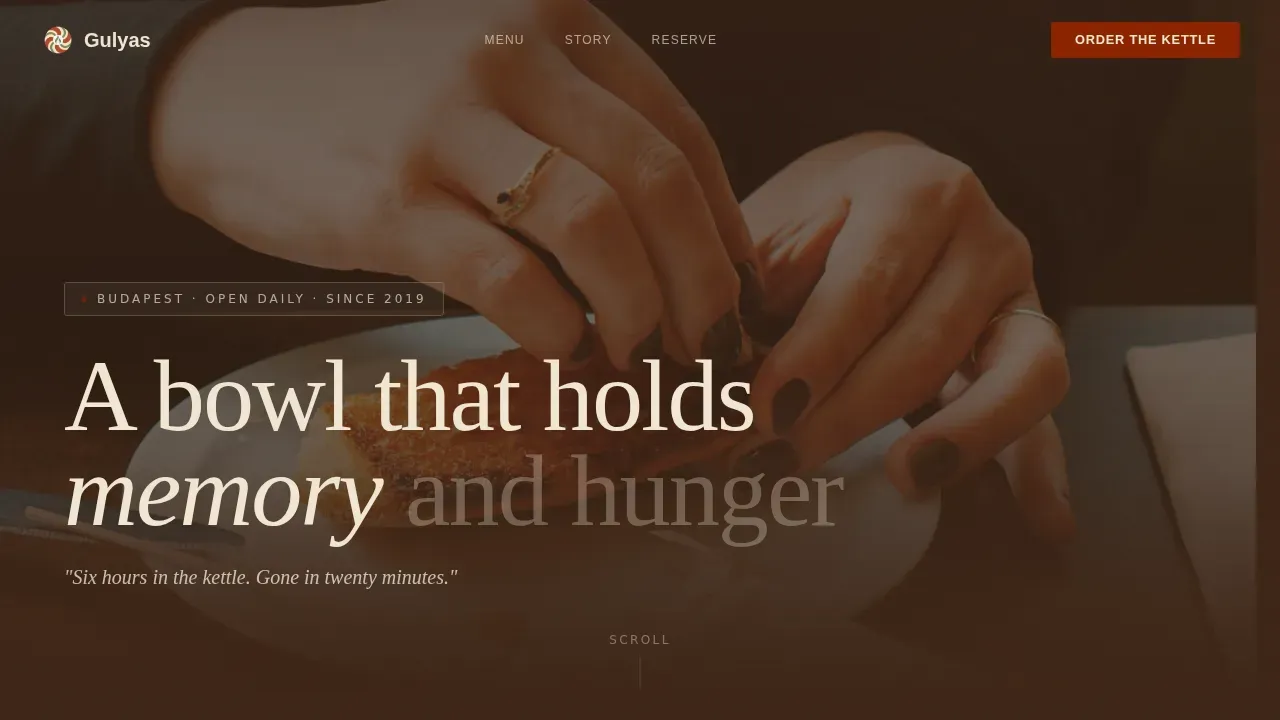
- A cinematic hero section with a lifestyle photograph, a Ken Burns animation effect, and a fade-in tagline reading "Six hours in the kettle. Gone in twenty minutes."
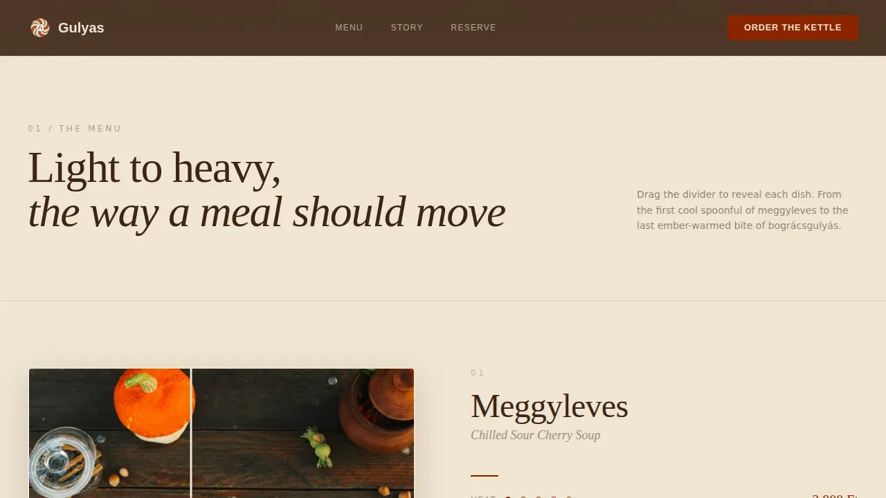
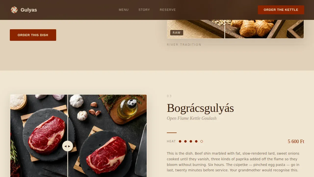
- A before-and-after dish gallery using a draggable slider that reveals each dish from raw ingredients to finished bowl, progressing from chilled meggyleves to open-flame bográcsgulyás.
- A tri-tab conversion hub with separate form paths for delivery ordering, table reservation, and nationwide kit purchasing, anchored below the hero.
- A Cook's Notes section with dish origin stories, spice-level meters, and individual cook quotes per dish.
- A Restaurant Story section that communicates the atmosphere of brick walls, copper kettles, and grandmother-era recipes.
- A persistent mobile bottom bar that keeps the active call-to-action button visible throughout the entire scroll.
- A minimal horizontal-flow footer with contact information and a location reference.
Feature list
This template ships with purpose-built features rooted in the brief. Each one serves the goal of turning a curious visitor into a paying guest or a kit buyer.
Cinematic Hero with Tri-Tab Selector
The hero opens with a shallow-depth-of-field lifestyle photograph: two hands breaking thick white bread over a steaming bowl of goulash, paprika oil catching the light, a glass of Egri Bikavér wine just out of focus in the background. A Ken Burns zoom effect gives the image life on load. Below the photograph, a tri-tab selector lets visitors immediately choose their path: "Order the Kettle" for delivery, "Save My Table" for reservations, or "Ship Me a Kit" for the nationwide shop. Each tab reveals only its relevant form, keeping the experience clean and focused.
Draggable Before-and-After Dish Gallery
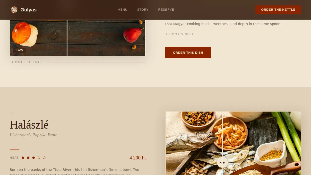
The dish gallery is the emotional core of the page. Each dish section opens with a still-life arrangement of raw ingredients on the left: whole dried paprika pods, marbled beef shin, a knob of lard, caraway seeds. A draggable slider reveals the finished dish on the right. Dishes progress from lightest to heaviest, building appetite like courses in a meal. The sequencing takes the visitor from a chilled sour cherry soup all the way to a bográcsgulyás cooked over open flame. Every reveal section includes an expanded detail panel with origin story, spice-level meter in lacquer red, and a single quote from the cook.
Cook's Notes Detail Panels
Beneath each dish reveal, an expandable panel surfaces the story behind the recipe. Visitors learn how the cook approaches the base: how they fry onions low and slow in butter or lard, add onions again at a second stage, stir in a generous measure of paprika, add tomato paste, and let the mixture simmer until the meat is fork-tender. These panels make the food feel personal and handmade, not factory-produced. The spice-level meter uses lacquer red to indicate heat, from mild sweet paprika dishes to genuinely spicy preparations.
Multi-Conversion Hub with Contextual Forms
Three distinct conversion paths live inside one cohesive section. The delivery tab collects an address and delivery date. The reservation tab captures party size and preferred time. The kit tab opens a small in-page shop with quantity selectors for goulash kits. This means a homesick Budapest expat and an adventurous foodie landing on the same page can each follow their own path without friction. A booking widget for reservations and delivery is integrated directly into the layout, removing the need to navigate away.
Persistent Mobile Call-to-Action Bar
On mobile screens, the active call-to-action button stays anchored to the bottom of the viewport through the entire scroll. The bar updates to reflect whichever tab the visitor last selected. This design choice acknowledges that mobile users often make food decisions quickly, and keeping the action one tap away dramatically reduces the distance between desire and decision.
Restaurant Story and Atmosphere Section
A dedicated section tells the story of the restaurant: brick walls, copper kettles, hand-cut csipetke, and cooks whose grandmothers cooked without timers. The section pairs atmospheric photography with editorial copy, grounding the food in real cultural context. It references goulash as a Hungaricum, a designation that recognizes its deep cultural importance in Hungary, and frames the restaurant as a place where that tradition is kept alive.
Page sections overview
| Section | Purpose |
|---|---|
| Hero Lifestyle Shot | Introduces the restaurant with a cinematic photograph, fade-in tagline, and tri-tab call-to-action selector |
| Tri-Tab Selector | Lets visitors choose delivery, reservation, or kit purchase before scrolling further |
| Before-and-After Gallery | Reveals each dish from raw ingredients to finished bowl using a draggable slider |
| Cook's Notes Panels | Expands per-dish with origin story, spice meter, and cook quote |
| Conversion Hub Forms | Surfaces contextual forms for each of the three conversion paths |
| Restaurant Story | Communicates atmosphere, heritage, and kitchen philosophy |
| Footer Horizontal Flow | Provides contact details, location reference, and minimal navigation |
Design & branding system
The visual identity runs on a four-color palette borrowed from a Japanese Zen sensibility and applied to the generosity of a Magyar kitchen. The restraint is intentional: fewer colors used with more precision create stronger appetite associations than a busy palette.
- Lacquer red (#8B2500) appears only on prices, spice-level indicators, and the primary call-to-action button, reserving heat for the moments that demand it.
- Smoked cedar (#3C2415) and unglazed ceramic cream (#F0E6D3) alternate as section backgrounds, with text living in cedar on light sections and cream on dark.
- Matcha sage (#7D8C6C) serves as a single accent for hover states and garnish photography borders, adding a quiet, earthy note without competing with the red.
- Fraunces serif handles display headings for warmth and character; DM Sans handles body copy for clarity and readability.
Mobile & speed optimization
The page is built mobile-first, with the persistent bottom bar as the clearest expression of that priority. Animations are handled with CSS transforms and Intersection Observer scroll triggers to keep the experience smooth on lower-powered devices.
- The Ken Burns hero effect, scroll-reveal animations, and parallax transitions are all implemented using CSS transforms only, avoiding heavy JavaScript libraries.
- The draggable before-and-after slider is touch-enabled, allowing mobile users to swipe the reveal naturally without needing a cursor.
- The persistent bottom call-to-action bar updates dynamically based on the visitor's last active tab selection, keeping the most relevant action always one tap away.
How this template helps you convert
The page is structured so that photography and storytelling do the convincing before any form appears. By the time a visitor reaches the conversion hub, they have already moved through a visual journey that built appetite and trust.
- The hero photograph and tagline create an immediate emotional connection. Visitors see steam, broken bread, and rich paprika-red liquid before they read a single menu item, which primes them to act.
- The before-and-after gallery builds progressive appetite across the scroll, moving from lighter dishes to heavier ones so that desire compounds naturally by the time the visitor reaches the conversion hub.
- The tri-tab selector removes decision paralysis by separating three distinct buyer intents into clean, focused paths. Each form is short, relevant, and immediately actionable, making it easy to place an order, book a seat, or add a kit to the queue.
Other information about this template
The Gulys warm artisan Hungarian goulash restaurant landing page template is designed to work for both established restaurants and new food businesses entering the European specialty dining market. It is fully customizable to reflect your own kitchen's identity, menu, and pricing.
- The landing page is built for the Food and Beverage category, specifically within the European Specialty Dining subcategory, with a niche focus on Hungarian goulash and related traditional Hungarian cuisine.
- The template supports a multi-conversion layout combining delivery, reservation, and e-commerce kit purchase in a single page structure. Restaurant landing page templates like this one help businesses create a meaningful online presence without requiring extensive programming knowledge. No-code tools make it practical for non-technical restaurant operators to launch quickly.
- Subscription-based template services often provide ongoing updates and support, so operators can keep the page current as their menu evolves or seasonal dishes like a chilled meggyleves arrive.
- The page is built to carry social proof naturally. Cook quotes, dish origin stories, and the specificity of technique, such as six-hour broth and hand-cut csipetke, function as testimonials in their own right. A direct quote like "The best goulash outside of Budapest! The atmosphere is incredibly cozy" fits naturally into the Cook's Notes section.
- The footer section supports an online menu reference and contact information with a location link, both of which are essential elements for any restaurant landing page.
- Warm colors including deep reds, earthy browns, and smoked cedar tones create the appetizing visual environment recommended for food and beverage pages. The high-resolution hero photograph of the signature goulash serves as the focal point and is central to the entire design strategy.
- The template content references goulash as a Hungaricum, acknowledging its recognized cultural status in Hungary. It preserves Hungarian dish names throughout, including bográcsgulyás, meggyleves, csipetke, nokedli, and pörkölt, to keep the experience authentic for Hungarian-speaking and Budapest-connected visitors.
- Fakanál Restaurant in Budapest is widely cited as a reference point for traditional goulash soup served with slow-cooked beef and Hungarian seasonings, reflecting the caliber of authenticity this template aims to communicate. The goulash soup served with fresh crusty bread in Budapest represents exactly the food experience this page is designed to translate into an online conversion.
- The recipe content referenced in the Cook's Notes panels covers core goulash preparation knowledge: how to fry onions until golden brown, brown the meat in lard, add tomato paste, season with black pepper and salt, pour in enough liquid to cover, and let the stew simmer at low heat until the sauce thickens to a rich, full texture. Variations include chicken goulash, which uses lighter meat and can be finished with a spoon of sour cream, and preparations that incorporate carrots, celery, green pepper, and potatoes alongside the beef.
- The kit shop path can be used to sell a goulash recipe kit that includes Hungarian sweet paprika, tomato paste, seasoning blends, and pre-measured spices. Buyers preparing the dish at home typically add onions, garlic, beef cut into small pieces, a knob of butter or lard, and a measure of flour to thicken the sauce. Potatoes and carrots are added during the simmer. The dish is served with bread, noodles, or dumplings on the side and finished with a dollop of sour cream.
- The template's gallery section can feature variations beyond classic beef goulash, including chicken preparations, dishes with mushrooms, beans, or zucchini for plant-forward options, and dessert-adjacent items where vanilla and lemon are used in sweet baked goods or a chilled lemon-bright sour cherry soup with a splash of lemon juice. Rice can be offered as a side dish alternative. Turkey goulash is a lighter variant some kitchens offer, and bacon is sometimes used at the start of the recipe to build a smoky base flavor before the onions go in.
- The overall design blends a Warm Artisan theme with a Japanese Zen color system, a Before-and-After Reveal creative direction, a Lifestyle Shot header concept, and a Marketplace/Multi landing-page direction. Together, these intersection choices make the template distinctive within the Gallery and Detail template style category.
Theme
Warm Artisan
Creative direction
Before/After Reveal
Color system
Japanese Zen
Style
Gallery + Detail
Direction
Marketplace/Multi
Page Sections
Cinematic Hero with Tri-tab Selector
Draggable Before-and-after Dish Gallery
Multi-path Conversion Hub
Persistent Mobile Call-to-action Bar
Cook's Notes Detail Panels
Restaurant Story and Atmosphere Section
Related questions
Can I use this template for a restaurant that serves dishes beyond goulash?
Does the template support all three conversion paths at once?
Can the Cook's Notes section be edited to reflect my own kitchen's recipes?
Is the persistent mobile bottom bar included in the template?
Can the colors and typography be changed to match my restaurant's brand?



