Government Consulting Landing Page Template
Govern is a single-column landing page template built for government growth consultants who help small and mid-size businesses win federal contracts. It pairs real client testimonials with practical downloadable resources in a rhythmic mosaic layout. The result is a page that builds trust through variety and converts through genuine value, not pressure.
by Rocket studio
Quick summary
Govern is a single-column flow landing page template designed for government contracting consultants. It opens with a powerful client testimonial and scrolls through an alternating pattern of social proof and free resources. The layout earns visitor trust before asking for anything, making the primary call to action feel like a natural next step.
Who this template is for
This template is built for consultants and advisory firms that guide small and mid-size businesses through the federal contracting process. If your work involves capability statements, set-aside qualifications, or past performance narratives, this page speaks your clients' language.
- Government growth consultants serving veteran-owned, woman-owned, or small disadvantaged businesses
- Advisors who help clients with federal registrations, proposal writing, and contract evaluations
- Consulting practices targeting first-time federal contractors in industries like manufacturing, information technology, and professional services
What problem this template solves
Small business owners who qualify for federal contracts often cannot find a consultant they trust enough to engage. A generic consulting page fails to reflect their specific pain. This template solves that by showing diverse client stories alongside the exact tools that helped each one move forward.
- Visitors leave consulting pages when they see no proof of relevant experience in their industry or set-aside category
- A single hero pitch fails to address the range of fears that different buyer types carry into the page
- Generic calls to action feel like toll booths rather than genuine offers of help
What you get with this template
You get a fully structured single-column landing page that alternates testimonial blocks with downloadable resource prompts. Every section is purposeful. The layout guides a cautious visitor from skepticism to confidence without ever feeling pushy.
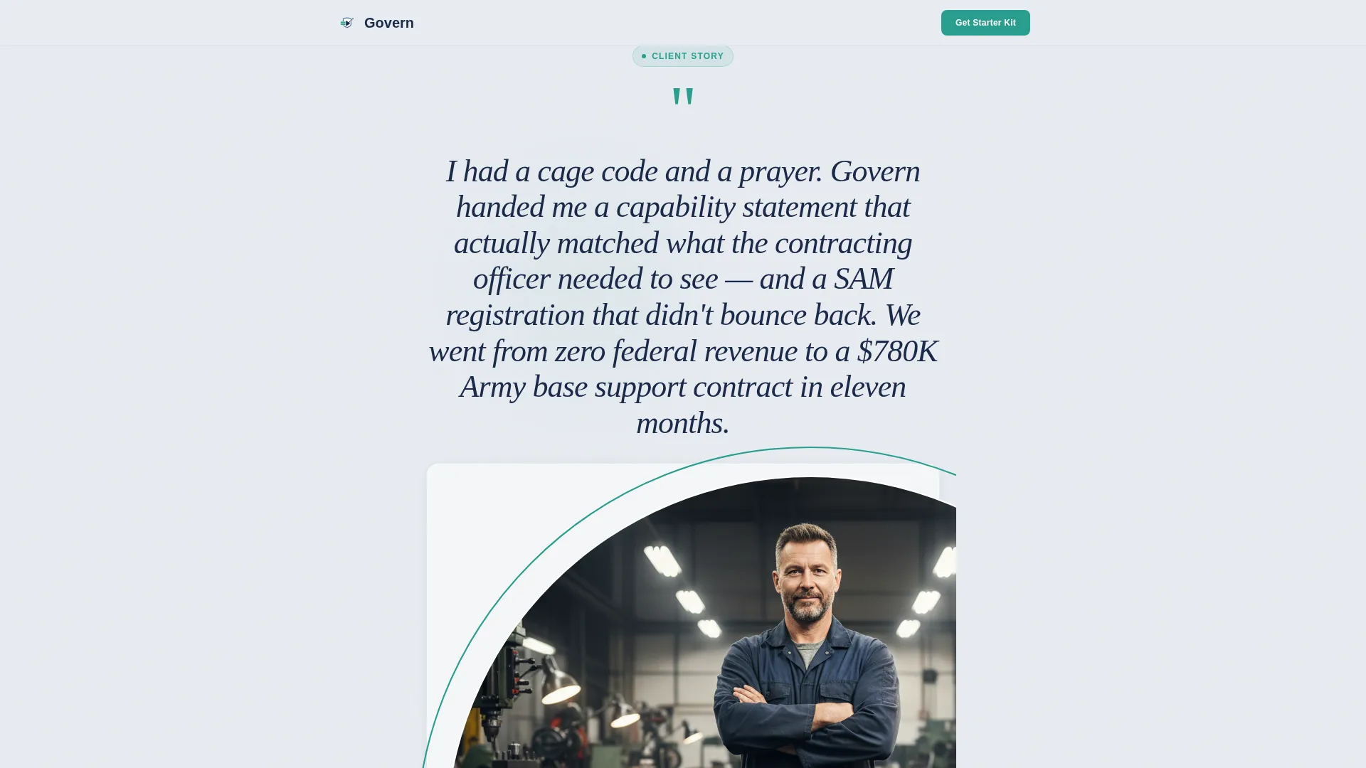
- A testimonial card header featuring an oversized client quote, name, company descriptor, and circular headshot with a teal border
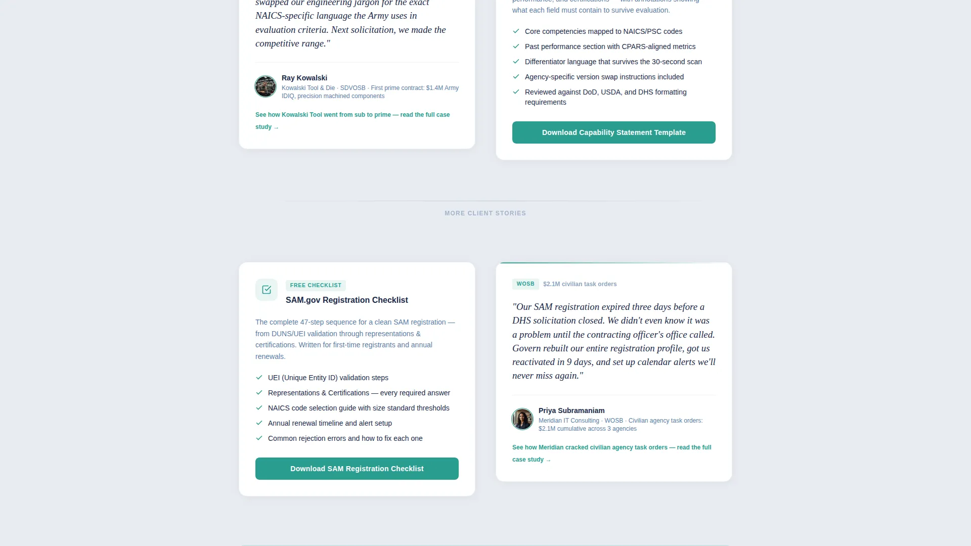
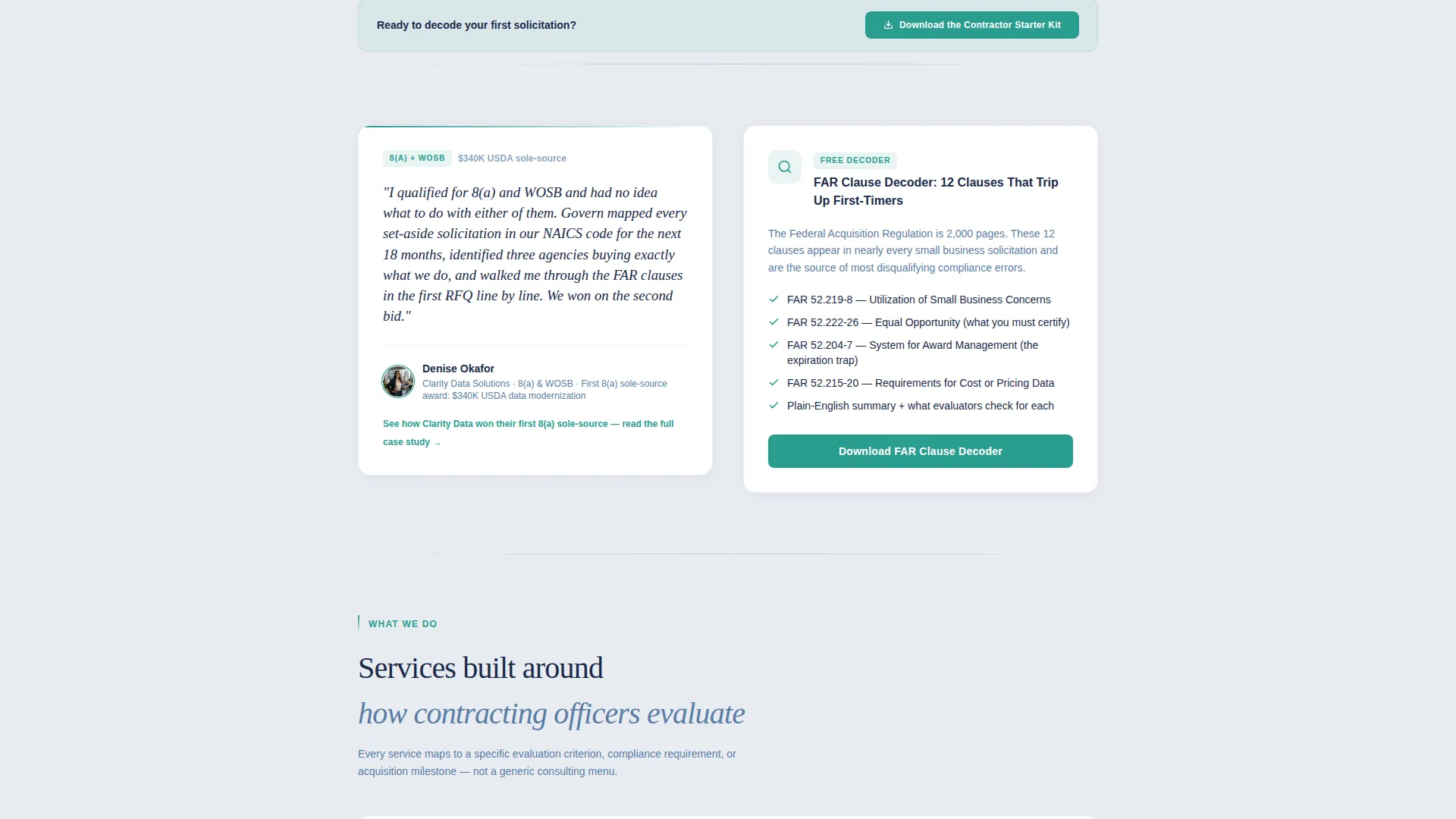
- An alternating mosaic of client voice blocks and resource prompts, including a capability statement template, a registration checklist, and a contractor starter kit download form
- A lead qualification form with fields for company name, North American Industry Classification System (NAICS) code with a helper tooltip, and email address
Feature list
This template includes the following built-in capabilities drawn directly from the brief.
Testimonial Card Header
The page opens with a single centered testimonial card set in oversized italic navy type. It includes the client's name, a company descriptor with contract details, and a circular headshot with a thin teal border. There is no hero image and no animation, only a human voice in clean white space.
Alternating Mosaic Layout
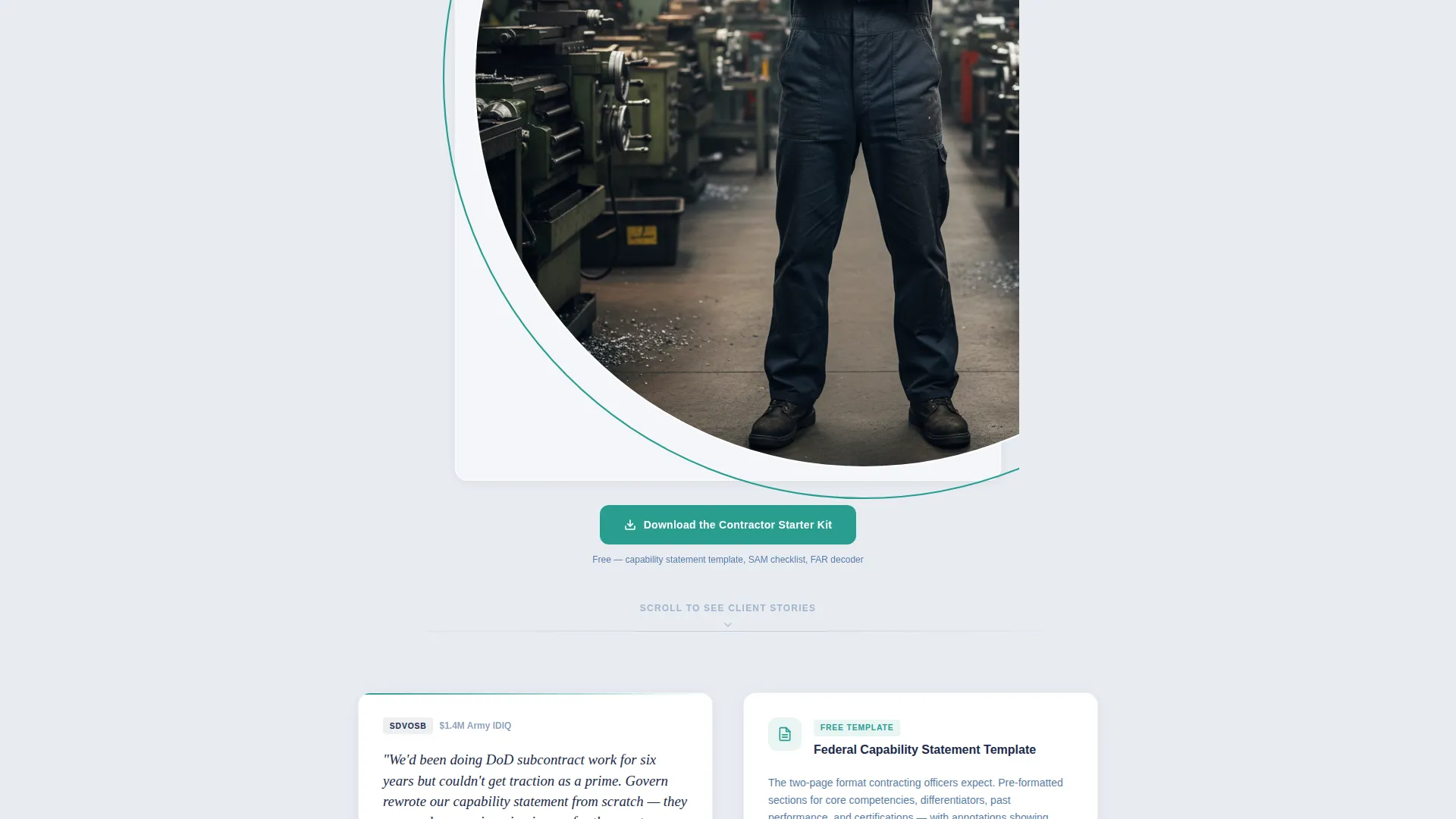
The scroll rhythm moves between client testimonials and actionable resource blocks. Each testimonial surfaces a specific pain point, and the resource immediately following it answers that pain. This voice-tool-voice-tool pattern builds cumulative proof through variety rather than volume.
Contractor Starter Kit Download Form
The primary call to action is a three-field form collecting company name, NAICS code, and email address. A helper tooltip explains the NAICS code field for first-time visitors. The form simultaneously delivers the resource and qualifies the lead by industry.
Repeated Primary Call to Action
The "Download the Contractor Starter Kit" call to action appears first beneath the header testimonial and repeats after every third resource block. Consistent placement keeps the conversion path visible without overwhelming the content rhythm.
Inline Case Study Links
After each testimonial, an inline text link invites visitors to read the full case study. These secondary conversion links are gated behind the same lightweight form, giving the consultant a second path to capture qualified leads without adding friction to the main scroll.
Cloud Canvas Color System
The page uses a four-color palette that feels like a freshly printed government form. Soft bureaucratic gray anchors the background, deep federal navy carries headlines and key text, muted steel blue handles secondary copy and dividers, and decisive teal is reserved exclusively for buttons and progress indicators.
Page sections overview
| Section | Purpose |
|---|---|
| Testimonial Card Header | Opens with a real client quote to establish immediate human trust |
| Primary Download call to action | Captures leads with a three-field form placed directly below the header |
| First Testimonial Block | Surfaces a specific pain point from a client's contracting journey |
| Capability Statement Resource | Offers a downloadable template directly answering the testimonial above |
| Second Testimonial Block | Adds a different industry or set-aside voice to widen relatability |
| Registration Checklist Resource | Provides a free federal registration checklist linked to the testimonial pain point |
| Third Testimonial Block | Introduces another client profile to reflect contract size and category variety |
| Repeated Download call to action | Repeats the starter kit offer after the third resource block |
| Additional Mosaic Blocks | Continues the voice-tool alternation to build full-scroll proof |
Design & branding system
The visual identity follows a Service Utility theme built on the Cloud Canvas color system. The palette is deliberately restrained, evoking the clean authority of a government document without any decorative distraction.
- Background uses soft bureaucratic gray (#E8ECF1), headlines and anchoring text use deep federal navy (#1B2A4A), and secondary copy with dividers uses muted steel blue (#5A7CA5)
- Decisive teal (#2A9D8F) is reserved exclusively for buttons and progress indicators, making every call to action visually distinct without competing with content
- Typography is set in oversized italic style for testimonial quotes and clean upright style for body copy, reinforcing the contrast between human voice and informational content
Mobile & speed optimization
The single-column flow structure is naturally suited for mobile viewing. There are no multi-column grids to collapse and no heavy visual assets to load. The layout scrolls cleanly from header to footer on any screen size.
- The alternating block structure stacks seamlessly on small screens without layout breakage
- No animations or hero images means the page loads with minimal render-blocking content
- The three-field form is compact and touch-friendly, keeping the conversion path accessible on mobile devices
How this template helps you convert
The conversion strategy is built around earning trust before requesting anything. Every resource on the page is genuinely useful on its own, which makes the starter kit feel like the logical next step rather than a gated demand.
- The testimonial card header immediately shows a real outcome (a named client, a specific contract value, a recognizable program), which gives skeptical visitors a reason to keep reading before you have made a single claim about your services.
- The mosaic rhythm ensures that every visitor who scrolls past two or three blocks encounters a client story that reflects their own industry, set-aside category, or contract type, making the case studies feel personally relevant rather than generic.
- The lightweight three-field form lowers the barrier to conversion while the NAICS code field quietly qualifies each lead by industry, so you receive contact details alongside the context needed to follow up with precision.
Other information about this template
This template is part of the Govern design system and carries the "Decisive" naming convention used across the series. A few additional details are worth noting before you customize and publish.
- The template is built as a single-column flow landing page, making it straightforward to edit section by section without disrupting the overall layout
- The testimonial mosaic creative direction is intentionally flexible, so you can swap in your own client quotes and resource types while keeping the alternating rhythm intact
- The page is designed for the government consulting niche but the lead qualification form logic works equally well for any advisory practice where industry segmentation matters at the point of contact
- The header concept is a standalone Testimonial Card, not a traditional hero section, which means your strongest proof point is the very first thing a visitor reads
Theme
Service Utility
Creative direction
Testimonial Mosaic
Color system
Cloud Canvas
Style
Single Column Flow
Direction
Content/Resource
Page Sections
Testimonial Card Header
Alternating Mosaic Layout
Contractor Starter Kit Download Form
Repeated Primary Call to Action
Inline Secondary Case Study Links
Cloud Canvas Color System
Related questions
Can I replace the placeholder testimonials with my own client quotes?
Does the form collect NAICS codes automatically or does the visitor enter them manually?
Can I add more resource blocks to the mosaic without breaking the layout?
Is the starter kit download form the only conversion point on the page?
What types of businesses is this landing page template designed to attract?



