Hobby & Passion Supplies Portfolio & Case Study Website Template
Grail is a neo-retro collector supply store landing page built for premium display accessory brands in the action figure market. Its Pinterest-style masonry grid, price-anchored hero, and "Level Up" toggle mechanics give collectors a focused, gallery-quality shopping experience. The Lavender Dream color system and bold vintage typography make every product vignette feel shelf-worthy.
by Rocket studio
Quick summary
Grail is a single-page e commerce landing page template built for collector supply stores that sell UV display cases, acrylic risers, and acid-free backing boards. It blends neo-retro visual designs with high-conversion upsell mechanics, giving any store owner the exact foundation to present premium products with authority and nostalgia.
Who this template is for
This landing page is ideal for entrepreneurs and designers creating an online storefront around action figure display supplies. It fits niche retail brands that want to sell to a passionate, detail-obsessed market.
- Collector supply store owners who want a professional e commerce landing page without starting from scratch
- Designers building client sites for hobby and passion supply brands seeking gallery-quality designs
- Small business owners ready to set up and sell display accessories to an enthusiast market
What problem this template solves
Generic e commerce templates do not communicate the reverence that serious collectors bring to their purchase decisions. High-value display supplies require extra evidence and clear price context to justify a buy. This landing page bridges that gap by behaving like a curated, high-end gallery focusing on authenticity, scarcity, and condition.
- Flat product-on-white layouts fail to show how a supply item fits into a real display build
- Buyers cannot find clear tier pricing or discover upgrade value without leaving the page
- Trust signals like testimonials and grading details are buried or missing entirely
What you get with this template
You get a fully structured, single-page e commerce landing page ready for a collector supply brand. Every section is source-brief driven and designed to move users from browsing to purchase without friction.
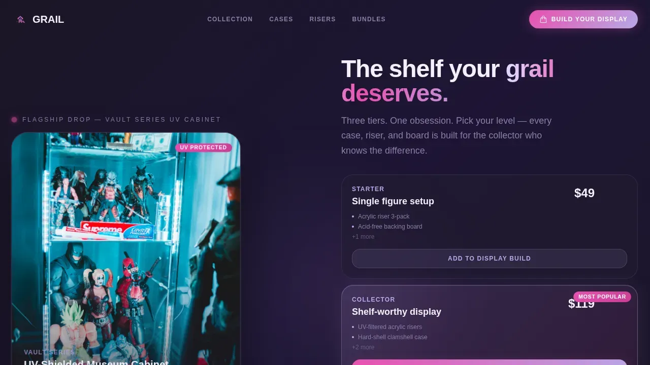
- A price-anchored hero split with a flagship product image and three visible pricing tiers
- A Pinterest-style masonry grid where each card shows a supply item in real shelf context
- A persistent bottom bar with a live bundle total and a dynamic savings badge that recalculates as users add items
Feature list
This landing page template delivers purpose-built components. Each one is grounded in the exact brief and designed to serve the collector market at every scroll depth.
Price-Anchored Hero Section
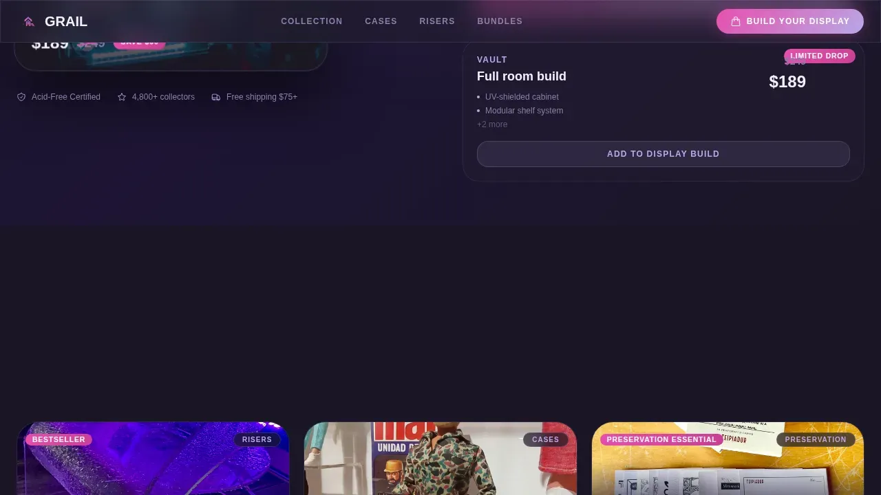
The hero splits the screen between a flagship UV-shielded display case on the left and three stacked pricing tiers on the right. The middle tier is visually highlighted. The top-tier price is struck through to a limited-time number, communicating urgency and value in a single glance.
Masonry Collection Grid with Level Up Toggles
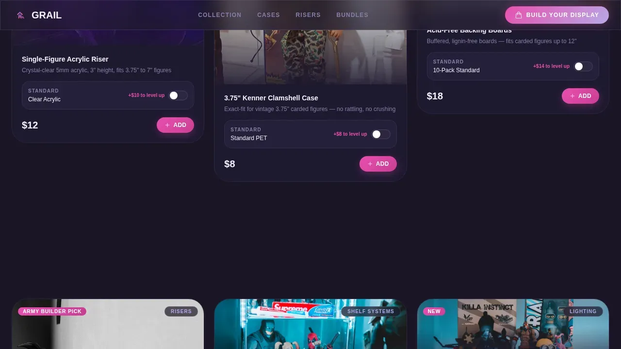
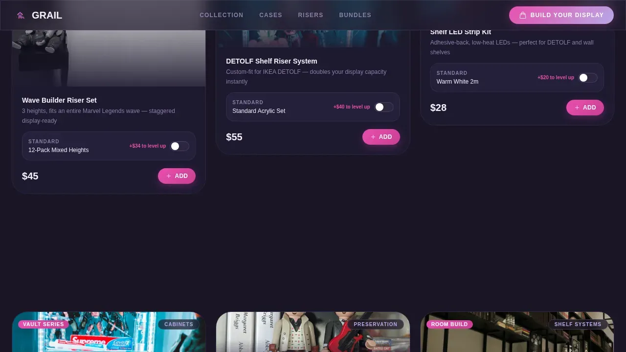
The masonry grid shows products in context rather than on white backgrounds. Each card includes a "Level Up" toggle that swaps the standard item for its premium variant, showing the price delta in laser-pink. This makes it easier for users to upgrade on the spot and build a better display set.
Build Your Display Drawer
The primary call to action opens a sliding drawer where selected items stack visually like a shelf being assembled. This interactive mechanic rewards the collector instinct to complete a set and keeps the purchase flow open and engaging.
Editorial Cluster Sections
Short editorial lines introduce each product cluster as the visitor scrolls. Phrases like "For the one you paid too much for" add provenance and storytelling context, increasing value perception and emotional connection to the brand.
Collector Testimonials with Shelf Photos
A social proof section features testimonials from collectors with specific figures named and shelf photos shown. Trust signals like star ratings and community stats reassure buyers that other serious collectors already rely on these supplies to protect their pieces.
Persistent Savings Bar
A fixed bottom bar shows the live bundle total with a dynamic savings badge. The badge recalculates in real time, allowing users to see exactly how much they save by buying together rather than separately.
Page sections overview
| Section | Purpose |
|---|---|
| Hero Split | Price-anchored flagship showcase with three visible tiers |
| Masonry Grid | Pinterest-style product vignettes with Level Up toggles |
| Editorial Clusters | Narrative introductions that build value per product group |
| Social Proof | Collector testimonials, shelf photos, and community stats |
| Build Your Display | Sliding drawer call to action for bundle assembly |
| Persistent Bottom Bar | Live bundle total with dynamic savings badge |
| Footer | Horizontal flow layout with navigation and brand links |
Design & branding system
The Lavender Dream color system gives this landing page a look that feels like nostalgia filtered through modern precision. Archival Modernism principles combine mid-century geometric lines with high-fidelity finishes, creating a premium "new nostalgia" that makes the brand feel both vintage and impossibly clean. Vintage-inspired typography built on blocky, rounded letterforms enhances the retro aesthetic of the entire site.
- Soft astral purple (#B8A9E8) as the primary wash, deep cartoon black (#1A1625) for card backgrounds, warm blister-plastic white (#F4F0FA) for body surfaces
- Hot laser-pink (#E84FAE) reserved for hover states, badges, and cart buttons to draw the eye toward action
- Plus Jakarta Sans typography renders blocky and retina-crisp, evoking a 1986 toy package aesthetic on modern screens
Mobile & speed optimization
The landing page is desktop-first by design, matching how collectors typically browse while organizing shelves. It also includes full mobile support so the site works well across devices. Fast loading and a touch-friendly experience are critical since a significant portion of traffic comes from mobile users.
- Optimized images used throughout the masonry grid to keep the landing page responsive and fluid
- Client components are isolated to interactive elements only, keeping non-interactive sections lightweight
- The masonry layout reflows naturally on smaller screens without breaking the gallery feel
How this template helps you convert
This landing page is built around conversion at every scroll depth. Strategic call-to-action placement repeats key actions throughout the page to capture user interest at the right moment. The designs guide users from discovery through purchase without dead ends.
- The price-anchored hero immediately sets context: one clear flagship product, three tiers, and a struck-through top price create urgency and scarcity without extra copy.
- The "Level Up" toggle on every masonry card lets users upgrade in place, making each product card a small conversion event that builds toward a bigger bundle purchase.
- The persistent bottom bar shows live savings, rewarding users who buy more and making the result of bundle building visible at all times.
Other information about this template
This landing page is part of a broader market of neo-retro e commerce designs making it easier for store owners to launch fast. Designers and store owners seeking a retro landing page that sells display supplies will find this template sits at the intersection of craftsmanship and commercial clarity. The wellness of a collector's shelf, meaning every piece protected and properly displayed, is the emotional throughline this landing page taps into.
- Shopify-compatible structure and clean code make it straightforward to adapt for Shopify storefronts or similar e commerce platforms that support custom landing page builds
- Designers can reference retro landing page styles like the Neon Bold Theme or Y2K Aesthetic on Shopify as comparable market context, though Grail goes further with editorial depth and upsell mechanics
- The template is available through Creative Market, which offers platforms like WordPress, Shopify, Wix, and Bootstrap compatibility, along with three license tiers: Personal License for non-commercial use, Commercial License for up to 5,000 end products, and Extended Commercial License for larger rights
- Users can customize all designs to match their brand, making it an ideal source for thousands of independent store owners sharing their collections with the world on Instagram and beyond
- The luxury resale market is projected to grow at nearly 10 percent compound annual growth rate through 2026, making collector-niche e commerce a strong long-term market to build in
- Platforms like Vestiaire Collective and Farfetch have shown that people will pay premium prices when trust, provenance, and authenticity are communicated clearly, exactly what this landing page is designed to do
Theme
Neo-Retro
Creative direction
Curated Collection
Color system
Lavender Dream
Style
Masonry/Pinterest
Direction
Upsell/Upgrade
Page Sections
Price-anchored Hero with Tier Pricing
Masonry Grid with Level Up Toggles
Build Your Display Sliding Drawer
Editorial Cluster Narrative Sections
Collector Testimonials and Trust Signals
Persistent Live Savings Bottom Bar
Related questions
Can I use this landing page template to sell on Shopify?
Does the template include the Level Up toggle and Build Your Display drawer?
Who holds the rights to use this template after purchase?
Can designers customize the color system and typography?
How does the persistent savings bar calculate the bundle discount?



