Cabinetmaker Customer Review Landing Page Template
Grain is a single-page landing page template built for established cabinetmakers who need their customer reviews to do serious selling. It pairs verbatim reviews with hard project data inside FAQ-anchored comparison tables, turning a testimonial page into a structured proof document. The stark monochrome palette and bold headline keep the focus entirely on earned credibility.
by Rocket studio
Quick summary
Grain is a review-focused landing page template for custom cabinetmakers. It organizes customer testimonials around the real questions prospects ask before hiring, pairing each answer with a side-by-side comparison table of anonymized project data. The result is a page that reads less like marketing and more like a case file built to close.
Who this template is for
This template is designed for custom cabinetmakers who rely on craft reputation rather than advertising spend. It suits businesses where the sale depends on proof, not promises.
- Custom cabinet shops and joinery workshops serving residential renovation clients
- Cabinetmakers whose leads include interior designers vetting subcontractors before committing
- Cabinet businesses fitting out spec homes where quality cabinetry is a closing argument for property developers
What problem this template solves
Most review pages are chronological feeds that prospects skim and forget. They do nothing to address the specific fears a serious buyer carries into a renovation decision.
- Homeowners burned by flat-pack failures need to see budget adherence and timeline accuracy before they trust anyone new
- Interior designers staking their professional reputation need documented proof of material grade and on-site reliability
- Developers fitting spec homes need quick, structured evidence that a cabinetmaker delivers consistently across multiple projects
What you get with this template
You get a single landing page structured like a cross-examination rather than a brochure. Every scroll answers a real objection with real data sitting right beside a real review.
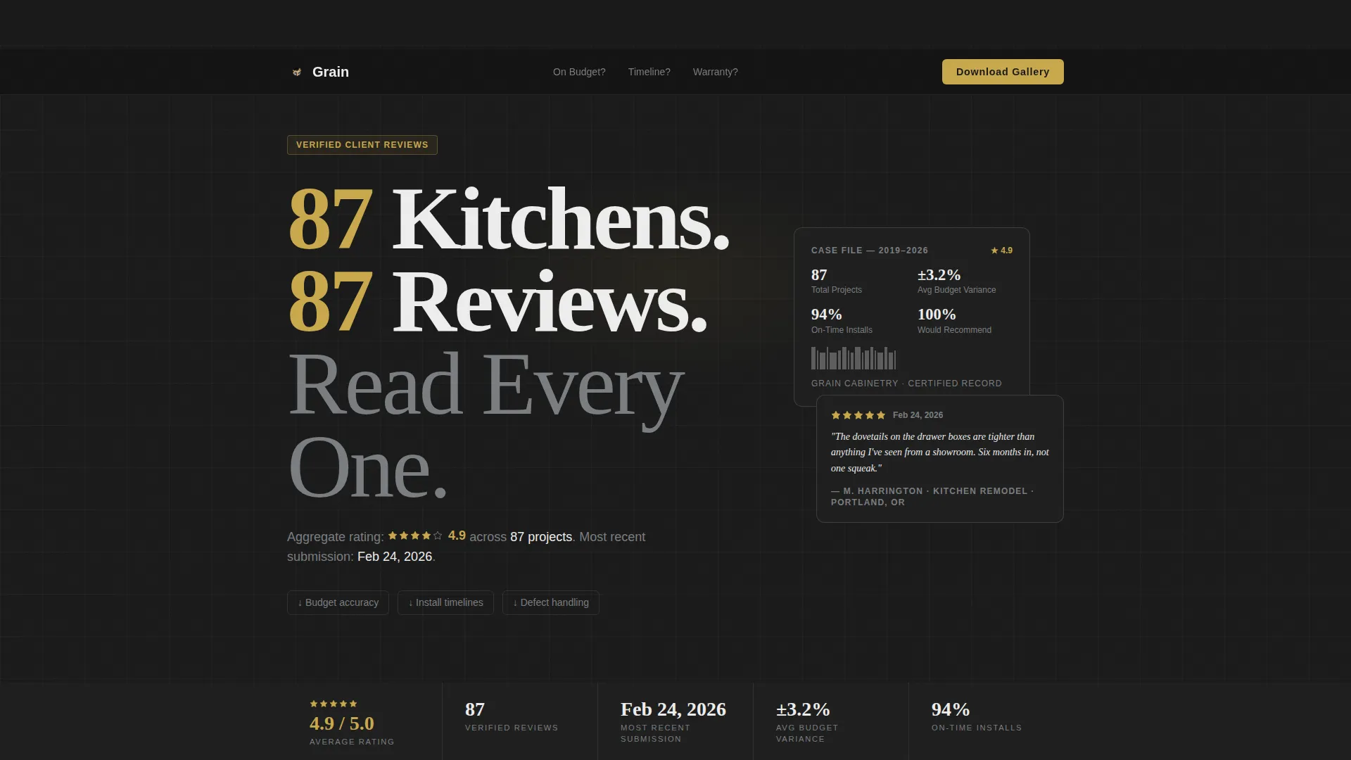
- A giant centered headline section with aggregate star rating, total review count, and date of most recent submission
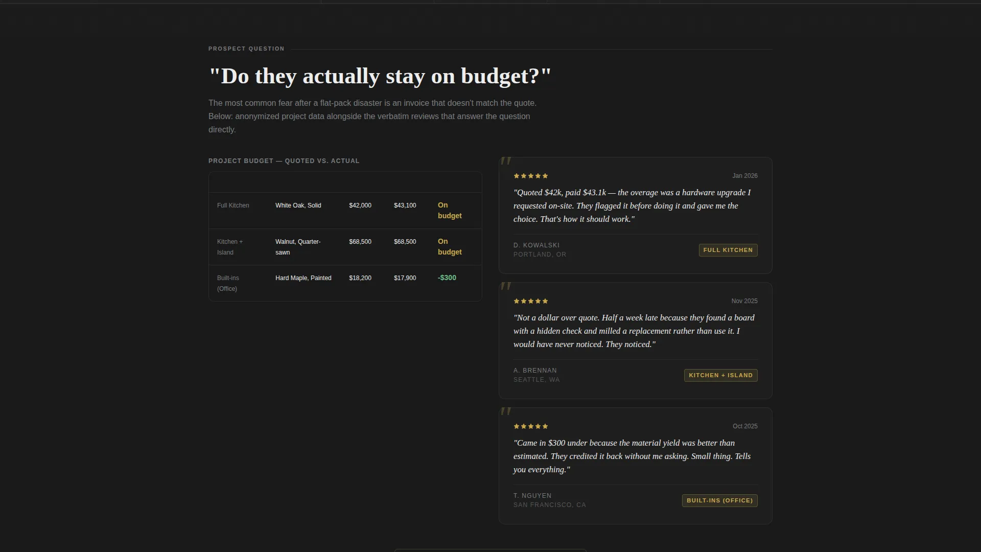
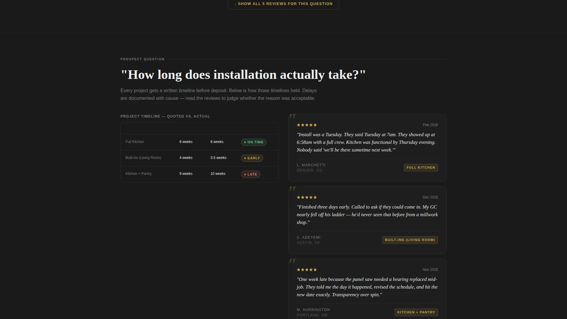
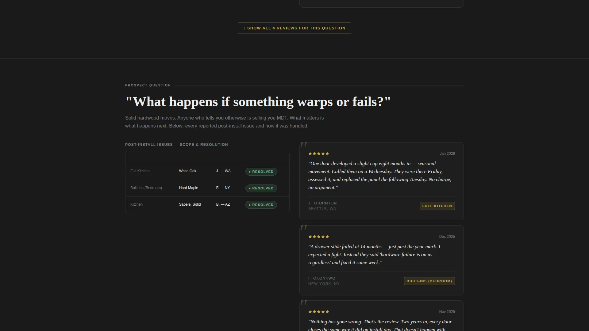
- FAQ-anchored comparison table sections, each pairing anonymized project details with a verbatim customer review
- A lead-capture section with a primary call to action to download a full project gallery PDF and a secondary review submission form
Feature list
This template is built around a small number of deliberately chosen components, each earning its place on the page.
FAQ-Anchored Comparison Tables
Each section opens with a plain-language question drawn from real search behavior, such as "Do they stay on budget?" or "What happens if something warps?" Below each question sits a comparison table showing anonymized project scope, quoted timeline versus actual timeline, and material grade. The verbatim customer review appears directly alongside it, so the data and the human voice answer the objection together.
Giant Centered Headline Block
The header uses stark white condensed serif type on a forge black background. The headline states the total project and review count as a direct challenge to skepticism. Below it, a single brushed nickel line presents the aggregate star rating, total review count, and the date of the most recent review submission in a format that feels like documented evidence rather than marketing copy.
PDF Lookbook Lead Capture
The primary call to action invites visitors to download a full project gallery PDF. The form requires only a first name and an email address. By the time visitors reach this section, they have already read twelve unedited reviews paired with project data, so the download request feels like a natural next step rather than a cold ask.
Review Submission Form
A secondary path allows past clients to submit their own review through a structured form. This component reinforces the transparency signal the entire page is built on and keeps the review library growing without extra effort from the business owner.
Monochrome Steel Color System
The palette uses four values: forge black, brushed nickel, workshop dust white, and a single case-file amber accent. Amber appears only on star ratings, pull-quotes, and hover states. The restraint is intentional. Every color choice directs attention to the content rather than the design.
Page sections overview
| Section | Purpose |
|---|---|
| Headline Hero Block | States total projects and reviews as an opening credibility claim |
| Aggregate Rating Bar | Displays star rating, review count, and most recent submission date |
| FAQ Comparison Section | Pairs project data tables with verbatim reviews per buyer question |
| PDF Download call to action | Captures first name and email in exchange for the project gallery |
| Review Submission Form | Invites past clients to add their own structured review |
Design & branding system
The visual identity follows a Legal Shield theme executed through a Monochrome Steel color system. Every decision reinforces the feeling of precision and accountability rather than decoration.
- Four-color palette: forge black (#1A1A1A), brushed nickel (#7A7D80), workshop dust white (#EDEDED), and case-file amber (#C9A84C) used only for star ratings, pull-quotes, and hover states
- Typography uses a condensed serif that reads as notarized and authoritative, not ornamental
- No photography or illustration in the header; the headline number and the dare carry the entire visual weight
Mobile & speed optimization
The page layout is intentionally lean. There are no background images, no illustration layers, and no decorative elements competing for load priority.
- The header block is pure type on a solid color, eliminating the heaviest render cost on any page
- Comparison tables are structured for vertical stacking on smaller screens so data remains readable without horizontal scrolling
- The lead-capture form requires only two fields, keeping the mobile interaction fast and low-friction
How this template helps you convert
The page is designed to dismantle objections sequentially before the ask appears. Trust accumulates through the scroll rather than being requested at the top.
- Each FAQ section removes a specific purchase barrier using documented project data and a matching customer voice, so visitors feel informed rather than persuaded by the time they reach the download button
- The PDF lookbook call to action offers clear value in exchange for minimal personal information, making the first conversion step feel proportionate and low-risk
Other information about this template
This template is built for a single-page format and is not configured as a multi-page site. All sections live on one continuous scroll. The FAQ-driven structure means the page works as a content and resource hub that can attract organic search traffic around the specific questions renovation clients are already researching. The comparison table layout is particularly effective for cabinetmaker businesses where the difference between a quoted and actual timeline is the single most searched proof point. The structured review submission form supports long-term page maintenance by encouraging real clients to contribute new entries without requiring manual page edits.
- The template is designed for cabinetmaker businesses in the professional services category, specifically within the cabinet maker customer review page niche
- The Legal Shield theme communicates accountability and craft integrity without requiring any certification claims or compliance language
- The amber accent color is reserved and intentional; overusing it outside its designated roles would reduce the designed trust signal
Theme
Legal Shield
Creative direction
FAQ-Driven
Color system
Monochrome Steel
Style
Comparison Table
Direction
Content/Resource
Page Sections
Faq-anchored Comparison Tables
Giant Centered Headline Block
PDF Lookbook Lead Capture
Structured Review Submission Form
Monochrome Steel Color System
Related questions
Can I customize the review questions in each FAQ section?
Does the page require a lot of existing reviews to launch?
What does the PDF lookbook lead capture actually deliver?
Who is meant to fill out the review submission form?
Is this template suitable for a cabinetmaker targeting interior designers as well as homeowners?



