Nonprofit Marketing & Agency Specialist Portfolio Website Template
Granted is a bold brutalist bento grid landing page built for nonprofit pay-per-click agencies. It leads with cinematic full-screen video, stacks jaw-dropping case study metrics in a trophy-case grid, and drives leads through a focused three-field audit form. Every design choice earns trust before asking for anything.
by Rocket studio
Quick summary
Granted is a single-page lead generation template designed for digital ads agencies that manage Google Ad Grant campaigns for nonprofits. It pairs a full-screen video header with a bento grid layout that presents results tile by tile, like a trophy case filling in real time. The page closes with two conversion paths: a grant audit form and a free compliance checklist download.
Who this template is for
This template is built for nonprofit pay-per-click agencies that need to turn a compelling results story into inbound leads. It speaks directly to the buyers those agencies are trying to reach.
- Development directors and grant managers at mid-size nonprofits who are worried about leaving grant money unspent
- Executive directors whose accounts have been suspended for falling below compliance thresholds
- Agency founders and marketing teams who want a page that presents evidence first and asks for contact details second
What problem this template solves
Nonprofit ad agencies often have extraordinary results but no single page that makes the case for them clearly. Generic agency templates bury the proof. This template puts the numbers front and center, in oversized brutalist type, before a visitor can scroll past them.
- Agencies lose leads because their pages persuade instead of proving; this template presents sealed verdicts, tile after tile
- Suspended or nervous nonprofit clients need reassurance fast; the compliance checklist download catches them before they leave
- The persistent mobile call-to-action bar removes friction for decision-makers who land on the page from a paid ad on their phone
What you get with this template
You get a fully structured bento grid landing page that moves from cinematic proof to a direct conversion ask without wasted space. Every section has a defined purpose and a deliberate visual weight.
- A full-screen video background header with a centred headline and a primary call-to-action button
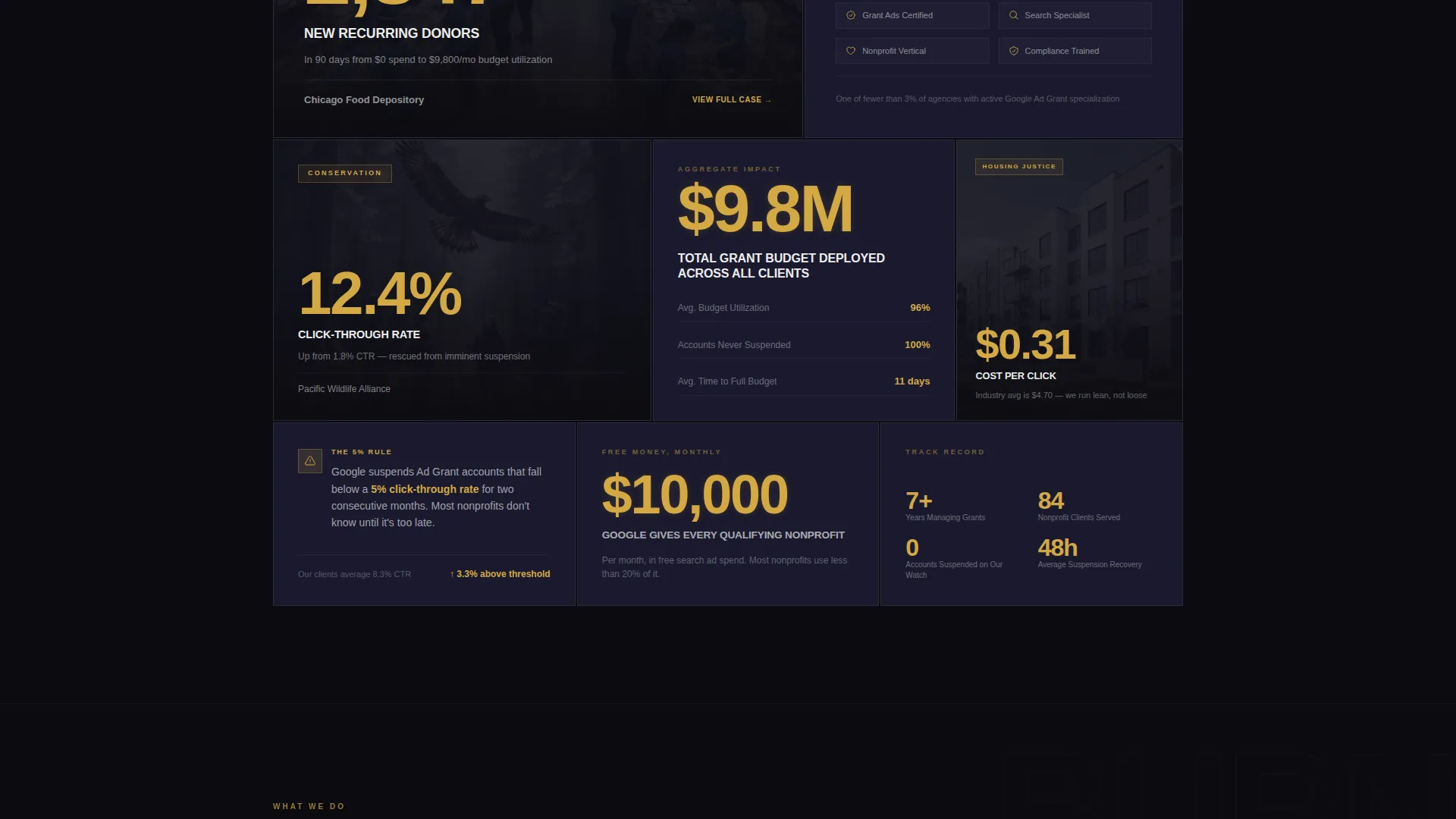
- A bento grid body built from trophy-case tiles: case study metrics, a partner badge display, and stacked testimonials
- Two lead capture paths: a three-field audit request form and an email-gated checklist download
Feature list
This template ships with a set of carefully scoped sections and components drawn directly from the creative brief.
Full-Screen Video Header
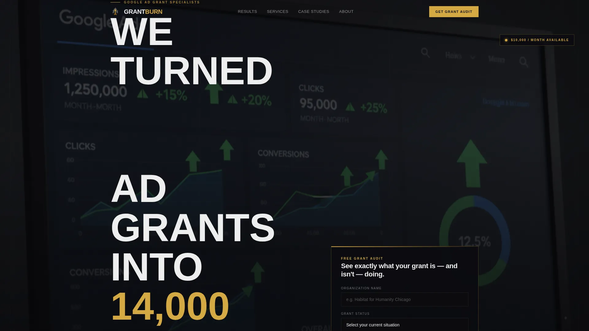
The header fills the entire viewport with a slow cinematic montage. Dashboard green arrows, donation confirmation screens, and real team reactions play in a slightly desaturated loop. Gold elements, including dollar figures and conversion counts, pulse with warm luminance to hold the eye. A single brutalist headline and a gold-on-black call-to-action button sit at the centre.
Trophy-Case Bento Grid
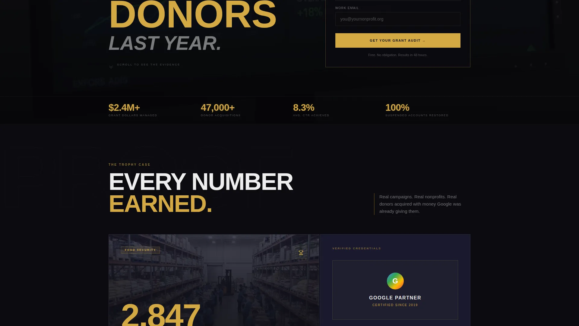
The bento grid is the core of the page. Each tile is a self-contained proof unit: one holds a nonprofit case study with a logo and a single headline metric, another displays a partner badge at full scale, and a third stacks client testimonials like plaques on a wall. Gold lines frame every tile like a display case.
Three-Field Lead Capture Form
The audit request form asks for three pieces of information: organisation name, grant status selected from a dropdown (Active Grant, Suspended, or Haven't Applied), and a work email address. The short form lowers friction while qualifying the lead in a single step.
Email-Gated Checklist Download
A secondary conversion path offers a free downloadable compliance checklist gated behind an email field. This catches visitors who are not ready to book an audit but are already concerned about their account health. It keeps the page earning leads at every exit point.
Persistent Mobile Call-to-Action Bar
On mobile, the primary call-to-action reappears as a fixed bottom bar so it is always one tap away. This is especially useful for executive directors clicking through from a paid ad on a phone during a busy workday.
Obsidian and Gold Branding System
The visual identity is built into every component. Deep black dominates all surfaces. Ceremonial gold appears only on statistics, call-to-action labels, award badges, and hover states. The contrast is deliberate and immediate.
Page sections overview
| Section | Purpose |
|---|---|
| Video header | Establish scale with a cinematic results montage and primary call-to-action |
| Headline stat block | Deliver the boldest number in oversized brutalist type |
| Case study tile | Present a single nonprofit logo alongside one jaw-dropping metric |
| Partner badge tile | Display full-scale recognition to build agency credibility |
| Testimonials tile | Stack client quotes like framed plaques for accumulated social proof |
| Audit request form | Capture qualified leads with three fields and a clear submit action |
| Checklist download | Offer a free compliance resource gated behind email only |
| Mobile call to action bar | Keep the primary call-to-action persistent at the bottom of the screen |
Design & branding system
The template uses a Bold Brutalist theme built on an Obsidian and Gold colour system. The palette is heavy, earned, and impossible to ignore, like an engraved trophy sitting on a concrete surface.
- Colours: deep volcanic black (#0B0B0F), raw charcoal (#1A1A2E), ceremonial gold (#D4A843), and sharp off-white (#EDEDED) for body text
- Typography is oversized, uppercase, and brutalist throughout, with slab letterforms that take up space proportional to the results they describe
- Gold is used sparingly and intentionally: statistics, call-to-action text, award badges, and hover states only; black dominates every other surface
Mobile & speed optimization
The layout is designed to translate the bento grid experience cleanly to smaller screens without losing the visual impact of the brutalist design system.
- The bento grid tiles restack vertically on mobile so no metric or proof unit is hidden below the fold
- The persistent bottom call-to-action bar ensures the primary conversion action stays visible as the user scrolls through the evidence tiles
How this template helps you convert
The page is structured as a sequential evidence presentation that earns the conversion ask rather than leading with it. Every design and layout decision moves a sceptical development director or grant manager closer to submitting their details.
- The video header delivers scale and credibility in the first seconds, presenting a real number ($120,000 in grant spend turned into 14,000 donors) before any claim is made in body copy
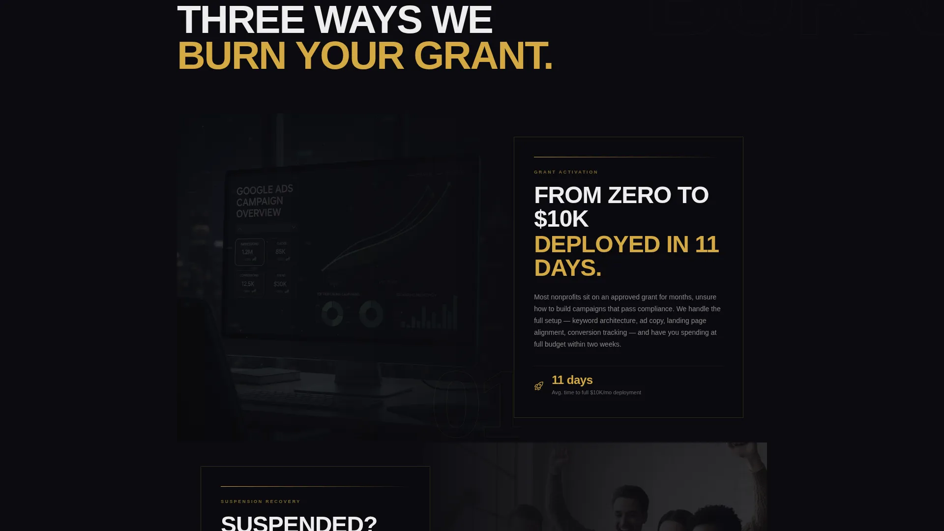
- The bento grid then builds accumulated proof tile by tile, tightening as the visitor scrolls deeper, so the call-to-action form arrives when the evidence feels undeniable
- The dual conversion path means visitors who are not ready for a direct audit conversation can still enter the funnel through the free checklist download, keeping no qualified lead behind
Other information about this template
This template is a strong fit for agencies working inside the Google Ad Grant programme, which provides eligible nonprofits with up to $10,000 per month in free search advertising. Compliance requirements, including a minimum five percent click-through rate threshold, create real urgency for the nonprofit clients this page targets. The creative direction and copy structure are built around that urgency.
- The Award and Recognition creative direction means the grid functions as a portfolio and a compliance brief at once, suited to agencies building trust with both new prospects and referral visitors
- The template style is Bento Grid, which is particularly effective for agencies that have multiple distinct proof points to present without a traditional long-form scroll narrative
- The header concept is Full-Screen Video Background, which requires the agency to supply video assets showing live dashboard results, donation screens, or team reactions for maximum impact
Theme
Bold Brutalist
Creative direction
Award & Recognition
Color system
Obsidian & Gold
Style
Bento Grid
Direction
Lead Generation
Page Sections
Full-screen Cinematic Video Header
Trophy-case Bento Grid Layout
Three-field Audit Request Form
Email-gated Checklist Download
Persistent Mobile Call-to-action Bar
Obsidian and Gold Visual Identity System
Related questions
Who is this landing page template designed for?
What are the two lead capture options included on this page?
Do I need video footage to use the header section effectively?
Can this template display multiple nonprofit client case studies?
What makes this template different from a standard agency portfolio page?



